


The Brand
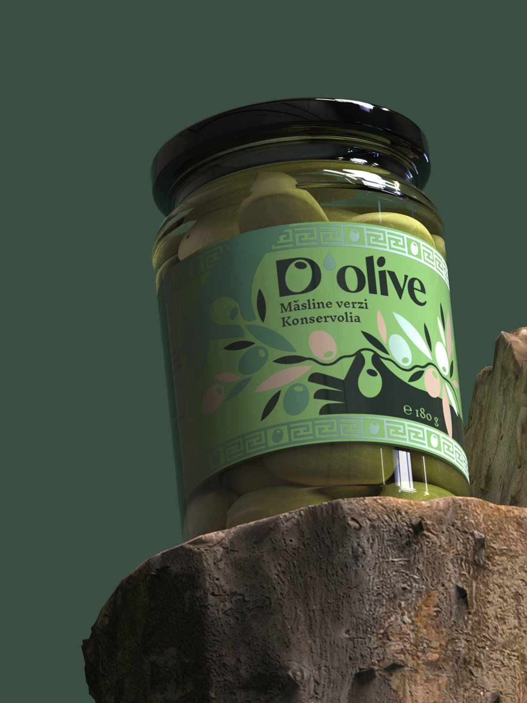
D’olive is an olive oil brand that tells a vivid Romanian story, built around a community that feels, tastes, and lives authentically. It is the vivid taste grown in the olive groves of Crete, bringing people together around the table.
Logo
The European olive oil market is undergoing a profound transformation. In this context, D’olive made a defining move: shifting from selling producers’ brands to building its own. This decision required a clear and solid logo, a symbol capable of telling the product’s story while also having the strength to inspire the stories told by others. The new logotype reflects one of the brand’s most important values: transparency.
Because the brand cares about what reaches your plate.
And about who stands behind the taste. It openly states which groves each batch comes from, who the producers are, which varieties it contains, and how the oil was obtained.
It hides nothing.
It does not generalize.
It makes no vague promises.
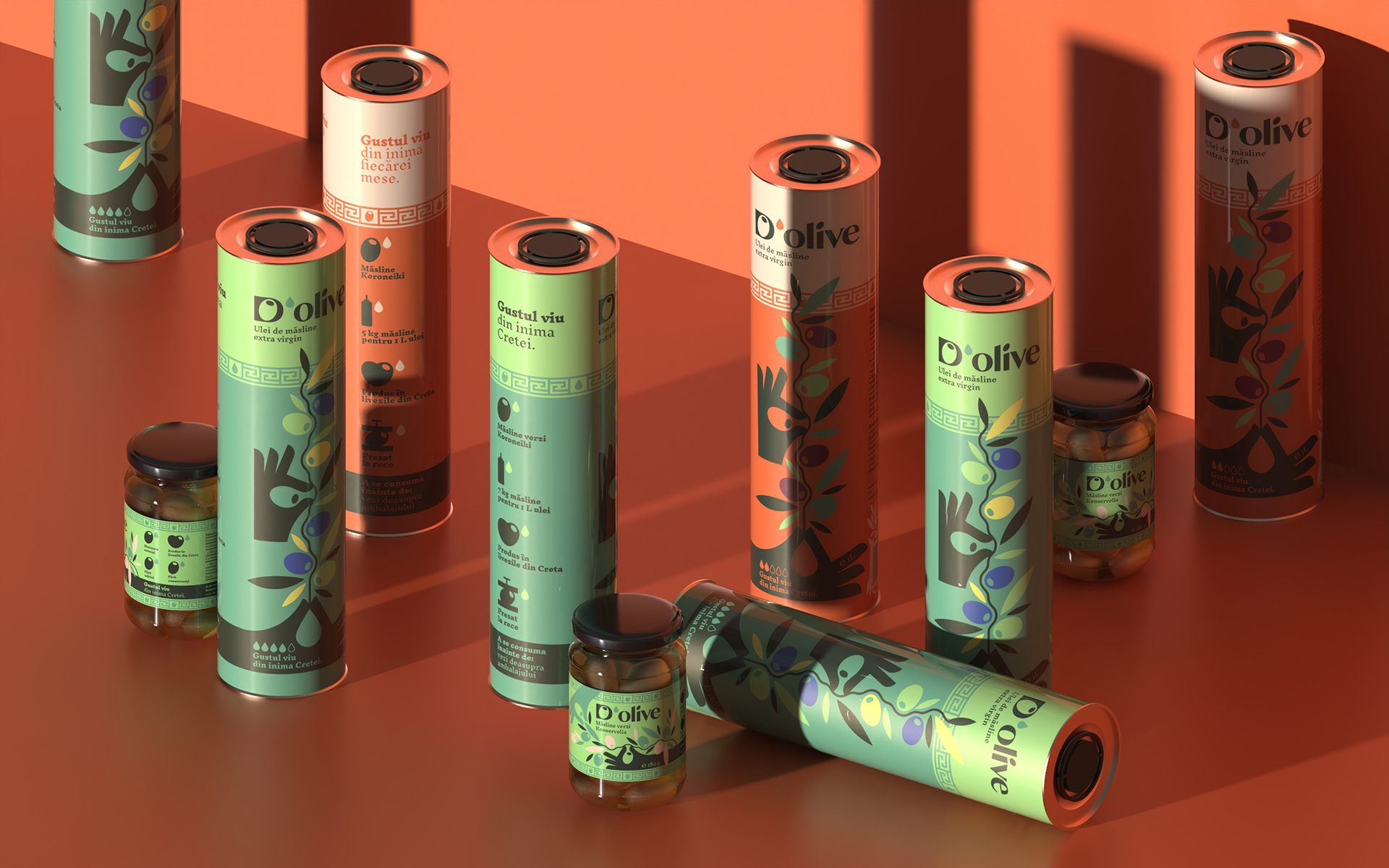
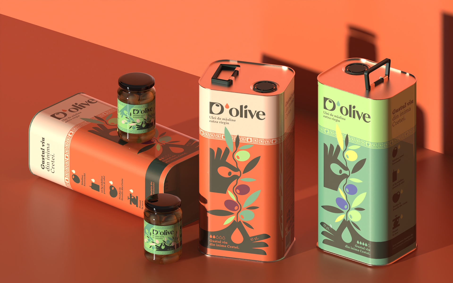
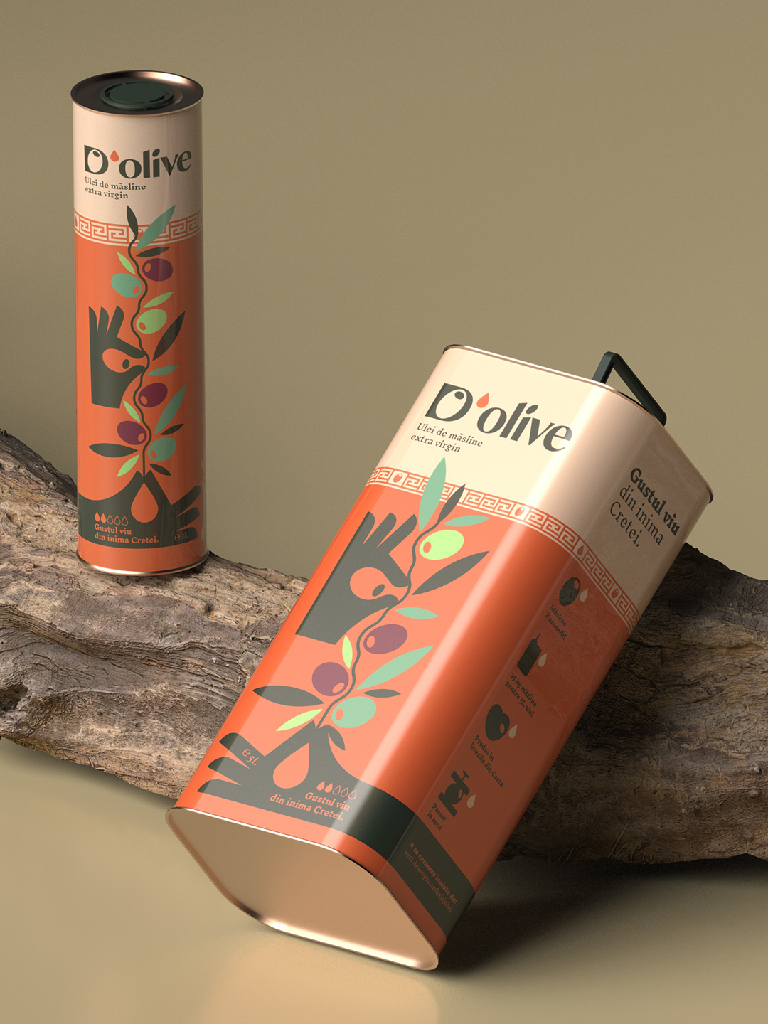
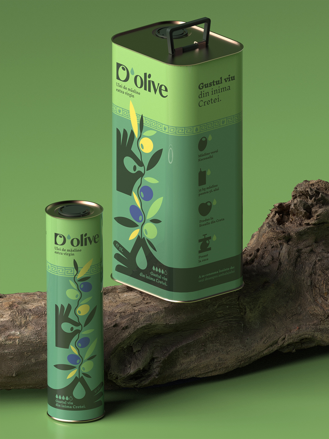
Packaging Architecture
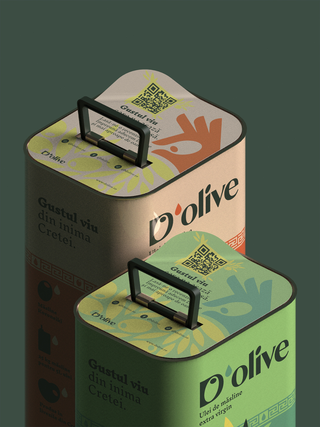
The D’olive packaging system was designed to bring clarity and unity across a diverse range of products and formats, while reflecting both the vivid taste and the human connection behind the brand. Alongside the 5L tin, we introduced a smaller 1L format to extend accessibility and flexibility. The system was built to allow product diversification based on taste intensity and flavor profile, turning sensory experience into a clear selling point.
There is a common myth linking the color of olive oil to its quality. We challenged it through the idea of “gustul viu”/ “vivid taste” and a color palette that reflects life in Greece as it truly is.
CREDIT
- Agency/Creative: VRLN Studio
- Article Title: D’olive Olive Oil Branding by VRLN Studio Turns Vivid Taste and Transparency Into a Modern Packaging System
- Organisation/Entity: Agency
- Project Type: Packaging
- Project Status: Published
- Agency/Creative Country: Romania
- Agency/Creative City: Bucharest
- Market Region: Europe
- Project Deliverables: Brand Design, Brand Guidelines, Brand Identity, Brand Strategy, Logo Design, Packaging Design, Packaging Guidelines
- Format: Jar, Tin
- Industry: Food/Beverage
- Keywords: Olive Oil, Modern greek, romania, packaging, tin can, logotype, olive logo
-
Credits:
Design Director: Paul Virlan
Brand Strategist: Manuela Dospina


