“Russians love drinking champagne not less than vodka. This has historical routs from the days of the Soviet Union, where there were several large factories of sparkling wines. It is important to note that Russian champagne has nothing in common with French or Italian, it has quite a specific taste and it is not an expensive drink. The average cost of a bottle in the regions of Russia is about 2-3 dollars.
Since Russian champagne is popular among consumers with low incomes, the labels in this segment mainly look either bad or Soviet style. However, this market is also evolving, and in recently more and more manufacturers realize that the outdated design of labels needs to be changed.
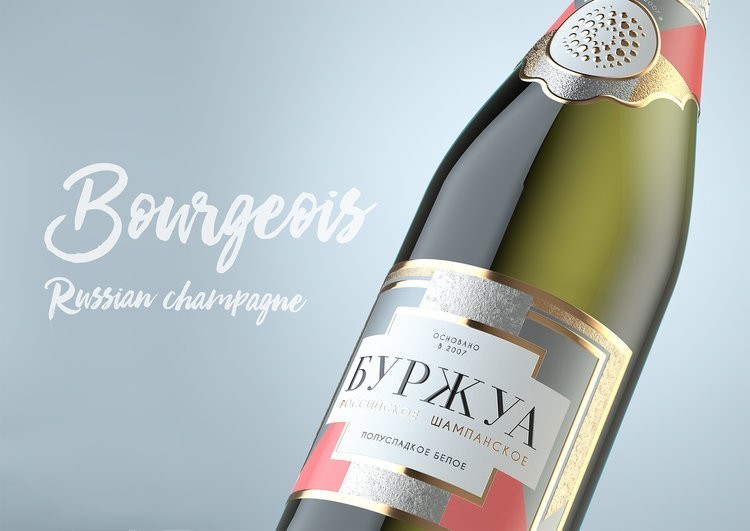
“Bourgeois” – is a typical, not expensive, Russian champagne of good quality. At the time, the manufacturers came up with champagne, “Bourgeois” should elicit the associations with a party and, in this way, they planned to step away from the line of Soviet labels.”

“The bubbles were to create a sense of a holiday. However, the name of the brand – “Bourgeois” was absolutely not connected to the appearance. There they were with the label for many years, and last year, they finally decided to make a cardinal restyling.
We offered to rethink the concept of a party. Make this party easy and joyful. We offered positive and light color scheme. If we talk about the concept, the labels were made in the style of an invitation to a cool party (engagement, wedding, birthday) Labels came to be very ornate, they have a lot of gold and silver (this is exactly what the majority of Russians like and associated with a holiday). However, at the same time we have introduced a complex geometry and supported it by the postproduction using different textures (glossy, matte, rough gold (blind embossing) and glossy gold edges. Such techniques allowed to create depth and volume and to make the picture lively and dynamic.”


