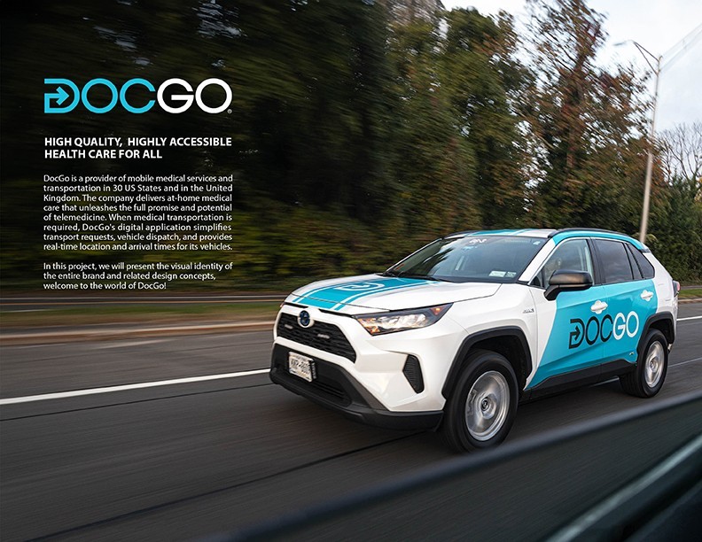
DocGo is a provider of mobile medical services and transportation in 30 US States and in the United Kingdom. The company delivers at-home medical care that unleashes the full promise and potential of telemedicine. When medical transportation is required, DocGo’s digital application simplifies transport requests, vehicle dispatch, and provides real-time location and arrival times for its vehicles. We are shaping the future of healthcare by reimagining the way healthcare is delivered. Our proprietary technology and skilled clinicians deliver population health programs for governments, value-based arrangements for payers, medical transportation for hospitals, and mobile healthcare solutions that help keep patients at home and out of the hospital. Powered by technology. Driven by compassion.
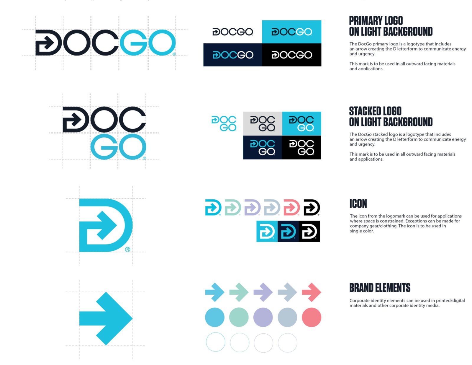
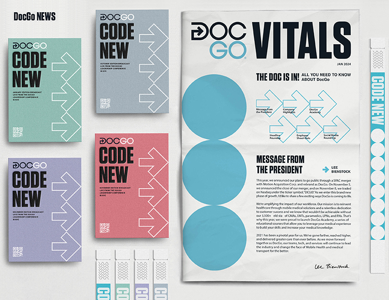
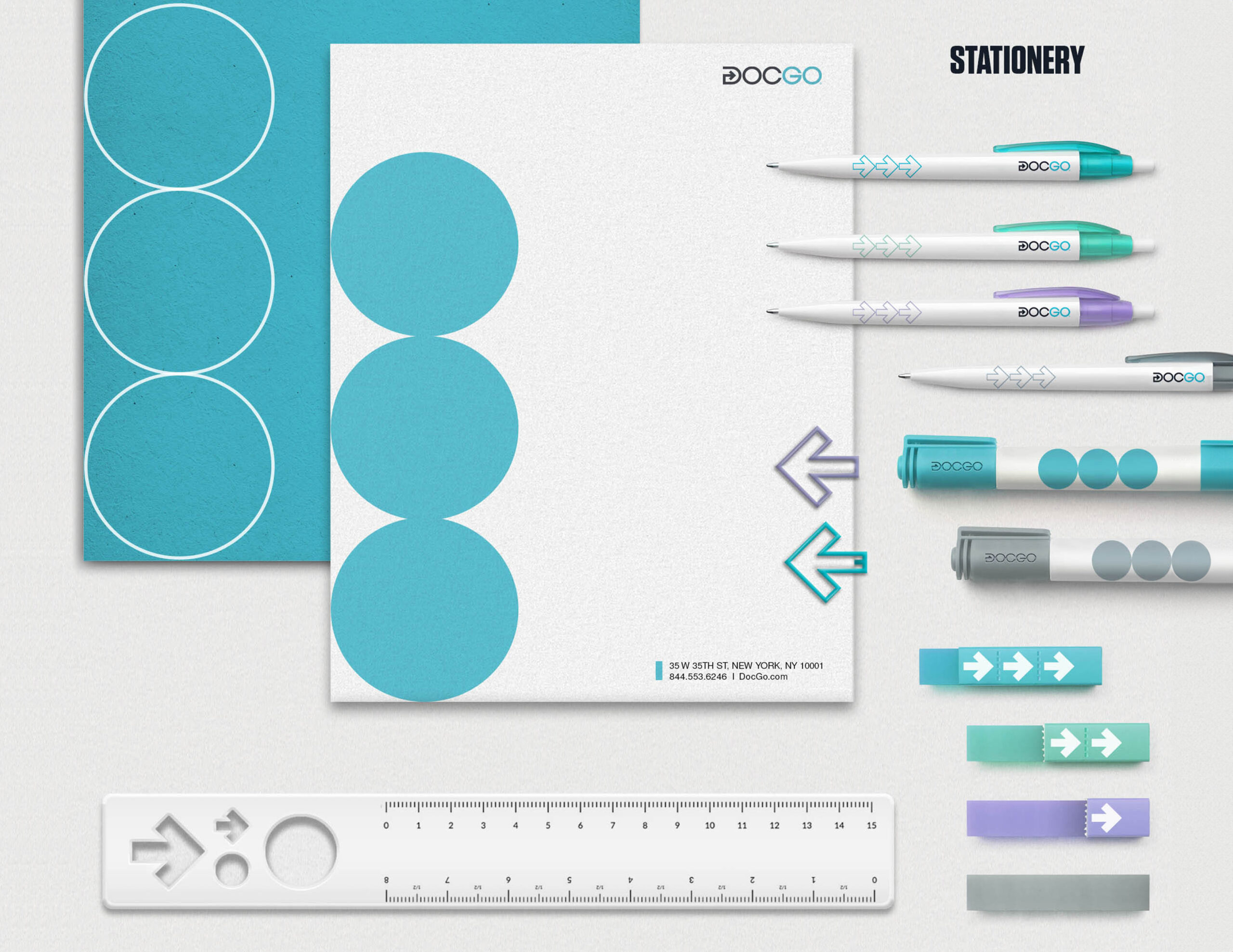
For the past few years, DocGo’s design team tried to create a strong visual for the brand, which included the brand stories, our services, products and all visual elements. We believe that the company’s core values include high efficient and affordable medical services, so arrows (fast, high mobility, flexibility) and circles (impeccable, high satisfaction) have become our main visual elements. These elements appear frequently in our designs. For example, our logo design contains an arrow. We believe fast, highly maneuverable and efficiency are very important in the medical transportation industry, so we hope to build this concept into the brand value. These elements can also be seen in our designs such as website, products, packaging, sales materials, advertising and anything about our brand identity.
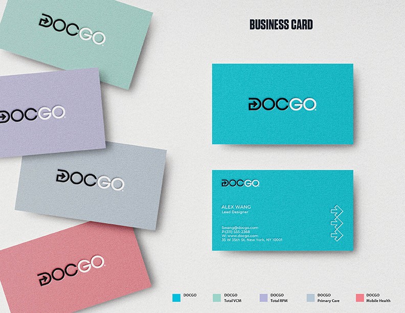
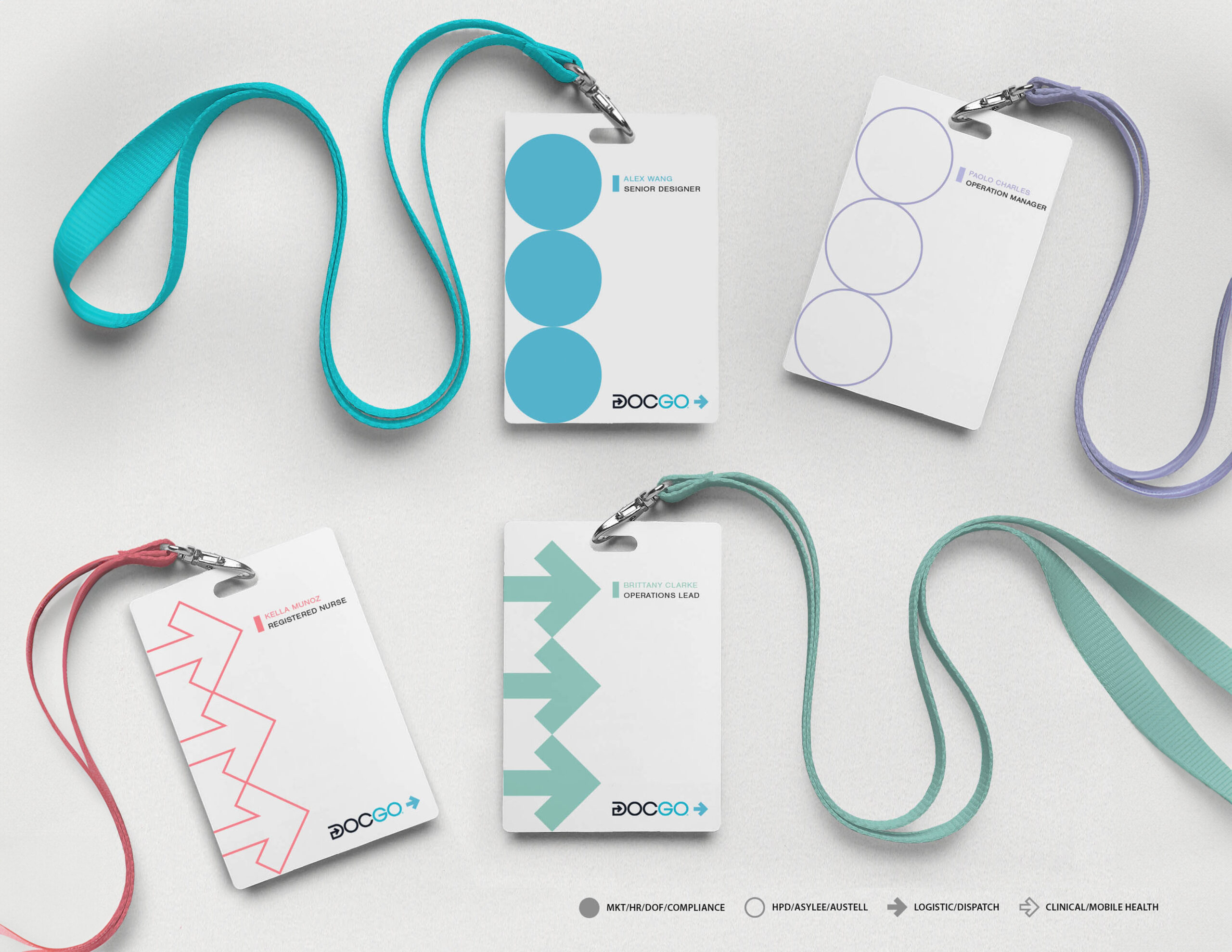
At DocGo, we have more than 40 offices and 7,000+ employees in the United States and the United Kingdom. To facilitate internal management, we use graphics and colors to identify departments. For example, solid and hollow arrows/circles represent different teams. When paired with different colors, people can clearly know which sub-brand these teams belong to. Our sub-brands include DocGo On-Demand (Blue), DocGo Total VCM (Green), DocGo Total RPM (Purple), DocGo Mobile Health (Pink) and DocGo Primary Care (Gray). About the shape, solid circle represents Marketing, HR, DOF, Compliance team; hollow circle represents HPD, Asylee, Austell team; solid arrow represents Logistic and Dispatch team; hollow arrow represents Clinical and Mobile Health team..Through the design of color and graphic classification, we further optimize the internal management of the brand.
About the brand image, our brand imagery captures “Care in Motion:” heroic depictions of our clinicians on the go, in the field, and providing care in non-traditional settings. Photos are shot reportage-style. Our photo archive is used on our website and in DocGo marketing and communication materials. Graphic overlays like circles and arrows are used when showcasing main images in marketing materials or presentations. For templated materials such as slide decks or letterhead. We do not use stock or staged photos. All shootings are carried out in a reportage style and look natural.
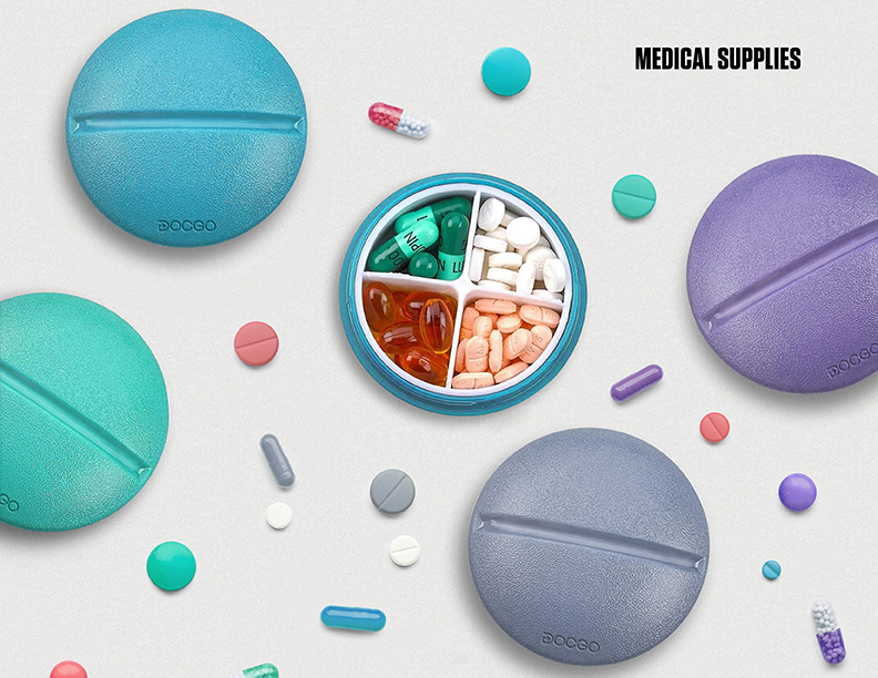
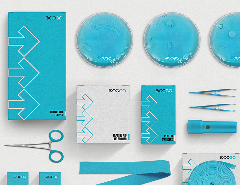
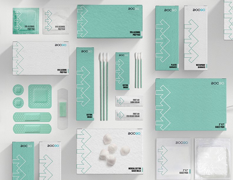
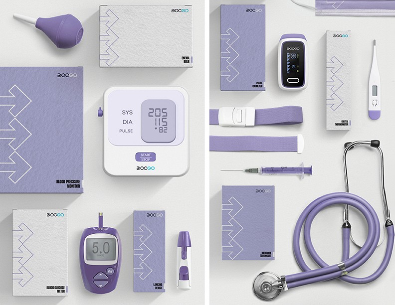
In this project, we also displayed our products and packaging. When we provide medical services, we also provide related products. Our trustworthy services make us the benchmark in the industry. DocGo is not only a good partner for hospitals but also a clinician for patients. Our products contain medical tools (blue packaging), Medical Supplies (Green packaging) and medical devices (purple packaging). We design packaging for individual products, using brand features and visual elements to enhance the identity of each item.
Our passion for innovation, business, and improving care unites us at DocGo. With a vision to create the world’s best health tech company, we work towards this goal every day. We believe that an innovative company culture, clear brand identity and design system will help us continue to achieve success.
CREDIT
- Agency/Creative: DocGo
- Article Title: DocGo’s In-House Design Team Branding – Leading the Proactive Healthcare Revolution
- Organisation/Entity: In-House
- Project Status: Published
- Agency/Creative Country: United States of America
- Agency/Creative City: New York
- Market Region: USA,UK
- Project Deliverables: Brand Creation, Brand Identity
- Industry: Health Care, Service
- Keywords: WBDS In-House Design Awards 2024/25
- Keywords: WBDS In-House Design Awards 2024/25
-
Credits:
Lead Designer: Alex Wang


