


ASIGN provides the digital business infrastructure to artists and galleries to manage their business dealings as well as a highly secure marketplace for collectors to buy and sell art.
The name Asign is a concise and memorable signifier of the company’s core value proposition: to connect artists, businesses, and collectors to buy, sell, and authenticate art and collectibles. The word “assign” means “to designate” or “to appoint,” which perfectly captures the company’s mission of bringing together all stakeholders in the art world and ensuring that each transaction is secure and transparent.
The name Asign was chosen for its simplicity and its inherent meaning, which perfectly aligns with the company’s mission. It was also chosen to reflect the brand’s core values, and the overall brand identity is designed to reinforce the same.
Asign uses a confident and authoritative tone to convey its reliability, commitment to innovation, and value to artists, businesses, and collectors. It is clear, concise, and informative. The tone is also professional and respectful, reflecting the company’s commitment to providing a high-quality service. This tone is used across all communications, including its website, marketing materials, and social media posts, to build trust and credibility.
The creative strategy for Asign was to create a brand that is both visually arresting, conceptually sound, distinctive and impactful.
Extensive research was conducted with potential customers to ensure that the brand would resonate with its target audience.
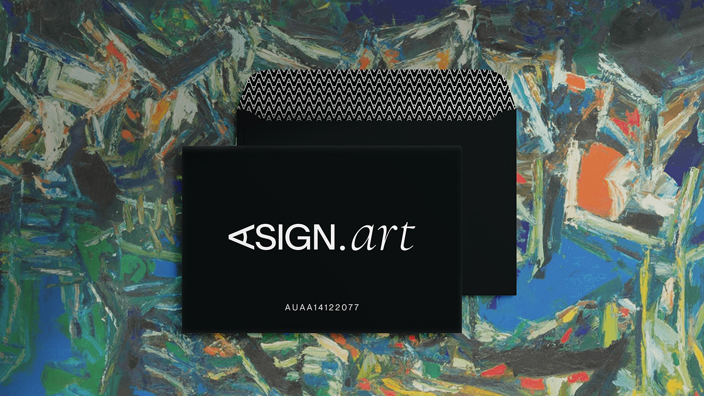
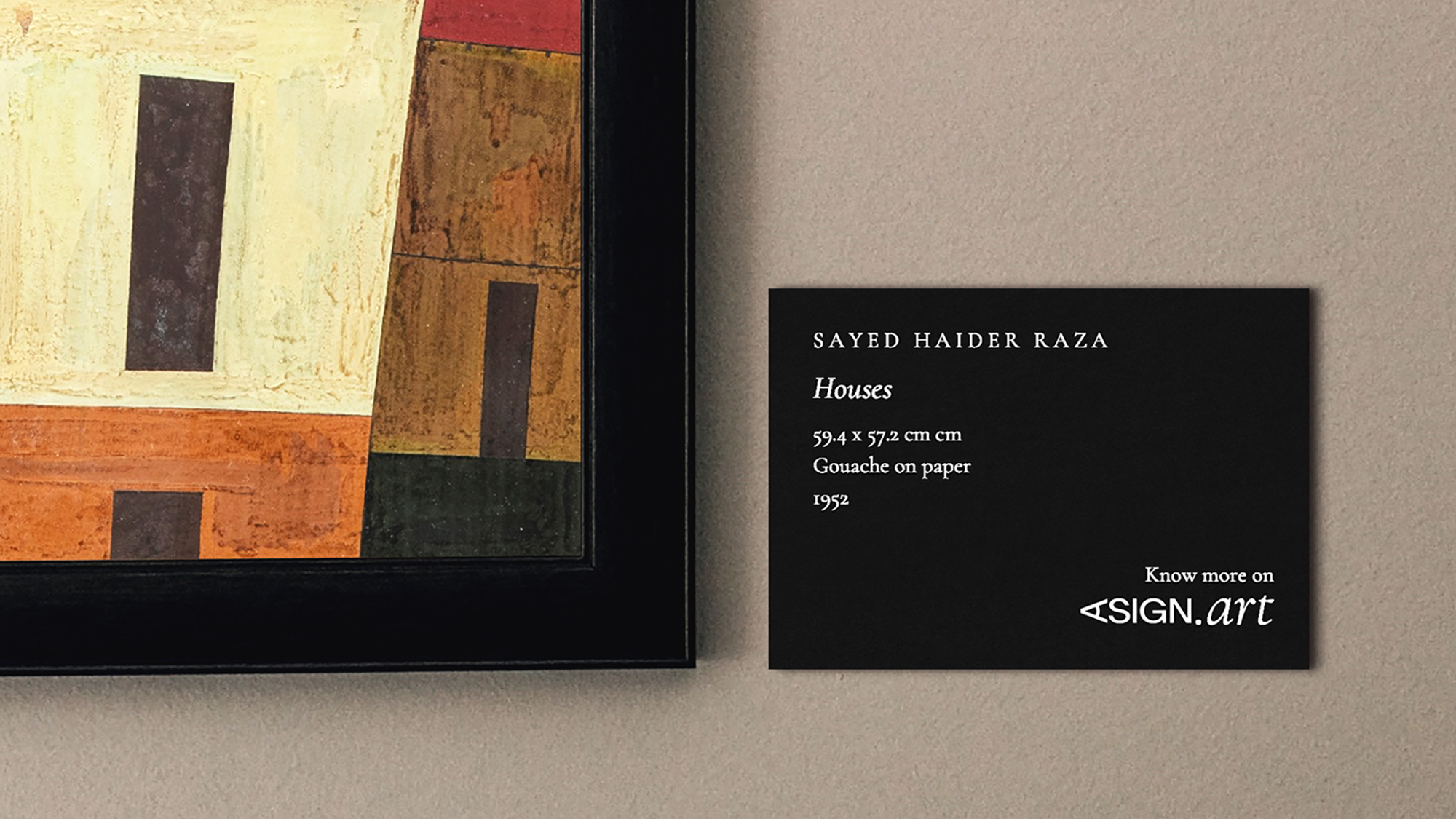
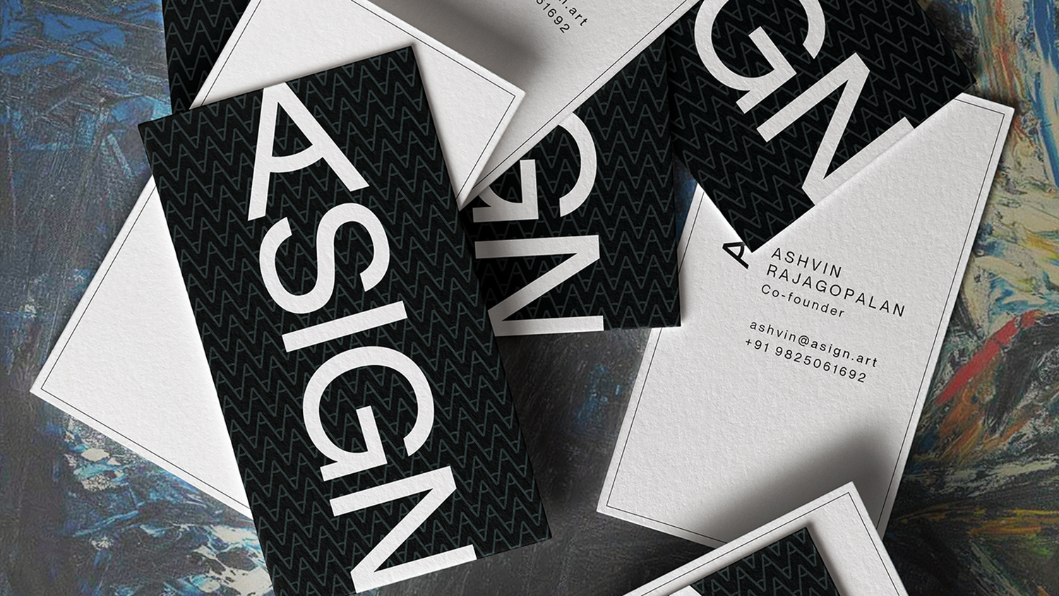
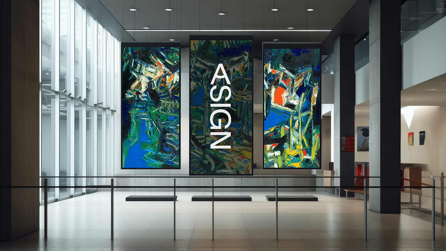
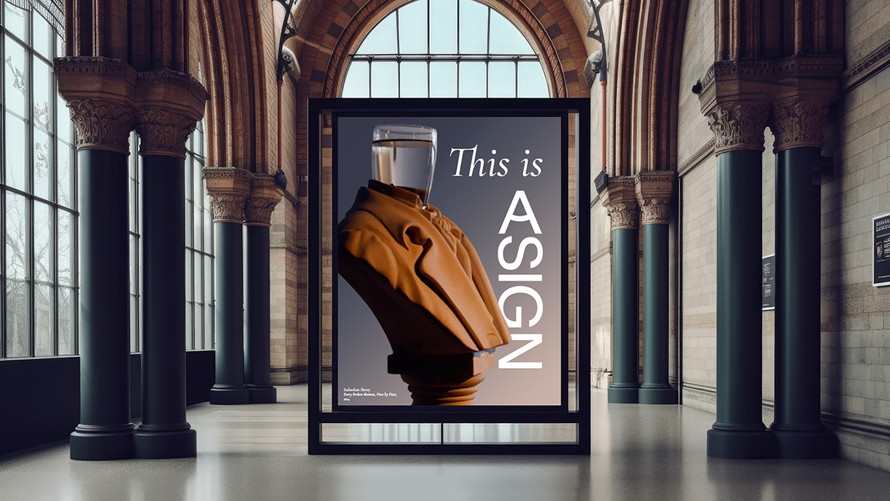
Asign’s visual identity is clean, modern, and minimalist. It uses neutral colours, simple typography, and an easy-to-navigate design to focus on the highlighted artworks. This reflects the company’s focus on innovation, its commitment to providing a high-quality user experience and its vision for the future of the art market.
Asign’s brand identity system is flexible and adaptable, allowing it to be used across all platforms and channels while also being customised to fit different needs. This flexibility is important for Asign as it grows and evolves, ensuring that its brand remains consistent and recognisable.
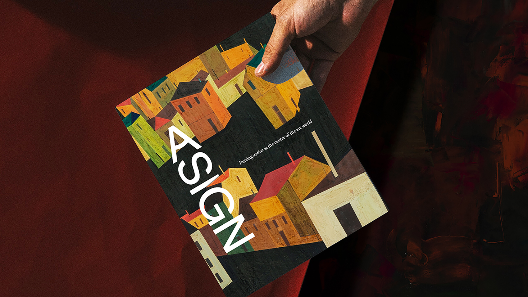
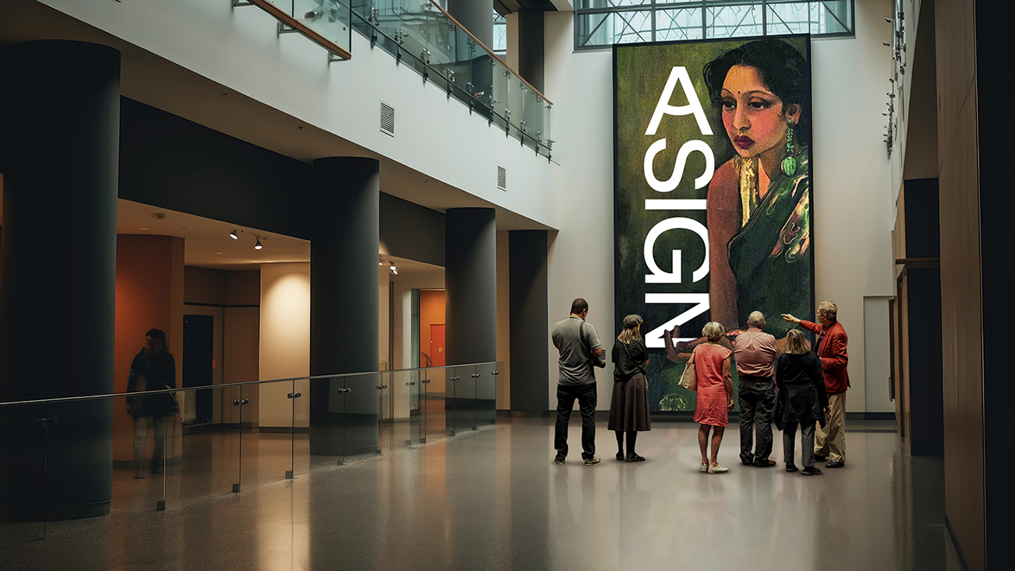
Our concept for Asign’s Brand Identity is based on the thought, “Do you see what I see?”
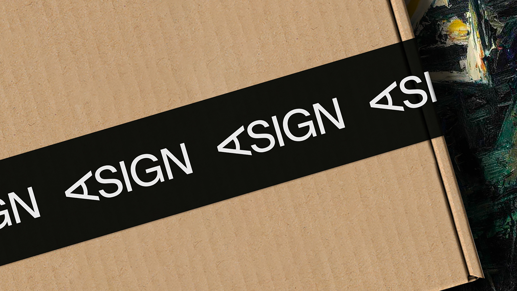
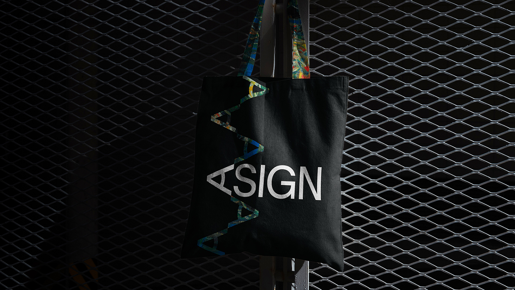
We believe that two people can have a completely different perspective on the same piece of art, and we wanted to create a logo that reflected this. Asign’s logo can be viewed both horizontally and vertically, and it reads the same in both perspectives. This fits well as a Solution to the problem of needing the logo to be used in vertical orientation (at physical exhibits and on artwork packaging & tapes) as well as in a horizontal orientation (on online platforms and on corporate stationery) without compromising on the legibility of either.
This solution ensures that however and whenever you see it, you’ll Always see Asign.
CREDIT
- Agency/Creative: Bombay Design Centre
- Article Title: Do You See What EYE See?
- Organisation/Entity: Agency
- Project Type: Identity
- Project Status: Published
- Agency/Creative Country: India
- Agency/Creative City: Mumbai
- Market Region: Asia, Global
- Project Deliverables: Brand Creation, Brand Design, Brand Identity, Branding, Logo Design
- Industry: Technology
- Keywords: Art, Online Market Place, Security
-
Credits:
Founder: Ankur Rander
Head - Business & Ops: Siddhesh Pednekar
Creative Director: Vinay Venkatesh
Designer: Sakshi Wadnerker


