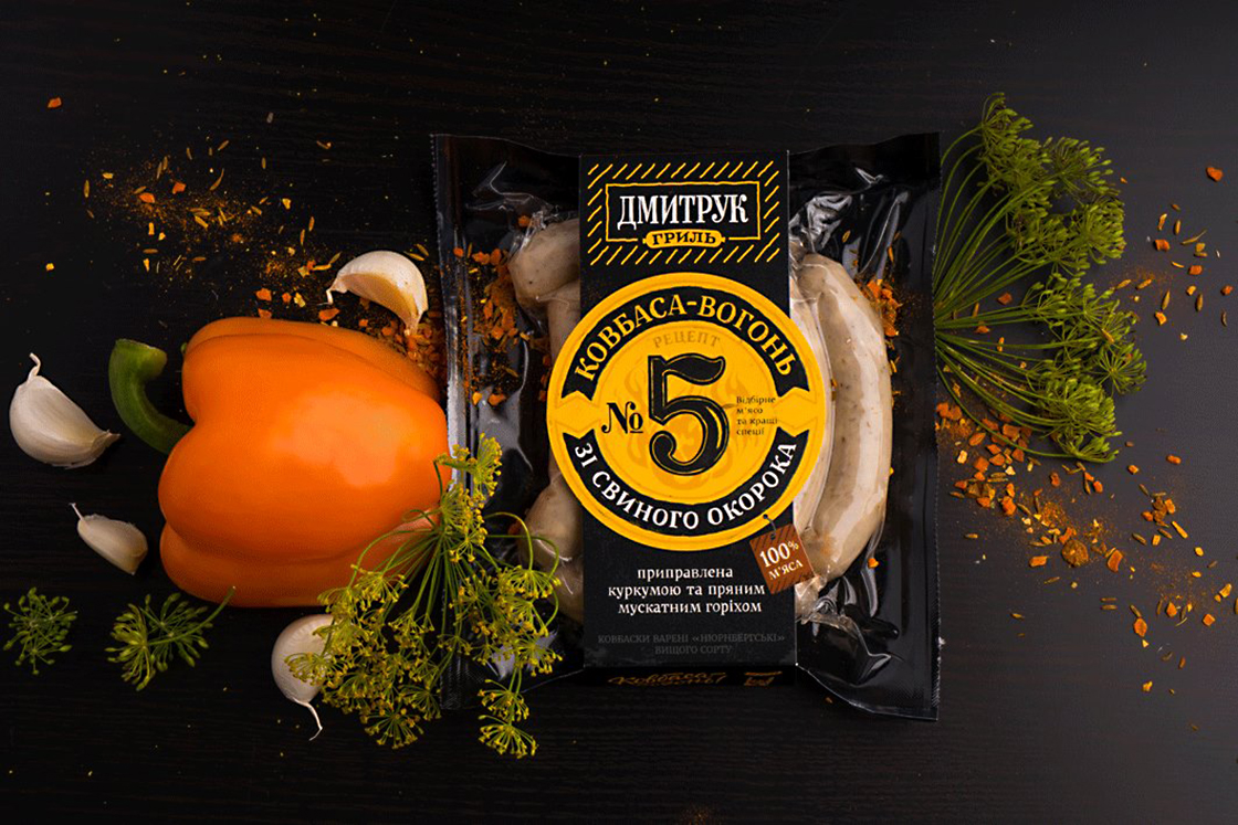
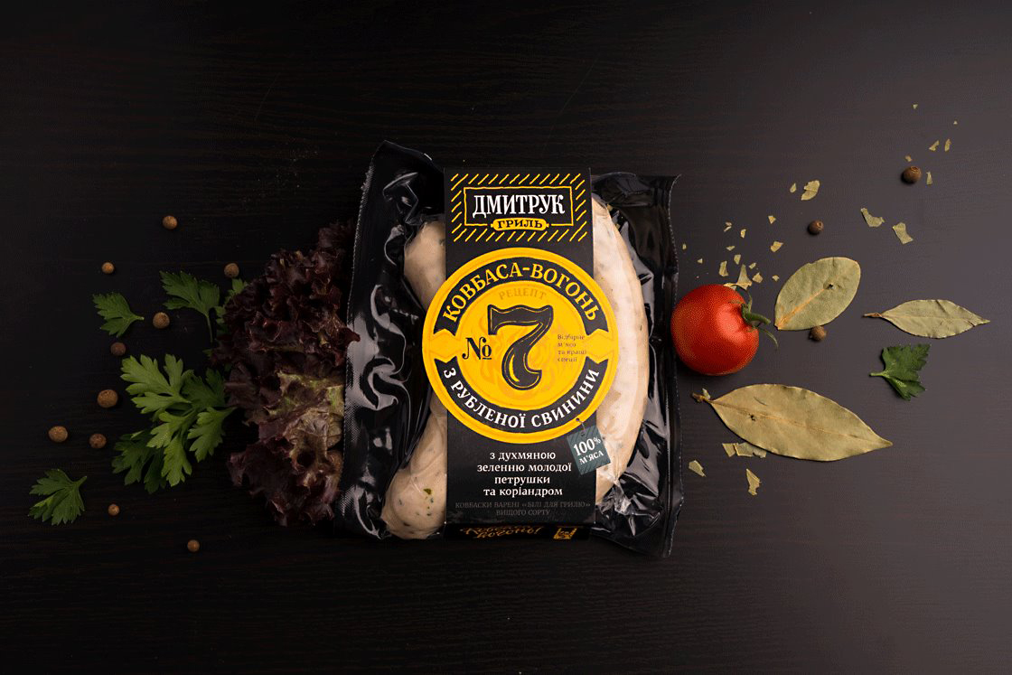
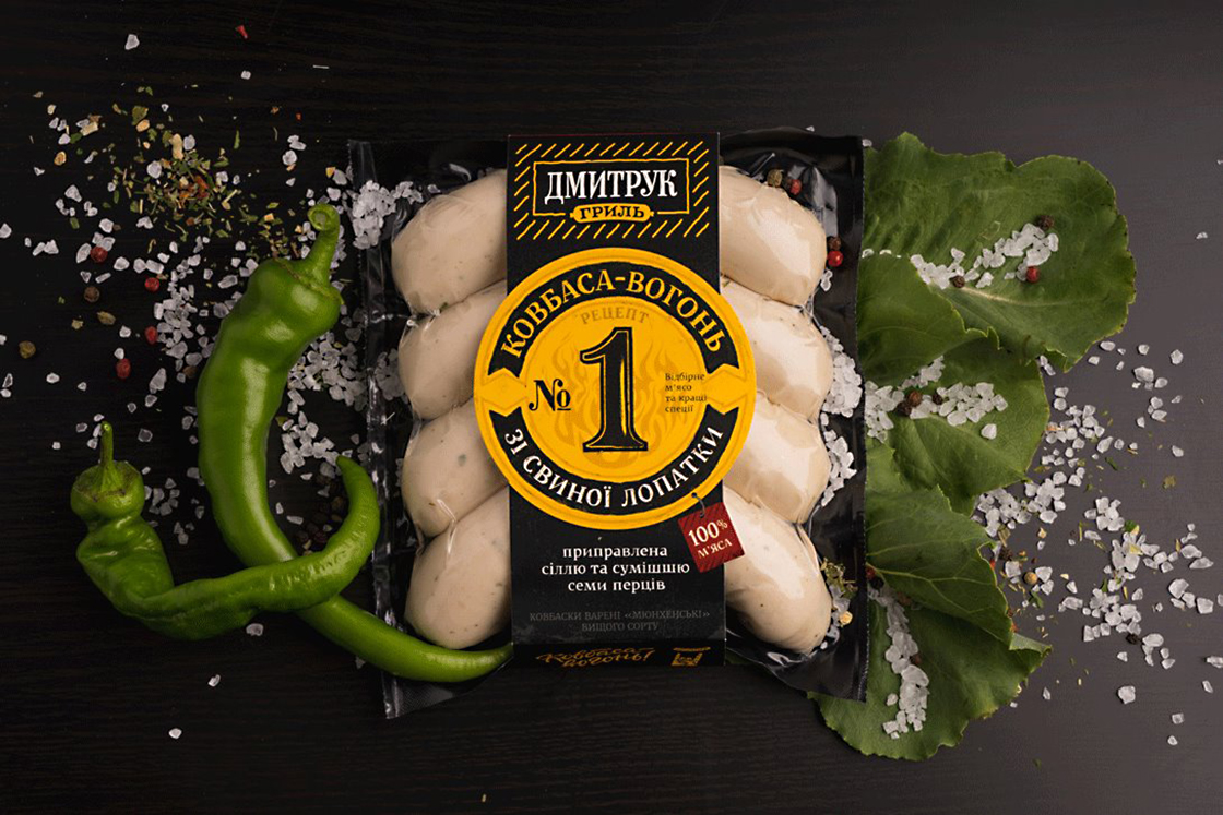
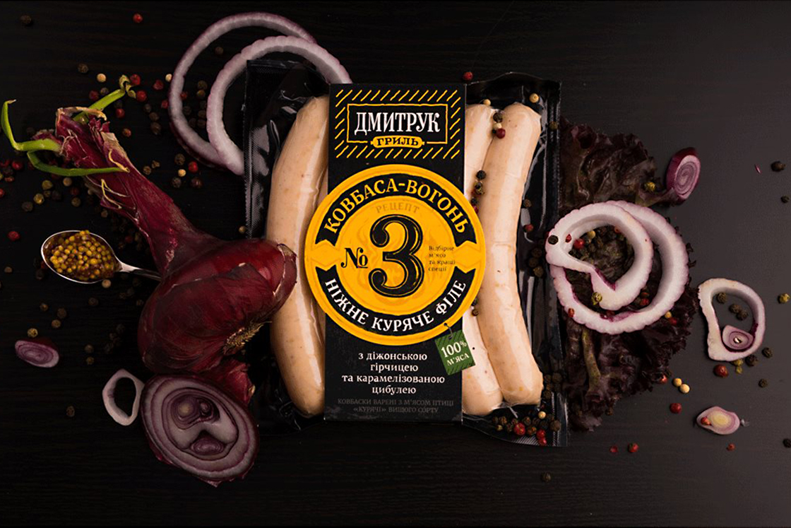
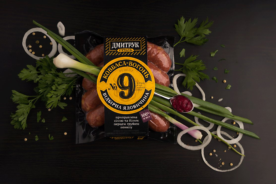
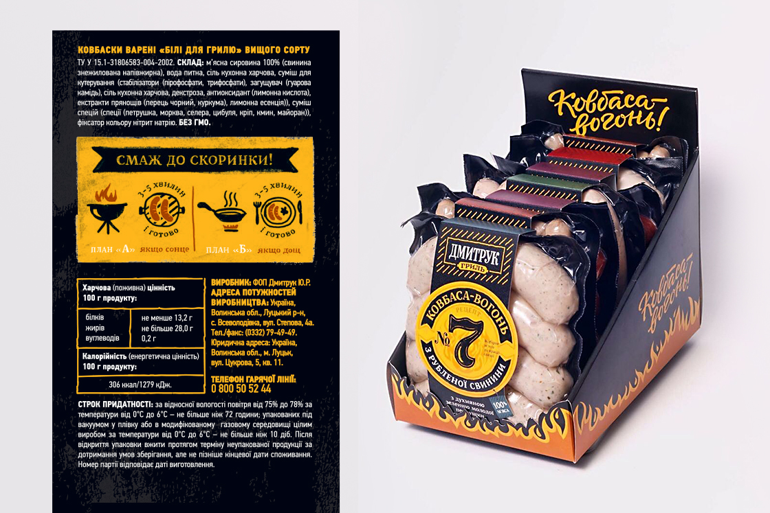
For Dmytruk Grill, a male-centric brand, we had to figure out a bunch of strictly practical aspects design-wise. First, the packaging needed to have a design that men could spot instantly. Second, a man needed to be able to choose the product quickly. Finally, the sausages needed to look overall as impressive as if you had brought home a mammoth. The yellow-and-black design is akin to a visual signal that draws attention to the product on the shelf. On the one hand, yellow attracts attention, and on the other communicates that the sausages taste good as hell. Also, numbers on the packaging are much easier to memorize than lengthy names.
CREDIT
- Agency/Creative: Dozen Agency
- Article Title: Dmytruk Grill New Packaging Design
- Organisation/Entity: Agency, Published Commercial Design
- Project Type: Packaging
- Agency/Creative Country: Ukraine
- Market Region: Europe
- Project Deliverables: Brand Advertising, Brand Identity, Brand Naming, Branding, Graphic Design, Packaging Design, Tone of Voice
- Format: Wrap
- Substrate: Plastic, Pulp Paper
FEEDBACK
Relevance: Solution/idea in relation to brand, product or service
Implementation: Attention, detailing and finishing of final solution
Presentation: Text, visualisation and quality of the presentation


