


Qualität is a brand that belongs to the Dots and Drops group, based in Al Jubail (Saudi Arabia). This brand offers a careful selection of the best organic honeys from different German beekeepers, which are packaged and marketed under the Qüalitat brand in different cities in Saudi Arabia.
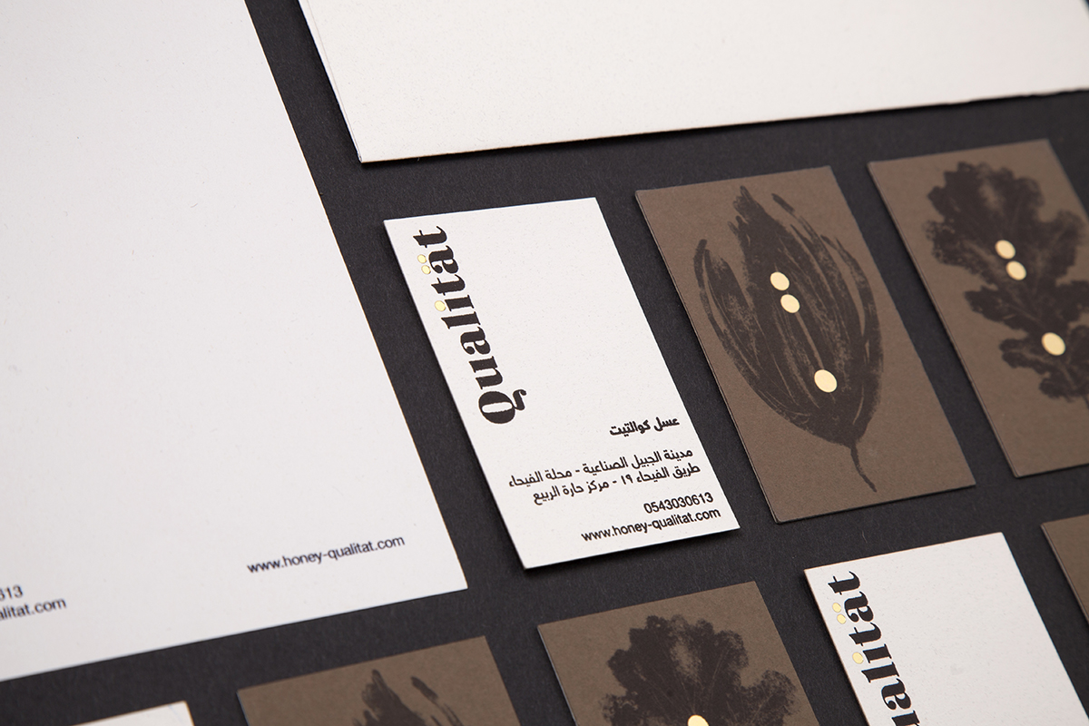
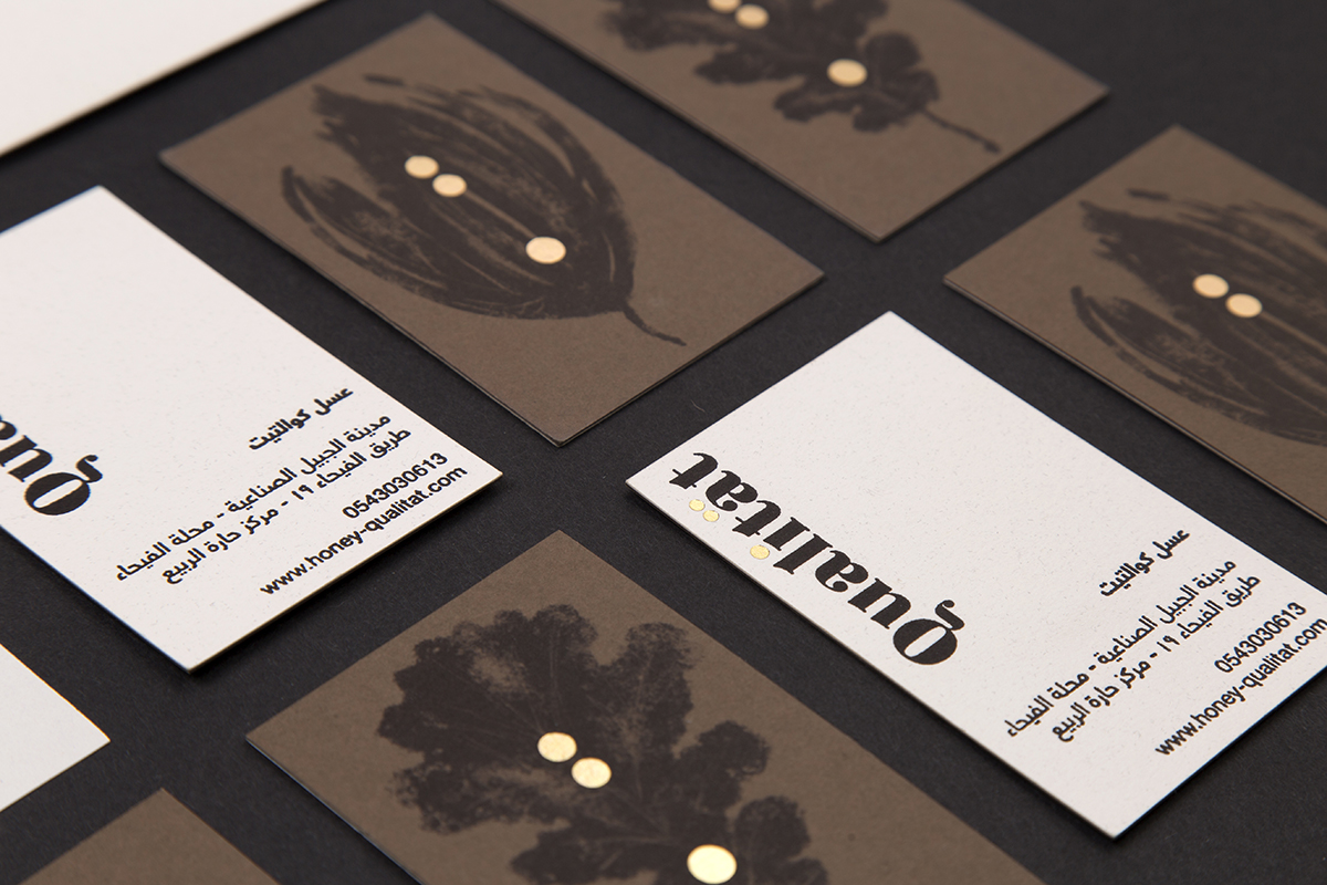
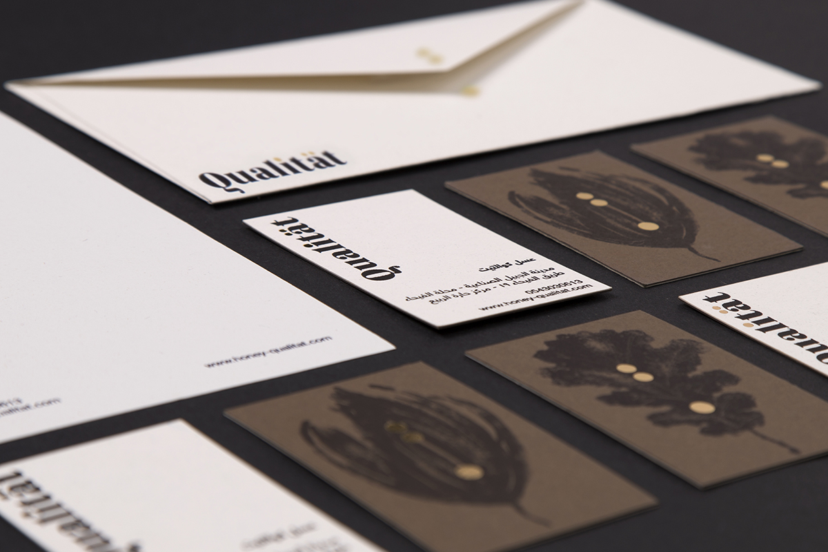
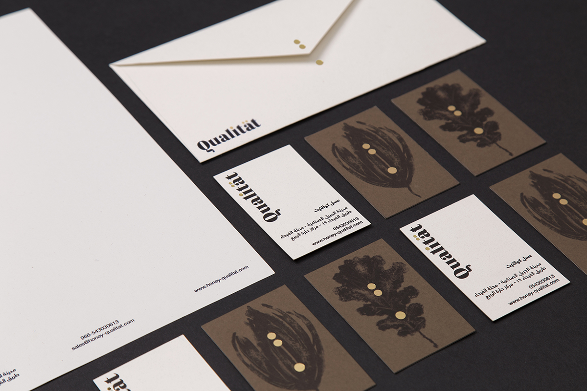
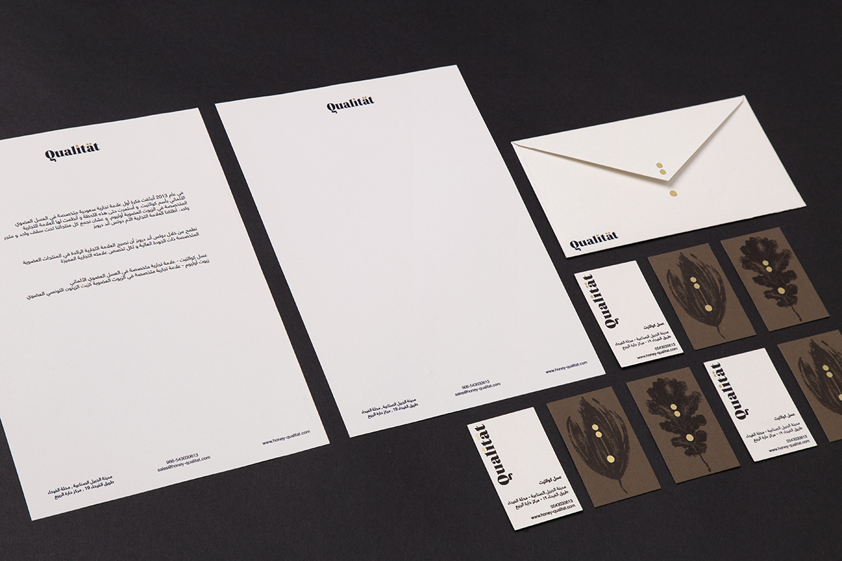
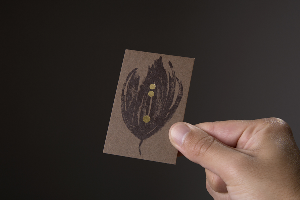
Designing the Qüalitat brand and packaging involves mixing visual cultures as different as European and Arabic. The dots present in the letters of its typeface, with their golden stamping, become the last drops of a jet of honey that step on the illustrations of an oak leaf or a flower petal, making a nod to the origin of the honey (flower or forest).
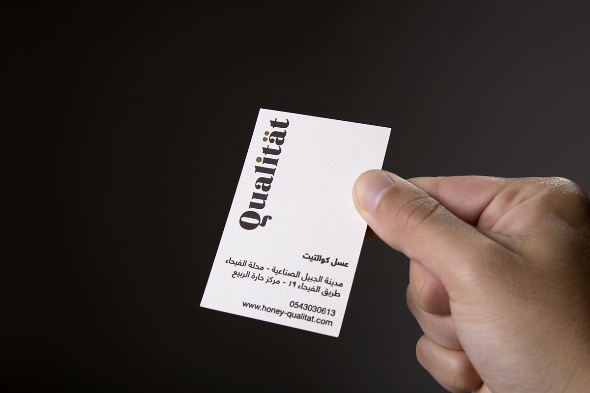
One of the characteristics of the logo is its simplicity, which brings elegance to the brand, letting the typography speak by itself. This will help us to create labels with great force without running the risk of the logo eclipsing the rest of the design.
The golden points of the typography, will be used as a visual resource that works as a union in the design of the labeling. It’s a visual game in which if we extract those points from the logo and isolate them, we’ll obtain a resource that, placed vertically, reminds us how the drop of honey is growing as it falls.
The identity of Qualitat includes a series of corporate colors chosen to enhance its brand values. The black and gold colors refer to the quality and colors of the bees. The different honeys will be differentiated by colors with the same desaturated range related to nature.
The typography on which we are going to base the brand is about the Regattia. It’s a contemporary doona, recognizable by the high contrast between its thin and thick strokes. These characteristics give it a highly elegant appearance while at the same time a great visual strength thanks to its contrasts. Typographies that bring as much personality as this, deserve a treatment of attention on them, so we’ll base the design of the brand on the typography, using a visual game that makes it different even more and creating a simple, elegant and communicative brand. The secondary typeface is Helvetica Neue LT Arabic. It is a clean and simple typography that will compensate the visual weight of the designs.
Stationery should be a part of the brand’s corporativity. Again we will use papers with natural finishes, we will apply desaturated and elegant color ranges to highlight the golds and we will use the resources of the illustrations to provide more personality in the card.
CREDIT
- Agency/Creative: Dmentes estudio creativo C.B
- Article Title: Dmentes Estudio Creativo Create Branding for New Arabic Honey Brand
- Organisation/Entity: Agency, Published Commercial Design
- Project Type: Identity
- Agency/Creative Country: Spain
- Market Region: Middle East
- Project Deliverables: Brand Creation, Brand Identity, Brand Redesign, Brand Refinement, Brand World, Branding, Graphic Design, Illustration, Rebranding, Research
- Industry: Food/Beverage


