


Disruptive Wine Startup Fills Every Pour with Personality
Barrel Riot takes an unconventional approach to winemaking by using spirit-barrel aging to create an intense, complex character.
The team at MiresBall recognized this wine needed a name and visual identity to communicate its rule-breaking personality.
Inspired by the spirit barrel-making process, the name Barrel Riot was born.
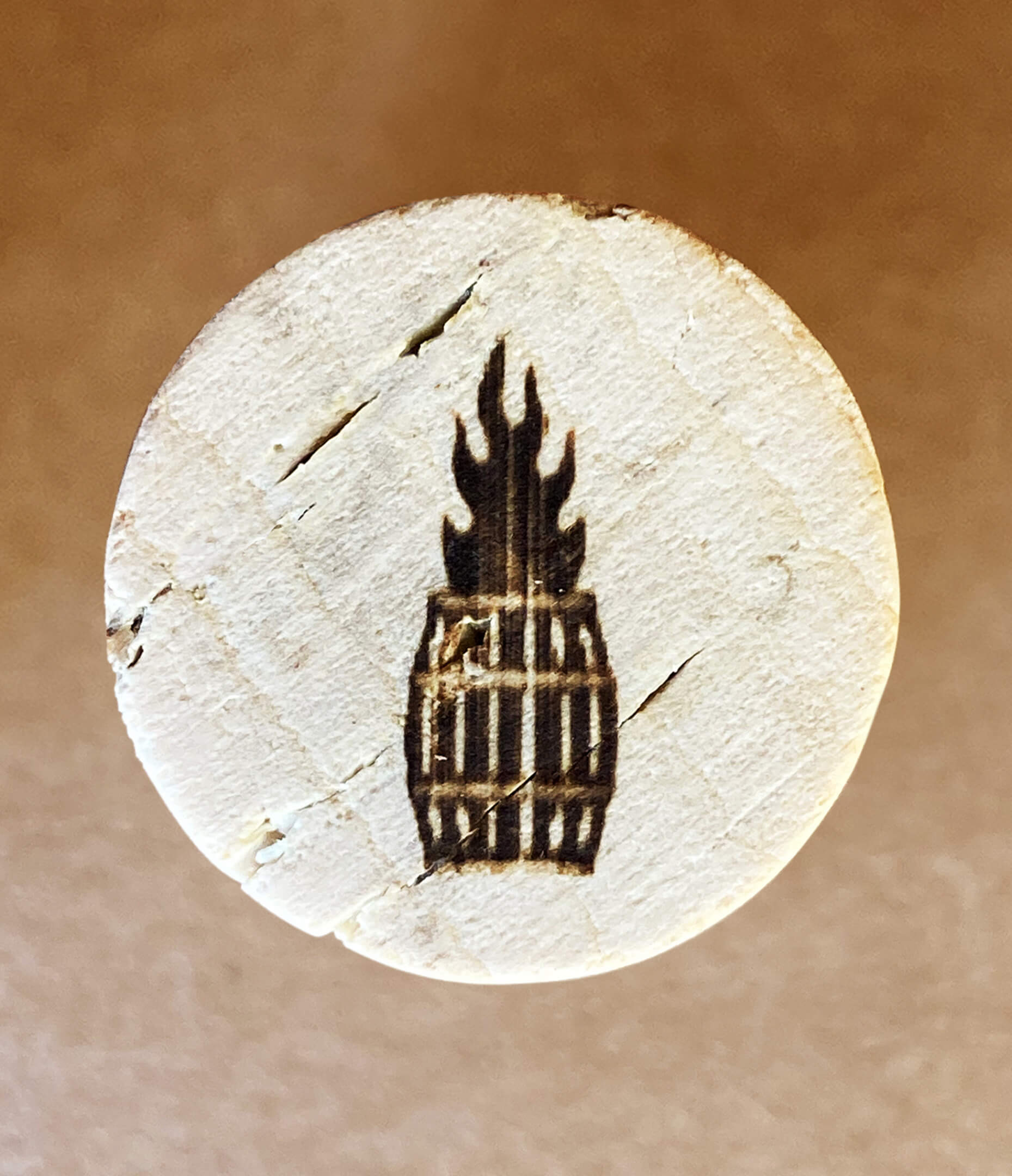
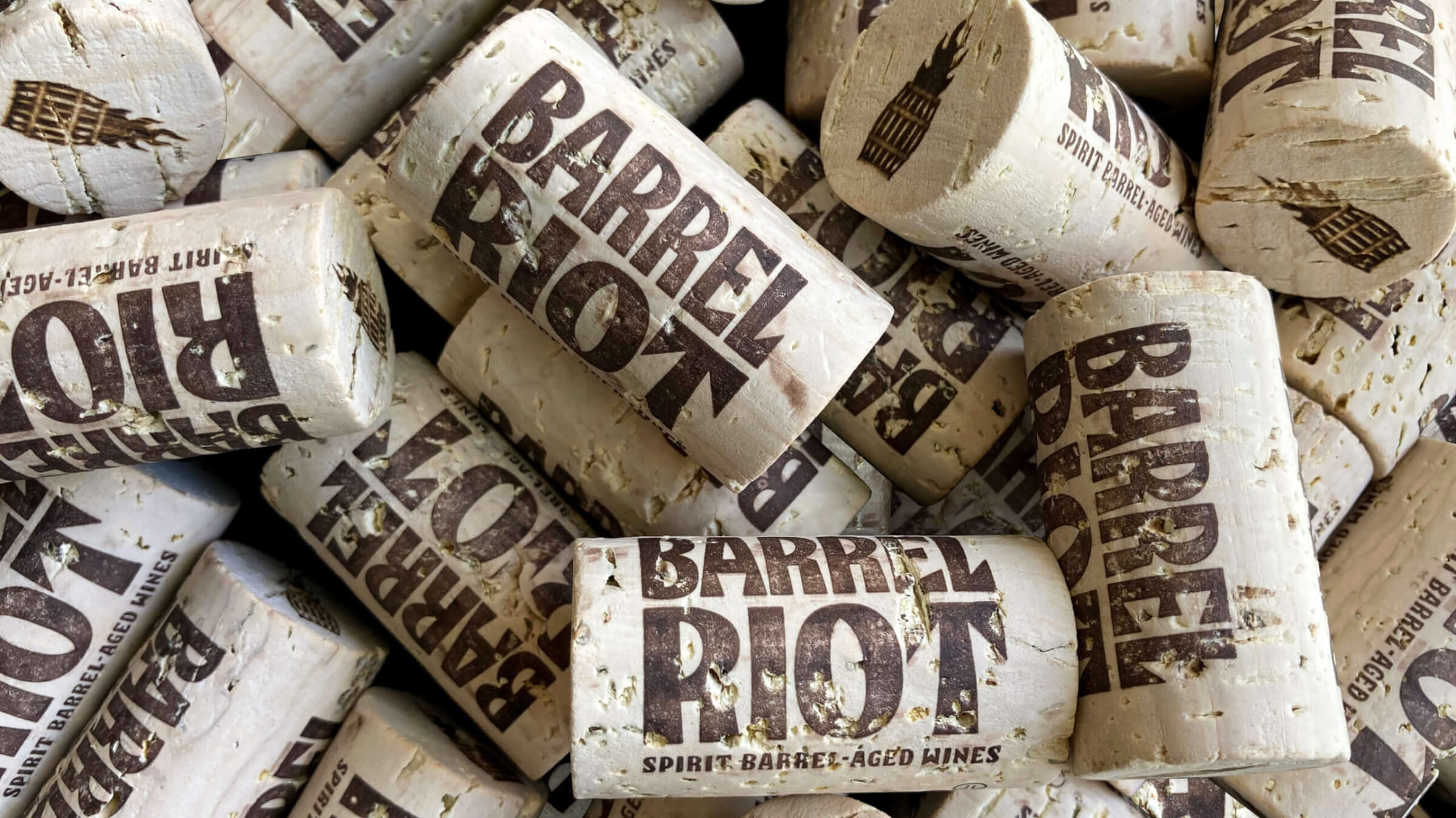
The scorched cork emblem signals a wine that’s bursting with flavor, and simultaneously acts as a cohesive identifier across all product variations.
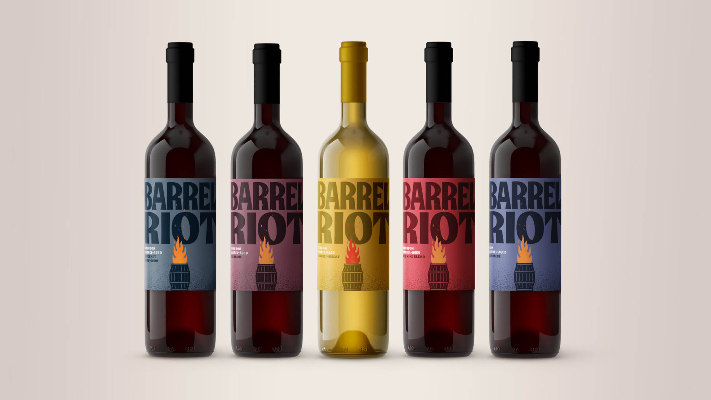
A strong color read on the label identifies wine varietals, while amplifying taste appeal.
The system is built to grow as different wine and spirit barrel combinations emerge and as Barrel Riot expands.
The brand story celebrates the adventurous, try-anything attitude at the heart of Barrel Riot. On the back of the bottle, the description reads, “A triumph over typical. We love a great-tasting wine as much as anybody. Maybe even more. But a well-worn spirit barrel should never go to waste when it’s got so much flavor left to give. That’s why our wines finish their journey inside one of these wooden wonders- just soaking it all in to create a unique, complex character that puts a cork in tradition. So take a sip, but take it slow. And savor the aged-in aromas of this one-of-a-kind liquid celebration.”
Dan Lipsky, owner of Barrel Riot, reflected on the partnership between Barrel Riot and MiresBall: “ Our brand is defined by the dramatic difference between us and other wines. MiresBall understood our message and infused it into a name, logo, and image that set us apart from the competition. I couldn’t be happier.”
Explore Barrel Riot’s Visual Identity
CREDIT
- Agency/Creative: MiresBall
- Article Title: Disruptive Wine Startup Fills Every Pour with Personality by MiresBall
- Organisation/Entity: Agency
- Project Type: Campaign
- Project Status: Published
- Agency/Creative Country: United States
- Agency/Creative City: San Diego
- Market Region: North America
- Project Deliverables: Advertising, Brand Design, Brand Identity, Creative Direction, Digital Art, Packaging Design, Writing
- Industry: Food/Beverage
- Keywords: bold, rebellious, distinct,
-
Credits:
CEO: John Ball


