


Introducing Our Latest Branding Project: D’Doctor – A Bold New Vision for Health and Wellness
We are excited to present D’Doctor, a European brand that is redefining the landscape of health and wellness with a fresh, innovative, and bold approach. Designed to break away from conventional medical branding, D’Doctor is all about blending modern aesthetics with deep-rooted care, science, and precision.
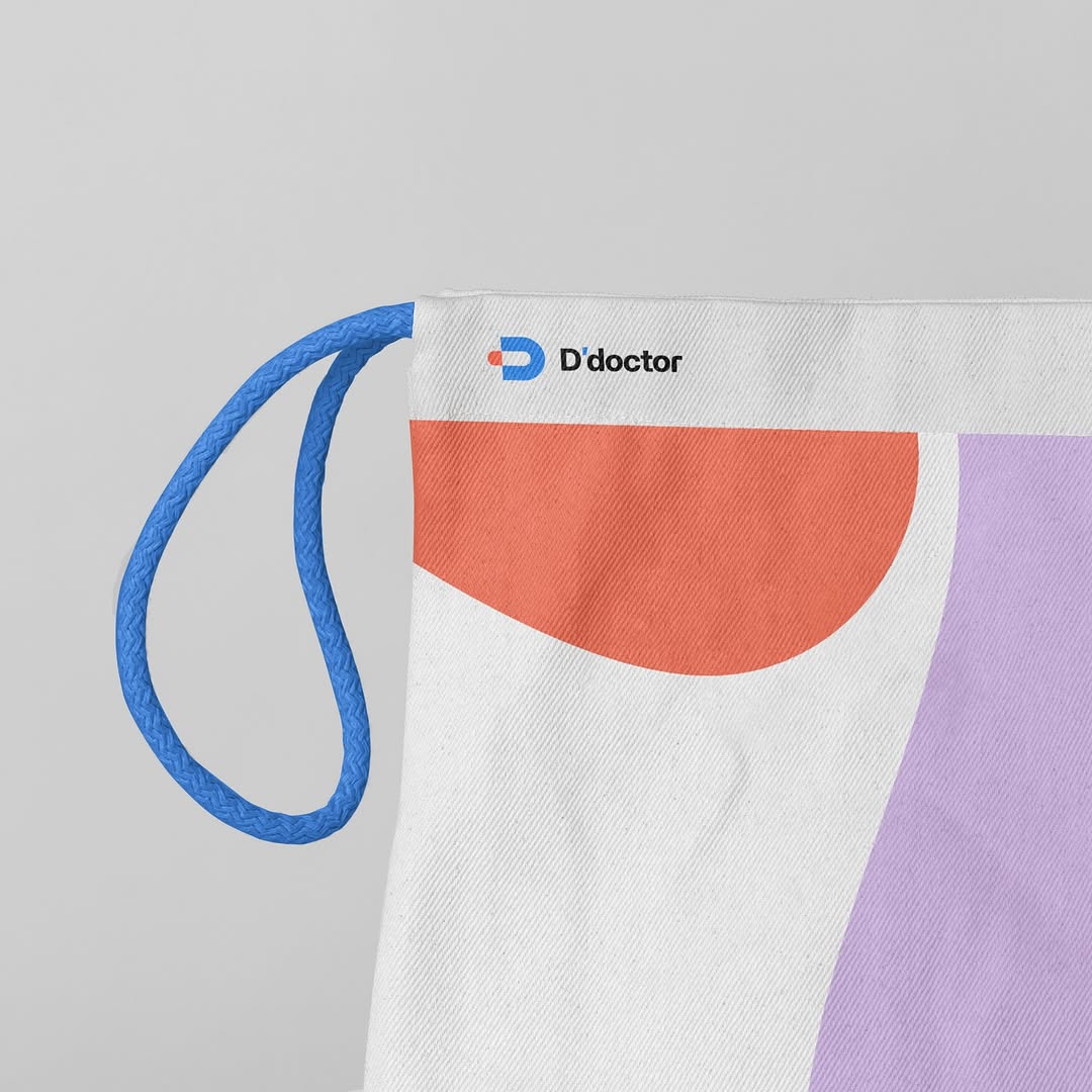
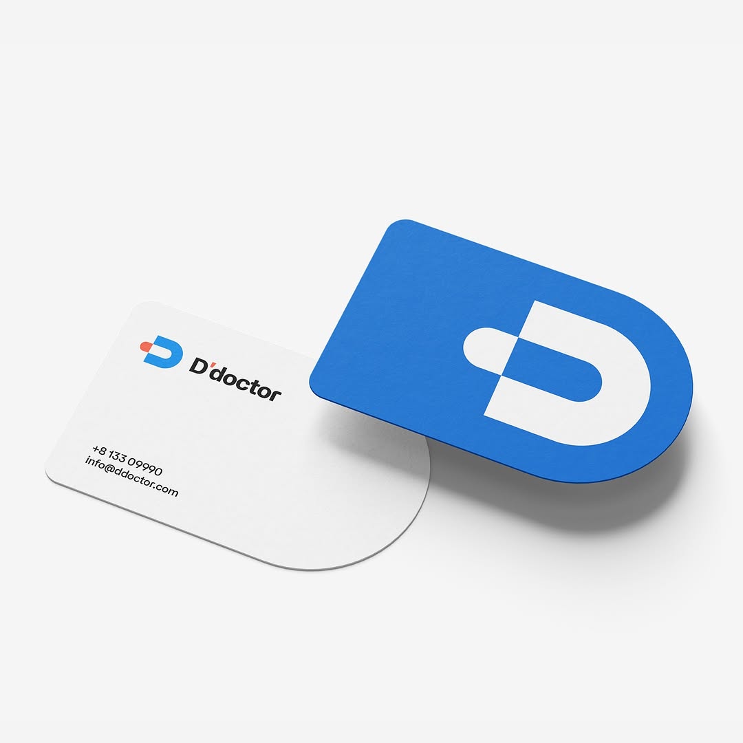
A Logo with Meaning
At the heart of D’Doctor’s visual identity is a distinctive logo that carries a deeper message. The design features a stylized “D”, within which lies a hidden symbol—a capsule—subtly representing care, precision, and expertise. This clever visual cue reinforces the brand’s strong connection to medicine, pharmaceuticals, and well-being.
Beyond that, the logo also takes inspiration from a paper clip, a subtle yet meaningful nod to the tradition of fastening prescriptions and medical documents. This element symbolizes the brand’s seamless integration of science and care, highlighting its dedication to both innovation and trust.
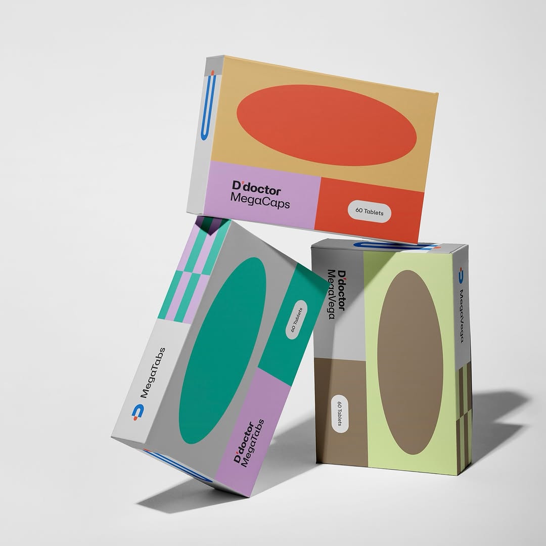
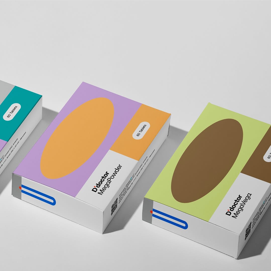
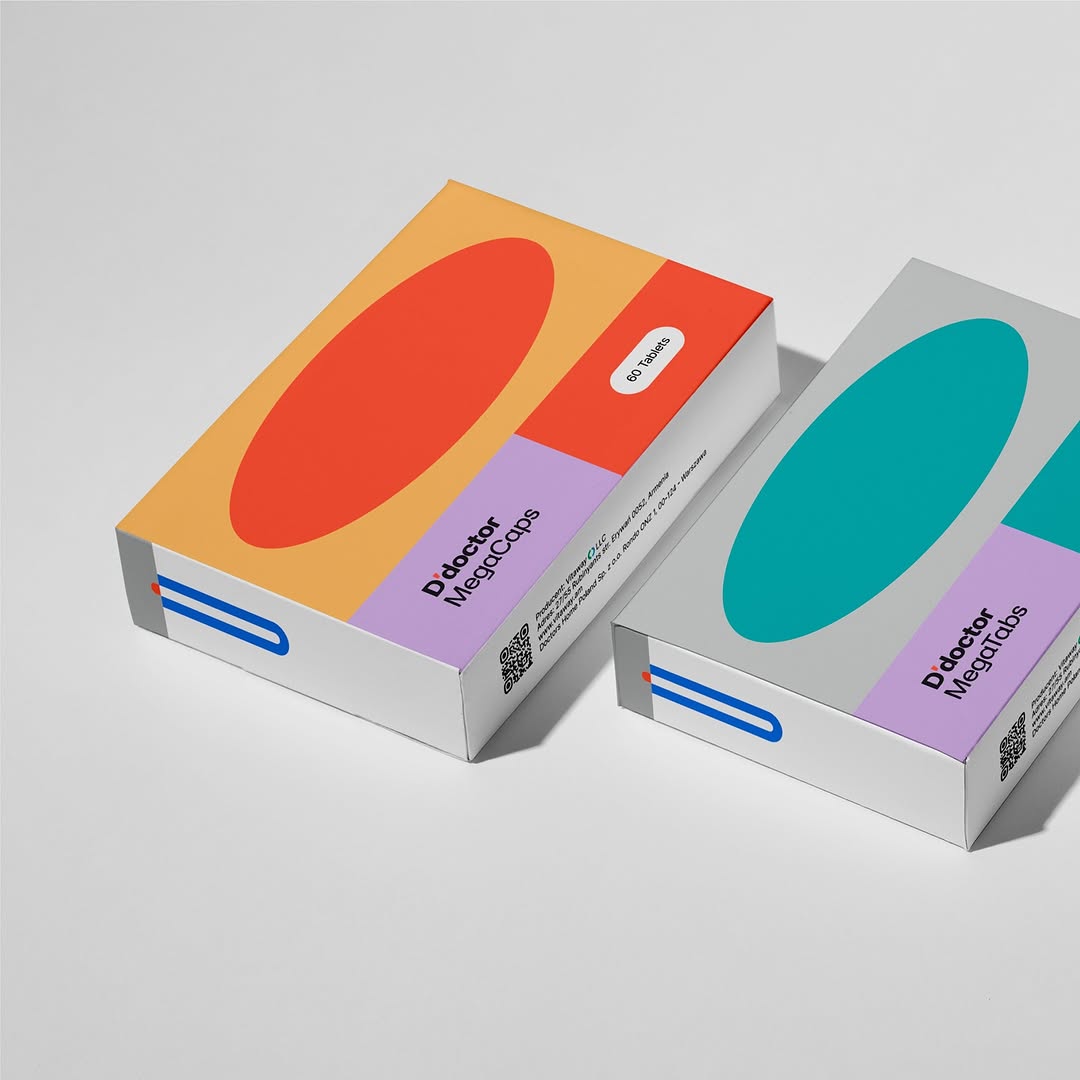
Bold & Vibrant Packaging Design
When it came to packaging, we aimed to go beyond the ordinary, creating something truly eye-catching and memorable. Instead of following traditional sterile, clinical designs, we introduced a bold, vibrant, and dynamic aesthetic that stands out on shelves. By incorporating a modern color palette, sleek visuals, and high-quality finishes, we designed packaging that not only attracts attention but also instills a sense of reliability and professionalism.
To further enhance the brand’s appeal, we carefully crafted graphic elements inspired by nature, striking a balance between the organic and the contemporary. This unique fusion allows D’Doctor to resonate with modern consumers who seek both scientific advancement and holistic well-being. Every design choice was made with purpose—to evoke energy, trust, and innovation.
More Than Just a Brand—A Symbol of Innovation & Care
D’Doctor is more than just another health and wellness brand; it represents a new era of empowerment, care, and innovation. Every element—from the logo to the packaging—was designed to reflect the brand’s commitment to progress, quality, and well-being.
As we launch D’Doctor into the European market, we are proud to have played a key role in shaping a brand that not only stands out visually but also emotionally connects with its audience. It’s a brand that represents care, trust, and the future of health and wellness—and we couldn’t be more excited to see it make an impact.


CREDIT
- Agency/Creative: Digital Factory
- Article Title: Digital Factory’s Dynamic Approach to Health Branding with D’Doctor
- Organisation/Entity: Agency
- Project Type: Identity
- Project Status: Published
- Agency/Creative Country: Armenia
- Agency/Creative City: yerevan
- Market Region: Europe, Middle East
- Project Deliverables: Brand Identity, Branding, Graphic Design, Illustration, Logo Design, Motion Graphics
- Industry: Pharmaceutical
- Keywords: Branding, Visual Identity, Brand Identity, Logo creation
-
Credits:
Art director: Hovhannes Ghazaryan


