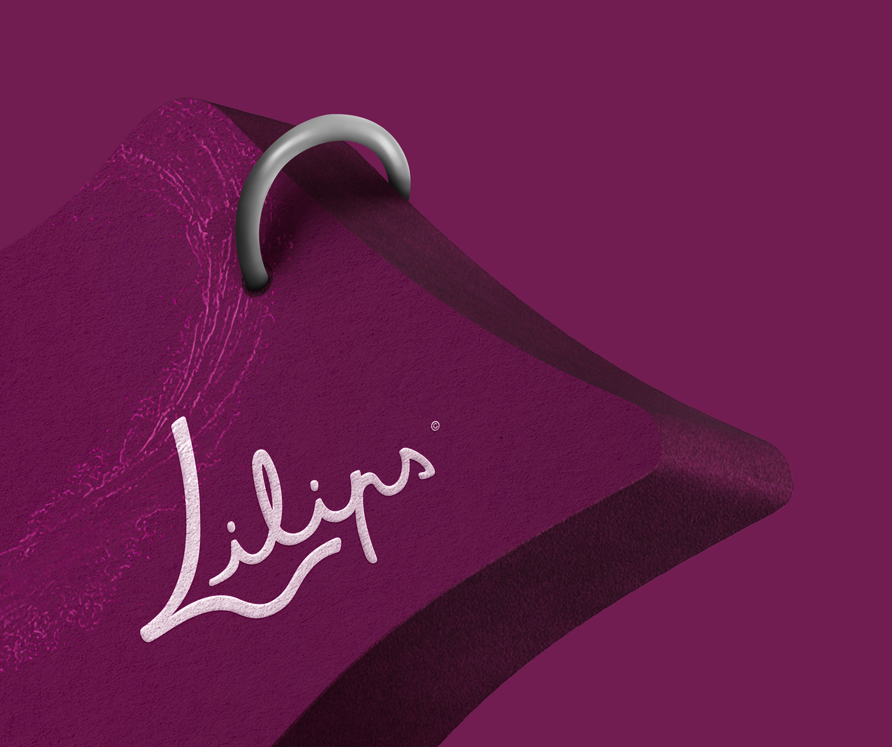
Made for teenagers and young adults, Lilips is a fresh and energetic lipstick brand. The movement created in the typography of the logo is inspired by lipstick and the effect it has when written with it. The curves made of full and loose lines make the name soft, supple and graceful, just like Lilips products. A mouth is subtly added in the negative space created by the capital “L” and the “il”, reinforcing the understanding of the logotype. The colour, halfway between the traditional red and fuchsia pink, rejuvenates the world of cosmetics and finishes the brand identity with softness, punch and a touch of originality. The slogan “difference matters” punctuates the whole and sets the tone and direction in which Lilips is committed.
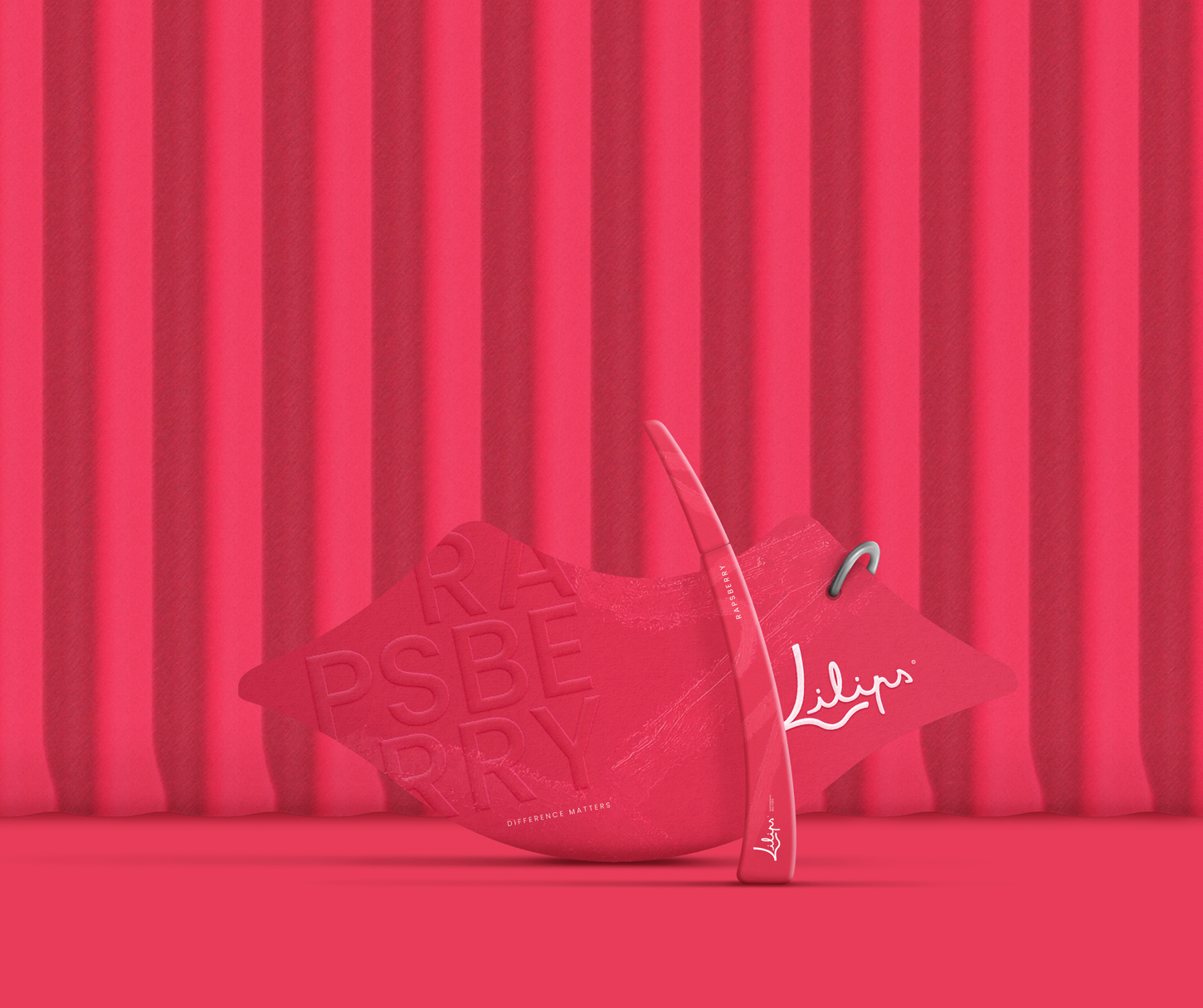
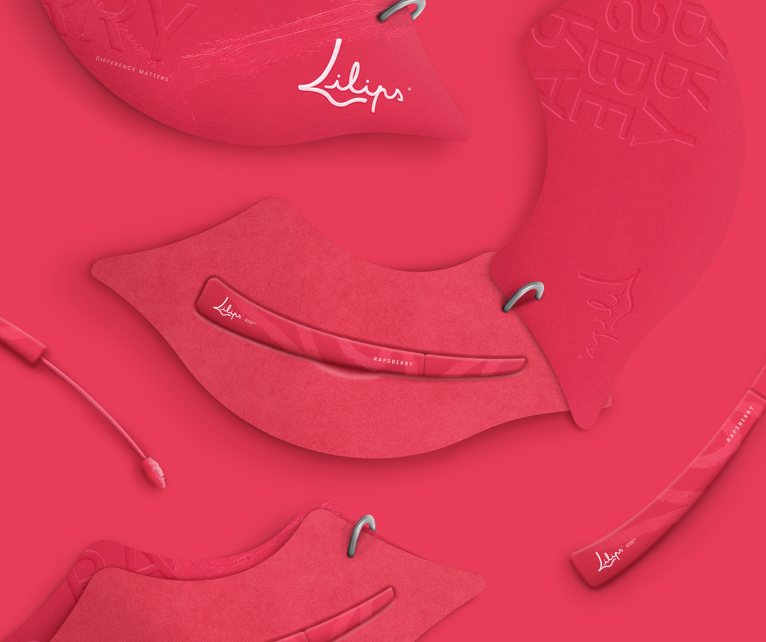
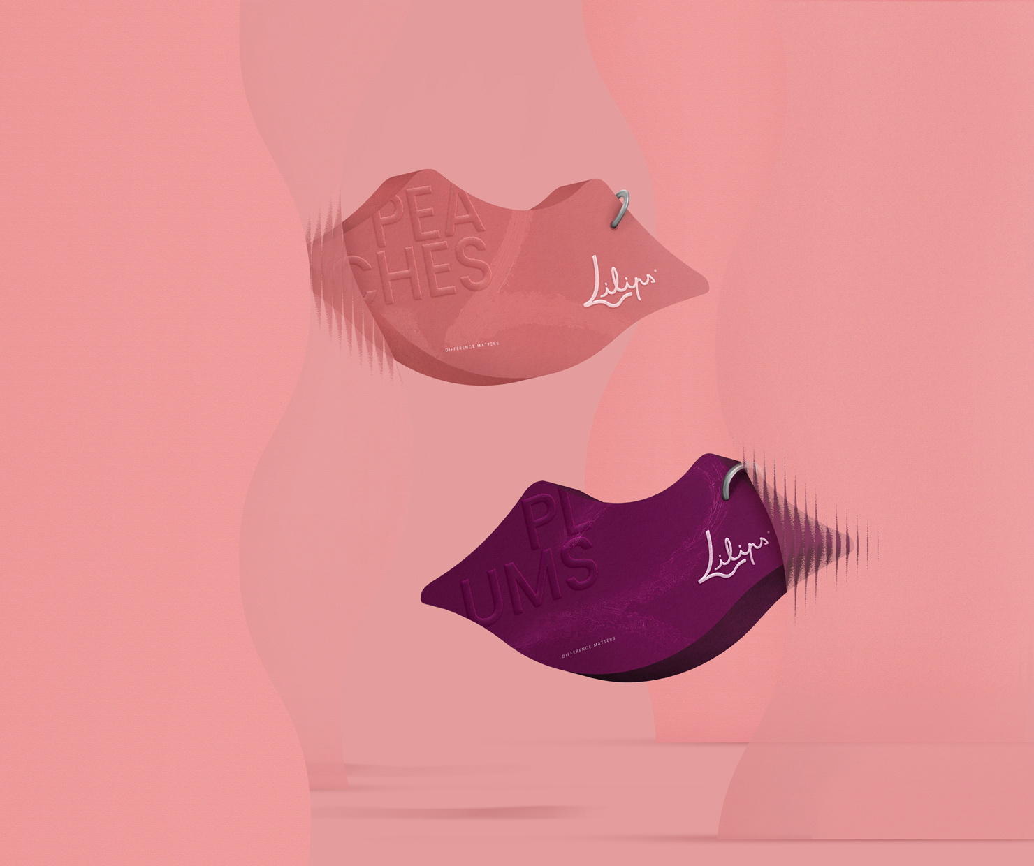
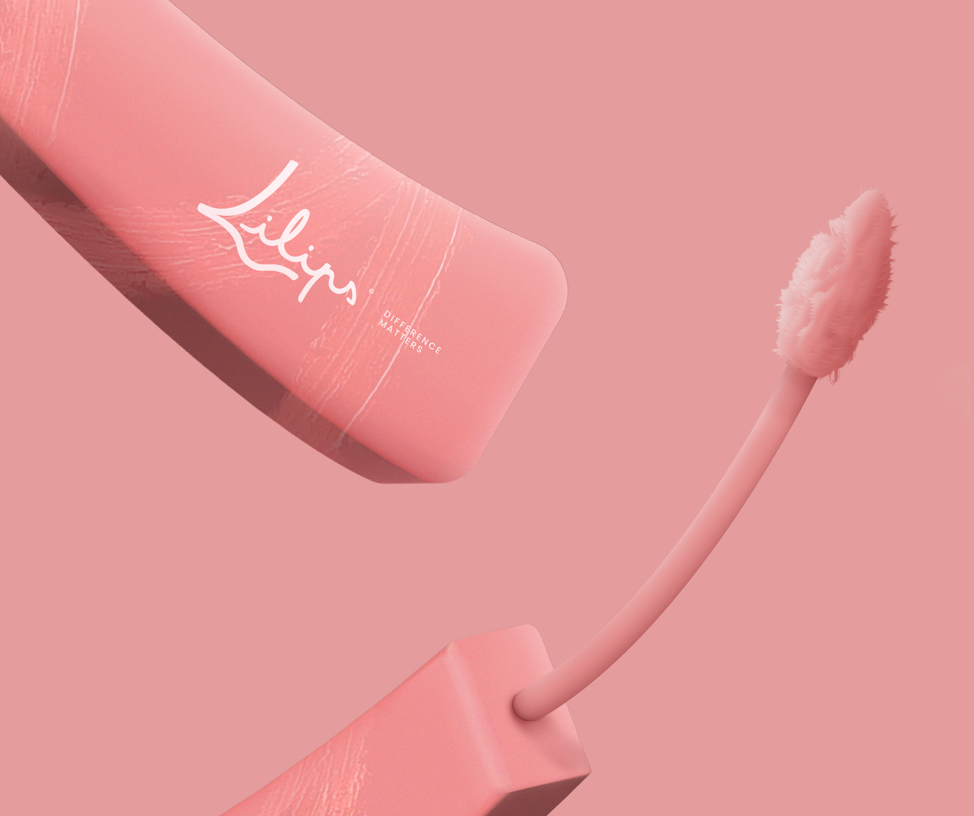
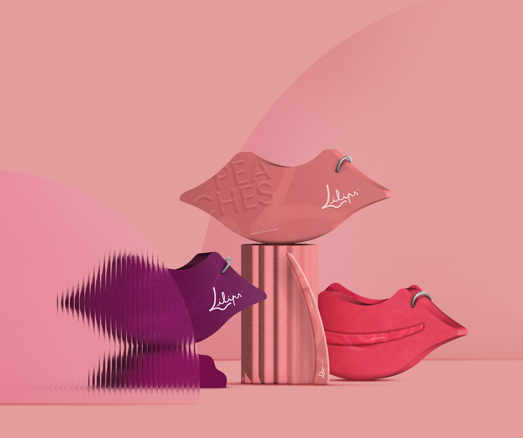
The lip-shaped packaging is derived from the mouth in the negative space of the Lilips logo. This hand-held packaging does not go unnoticed and stands out from all its competitors. A thick foam is hollowed out in the middle to accommodate the lipstick. The lipstick is curved to symbolize a smile but also for a better grip. In addition to ergonomics, this lipstick is designed with a brush for a quality and precise application on the lips. The label connected by a metal ring, evoking a piercing, covers this foam on the front side. It allows the label to be turned from the side like a binder. The label itself plays with the idea of tone on tone: “Rapsberry”, “Peaches” or “Plums” are revealed in a subtle way with an embossing. A touch of white provided by the logo and the slogan illuminates the packaging as well as a trace of lipstick giving rhythm to the whole. Lilips wants everyone to affirm and show their difference with this lipstick.
Lilips wants to break the codes of cosmetics and those by advocating the difference of each one and not the resemblance. Everyone is unique, and Lilips has a wide range of colours to suit every skin type and complexion.
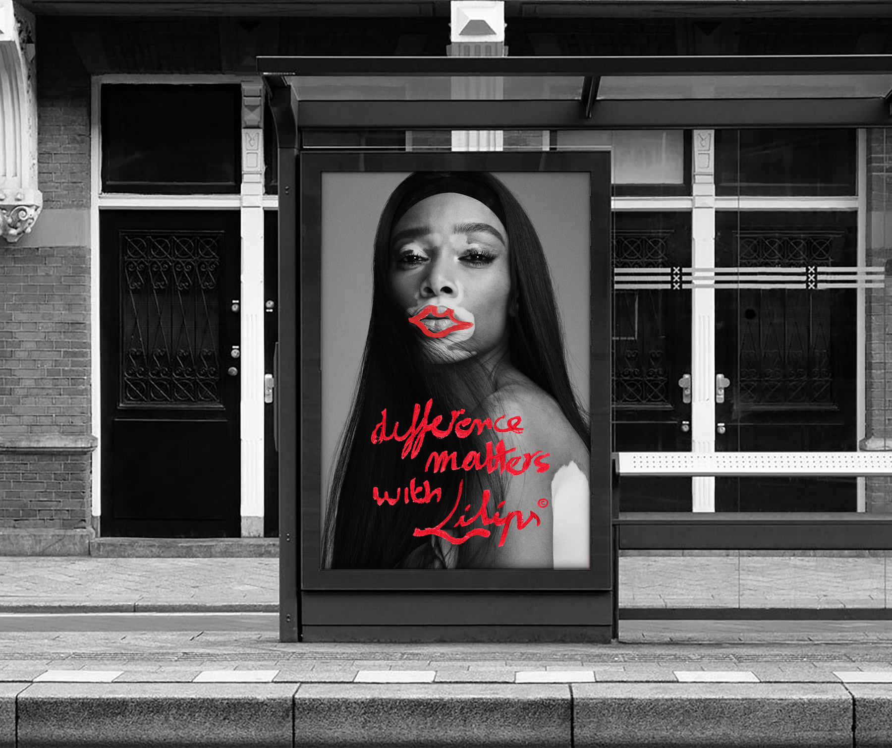
I chose Winnie Harlow as the face of the brand. She is a model who embraces her difference, just like the values of Lilips. Young people want to assert their difference, and that’s why I chose to write the slogan with a lipstick that has a “protest” spirit. The way it’s laid out is reminiscent of posters in the streets or slogans from demonstrations. To accentuate these aspects, the red mouth “highlights” Winnie Harlow’s, like a rallying sign that advocates difference.
Young people want to make things happen, and it is through communication actions in the streets that they express themselves. Therefore, this Lilips advertising campaign will reach out to young people much more than a traditional poster because it uses similar communication features to those they use. Putting oneself in the shoes of others to better understand and sometimes express them is what Lilips is doing through its advertising.
CREDIT
- Agency/Creative: Hurtikonn
- Article Title: Difference Matters With Lilips Lipstick Brand
- Organisation/Entity: Student
- Project Type: Packaging
- Project Status: Non Published
- Agency/Creative Country: France
- Agency/Creative City: Hayange
- Market Region: Europe
- Project Deliverables: 3D Modelling, Advertising, Brand Creation, Graphic Design, Logo Design, Product Design
- Format: Box, Case
- Substrate: Metal, Plastic, Pulp Moulded Fibre, Pulp Paper
- Industry: Health Care
- Keywords: Packaging, Logotype, Makeup, Lipstick, Lips, Beaty, Advertisement, Ad, Brand identity, Brand creation, Packaging design, Concept
-
Credits:
Graphic Designer: Mattéo Tabutieaux


