


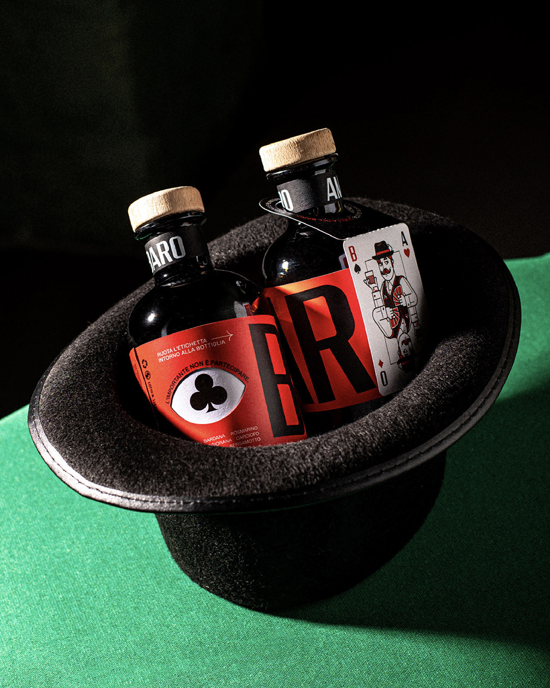
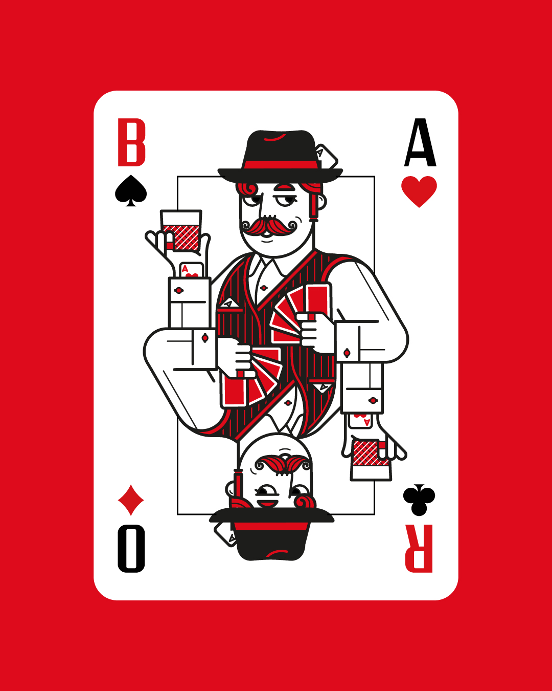
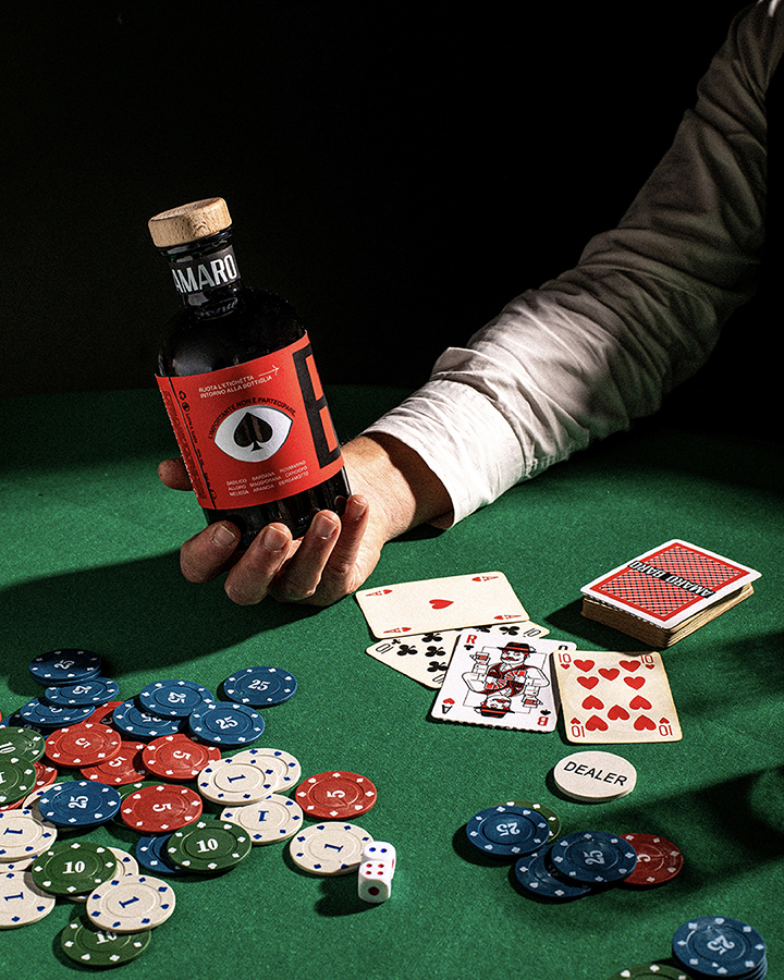
Mr. Baro (“baro” means cardsharp in Italian) is a gentleman from another era, with a sly, knowing gaze – always ready to play the right card to win.
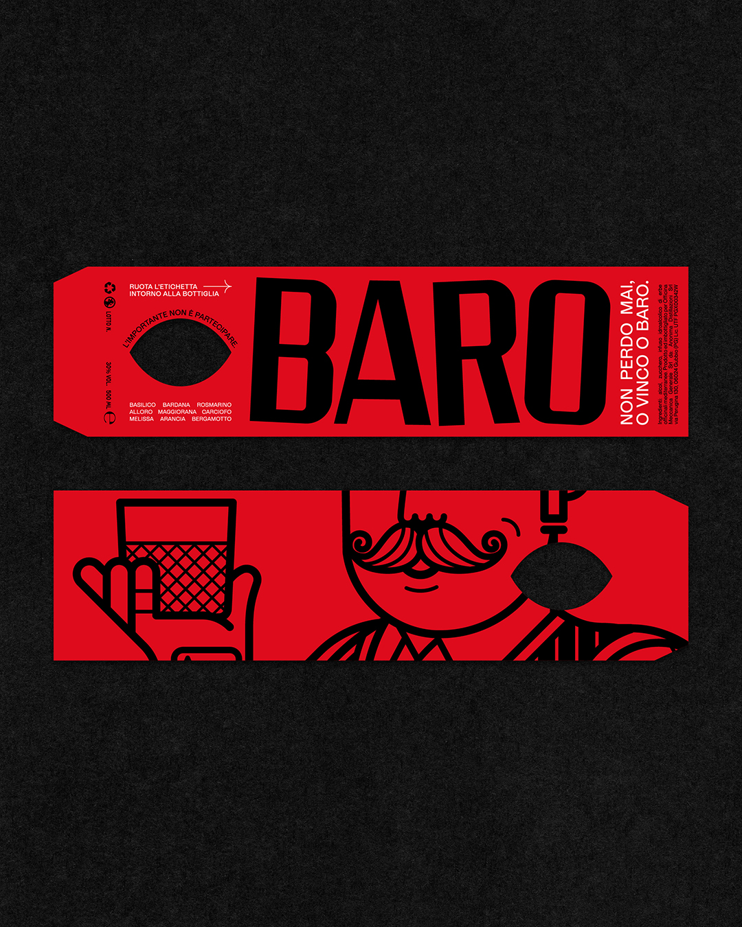
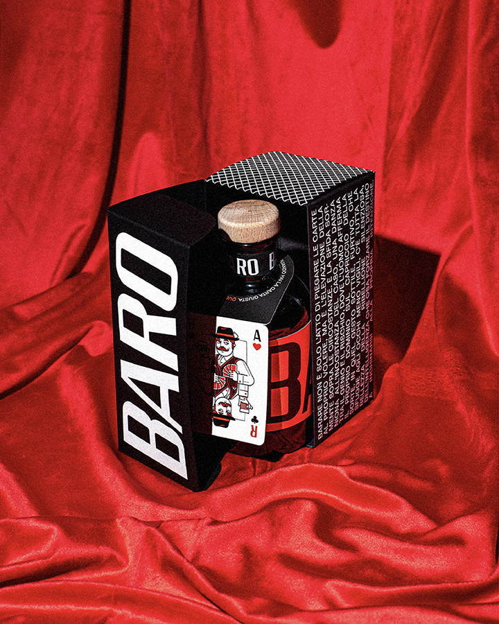
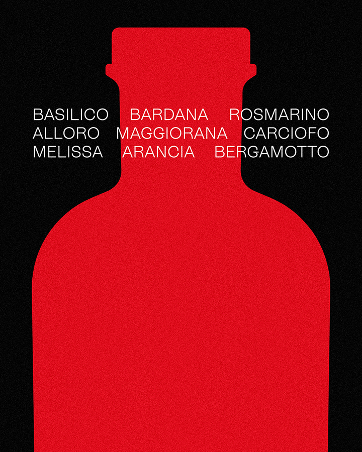
The project features a double label. The top label, with the cardsharp’s eye, wraps around the bottle and “reveals” the card suits as it turns, creating interaction. Each bottle also includes a neck tag with “the cardsharp’s card,” illustrated in the classic poker-card style with a contemporary twist; it detaches and becomes a keepsake gift.
The primary typography is based on @fontpopulista, a project that pays homage to the vinyl adhesive lettering typical of Italian hardware stores, commonly seen on shop windows and signs in the ’80s and ’90s – often slightly misaligned, with a highly recognizable, popular aesthetic.
As a classic Italian after-dinner digestif, this amaro is meant to be sipped neat or over ice at the close of a meal. Here, a fresh blend of botanicals shapes a profile that’s aromatic, crisp, and deliberately dry – bright on the palate, never sugary.
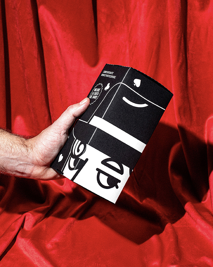
Mr. Baro’s illustration was created by @dariogenuardi_illustrations, a specialist in playing-card artwork, bringing true card-table iconography and character to every part of the brand universe. The packaging is screen-printed, and the boxes – when aligned – can recompose the cardsharp’s face.
“It’s not about taking part.”
CREDIT
- Agency/Creative: Diego Serpico
- Article Title: Diego Serpico Designs Mr. Baro Amaro as a Playful and Collectible Italian Digestif Identity
- Organisation/Entity: Freelance
- Project Type: Packaging
- Project Status: Published
- Agency/Creative Country: Italy
- Agency/Creative City: Naples
- Market Region: Europe
- Project Deliverables: Brand Identity, Label Design, Packaging Design
- Format: Bottle, Box
- Industry: Food/Beverage
- Keywords: amaro, liqueur
-
Credits:
Art direction & graphic design: Diego Serpico
Illustration: Dario Genuardi
Photography: Aurora Scotto di Minico
Motion design: @russovittorio98


