


Dichotomous by name and nature, Dichotomy live by the principle that there is more than one way to pick a grape, proudly showcasing the flavour and structural range of varietals by taking the winemaking road less travelled.
The brainchild of American Rosie Signer and Barossan Jarred Jenner, the winemaking couple have established vineyards in both SA and Washington State, allowing them to deep dive into varietal potential and explorative techniques that showcase the power of dichotomy.
Pairing this geographic contrast with their new-age winemaking principles sets the tone for an increasingly diverse and exciting range of wines, created to appeal to the premium end of the market from a fresh, playful perspective that denies stuffy varietal stigmas or connotations.
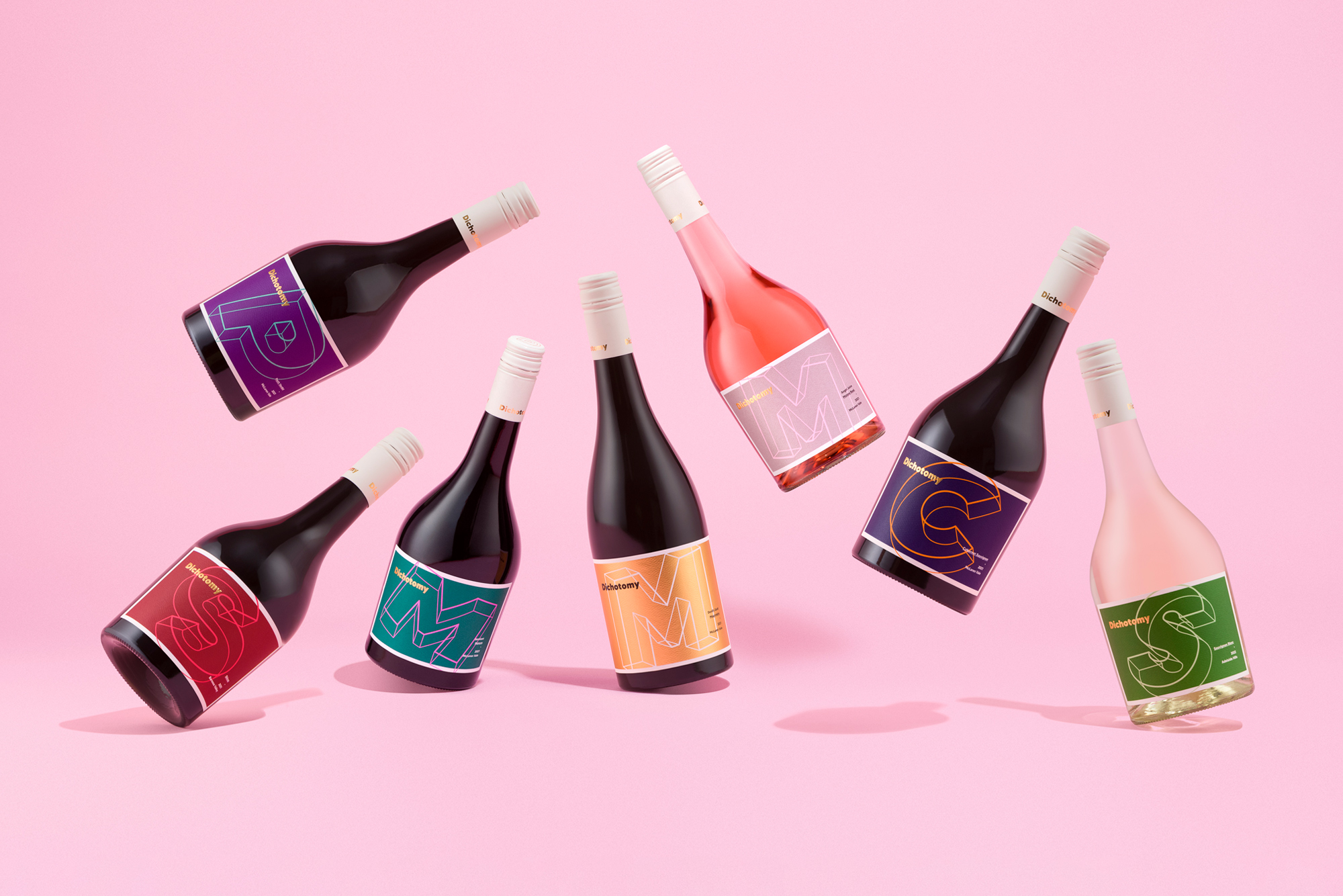
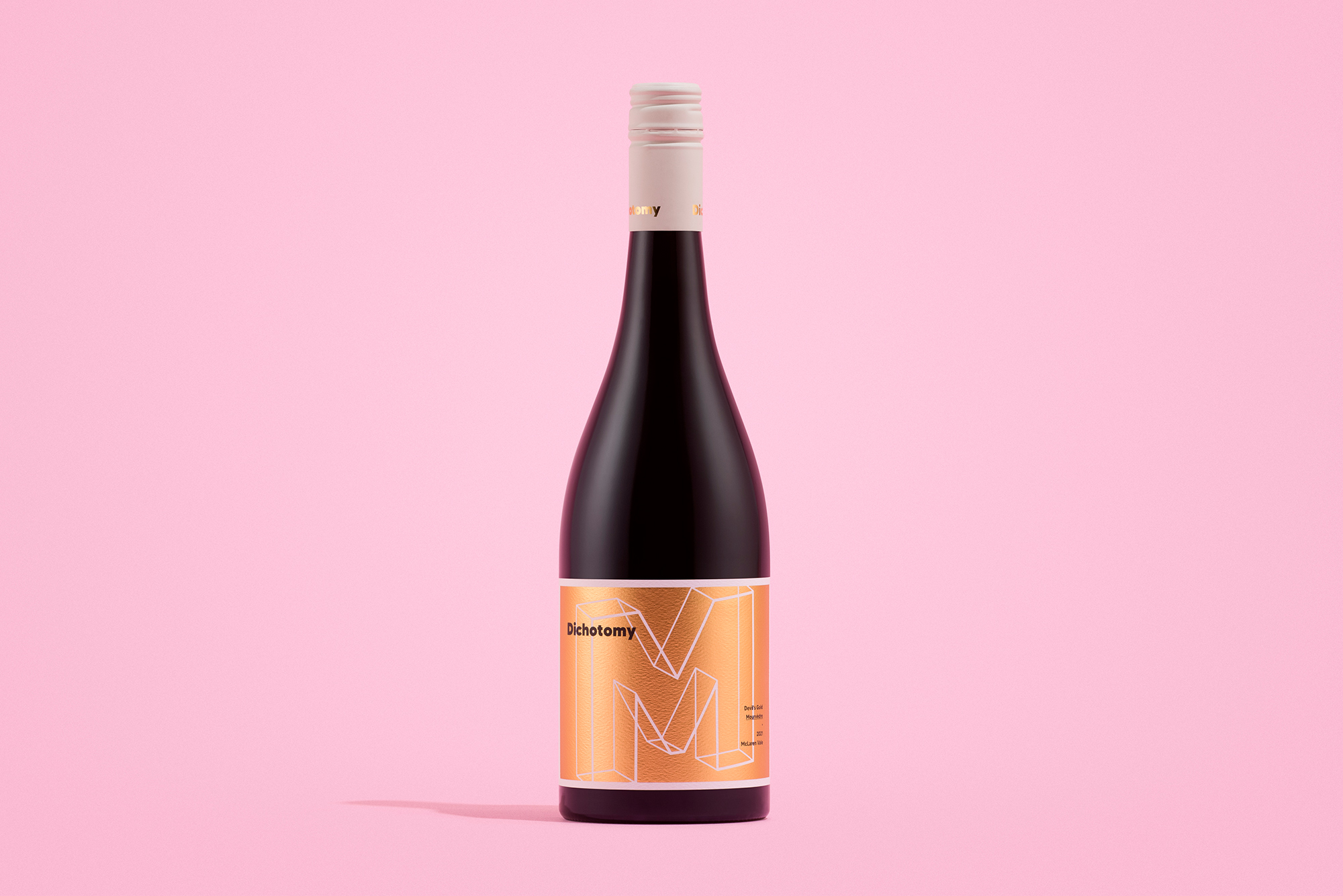
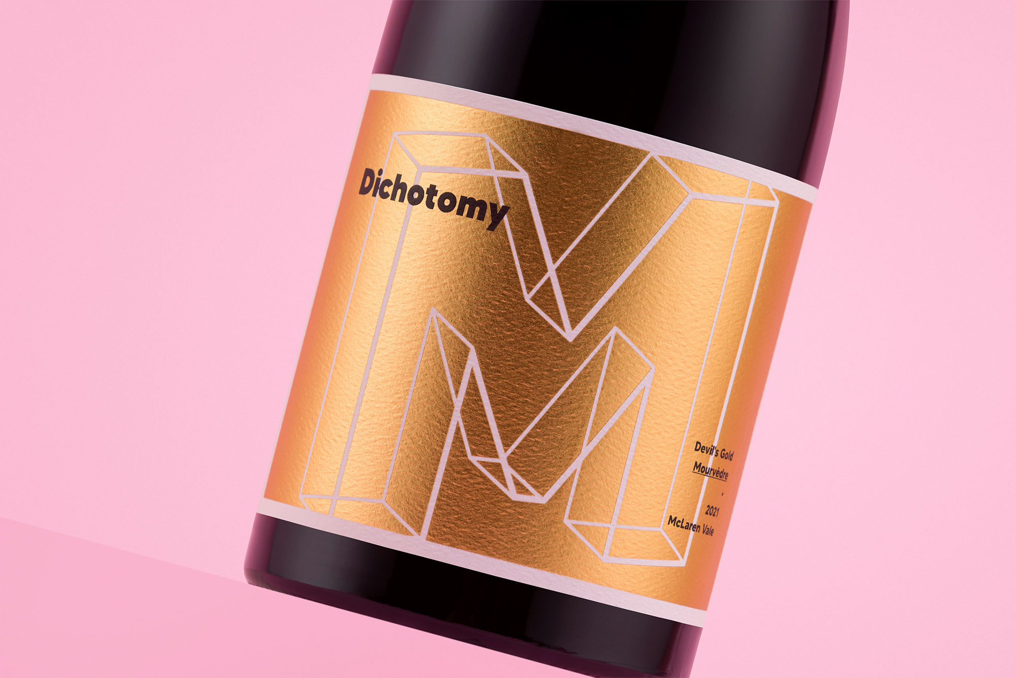
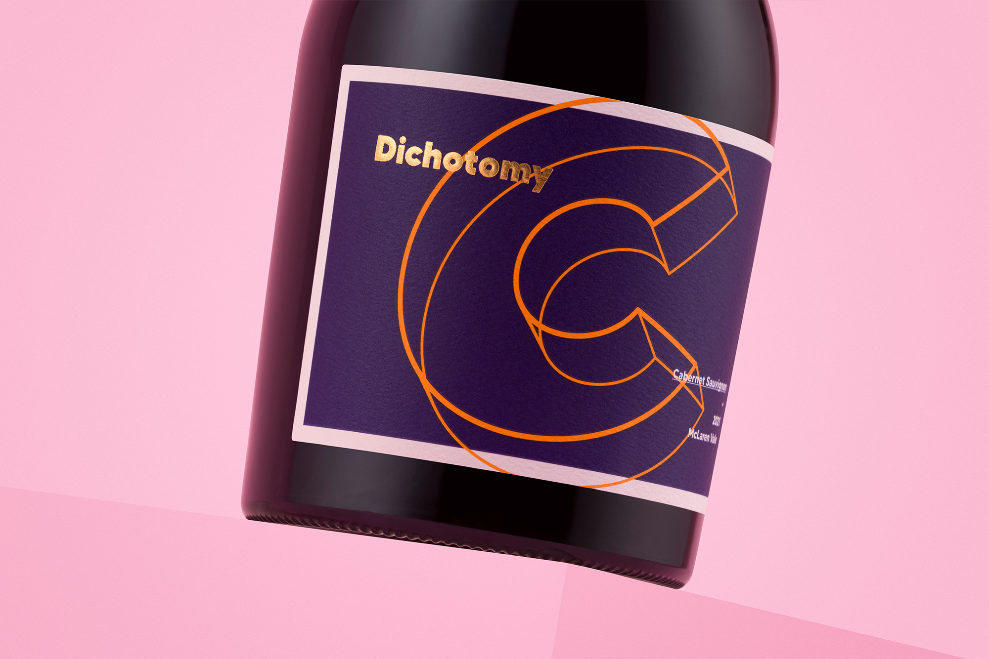
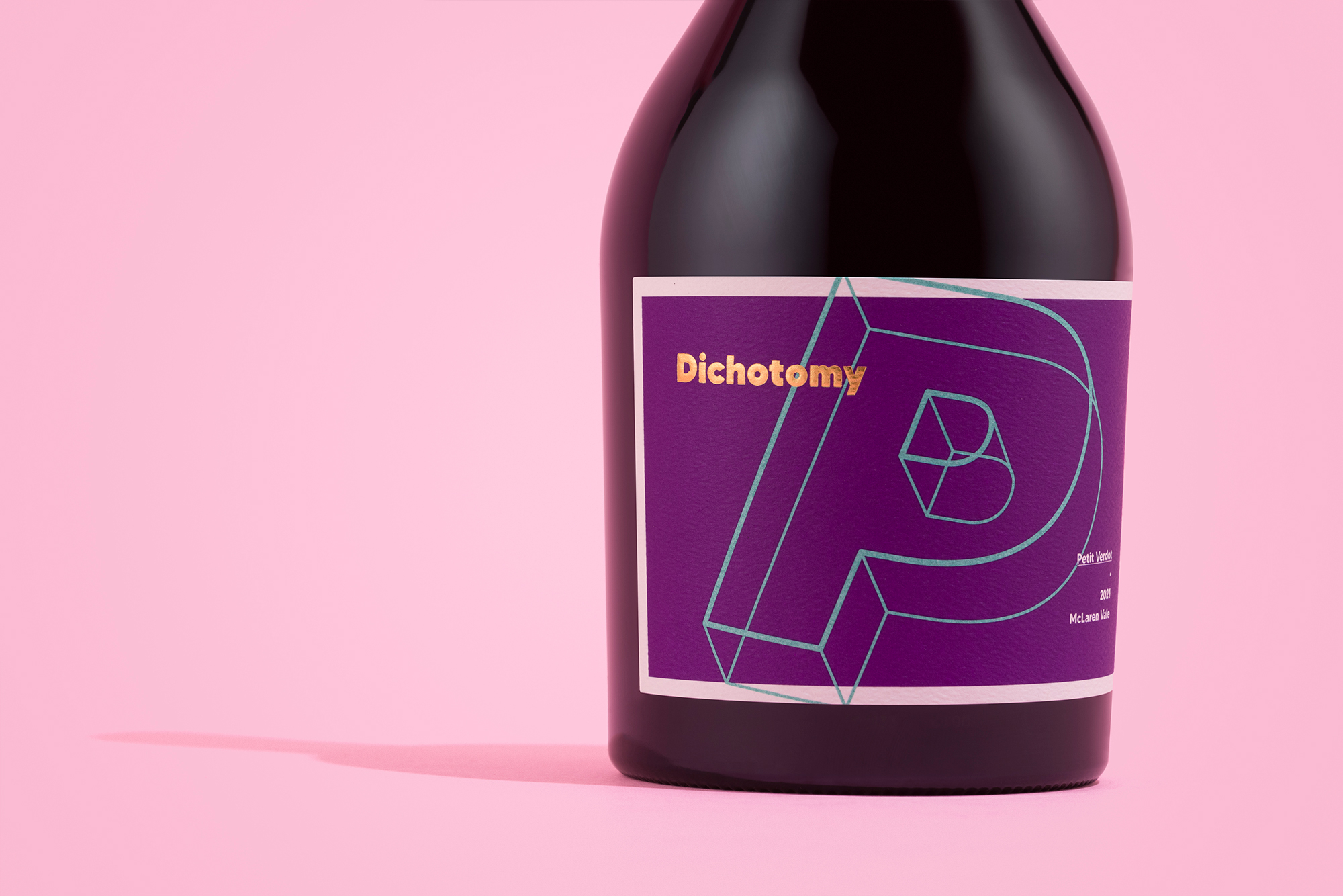
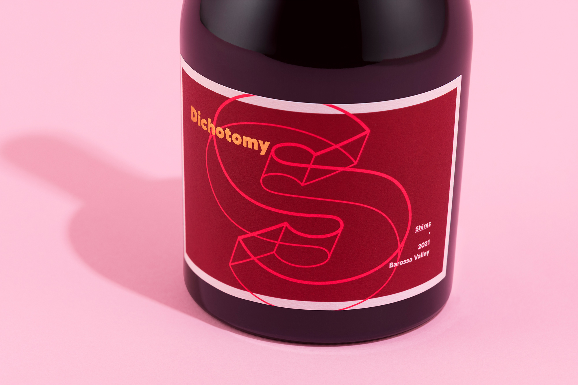
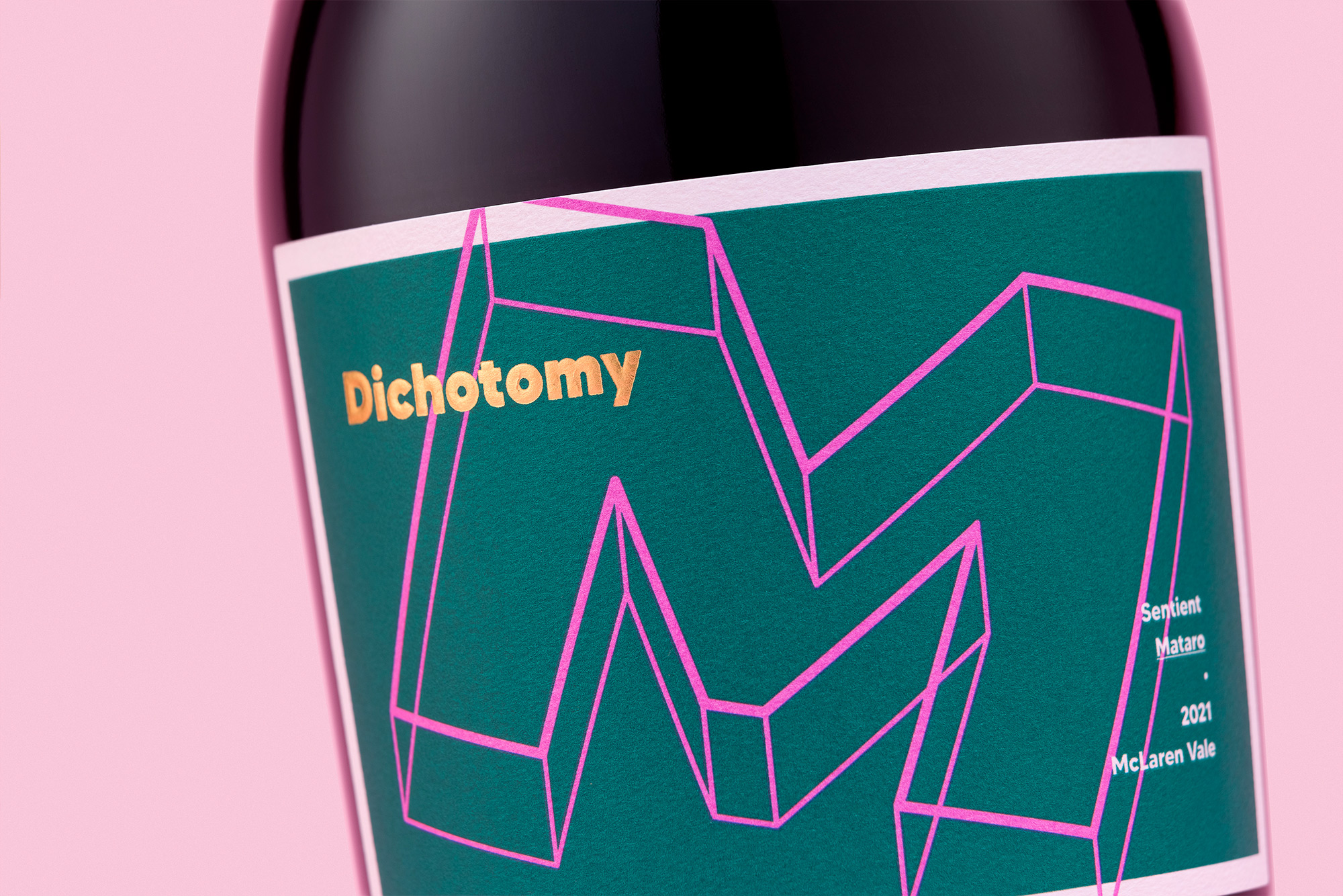
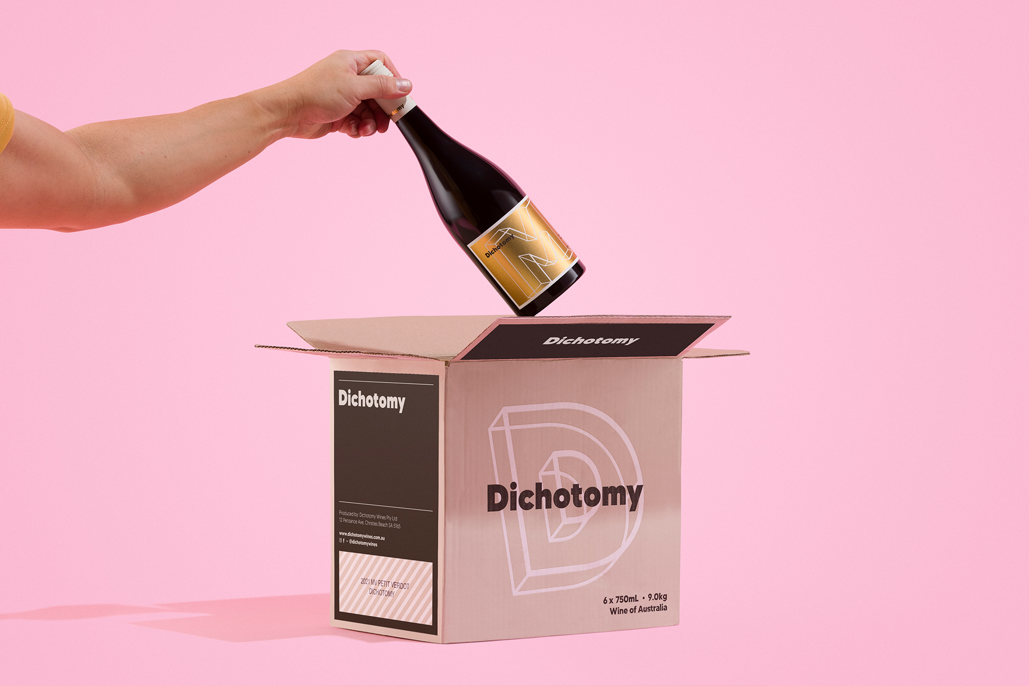
At the heart of this branding project was the need to represent this dichotomy, creating a visually cohesive range whose wines are also undeniably individual. Each label sports a palette of hues to represent the wine’s tasting note, and extruded typography to represent a new perspective on the varietal at hand. Skewed and decidedly leaning away from the straight and narrow of classic form.
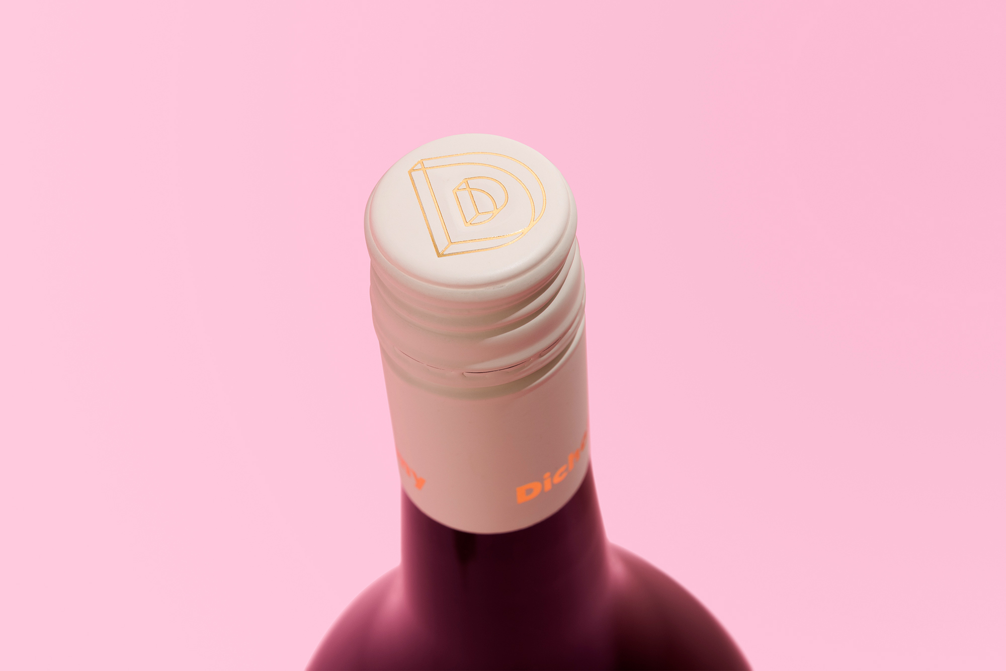
The back label is lifted by gold foil embellishments, including panels that highlight key winemaking techniques – particularly of interest when producing various wines from the same varietal.
Finished in a striking curvaceaous bottle, the result is decidedly contemporary packaging that stands in proud contrast to its neighbours on the shelf and within its own range.
CREDIT
- Agency/Creative: Byerlee Design
- Article Title: Dichotomy Wines Label Design by Byerlee Design
- Organisation/Entity: Agency
- Project Type: Packaging
- Project Status: Published
- Agency/Creative Country: Australia
- Agency/Creative City: Adelaide
- Market Region: Global
- Project Deliverables: Brand Architecture, Brand Design, Design, Packaging Design
- Format: Bottle
- Substrate: Glass, Pulp Paper
- Industry: Food/Beverage
- Keywords: wine label, branding, barossa, dichotomy, david byerlee, McLaren vale, south australia, graphic design, packaging, shiraz
-
Credits:
Design: David Byerlee


