On the occasion of the 2021 Christmas campaign, the company Dolciaria Di Stefano has commissioned us the rebranding of the entire corporate identity.
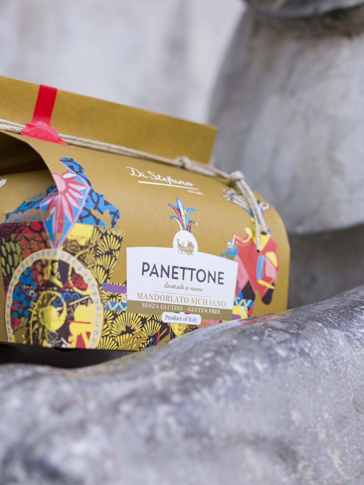
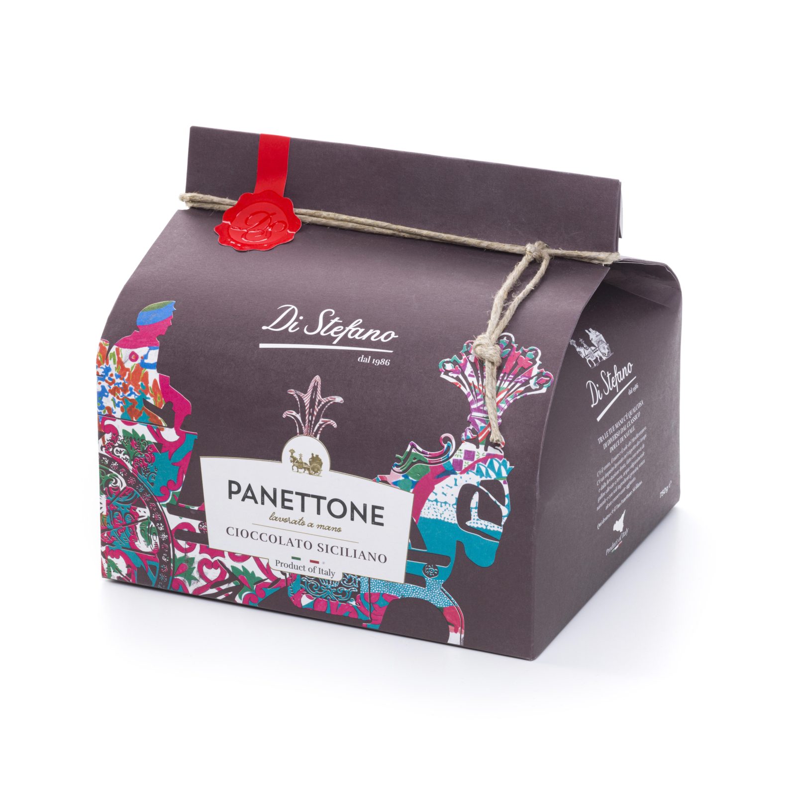
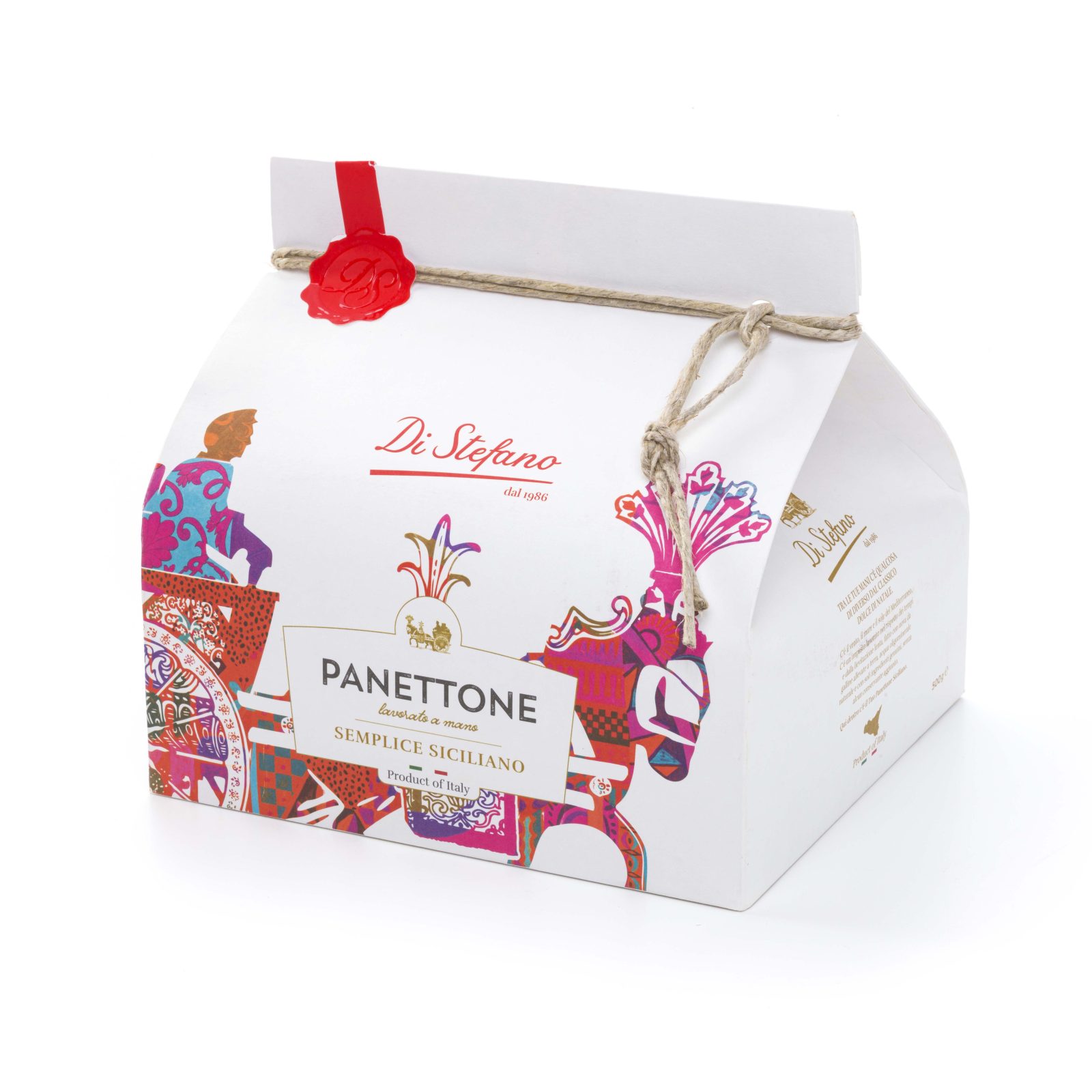
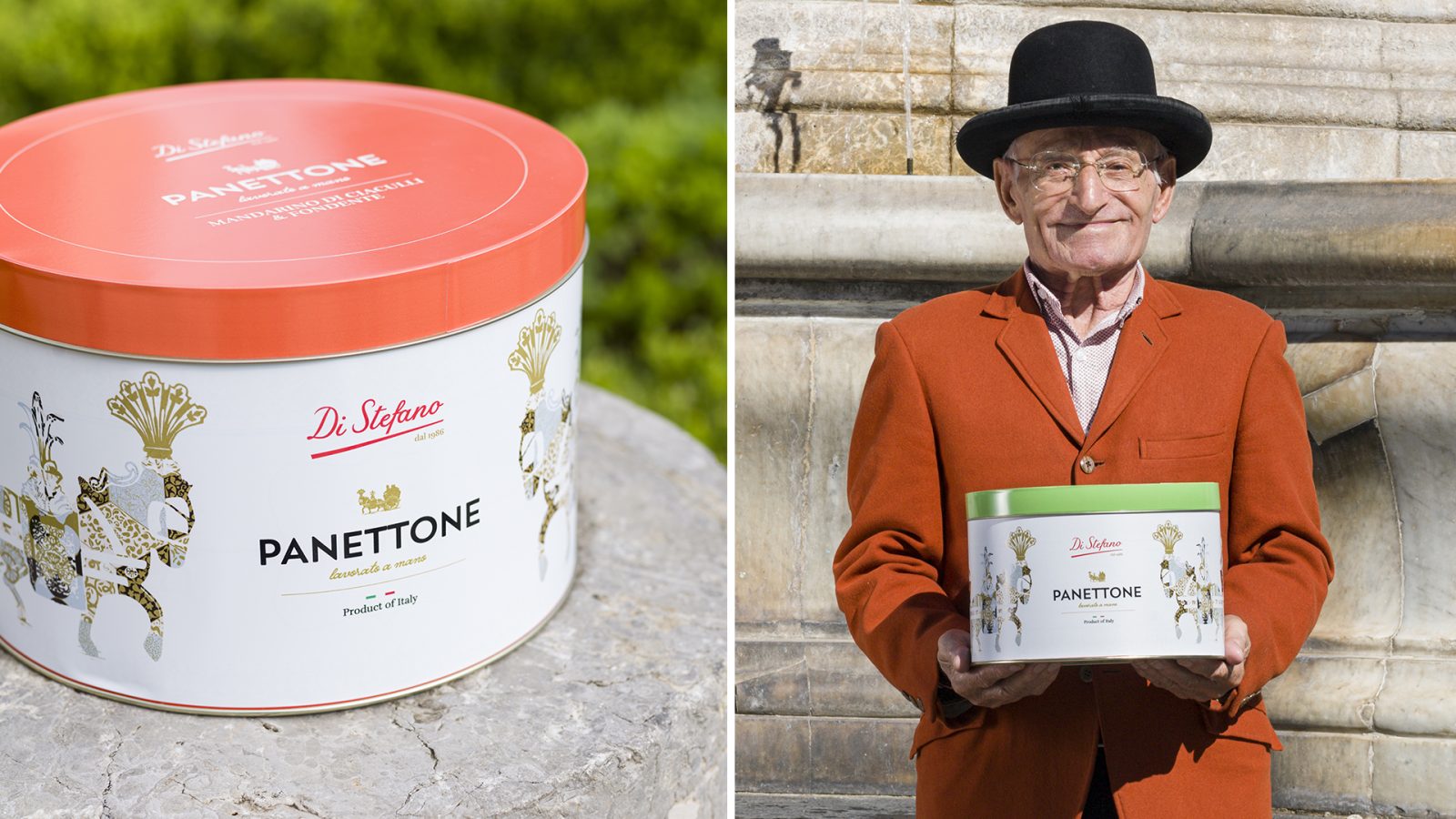
Starting from the logo, the project involved the entire graphic design of the Panettoni line packs.
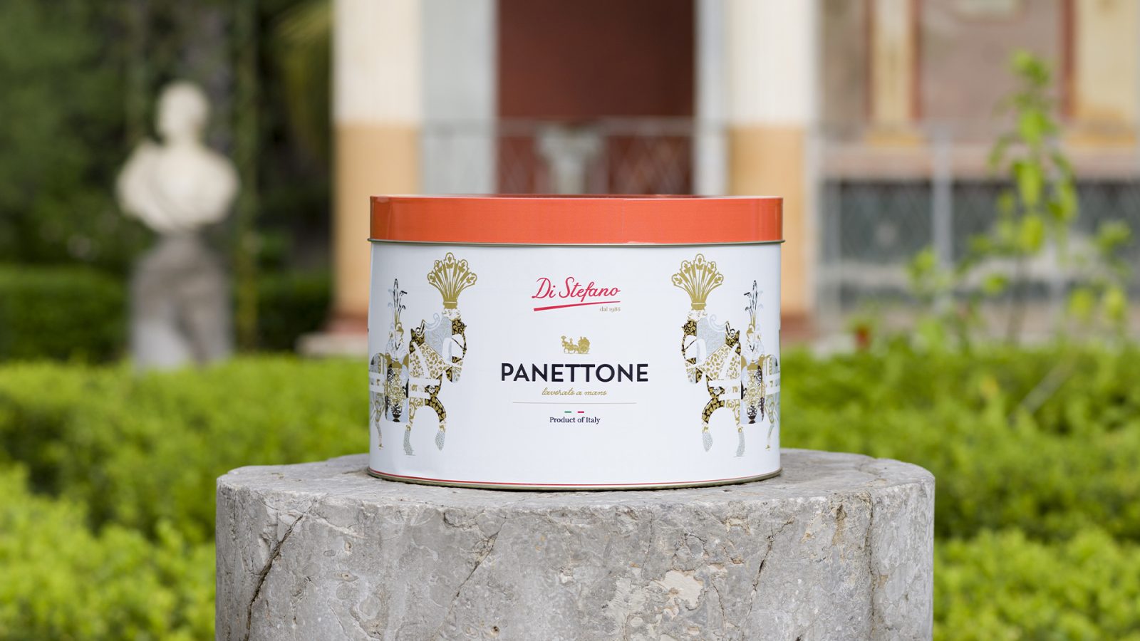
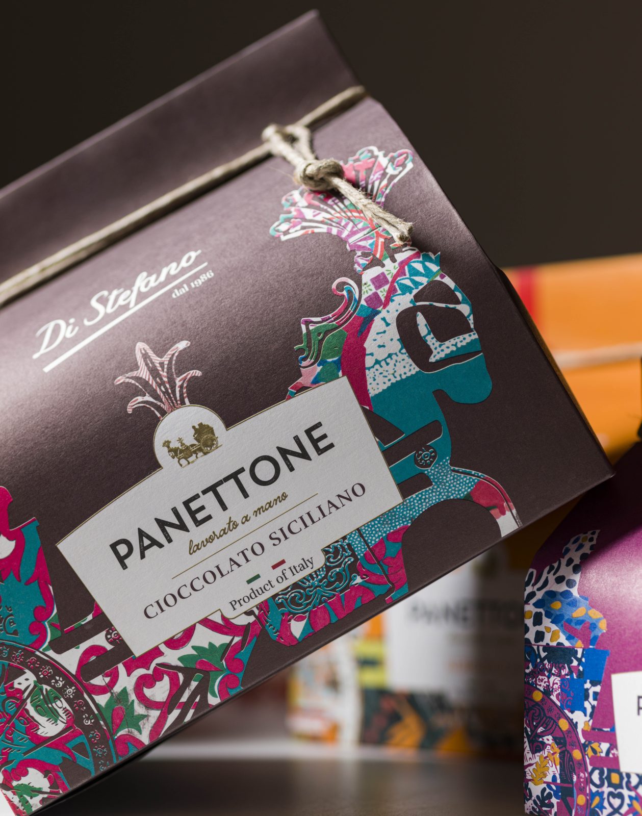
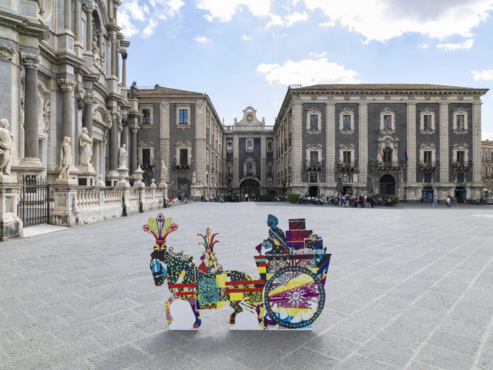
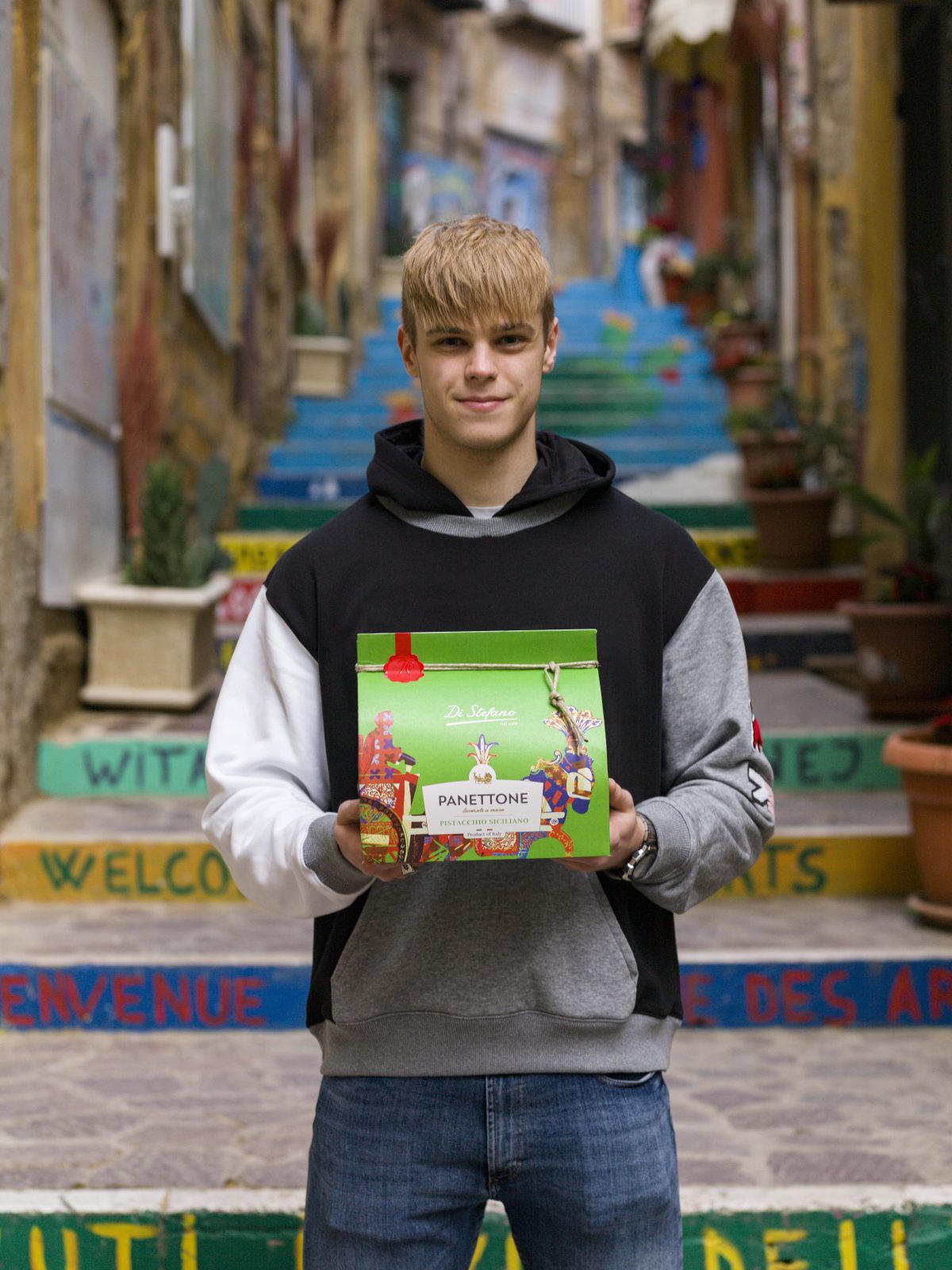
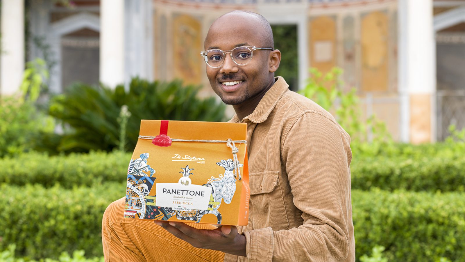
The aim of the intervention was to reaffirm the brand as a Sicilian producer of excellence. The identifying concept is the contemporary and pop reinterpretation of the illustration of the typical Sicilian cart, which has marked the original logo brand Di Stefano.
Recalling the natural and architectural peculiarities of the island, reinforcing its bond with Sicily that, for thirty-five years and also on this occasion, inspires its choices.
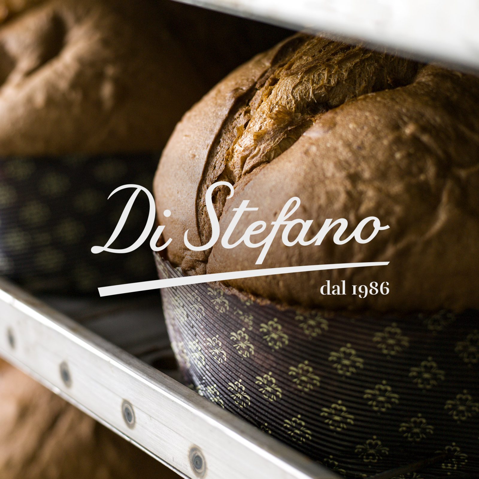
Warm and bright colours, strong and decisive lines, new lettering and colour code (red) were used for the logo in which their date of incorporation was also inserted (1986). These elements have establish a real turning point within the company that inevitably involved the external basket, that is, the presentation of products in terms of pack and communication.
A modern suggestion of the “journey to Sicily”, to discover the natural and monumental heritage of the island off the most famous circuits.
Moreover, the choice of paper was made taking care the sustainability concept. Hence, it is a recycled paper that marks the beginning of a new path, strongly wanted by the company, aimed at choosing and using – also for the packaging of products – raw materials that are environmentally friendly.
The Sicilian company by choice with over 35 years of experience
Di Stefano’s is a simple story that we wanted to listen to carefully, a journey to discover the natural and monumental heritage of Sicily.
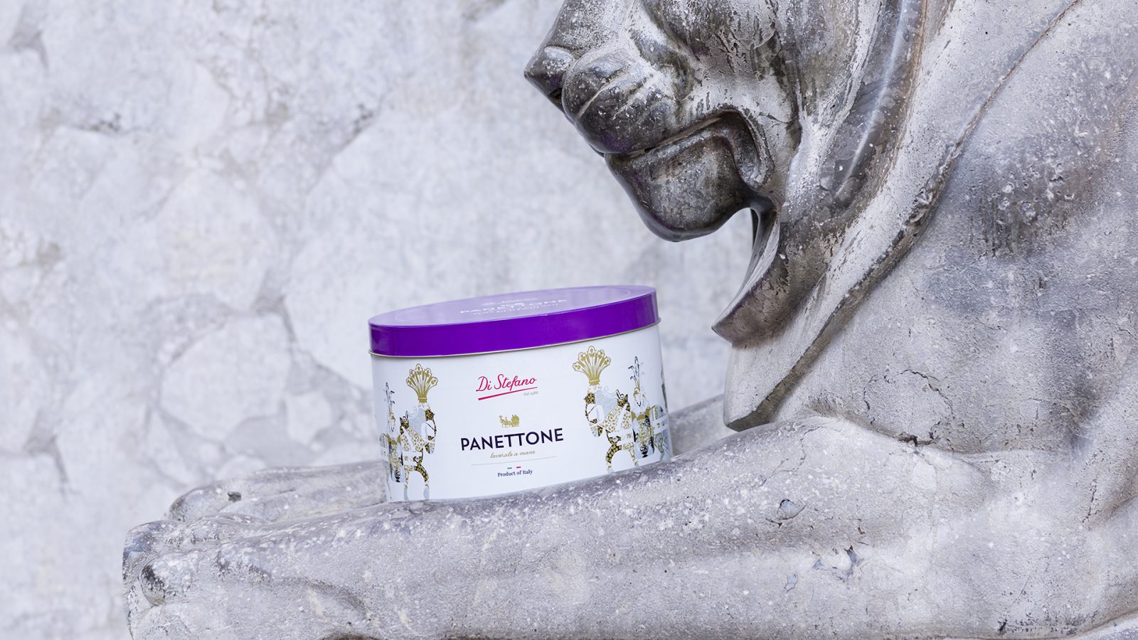
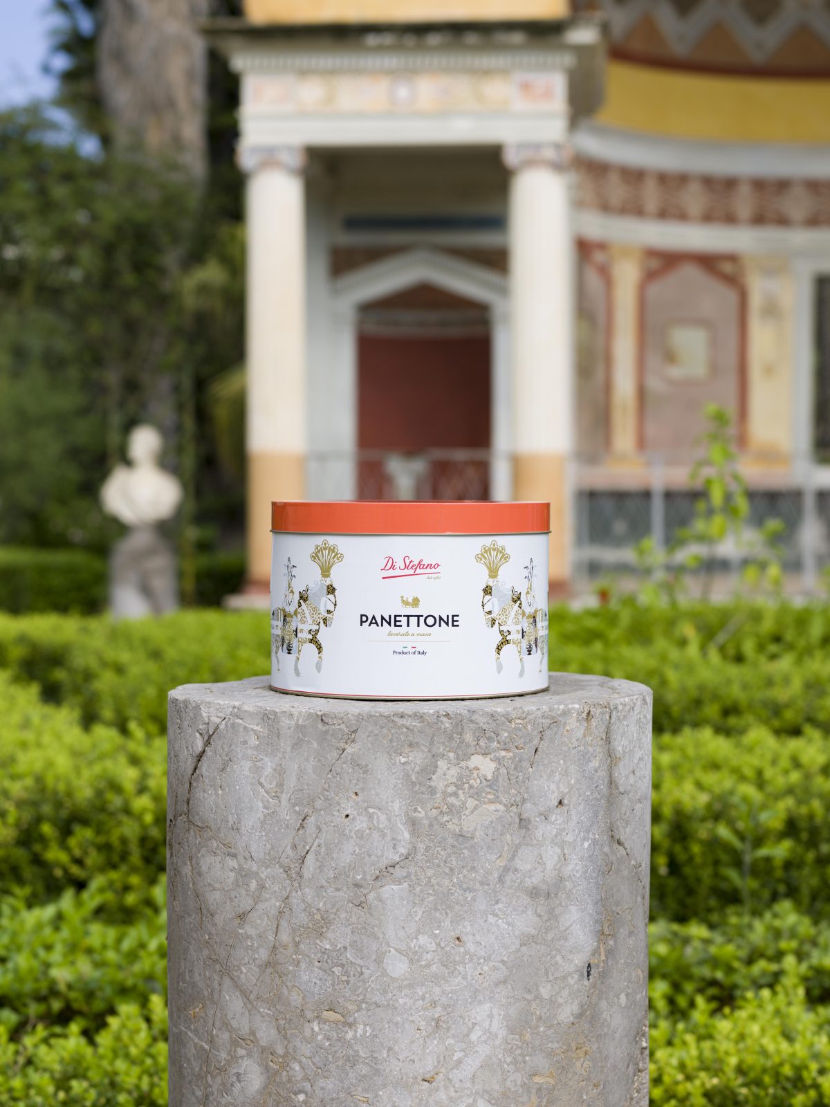
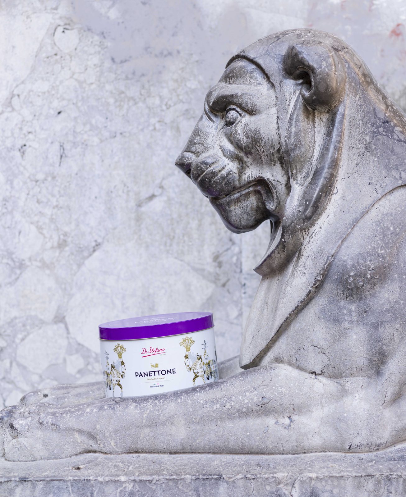
This is how the “postcards of taste” shots were born. Some of the most evocative places of the cities of Catania, Palermo and Agrigento have become the scenes of photos and videos portraying the variants of the traditional Sicilian cart revisited in a pop key, new packs and new shoppers, equal in shape and essence of the “hand-made”, different colors, style and choice of material. The latter – this is a particular type of paper – marks the beginning of a new path, strongly desired by the company, aimed at choosing and using also for the packaging of products, environmentally friendly raw materials.

CREDIT
- Agency/Creative: Industria01
- Article Title: Di Stefano Packaging Redesign by Industria01
- Organisation/Entity: Agency
- Project Type: Packaging
- Project Status: Published
- Agency/Creative Country: Italy
- Agency/Creative City: Tremestieri Etneo - CT
- Industry: Food/Beverage
- Keywords: WBDS Agency Design Awards 2022/23
-
Credits:
Marketing director: Sarah Bersani
Creative director: Bice Guastella
Art Director: Salvatore Cultrera
Graphic Designer : Monica Montesano
Graphic Designer: Giulia Arcidiacono
Social Media Manager: Gessica Lanza


