When two Brazilian entrepreneurs of Italian descent decided to create Di Ligúria, a pizzeria in Belo Horizonte, they were looking for more than just a pizza menu. They wanted to build a brand that would truly honor the flavors, traditions, and warmth of Italian culture, while also incorporating the lively and welcoming spirit of Brazilian gastronomy. I took on this challenge and, in doing so, developed the brand design and packaging that would uniquely connect these two cultural worlds.
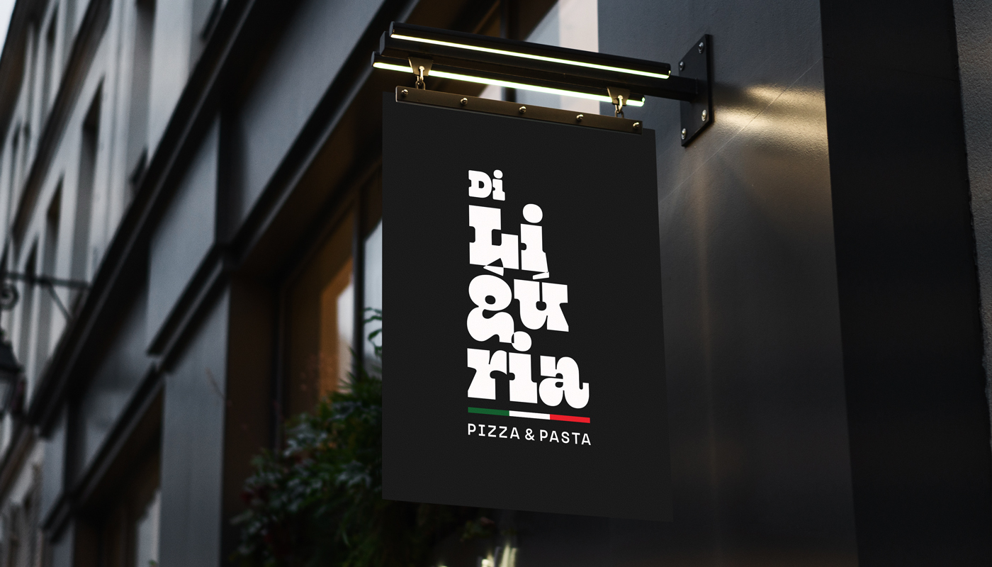
The visual identity of Di Ligúria is inspired by a deep love for Italian cuisine, with strong influences from the founders’ Genoese roots and the rich culinary tradition of the Liguria region. The visual concept created for the brand reflects this Italian heritage, while infusing a relaxed and joyful Brazilian vibe. The very name “Di Ligúria” is a tribute to the Liguria region in Italy, immediately conveying a sense of authenticity and tradition.
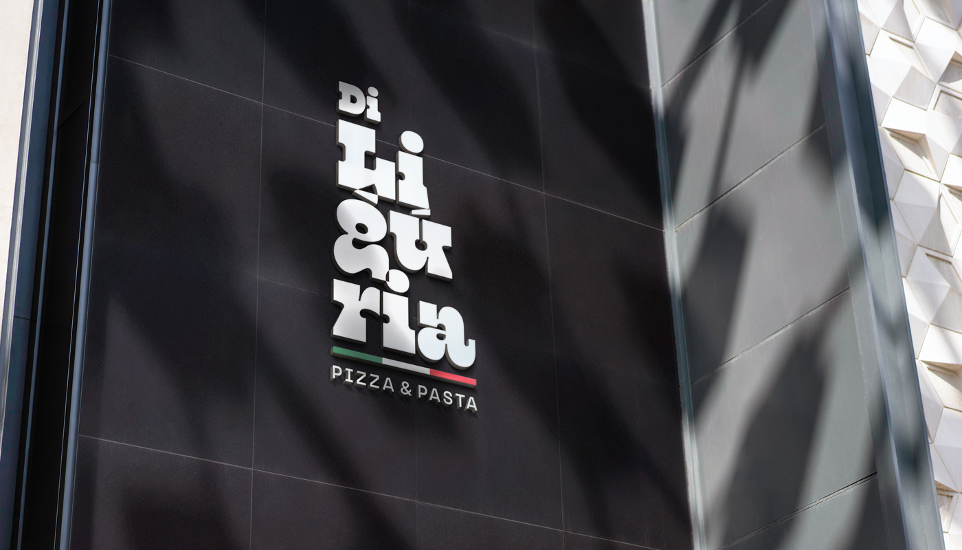
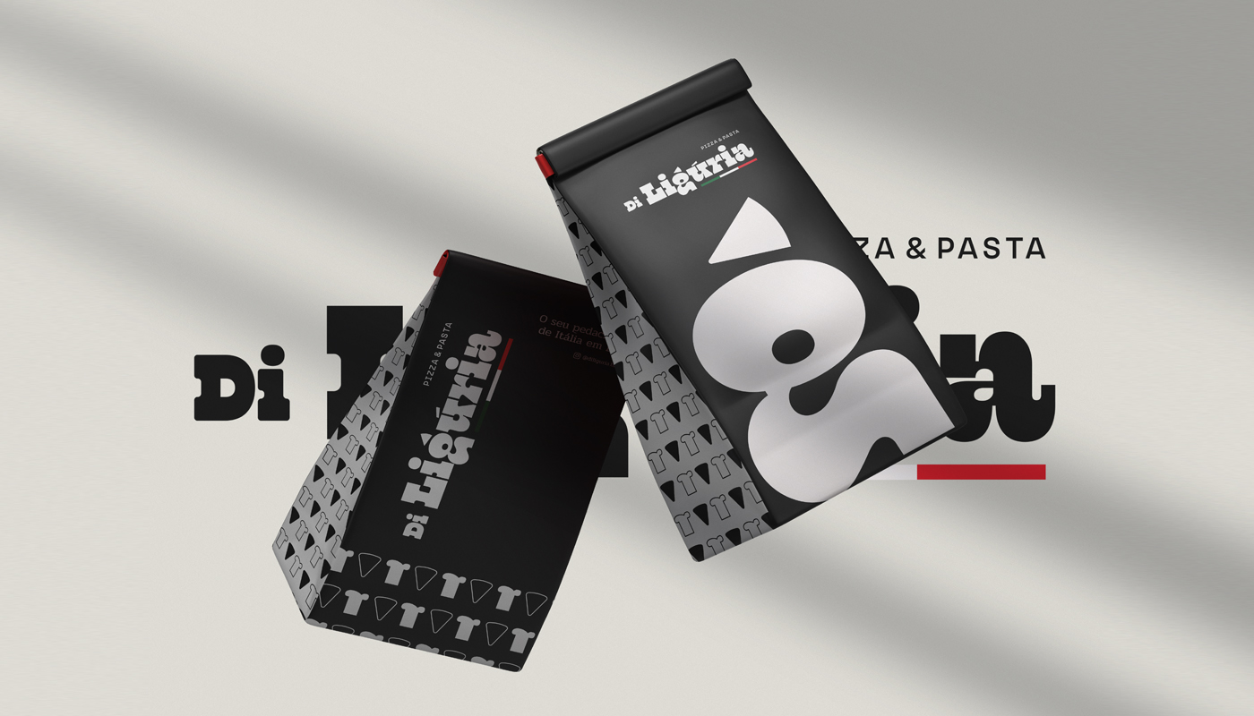
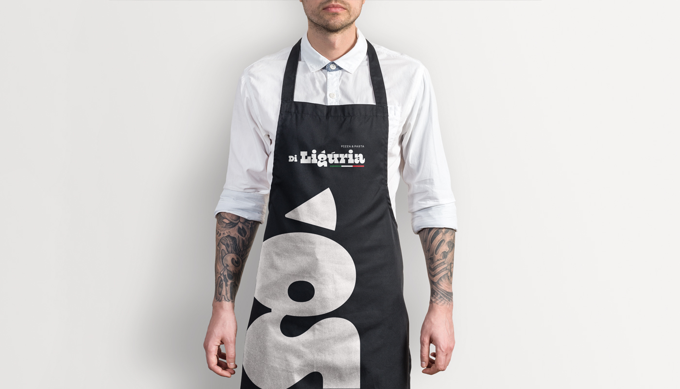
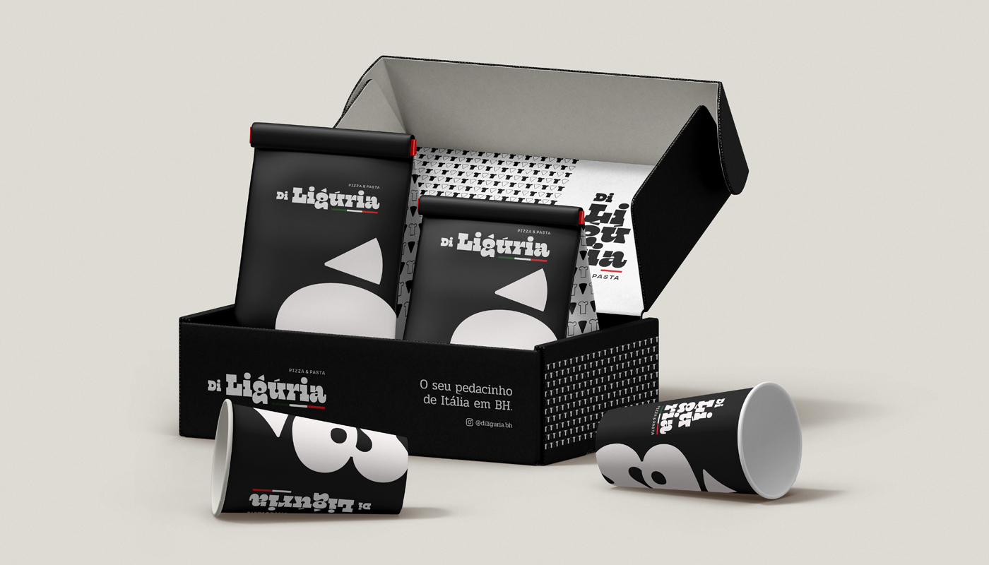
The design was crafted to capture this dual identity, focusing on simplicity, elegance, and a playful touch. By using negative space and bold typography, I aimed to highlight Italian tradition in a modern and appealing way, creating an aesthetic that is both sophisticated and accessible. The balance between contemporary elements and nostalgic references to Italian cuisine resulted in a memorable brand that invites customers to immerse themselves in the unique experience of savoring Italy.
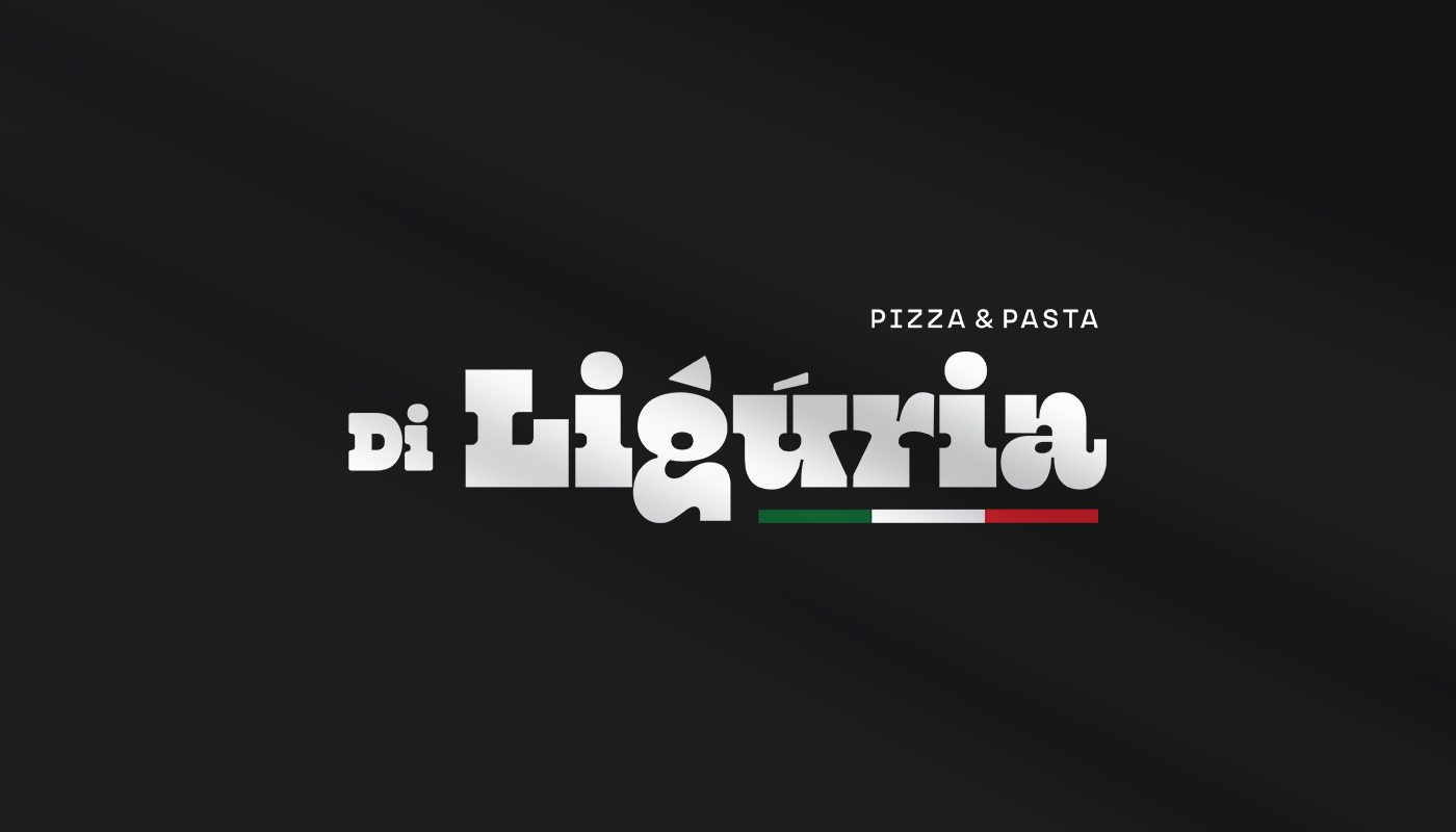
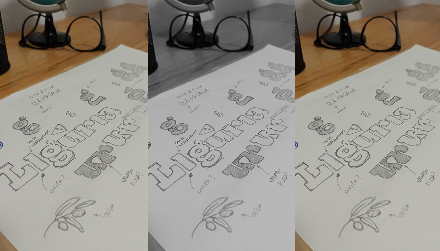
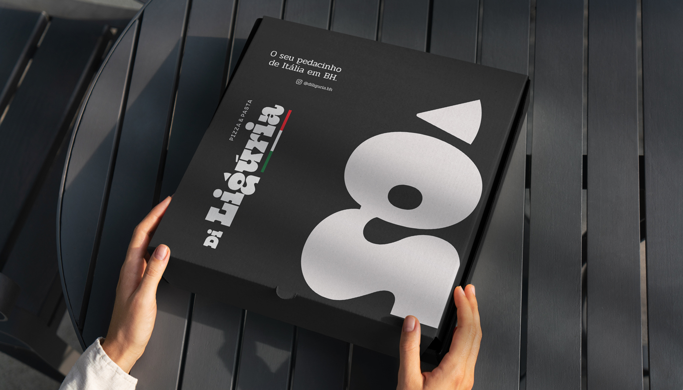
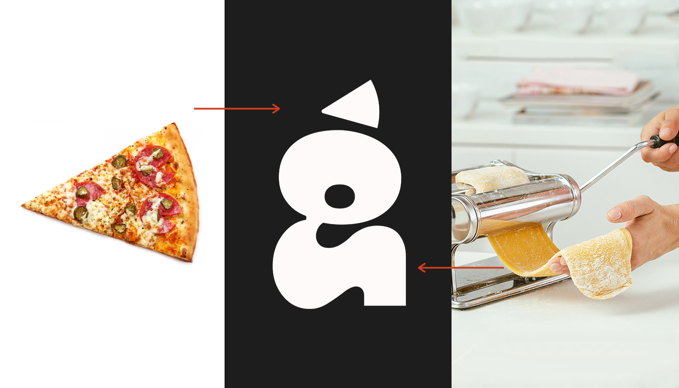
I developed a custom typography style that subtly references the main specialties of Di Ligúria: pizza and pasta. By exploring negative space within the letterforms, especially in the “G”, I created visual references to pizza slices and strands of pasta. This creative use of negative space allows the brand to communicate its core products in a discreet yet effective way.
The font chosen for the logo blends modernity with timeless elegance, paying homage to the classic style of Italian design. Beyond serving as a brand marker, the typography becomes an integral part of the visual experience, subtly reinforcing the restaurant’s Italian roots while remaining approachable and inviting.

CREDIT
- Agency/Creative: Danilo Akan
- Article Title: Di Ligúria Branding and Packaging Design by Danilo Akan
- Organisation/Entity: Freelance
- Project Type: Identity
- Project Status: Published
- Agency/Creative Country: Brazil
- Agency/Creative City: Salvador
- Market Region: South America
- Project Deliverables: Brand Design, Brand Identity, Packaging Design
- Industry: Food/Beverage
- Keywords: Pizza, Italian Cuisine, Pizzeria, Food, Restaurant
-
Credits:
Creative Director, Brand Designer: Danilo Akan


