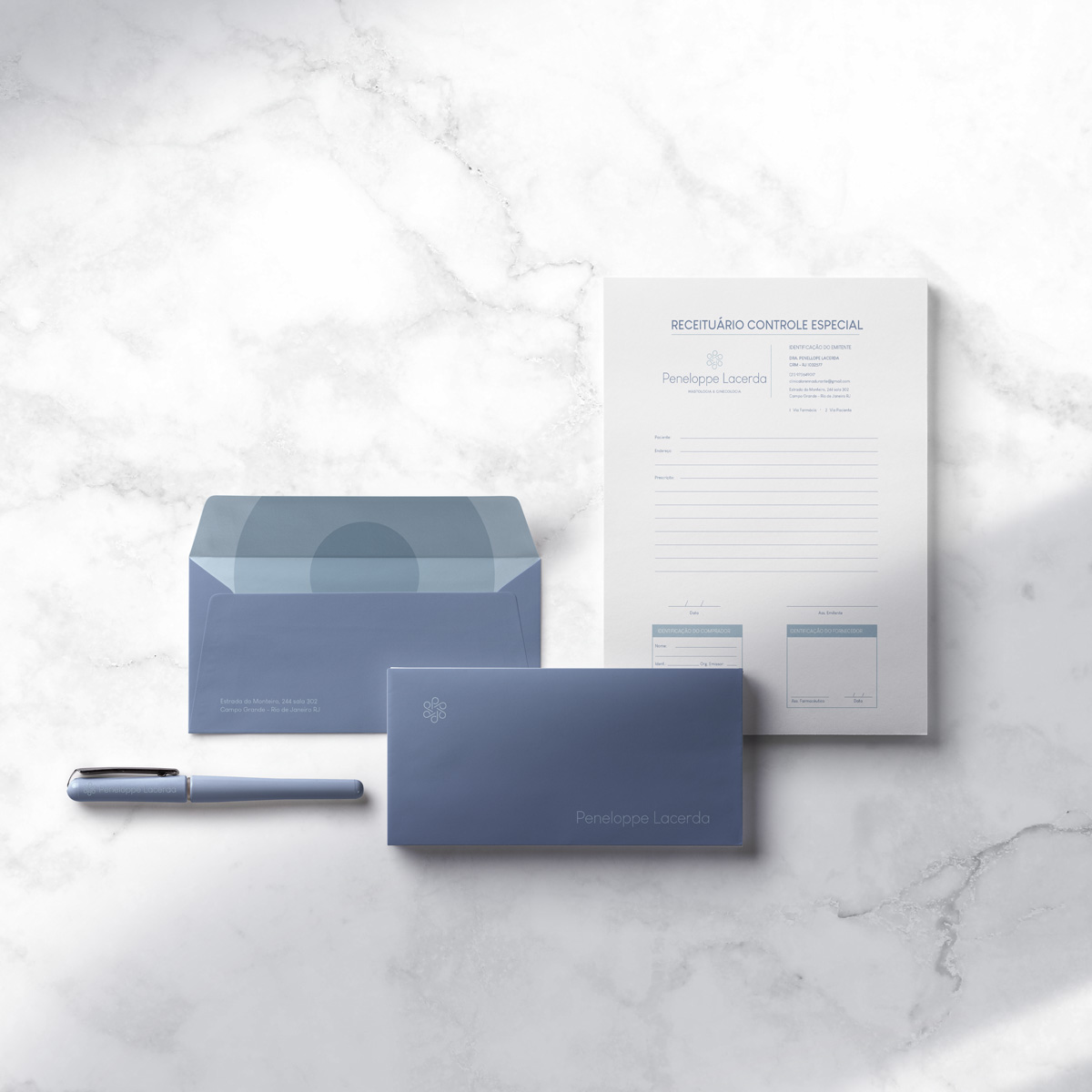
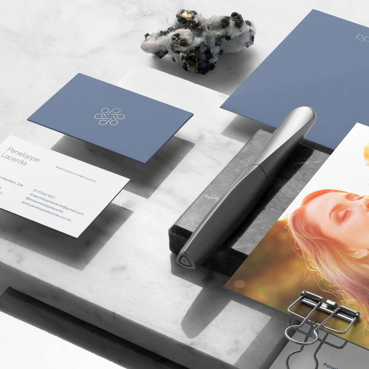
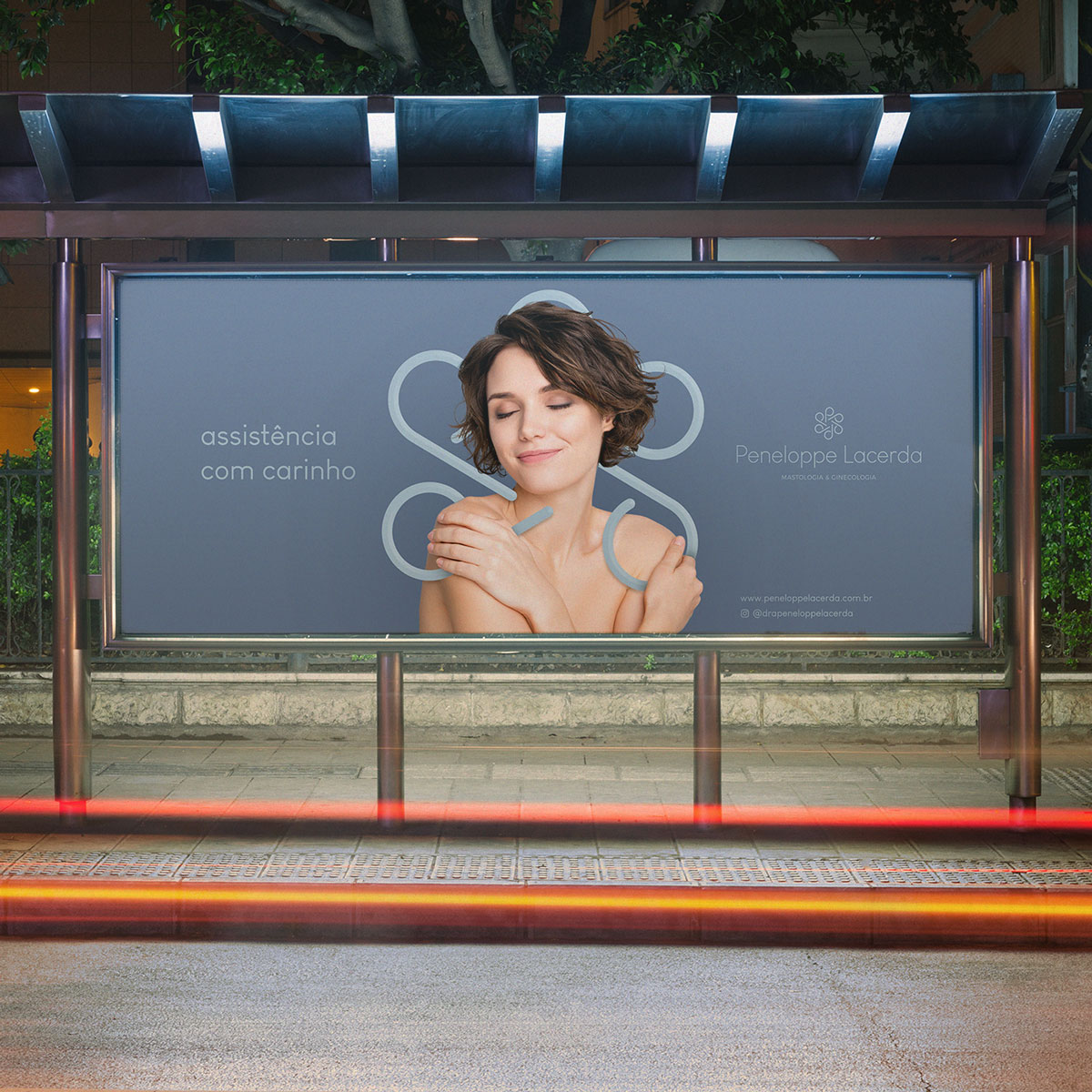
Client: Peneloppe Lacerda M.D., who is a mastologist and gynaecologist, reach me to redesign her old brand and create all the visual identity for a new clinic. The briefing was clear. The biggests feelings the identity needs was: lightness, elegance, harmony, love and care for details. For this reason, the entire project was designed to provide these characteristics, avoiding cliché images of the niche. The colors were chosen to match the clinic’s architecture and differentiate itself from most brands related to mastology and gynecology. The brand is the visual representation of affection, professionalism, love of medicine, care and attention when dealing with women and the female body. It is light, harmonious and promotes well-being for all patients.
Objective: Create a visual identity that represent the doctor in terms of feelings, perception and convey the level of quality of the service provided, with delicacy, in an uncomplicated, refined and easily recognised form for all. Have a professional presence in the segment, which creates empathy and bond with the public. But mainly, it stands out among competitors, providing a sense of commitment and care for the clinic itself and the situation of each patient. Still thinking about the goals of the brand, with the intention of focusing on mastology and possibilities to add other areas of health, it is important to keep in mind the use of a certain neutrality for the identity, facilitating the expansion of the company without having to change its visual identity in the future.
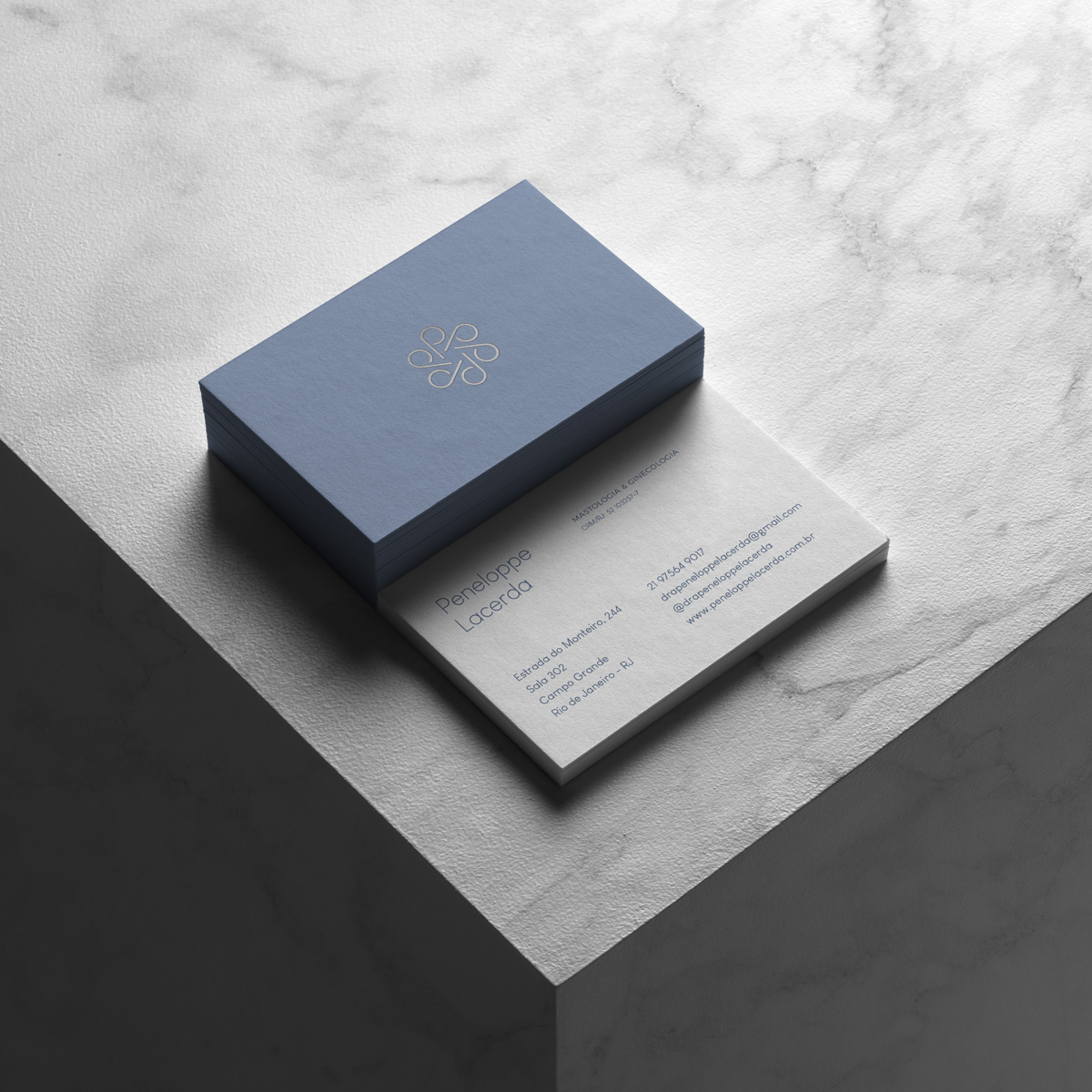
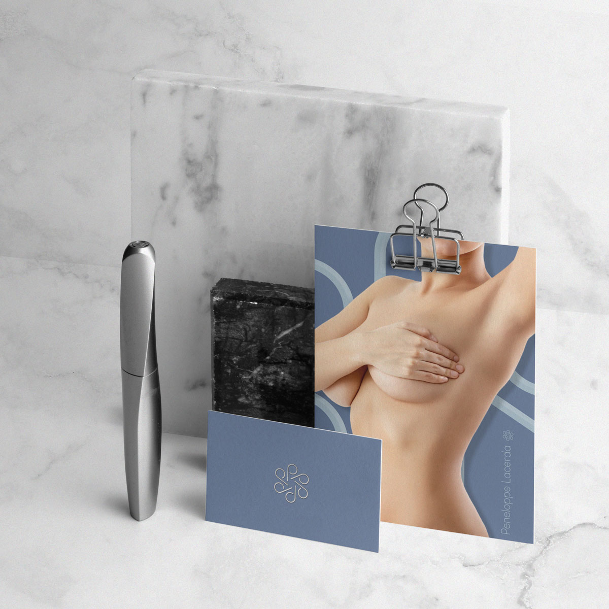
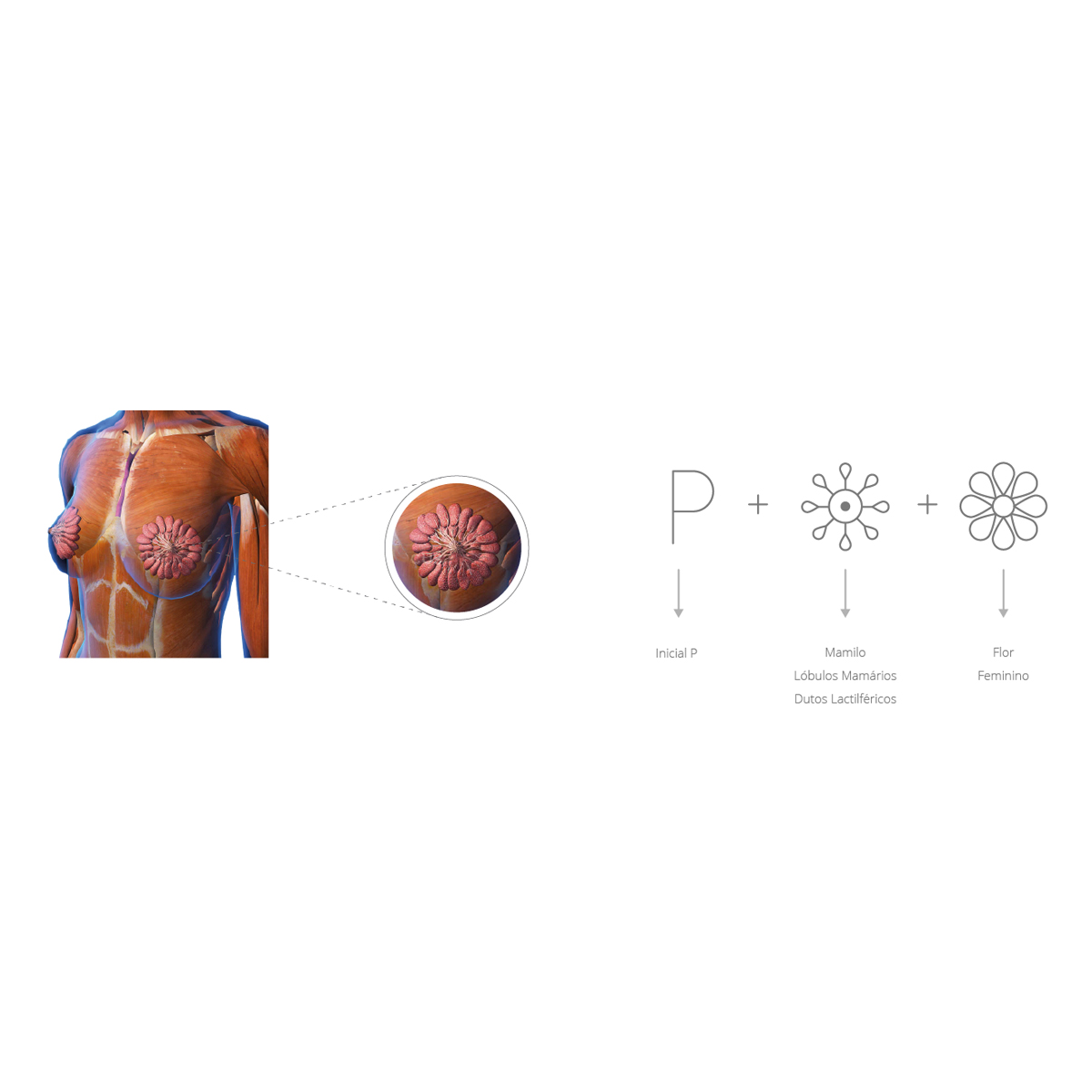
Solution: The concept is based on the anatomy of the breast merging the letter “P” from Peneloppe. The typography was chosen with the objective of transmitting the sensations of modernity and elegance directed to its target audience but with a neutrality to speak with different types of people. For the name in the logo, I modified the font so that it still has a greater personality and harmony with the symbol. This type of customis1ation creates an extra charm for a brand and easily dialogues with the entire universe of visual identity. The creation of the symbol, particularities of the breast anatomy and characteristics which were highlighted through the briefing.


CREDIT
- Agency/Creative: Dhyogouveia Design
- Article Title: Dhyogouveia Design Create Branding and Visual Identity for Peneloppe Lacerda’s Clinic
- Organisation/Entity: Freelance, Published Commercial Design
- Project Type: Identity
- Agency/Creative Country: Brazil
- Market Region: South America
- Project Deliverables: Brand Creation, Brand Design, Brand Experience, Brand Identity, Brand Redesign, Brand Strategy, Branding, Graphic Design, Identity System, Research, Tone of Voice
- Industry: Health Care
- Keywords: Clinic. Minimalist, Light, Elegant, Feminine, Clean


