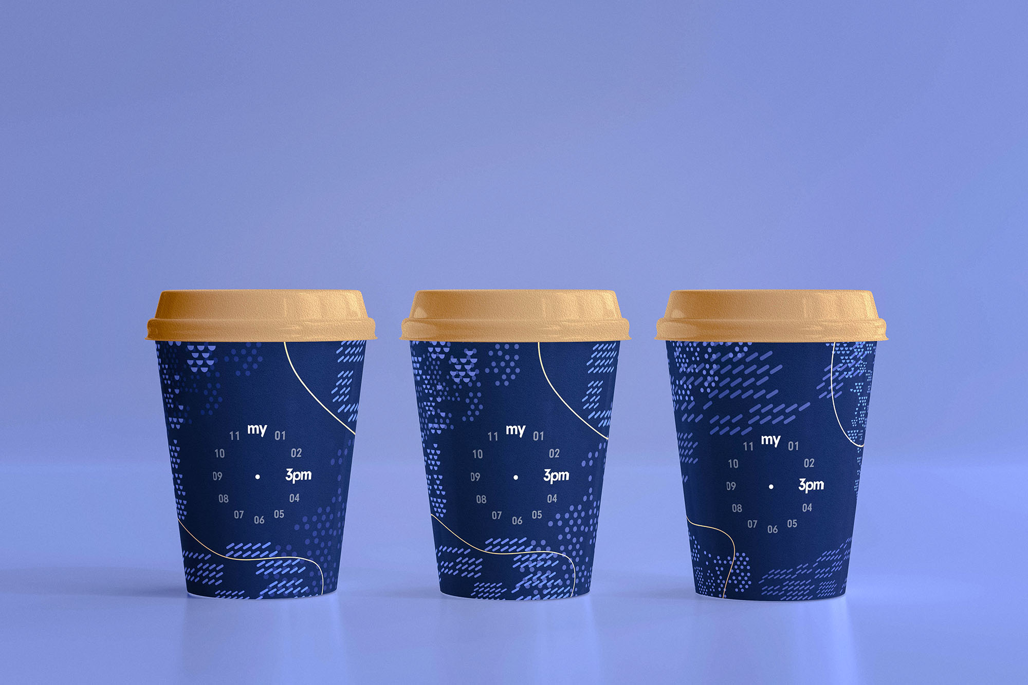
After opening its third store in the luxury shopping district Cheongdam-dong of Seoul, Korea, Chang-il Coffee is on a mission to capture and solidify its position in the Korean market as a leading coffee drinking experience provider. Commissioned, LNM Production, a young creative agency led by Nhat Minh Ly, has embarked on helping the Korean business to develop a brand strategy, redefine their brand values, and create a unique visual identity.
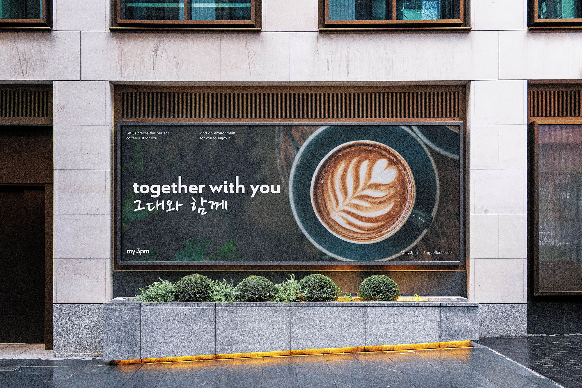
Unlike Western markets, the Korean coffeehouse market is highly competitive, with different brands employing different strategies to capture the market share. Through its rebranding, Chang-il Coffee hopes to carve out a new niche market to help the business capture more customers while making itself stand out from the hyper-competitive market. Centering its business around the three keywords: personalized, experiences, and companion, Chang-il Coffee set out to solidify itself as a coffee drinking experience provider instead of an ordinary coffee provider. LNM Production was briefed to create a new identity for Chang-il Coffee that would not only appeal to the target customers but also could represent the keywords that Chang-il Coffee hopes to convey.
With extensive researches, LNM Production and Chang-il Coffee agreed to rebrand the business with a new name: “my.3pm” The new name is a bold challenge against the scientific belief that caffeine should not be consumed after 3 PM. Chang-il Kim, Chang-il Coffee’s business owner, commented: “A good cup of coffee can and should be drunk at any time in a day as it’s not only an energy booster but also a companion who will accompany the consumer through their daily journeys.” Based on this idea, LNM Production further developed and expanded the original keywords into a complete graphic system that is confident, clear, and visually attractive.
Design details:
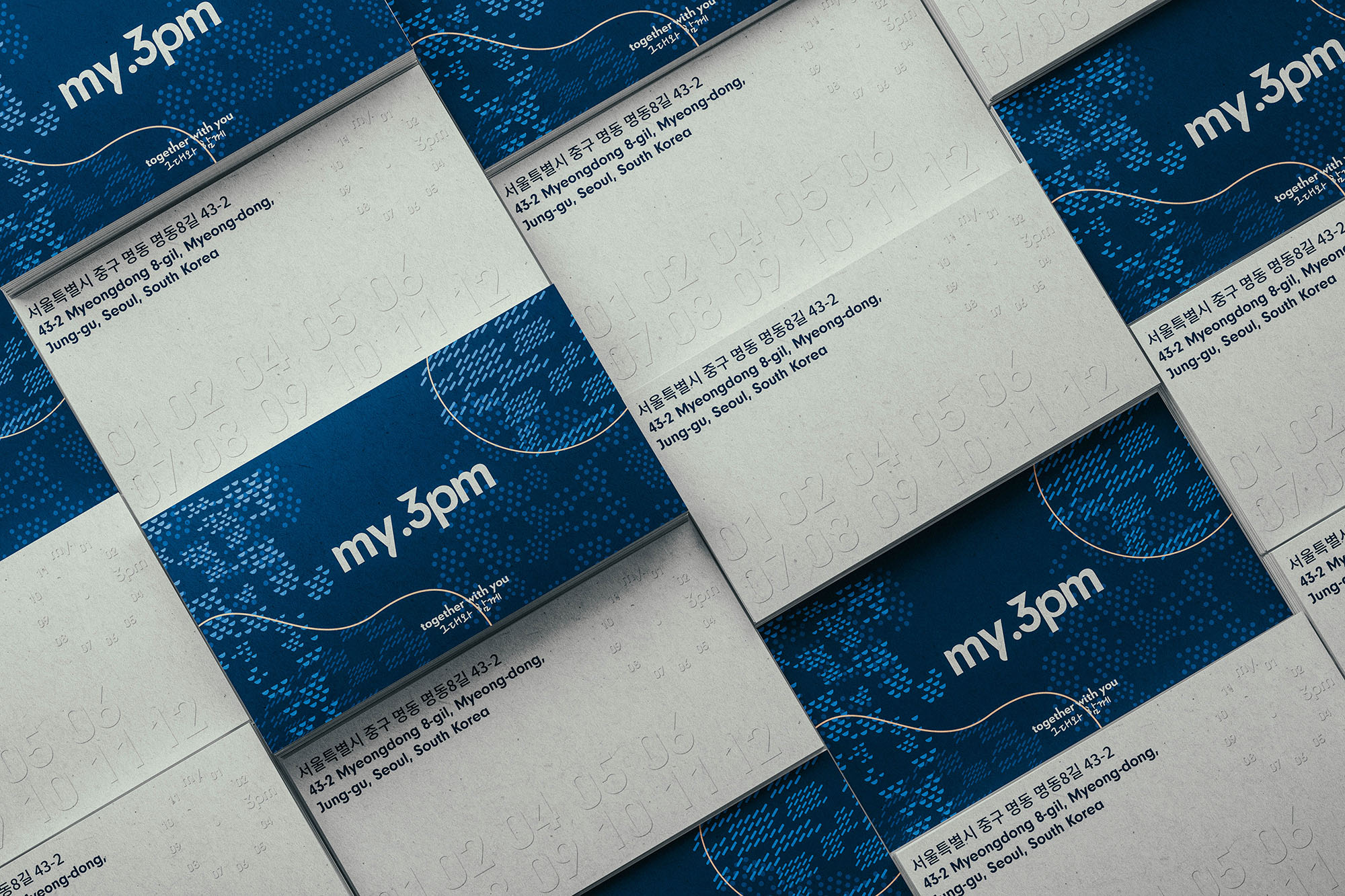
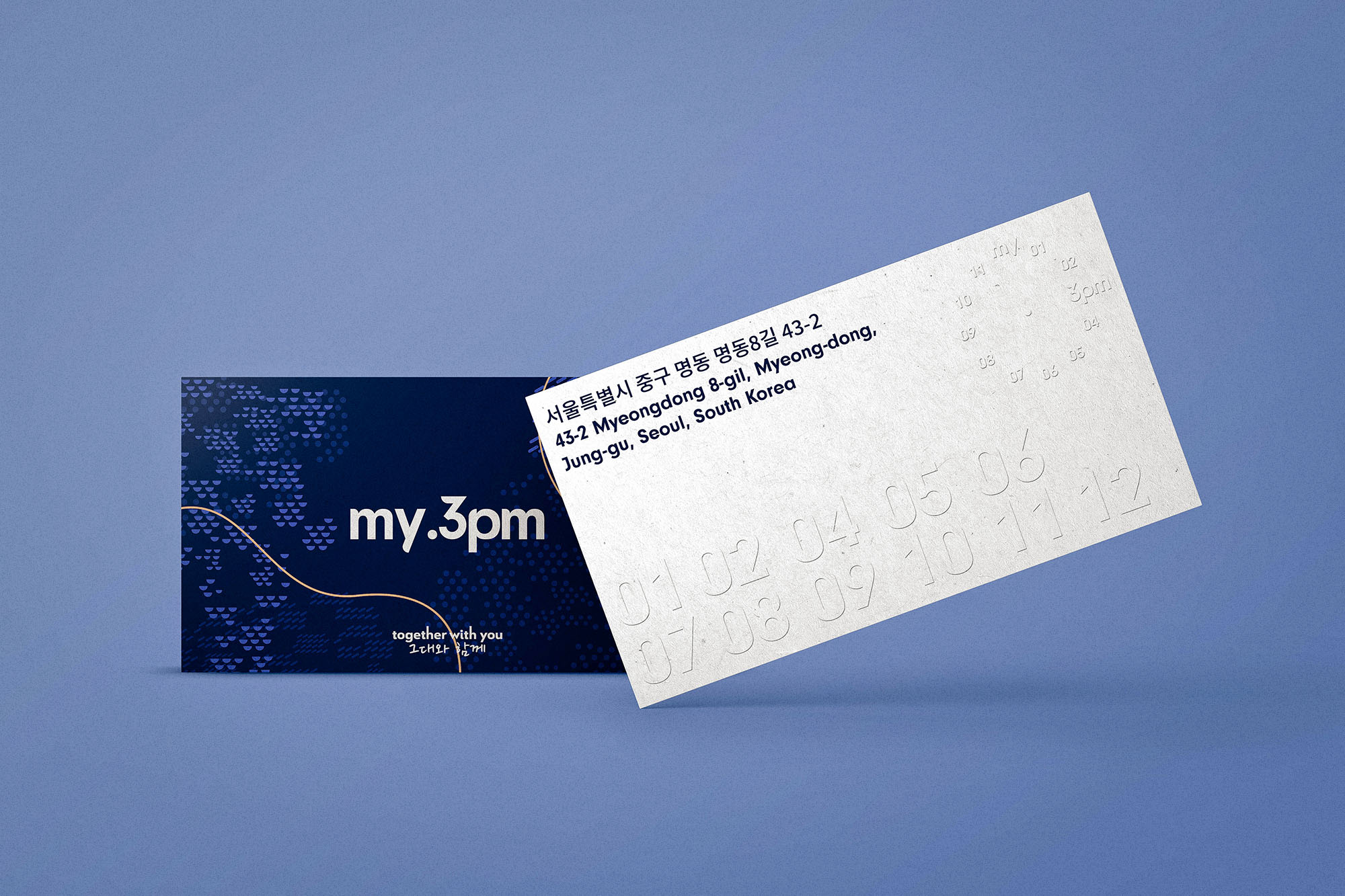
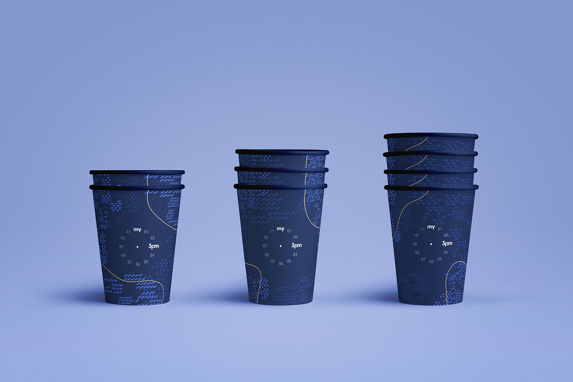
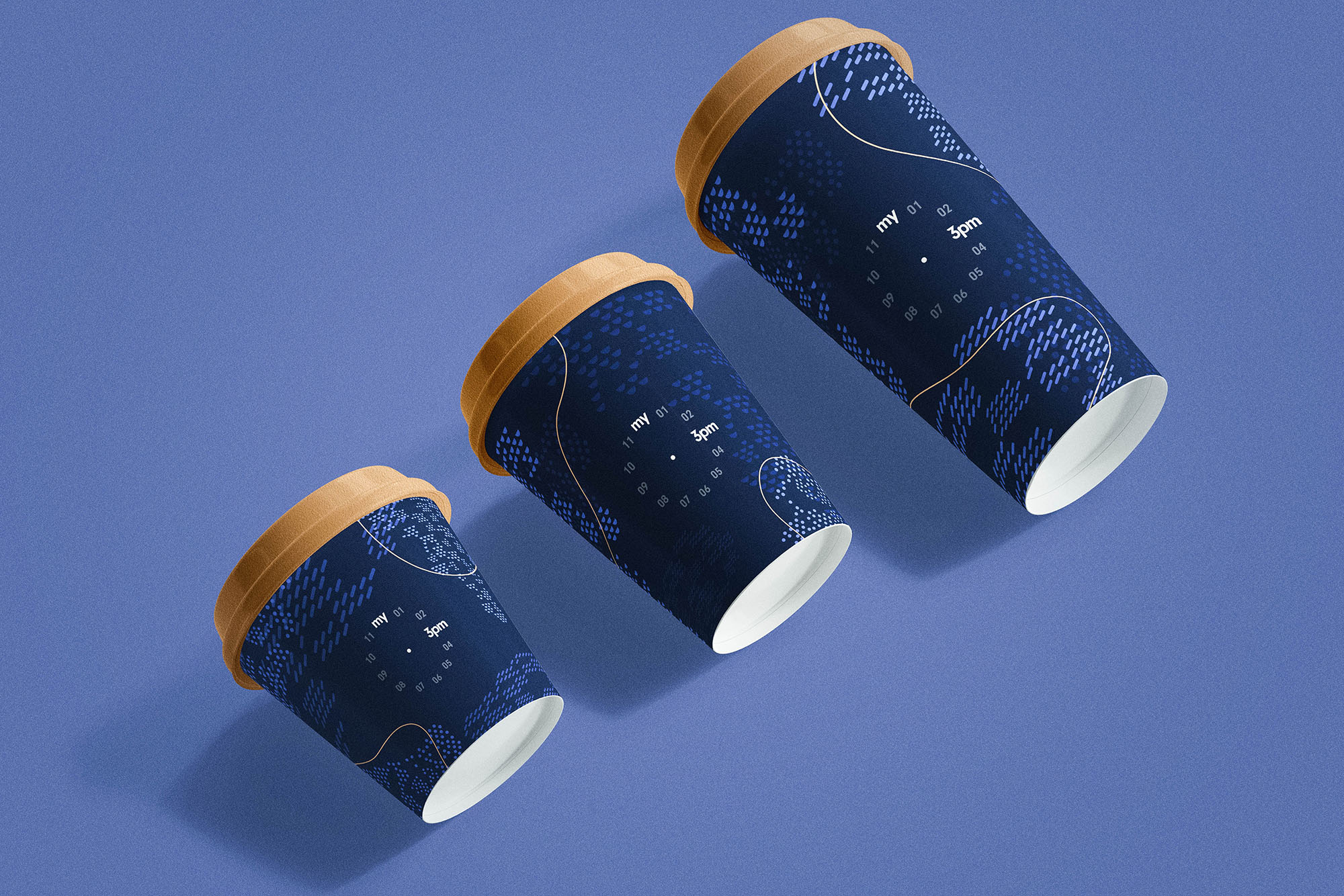
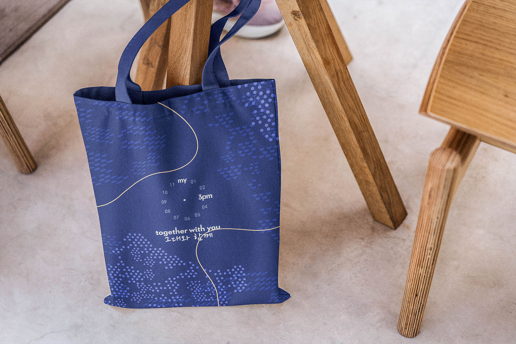
• LNM Production created two distinct logo marks for the Korean business: one that employed the grotesque typography style to represent my.3pm’s ideals, and one that employed the analog clock’s image as its central motif to represent the brand’s challenges toward conventional beliefs.
• Combining two unconventional typefaces: Neuzeit Grotesk and Le Havre, LNM Production created an identity with a casual yet bold and confident to represent my.3pm’s ideal, philosophy, and visions.
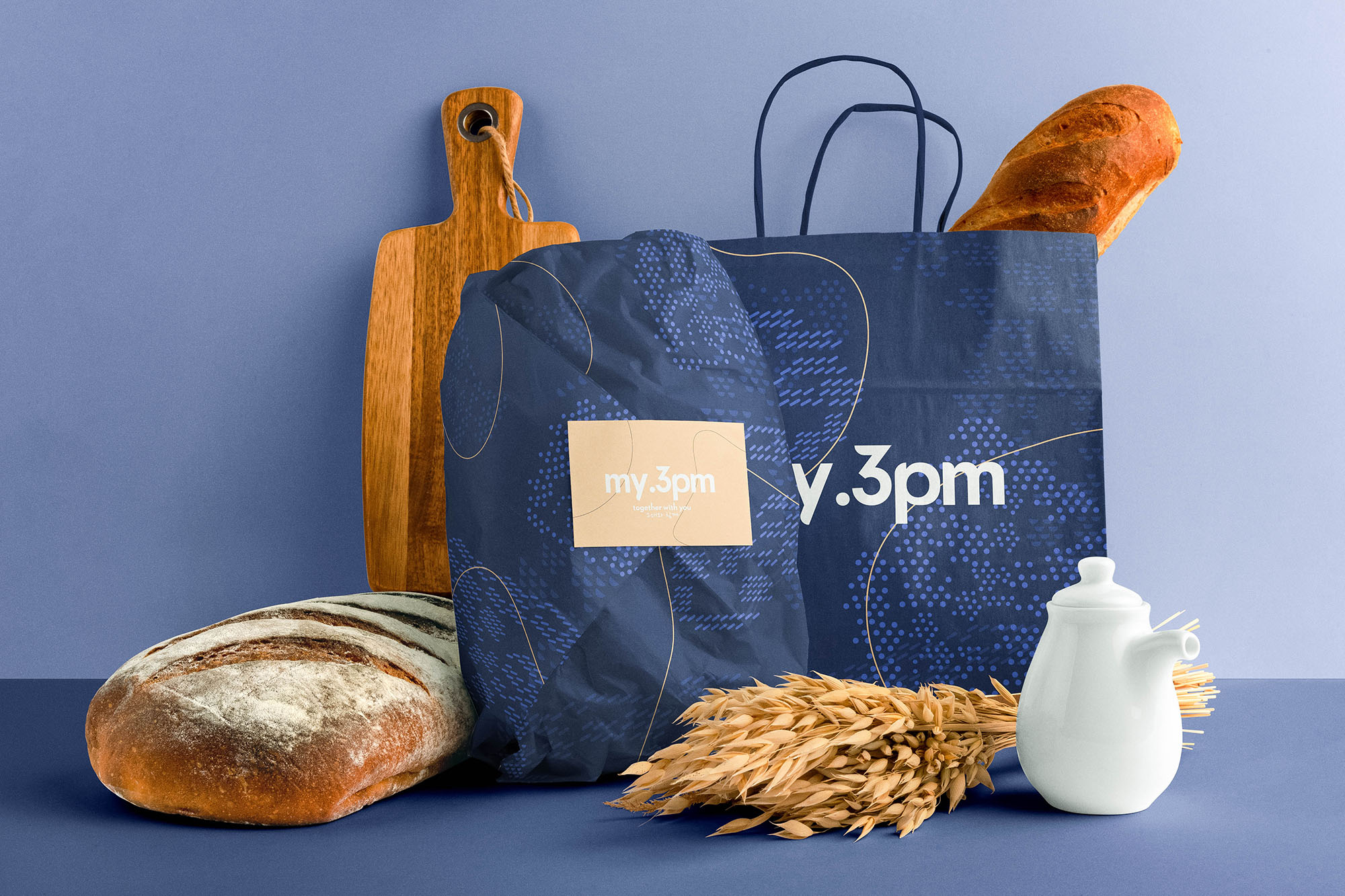
• In combination with a modular graphic motif system, which employed the image of the neighborhoods in Seoul, with only two colors: Cappuccino Orange and Seoul Navy, LNM Production created an easy to recognize packaging system that is not only attractive even for non-creative customers but also represents the original keywords and messages that the Korean business hoped to convey.
With the project completed, Sunyong Park, my.3pm’s Marketing Leader, commented: “With this new identity, we are looking forward to accelerating our expansion and are excited to become the companion for all of our customers.”

CREDIT
- Agency/Creative: Nhat Minh Ly / LNM Production
- Article Title: Development of Identity for a Korean Coffeehouse Chain
- Organisation/Entity: Agency
- Project Type: Identity
- Project Status: Published
- Agency/Creative Country: Japan
- Agency/Creative City: Tokyo
- Market Region: Asia
- Project Deliverables: Art Direction, Brand Experience, Brand Identity, Brand Redesign, Brand Strategy, Branding
- Industry: Food/Beverage
- Keywords: coffee coffeehouse korean business experience
-
Credits:
Creative Director/Art Director: Nhat Minh Ly
Marketing Team Leader: Sunyong Park
Project Manager: In-su Seok
Business Owner: Chang-il Kim


