Developing corporate identity for a JetLend crowdlending platform. JetLend is engaged in crowdlending: the company helps business to get funds through a special-purpose online platform. The brand is operating in a p2b (person-to-business) sector where individuals rather than banks act as lenders.
JetLend is engaged in small business lending only: they fit investors’ funds and borrowers’ needs together and work just like deposits and loans do, but with lower time expenditures and efforts on both sides.
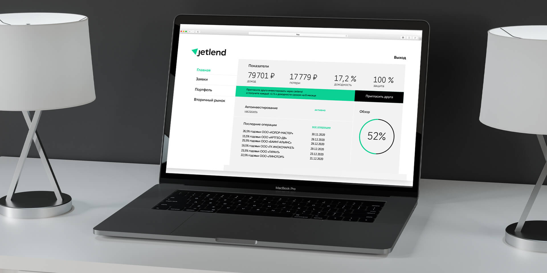
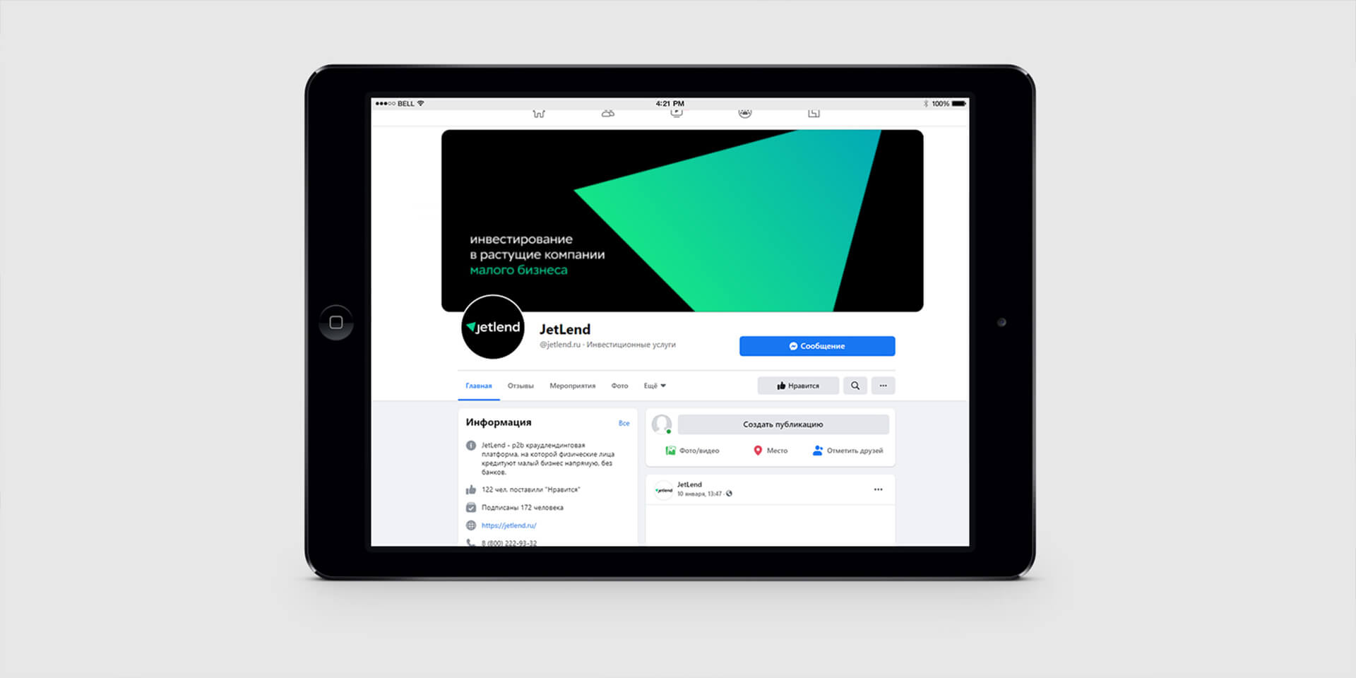
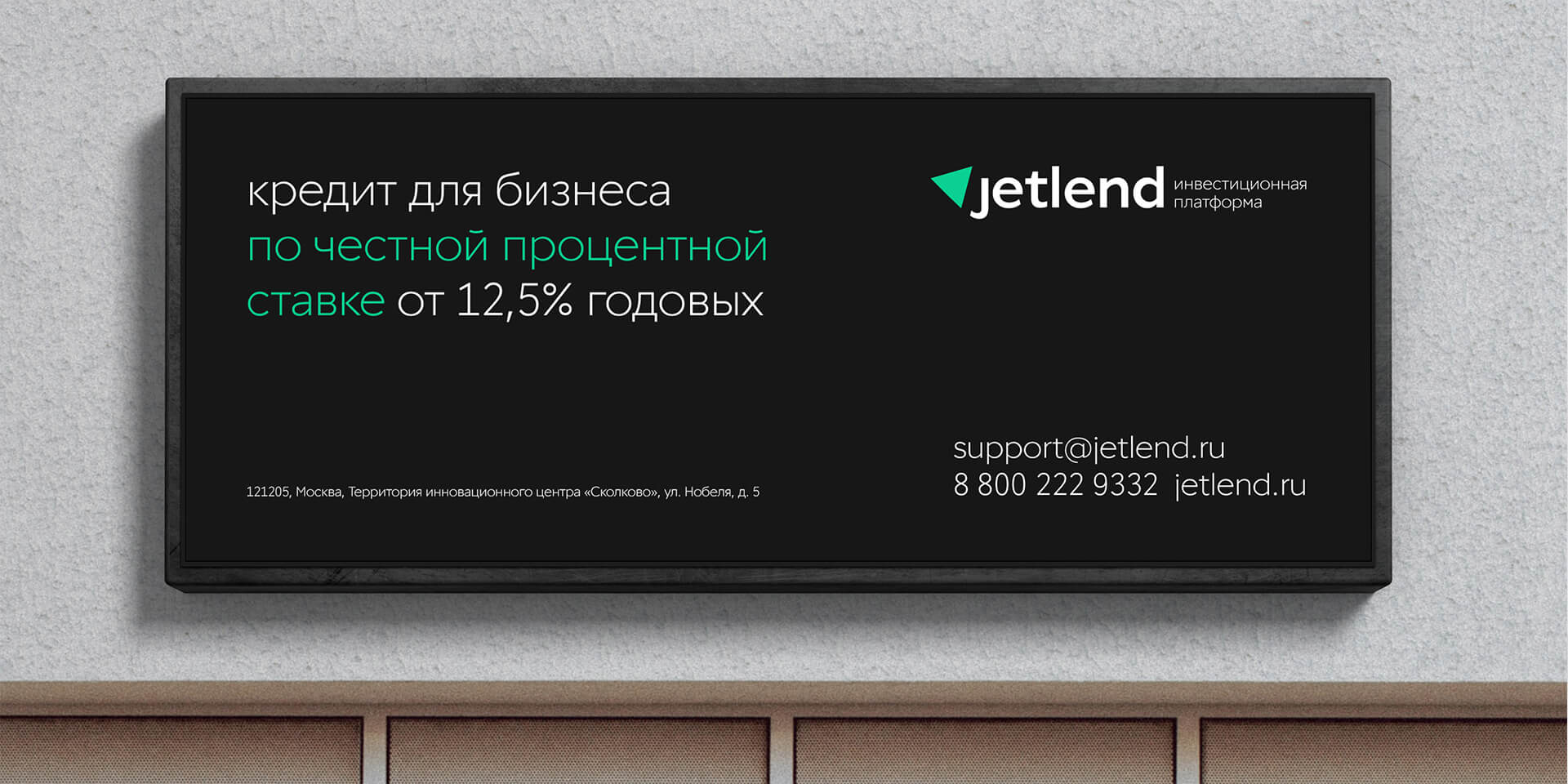
The initial corporate identity had been created at a start-up stage. Having moved to a new level, the brand needed a new image: more ambitious and flexible than those of classical banks. As far as the company largely operates online, its new style had to look seamless in the digital environment. Above all, it should impress on customers and investors the company’s reliability.
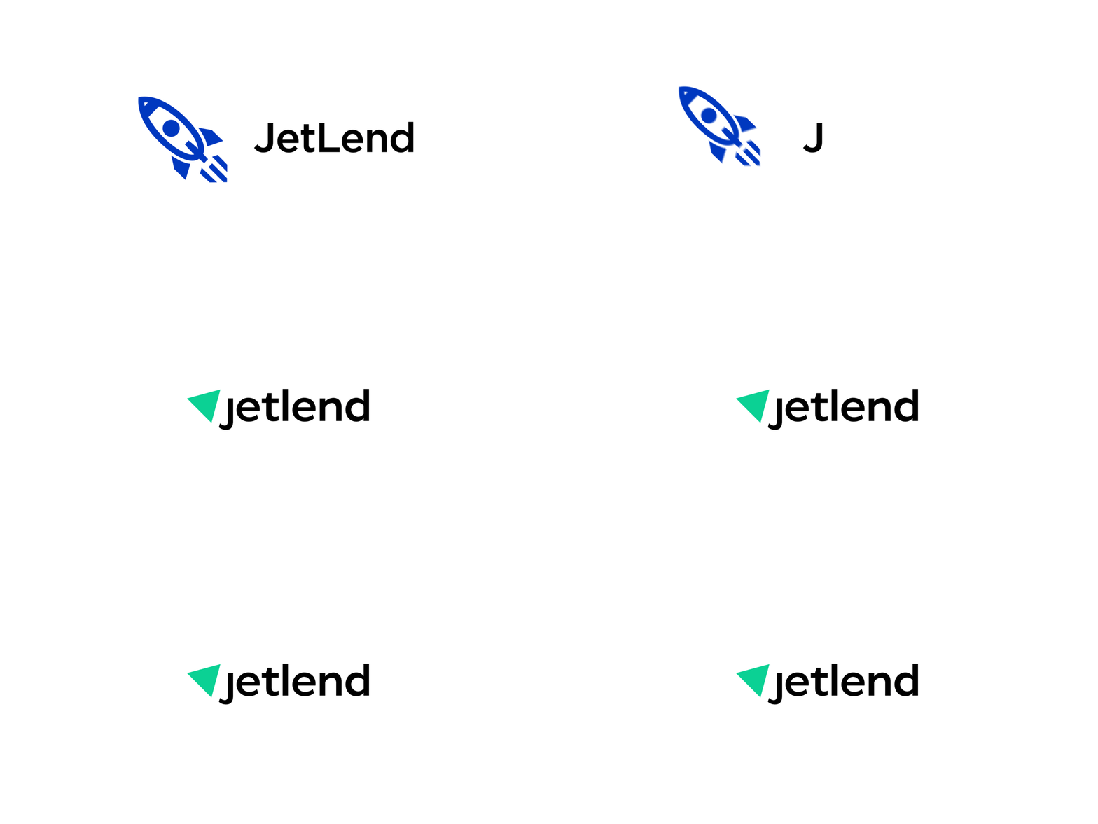
This is the name that had contributed to the initial logo selection. JetLend is composed of Jet (‘a personal aircraft, special service’) and lend (‘to borrow money’). It was important for the customer, to preserve this association while showing that the brand had gone far beyond the limits of a start-up.
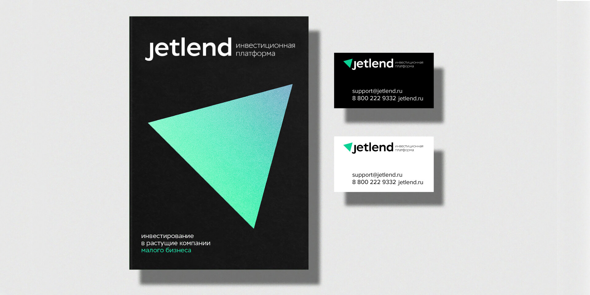
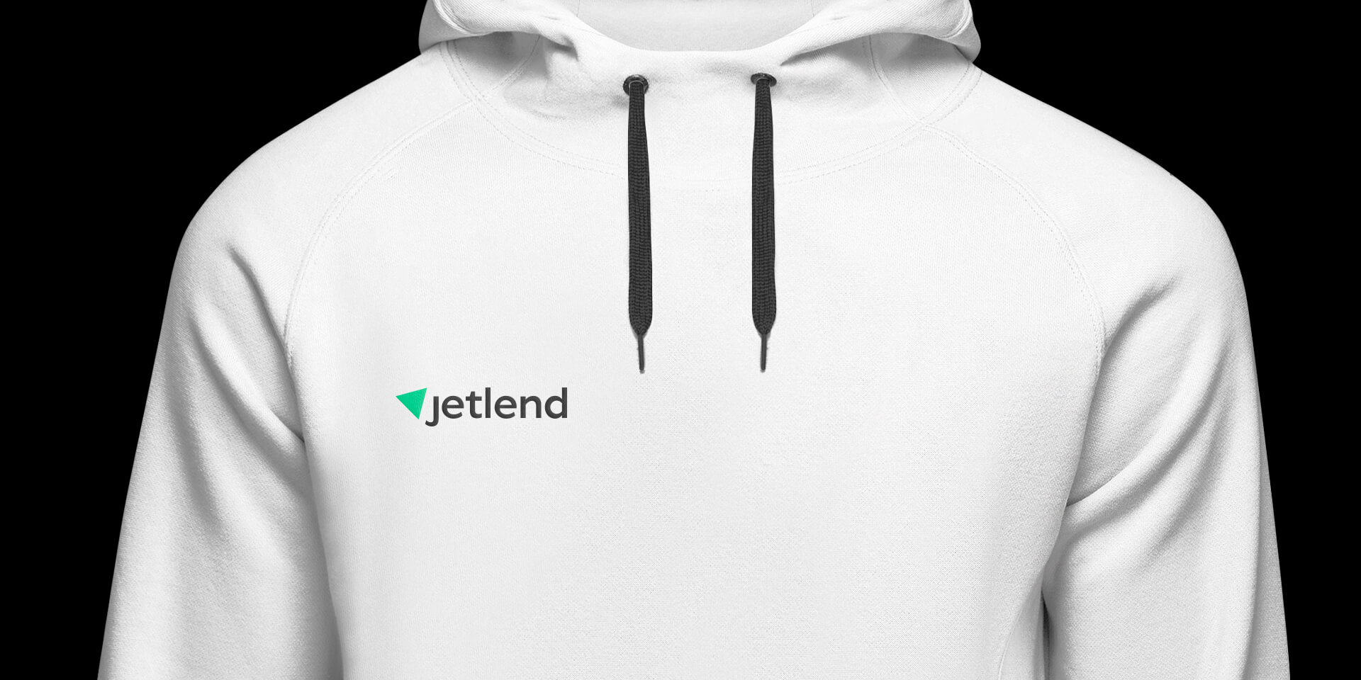
The rocket shape fits a triangle easily. It allows creating a stronger logo composition by changing the movement direction. It’s a bold claim to transform the rocket into a minimalist triangle: only a self-confident company can cut the bells and whistles by keeping the essence of the matter and have no fear to be extremely simple.
We use colors to evoke necessary associations: traditionally, turquoise green is perceived as the color of digital environment, and as a reference to the financial sector.
Today, crowdlending is one of the most up-to-date sectors of the financial market. The p2b method compels crowdlending brands to look both reliable and bold. Just as the new JetLend image is. It inspires confidence and makes the statement clear: the brand is neither a bank nor a start-up, but an independent financial platform.




CREDIT
- Agency/Creative: lovemedo branding agency
- Article Title: Developing Corporate Identity for a JetLend Crowdlending Platform
- Organisation/Entity: Agency, Published Commercial Design
- Project Type: Identity
- Agency/Creative Country: Russia
- Market Region: Europe
- Project Deliverables: Brand Identity, Branding, Product Architecture, Research, Tone of Voice
- Industry: Technology
- Keywords: startup / designoftheworld / identitydesign / brandidentity / branding / identity / visualstyle / logodesigner / creativelogo / logoconcept / logotypedesign


