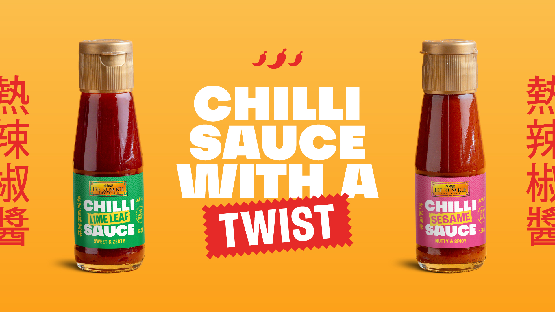
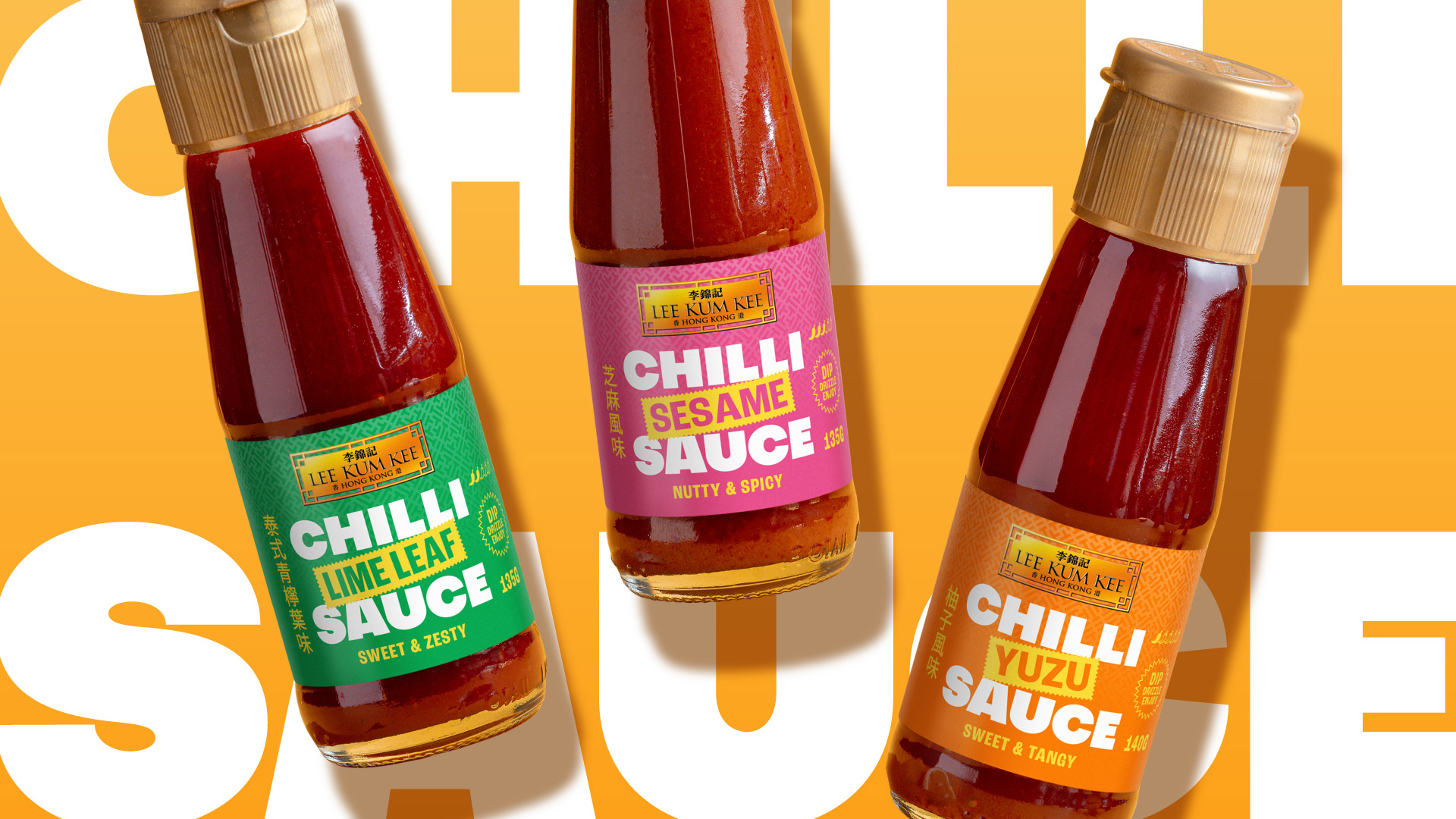
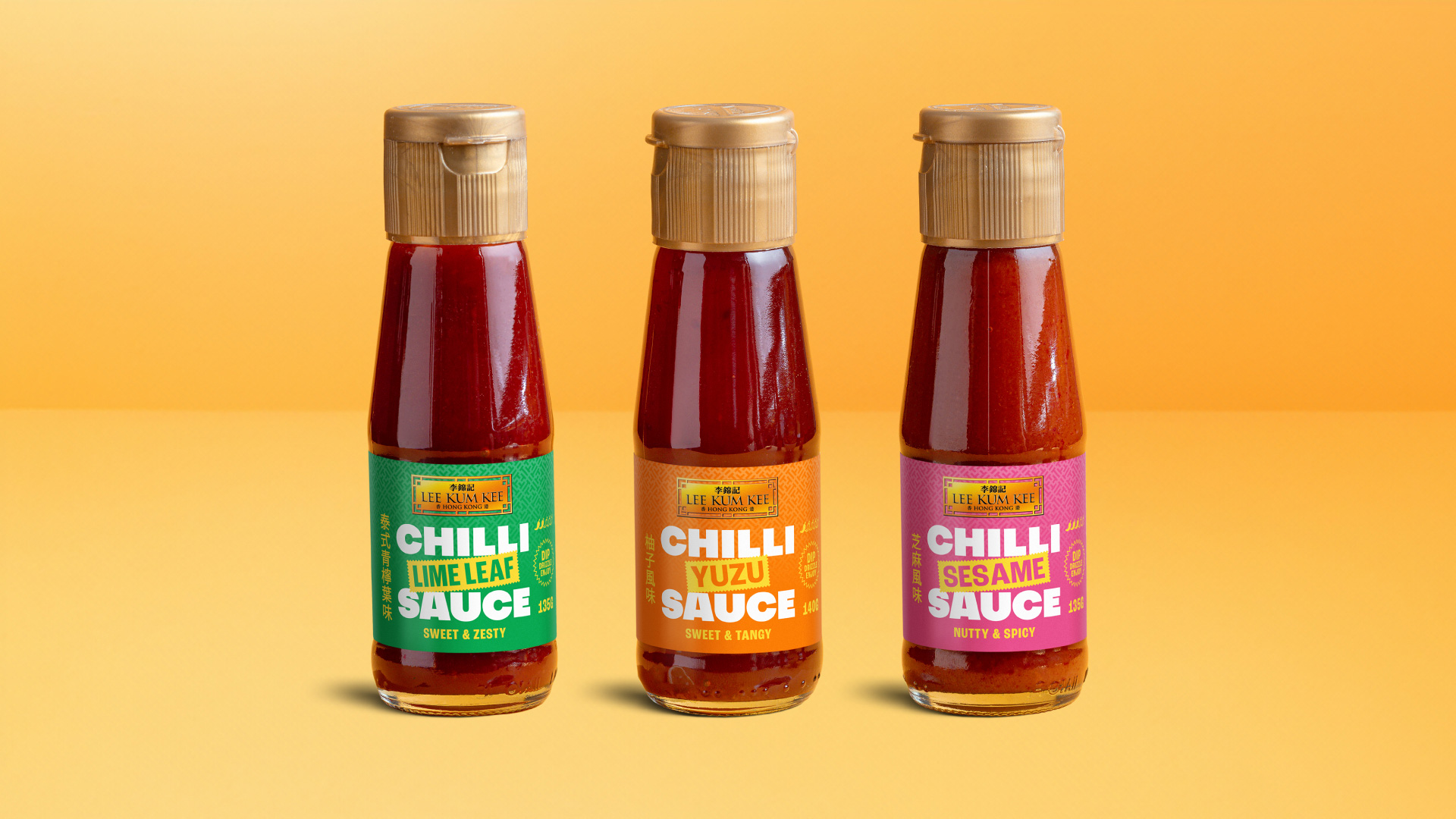
For over 135 years, Lee Kum Kee has been a global leader in Asian flavours, renowned for their commitment to quality and authenticity. Despite their extensive portfolio, they had never ventured into bottled hot sauces – until now. Deuce Studio was tasked with creating the packaging and brand identity for an Asian-inspired chilli sauce, featuring unique flavours like sesame, lime leaf, and yuzu, offering a distinctive twist on the classic condiment.
We started with an extensive market research process which led us to survey the target audience about what makes a chilli sauce stand out in a crowded market. Is it authenticity? Unique flavours? Or is it something entirely different? The results were in. Our target audience of Gen Z and Millennials were most attracted to chilli sauces that have simple, bold designs that feel authentic and inspire them to try new and exotic flavours. This insight provided the perfect strategic foundation for our new design.
Lee Kum Kee wanted the chilli sauce to feel new and different to their core range, but still have some elements that kept it part of the family, such as the golden plaque logo used across all their products, or the dual language product names in English and Chinese. We took onboard all of these requirements while creating a new chilli sauce that felt unique for the market yet distinctly authentic to the Lee Kum Kee brand story.
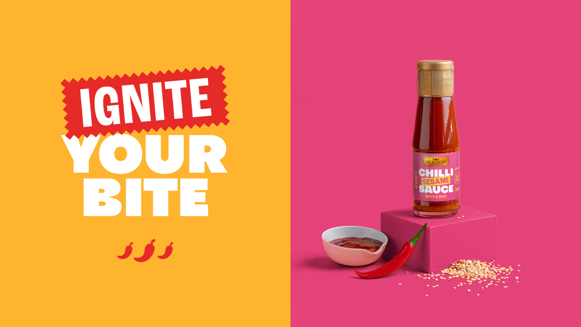
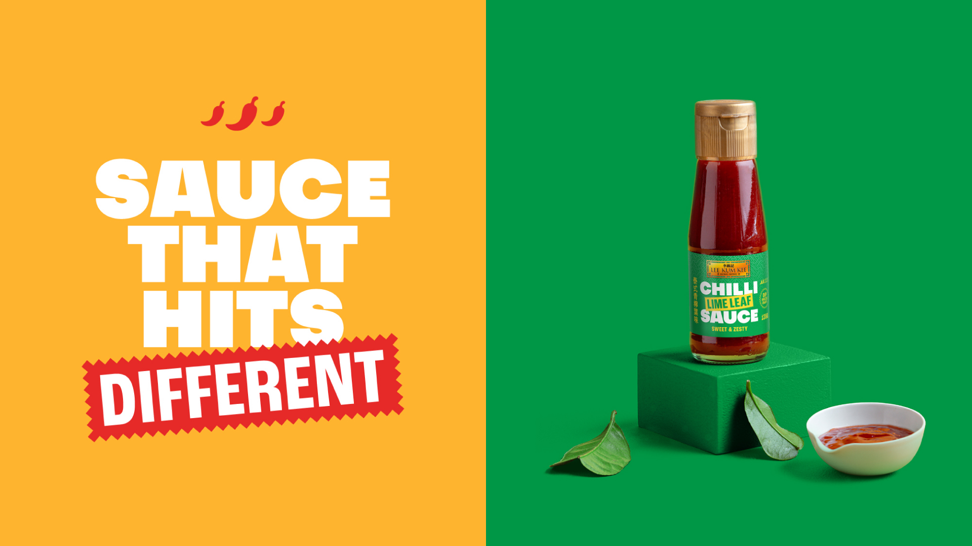
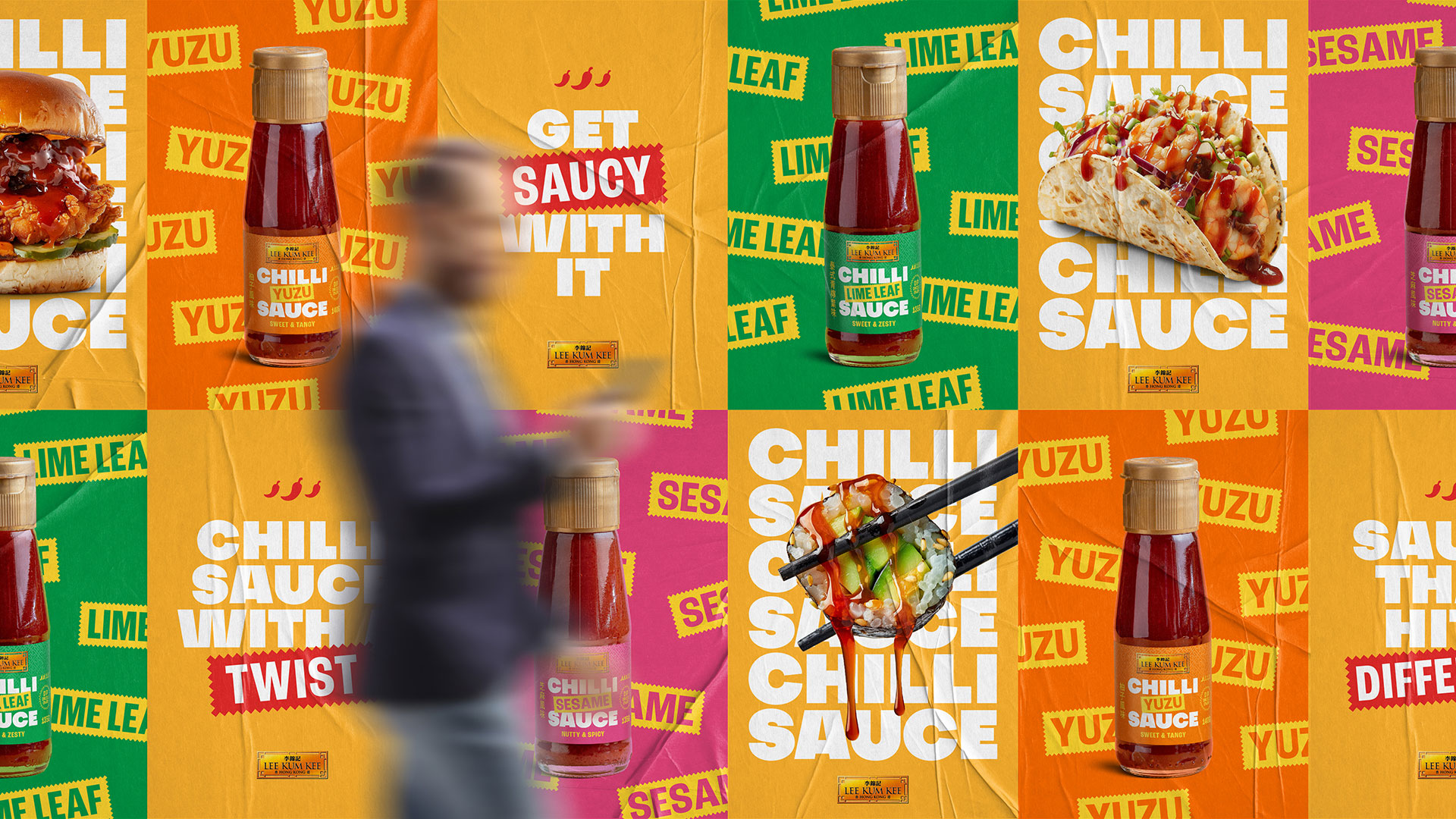
With the brief and Lee Kum Kee’s rich history in mind, we took inspiration from Asian culture by combining jagged badges, a strict grid system of elements including Chinese lettering and large bold typography to feel authentic but new. The large bold typography also helps to increase the label’s ability to be seen on the shelf and makes the most of the small label size. We also used a bright and youthful colour scheme that not only felt fresh but also reflected the Lee Kum Kee golden plaque logo and the unique flavours of the sauces. Lastly, we included their iconic brand pattern in the background, tying in with the Lee Kum Kee product portfolio.
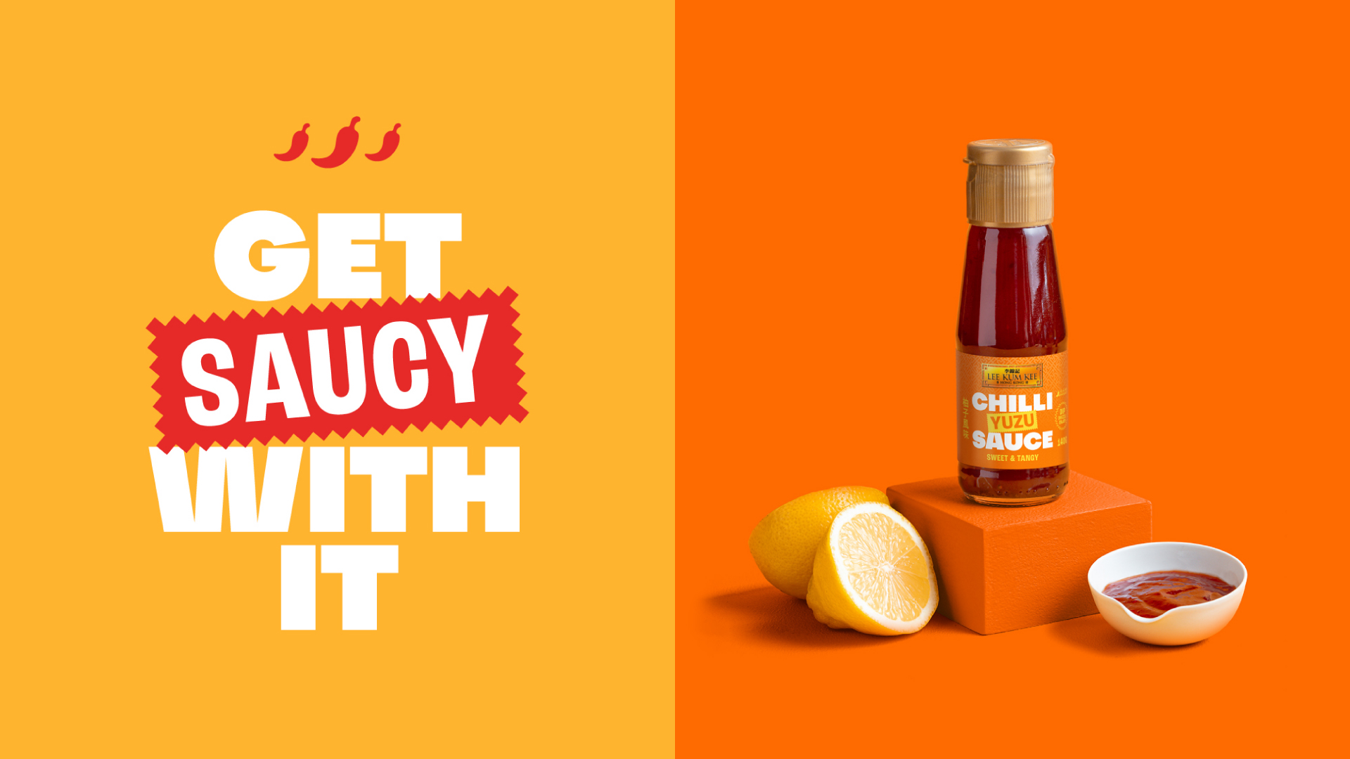
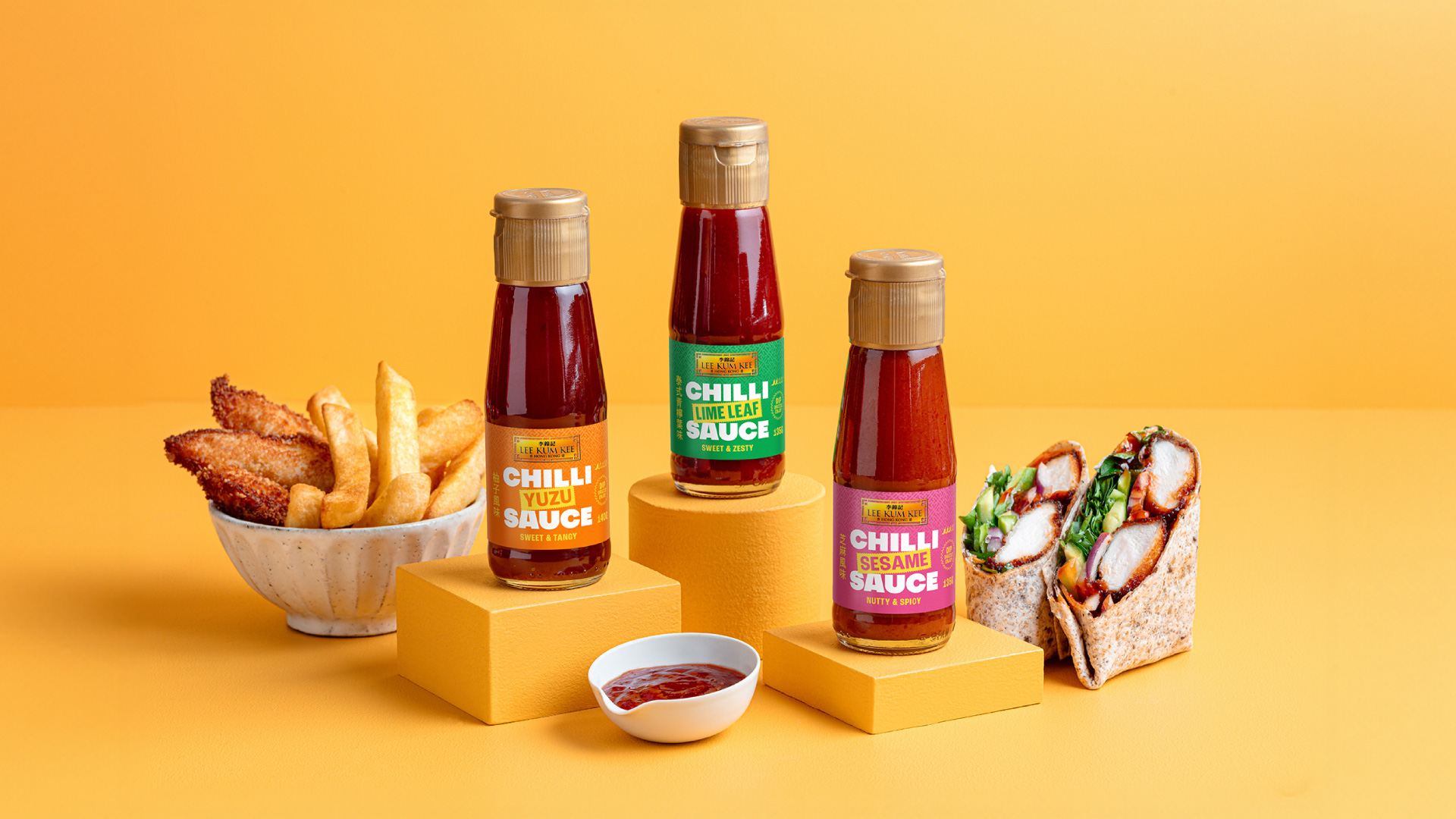
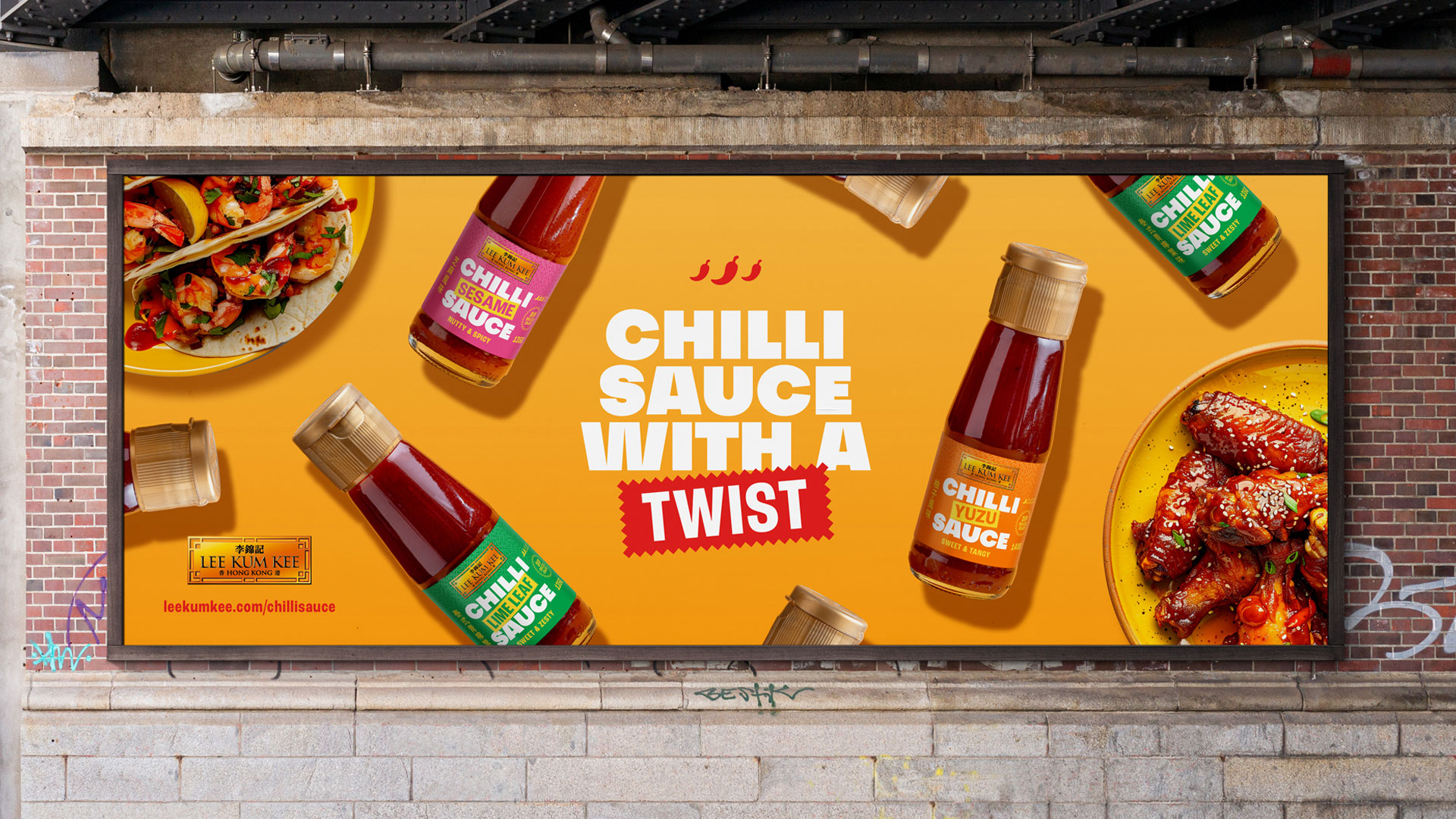
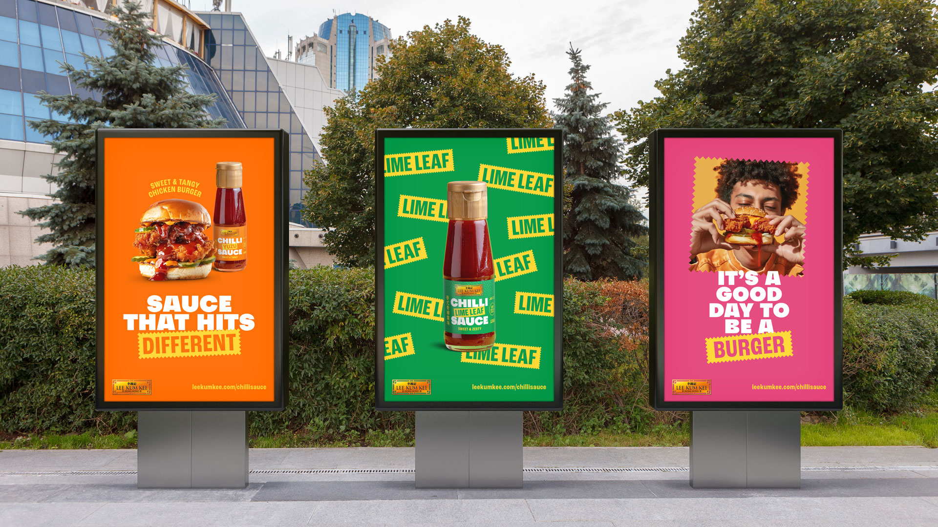
Once the label design was created, we applied the design to the overall brand world, including print and digital applications such as social media and out-of-home advertising in a playfully impactful way. We used the jagged badges as stickers to emphasise certain words in key copy, extended the jagged lines to become holding devices for imagery, and finally combined this with enticing close-up food photography dripping with chilli sauce to add that extra taste factor.
Product Photography by Hikaru Funnell
CREDIT
- Agency/Creative: Deuce Studio
- Article Title: Deuce Studio Designs The Packaging For Lee Kum Kee’s New Chilli Sauce With A Twist
- Organisation/Entity: Agency
- Project Type: Packaging
- Project Status: Published
- Agency/Creative Country: United Kingdom
- Agency/Creative City: London
- Market Region: Europe
- Project Deliverables: Advertising, Advertising Photography, Art Direction, Brand Creation, Brand Design, Brand Identity, Brand Strategy, Brand Tone of Voice, Brand World, Branding, Food Photography, Graphic Design, Motion Graphics, Packaging Design, Packaging Guidelines, Photography, Photography Styling, Product Photography
- Format: Bottle
- Industry: Food/Beverage
- Keywords: chilli sauce hot glass bottle lee kum kee youthful bold colourful gen z millennial asian yuzu lime leaf sesame packaging branding design
-
Credits:
Brand & Packaging Design Agency: Deuce Studio


