


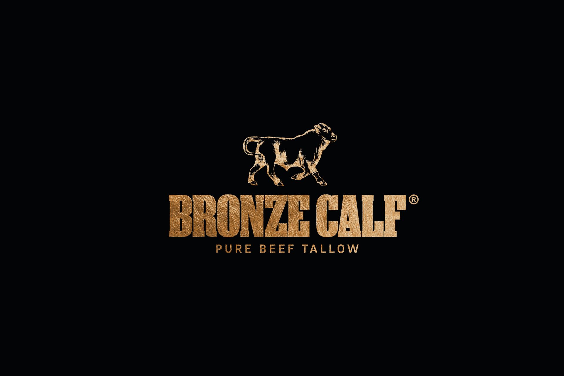
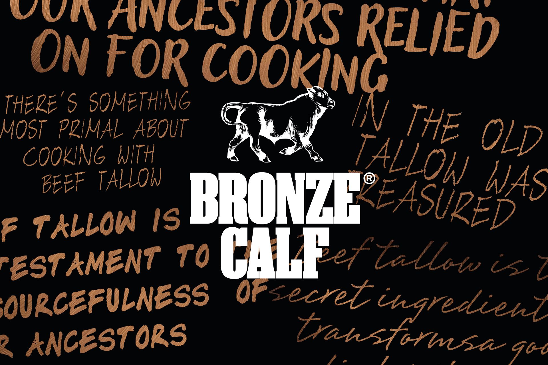
Bronze Calf is a premium beef tallow brand that celebrates the rich heritage of cattle farming and the wholesome, traditional benefits of tallow. The branding for Bronze Calf was developed to embody strength, tradition, and authenticity, appealing to consumers who value quality and a connection to the land. Central to the visual identity is a prominent cattle icon – a bold, stylised silhouette of a steer, designed to evoke the rugged essence of Britain’s pastoral landscapes and the brand’s deep ties to its bovine origins. This striking symbol serves as a versatile foundation, anchoring the brand across all touchpoints, from packaging to marketing materials.
Typography plays a crucial role in reinforcing Bronze Calf’s identity, with the use of strong, stencil-style lettering. This choice reflects durability and a straightforward attitude, reminiscent of cattle branding tools and practical farm aesthetics. The stencil type enhances readability while infusing the brand with a modern, industrial flair, striking a balance between heritage and contemporary appeal. The typeface was carefully chosen to command attention and complement the cattle icon, creating a unified and memorable visual language.
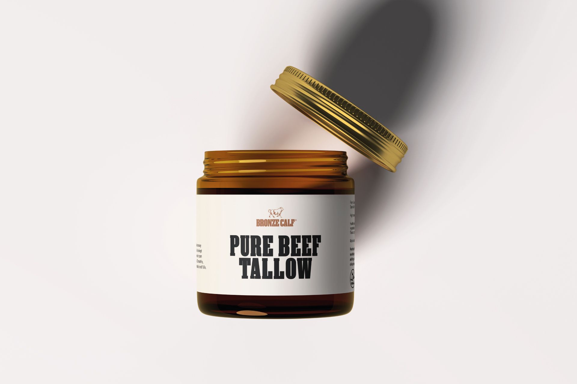
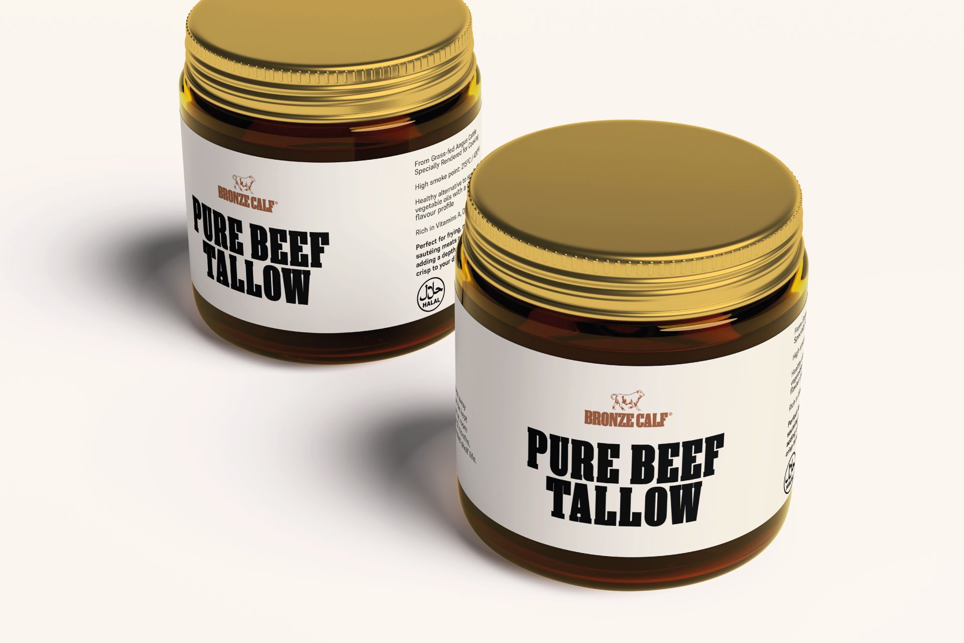
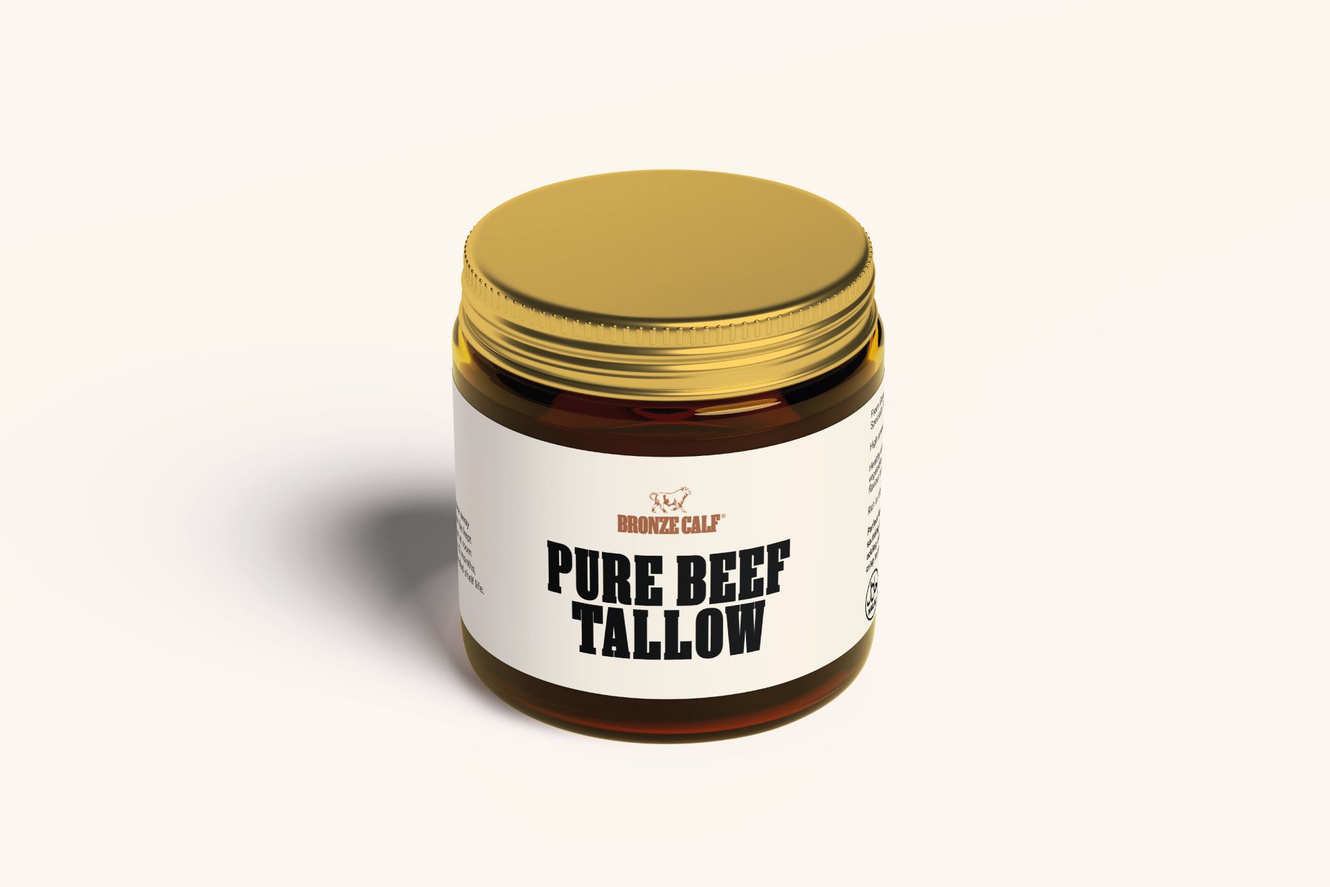
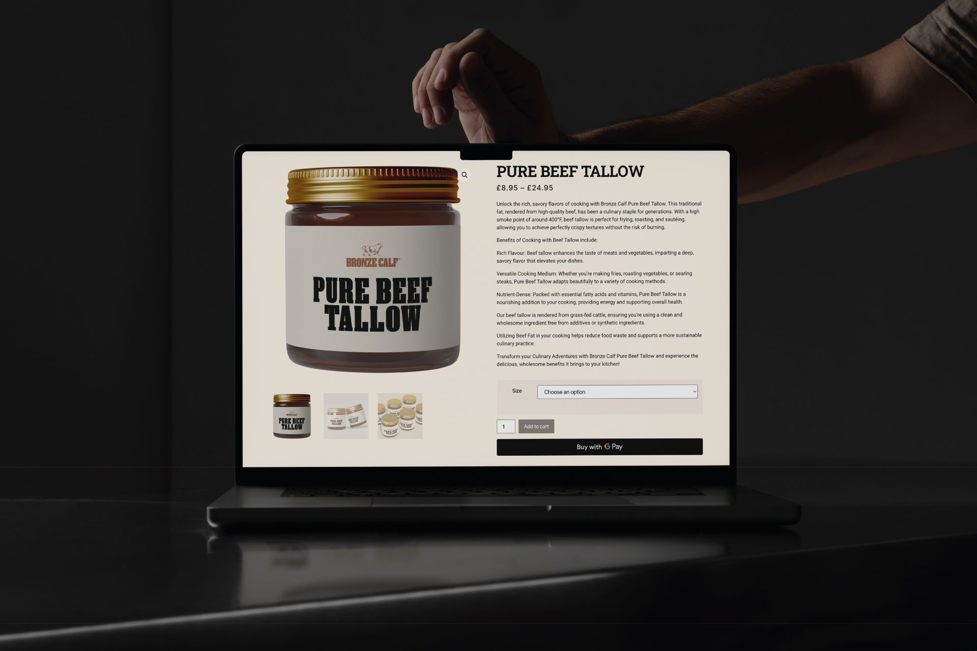
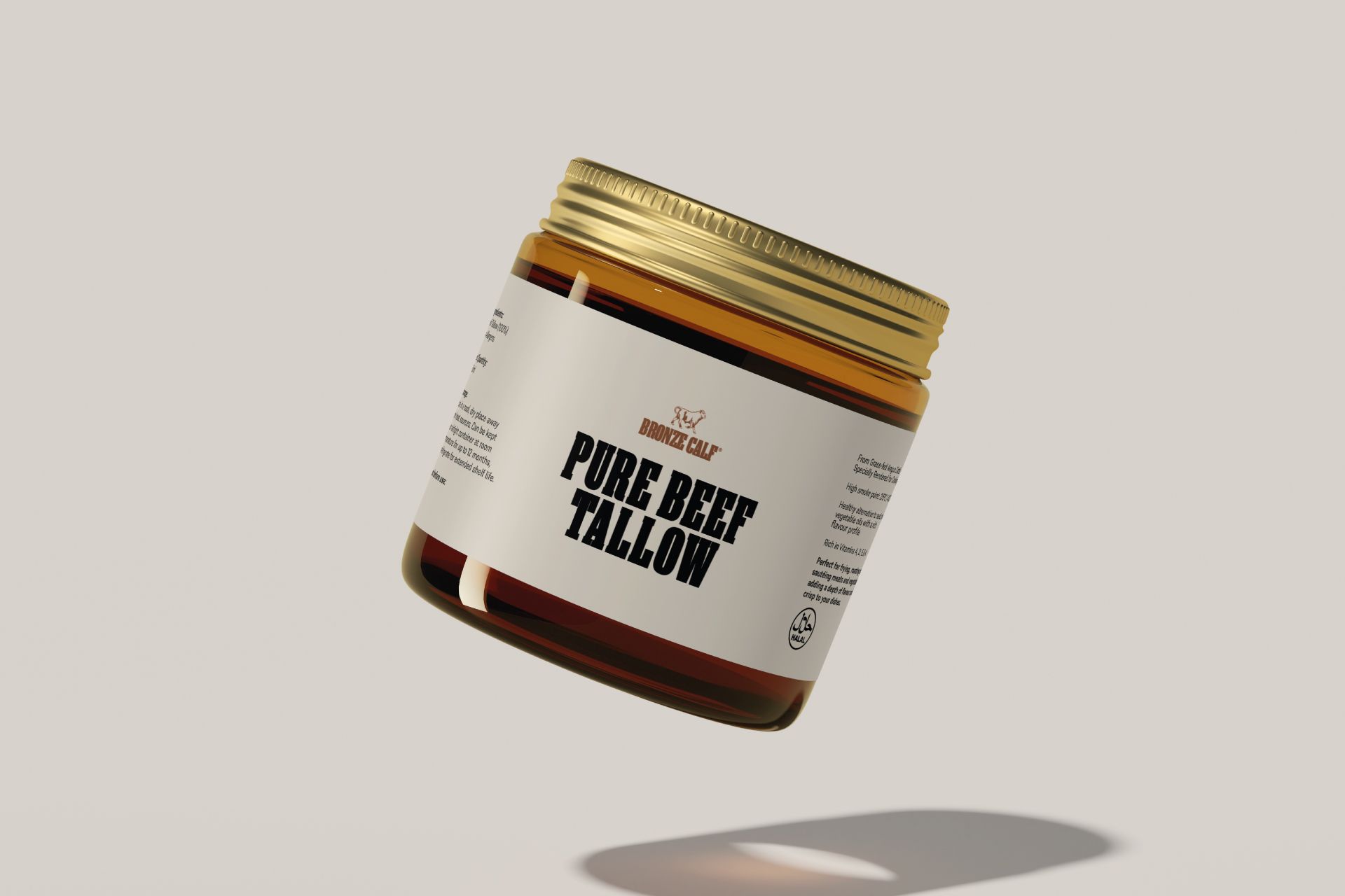
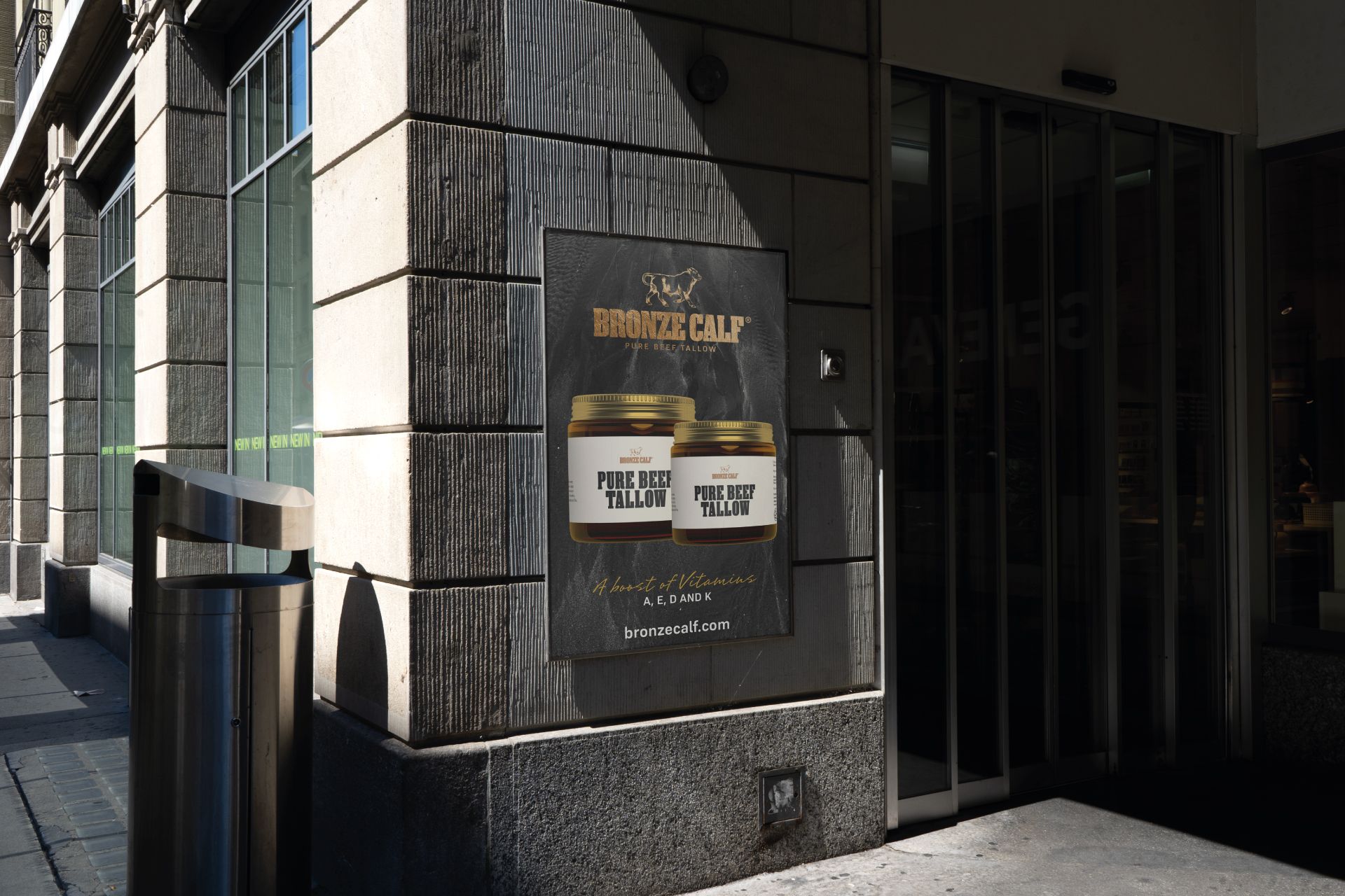
A significant aspect of the branding project was the packaging design for Bronze Calf’s tallow jars. The jars were conceived to be both functional and visually striking, designed to stand out on shelves whilst conveying the product’s superior quality. The cattle icon takes pride of place on the label, paired with the stencil typography to clearly present the brand name and product details. Earthy, bronze-hued accents pay homage to the brand name and the natural purity of beef tallow, while clean lines and a minimalist layout ensure the design feels approachable yet refined. The packaging blends rustic charm with modern sophistication, appealing to a broad audience—from culinary enthusiasts to those passionate about natural wellness.
In essence, the branding for Bronze Calf tells a story of heritage, strength, and purity, brought to life through a distinctive cattle icon, robust stencil typography, and carefully crafted jar packaging. This cohesive identity positions Bronze Calf as a standout in the market, resonating with consumers who seek authenticity and excellence in every spoonful.
CREDIT
- Agency/Creative: De:strukt Studio
- Article Title: De:strukt Studio Defines Bronze Calf’s Identity with a Powerful Cattle-Inspired Aesthetic
- Organisation/Entity: Agency
- Project Type: Packaging
- Project Status: Published
- Agency/Creative Country: United Kingdom
- Agency/Creative City: Edinburgh
- Market Region: Global
- Project Deliverables: Brand Design, Packaging Design, Web Design
- Format: Jar
- Industry: Food/Beverage
- Keywords: Beef Tallow
-
Credits:
Creative Director: Riccardo Chapman


