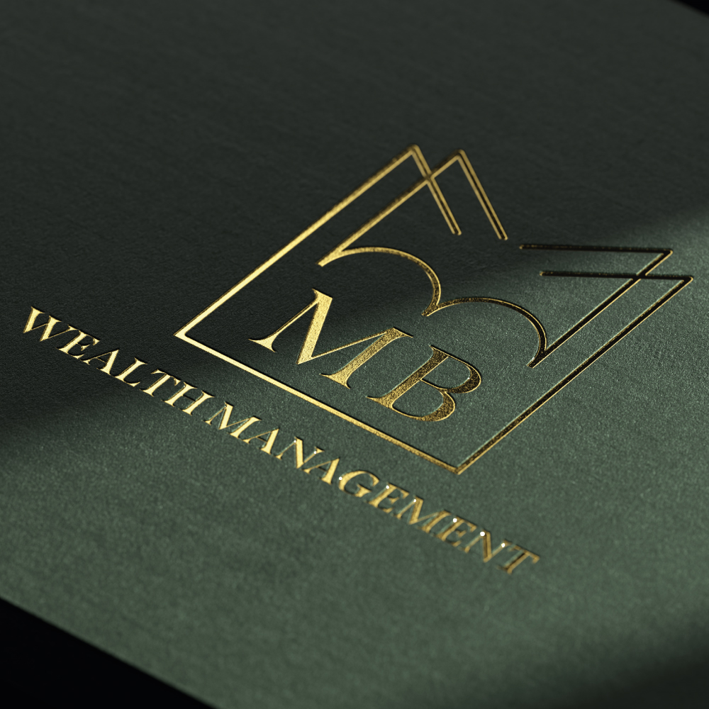
Founded by Morad Bhatti, MB Wealth Management is based in Glasgow and its aim is to provide bespoke and tailored financial advice to both private and corporate clients across the United Kingdom. The owner had previously worked with IFA’s across the UK as an Investment Consultant helping clients build a robust Investment Planning Process and streamlined business model.
Understanding that talking about money and finances is personal. So, it’s reassuring to know that MB Wealth Management have someone on hand who can help address your needs, understand your goals and help you realise your dreams.
We created a brand identity as well as a logo marque, business cards, letterheads, social media assets and fresh new style guidelines to set this young company apart from the “oldies”. The logo marque is in a geometric shape consisting of the initials “MBW”.
The client wanted options of the branding to show the full name of the company and the minimal logo marque on its own that way it becomes a more recognisable brand in the future in the wealth management sector.
The primary colour palette is made up of three colours; black, green and yellow/gold. In physical applications, the yellow colour is sometimes replaced with a gold foil. Mainly the companies stationery materials.
Along with the logo marque, we also introduced a new typeface, Span, an elegant font that bridges the contemporary and traditional, which would be used across the companies social media platforms. We based the colours of the branding on the GF Smith paper stock that way all of the stationery colour matched all of the print materials.
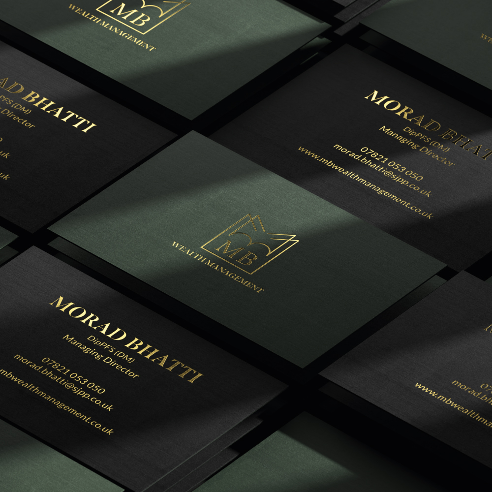
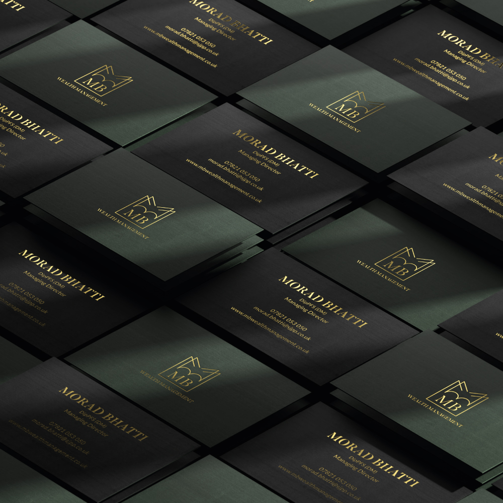
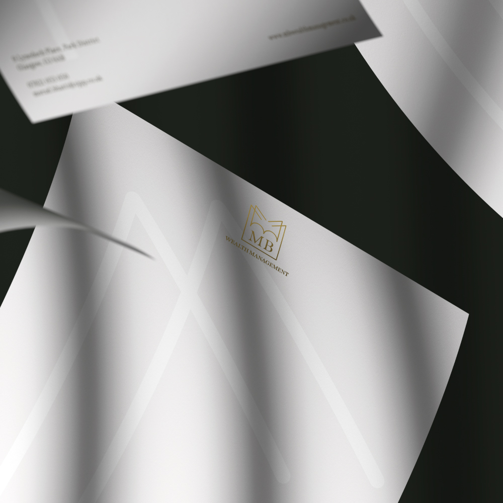
An elegant range of stationery was designed, using subtle means to great effect. Bespoke envelopes were designed and manufactured, to hold letters and invoices. The business cards are premium quality, printed in a gold foil on a racing green and ebony black GF Smith paper stock. The gold foil shows off the high standard the company sets itself from its competitors.


CREDIT
- Agency/Creative: Destrukt Studio
- Article Title: Destrukt Studio Branding for an Established Wealth Management Company
- Organisation/Entity: Agency, Published Commercial Design
- Project Type: Identity
- Agency/Creative Country: United Kingdom
- Market Region: Europe
- Project Deliverables: Brand Identity, Brand Naming, Brand Strategy, Branding, Tone of Voice
- Industry: Financial
- Keywords: Wealth Management, Corporate, Branding, Logo


