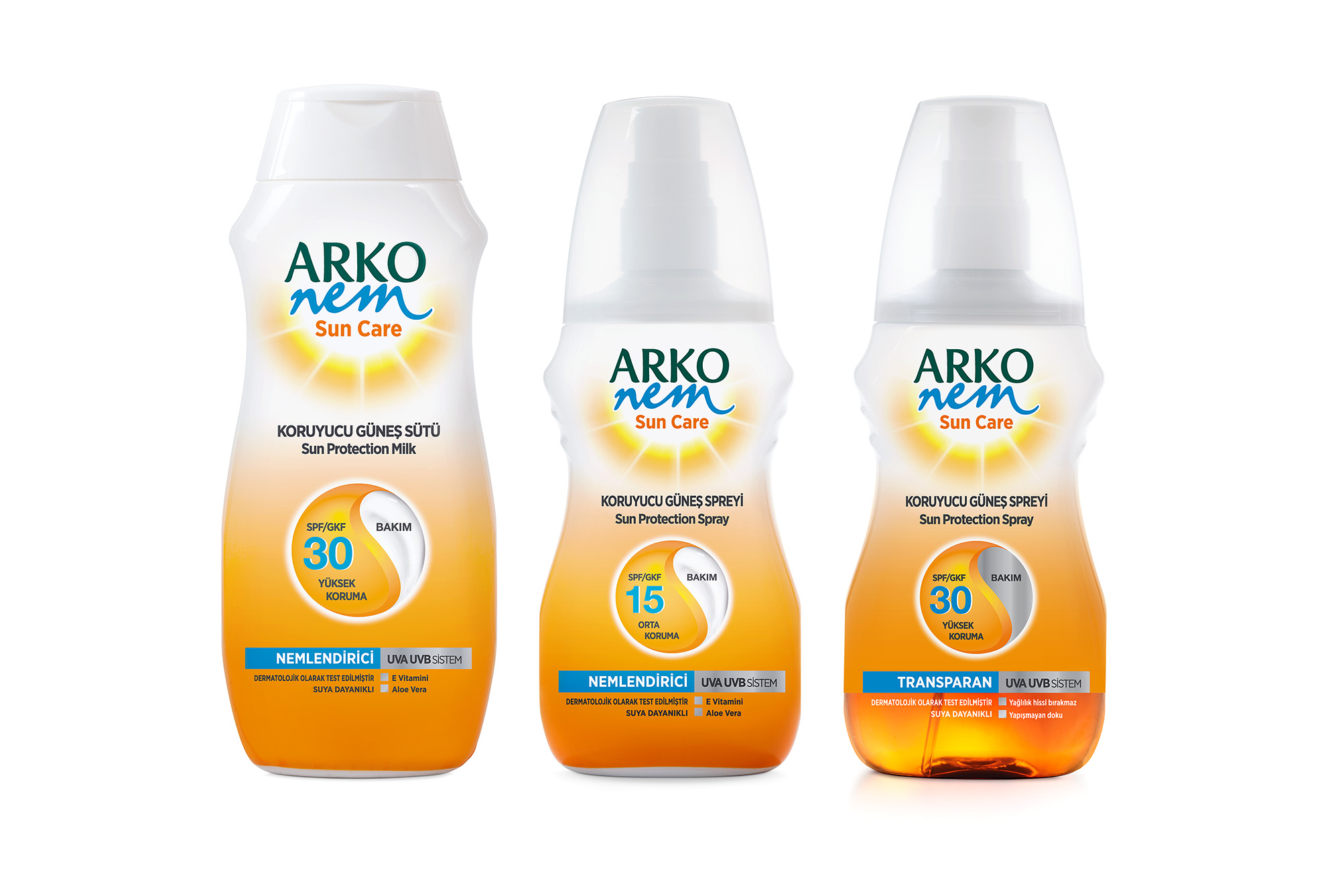
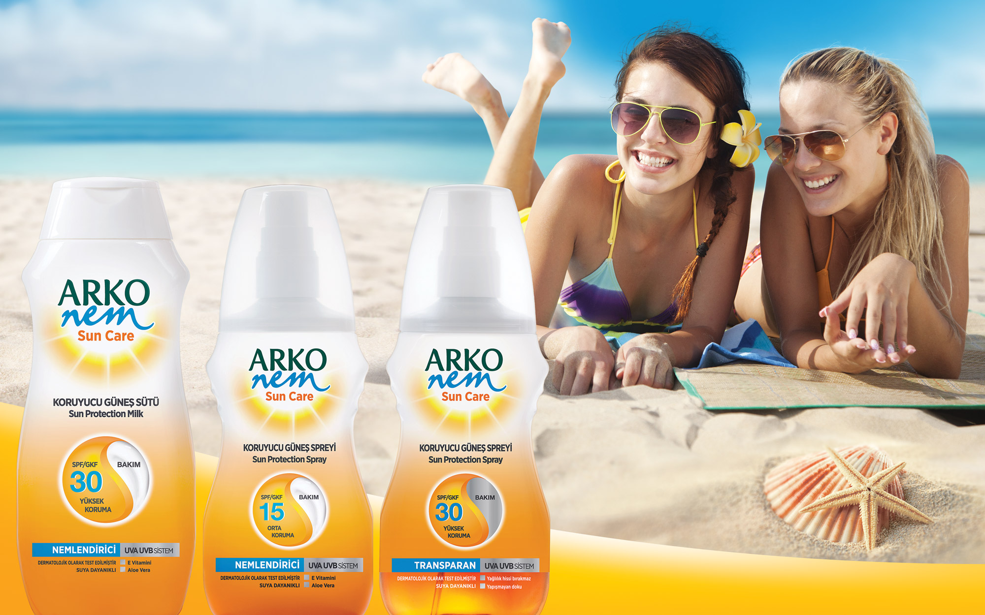
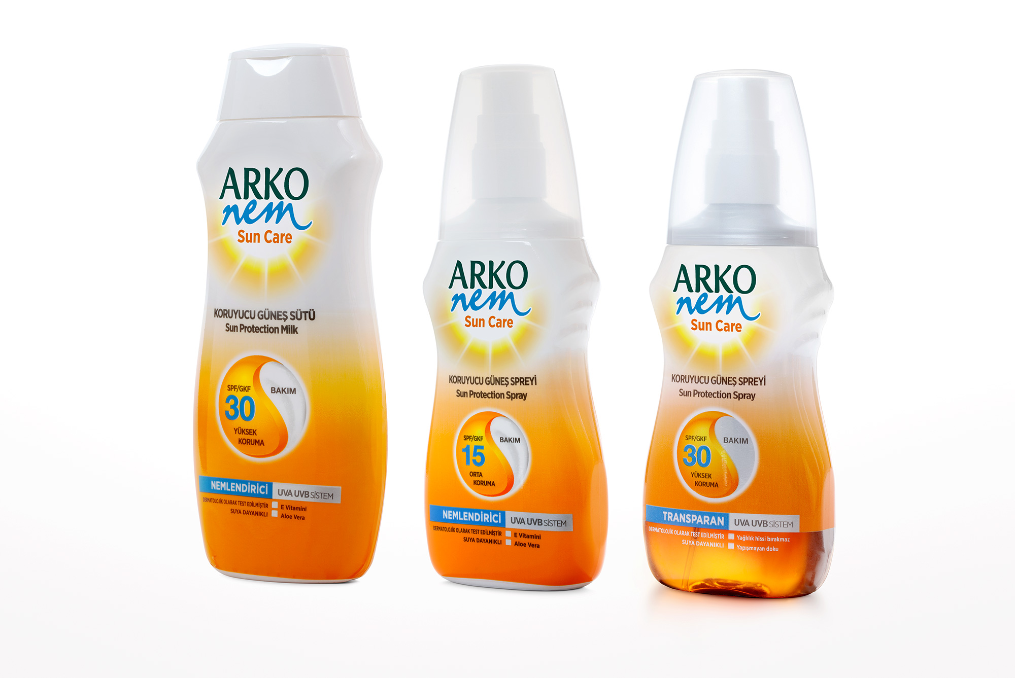
The purpose of the sun placed on the sleeve label in fading white- orange ground color used for the sake of providing graphical integrity to the packing group designed considering the hand anti-slip and practical use features, was to create an eye- catching effect with its circular yin-yang shape.
The packing designs of Arko Nem Sun care products display protuberances on the upper right and left shoulders , which are intended to provide hand anti-slip and practical use characteristics. The purpose of using the sleeve label for all the renewed members of the product family was to use the same design language for all. The desired graphical integrity effect was acquired by using the white color starting from the plastic cap on top and making it fade towards the middle where it turned into orange and spread all over the packing. The sun image which is important for the product category was used in the region under the logo, on white background. Both the protection factor information and the care emphasis were provided by placing the yin- yang symbol in the circular area in the center of packing . The product information was placed in a simple and comprehendible style in the undermost section.


CREDIT
- Agency/Creative: design VENA
- Article Title: DesignVENA Create New Sun Care Packaging Design
- Organisation/Entity: Agency, Published Commercial Design
- Project Type: Packaging
- Agency/Creative Country: Turkey
- Market Region: Multiple Regions
- Project Deliverables: Brand Architecture, Branding, Graphic Design, Industrial Design, Packaging Design, Product Architecture, Rebranding, Structural Design
- Format: Bottle
- Substrate: Plastic


