


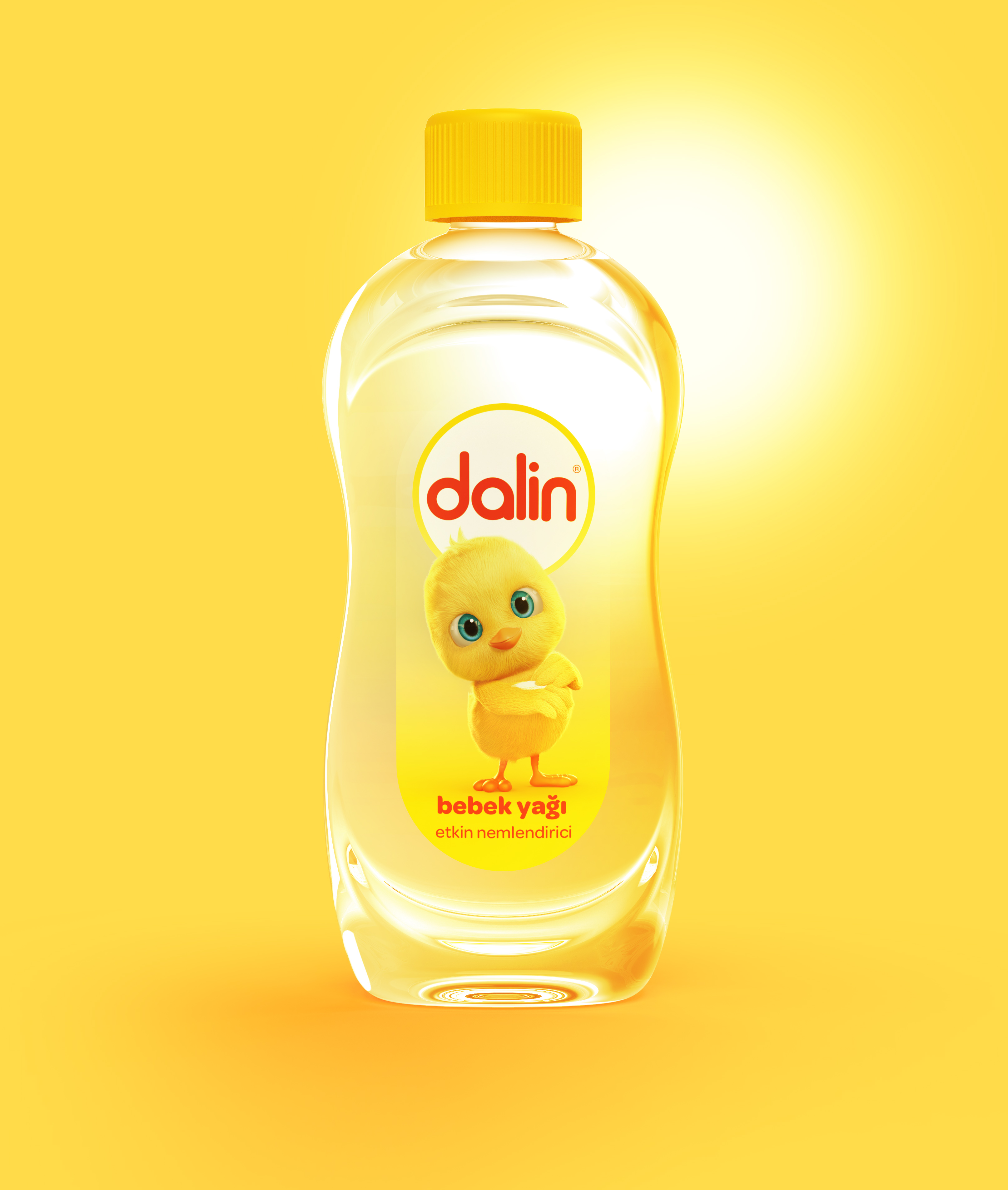
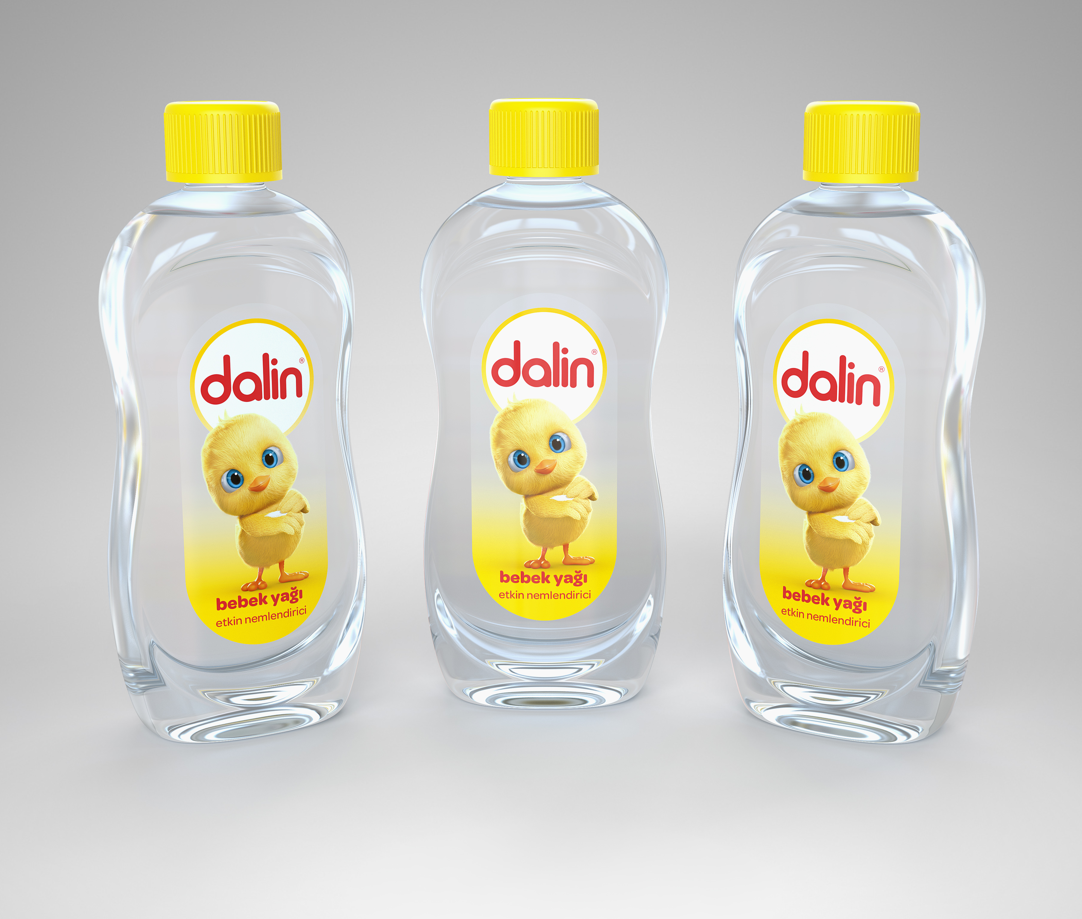
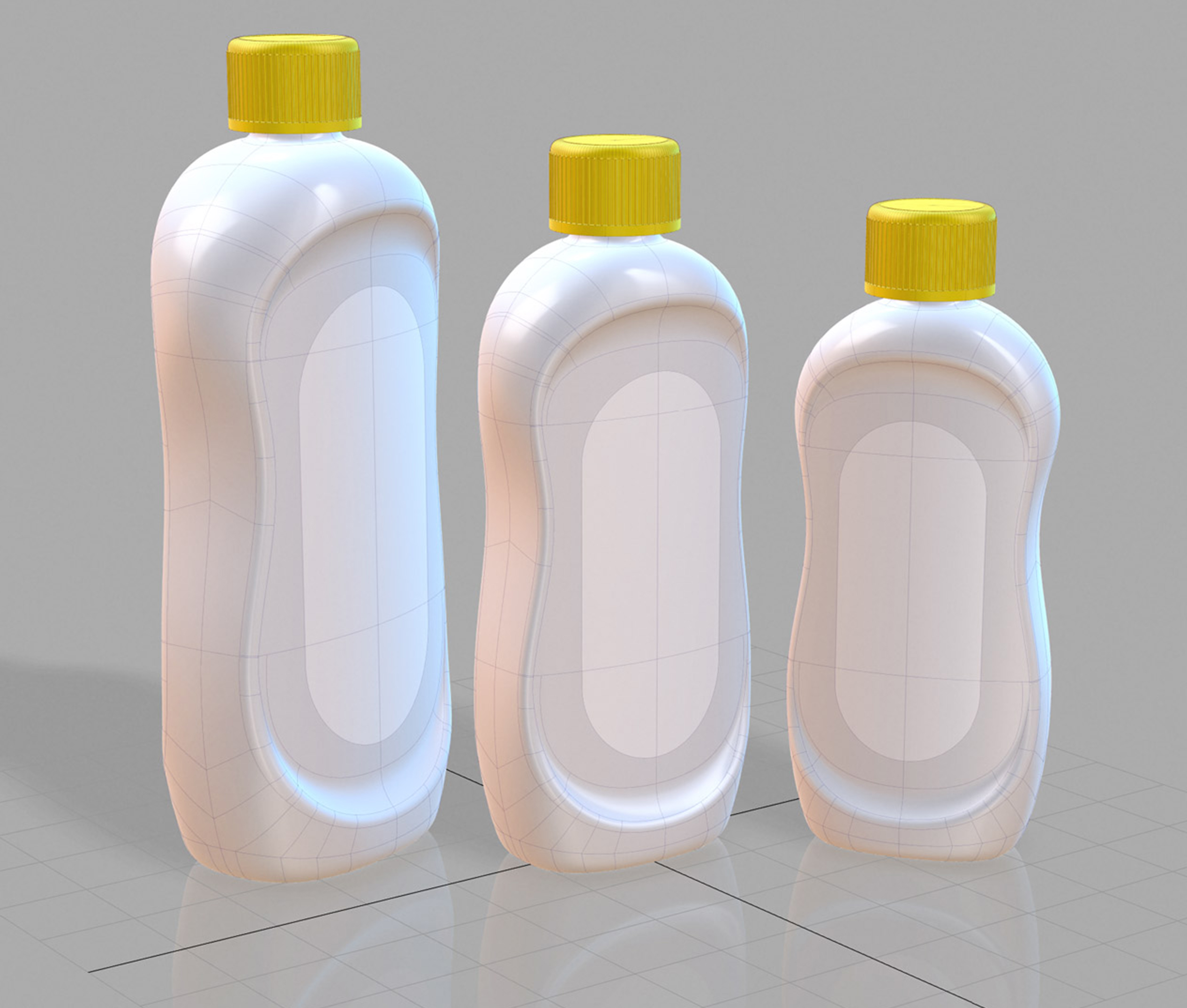
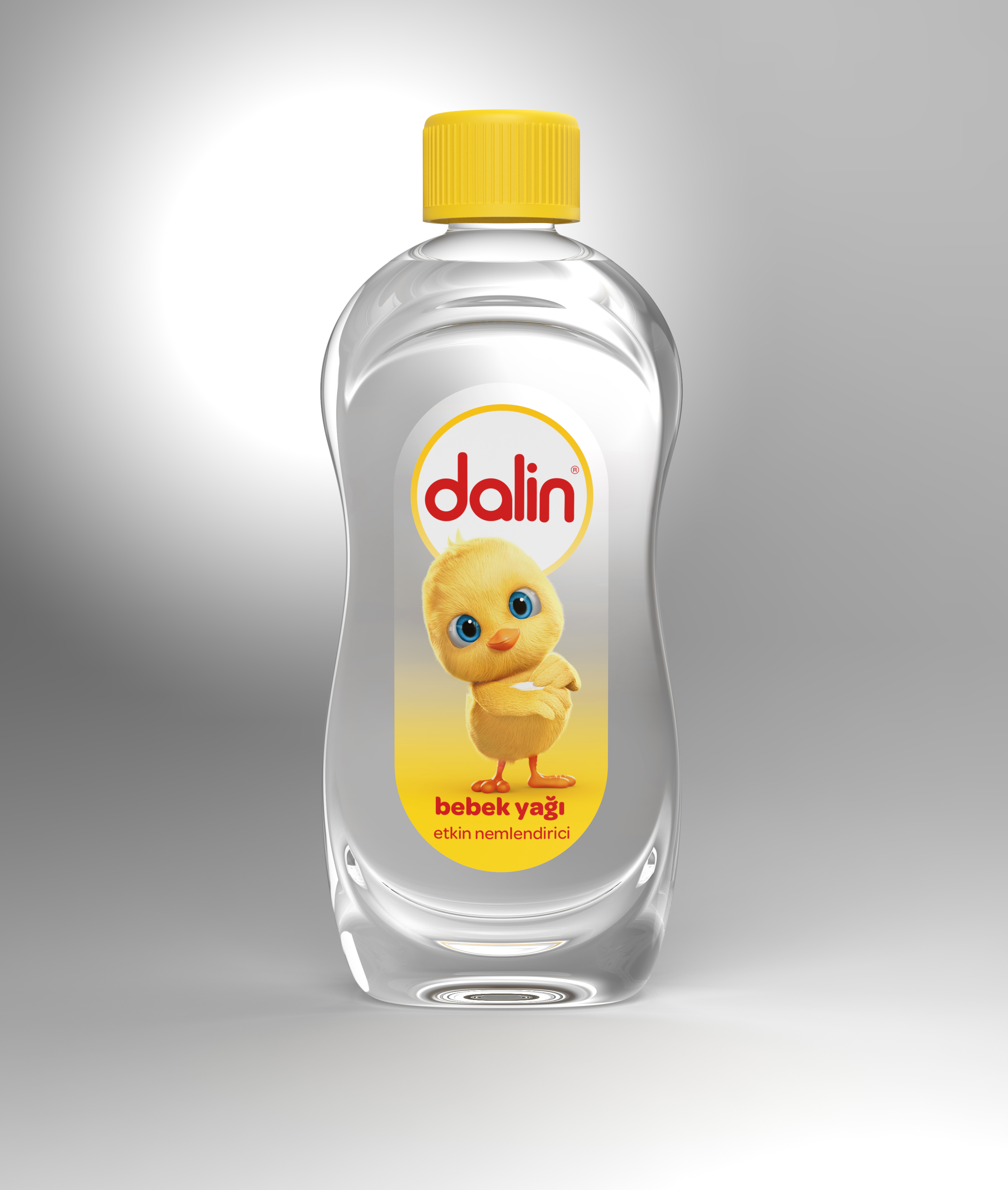
This design with round forms provides a warm communication with the user and an ergonomic grip due to its thin belly, whereas the upper front and back protuberances avoid sliding and the base front and back protuberances provide standing stability.
The purpose of the round and flowing form designed for the Baby Oil label was to build a warm connection with the end user. The design which provides an ergonomic grip with its thin belly, gives also more stability while advancing on the filling line due to the front and back protuberances which provide a wide base. The renewed brand logo and mascot are placed simply on the transparent label while the ground color which provides visibility to the ingredient text becomes lighter and lighter from the bottom until transparent at the top.
CREDIT
- Agency/Creative: design VENA
- Article Title: designVENA Create New Baby Oil Packaging Design Turkey and Europear
- Organisation/Entity: Agency, Published Commercial Design
- Project Type: Packaging
- Agency/Creative Country: Turkey
- Market Region: Multiple Regions
- Project Deliverables: Brand Architecture, Brand Strategy, Industrial Design, Packaging Design, Product Architecture, Rebranding, Structural Design
- Format: Bottle
- Substrate: Plastic


