Oxygen Fitness Overview:
Oxygen Fitness is a forward-thinking fitness brand that aspires to empower individuals through tailored strength programs for individuals. I was tasked with creating a visually compelling and futuristic visual identity, embodying strength, achievement, futurism, and intelligence in their wellness journey.
At the core of my approach lies a commitment to collaborative strategy workshops that precede the design journey for brands like Oxygen Fitness. Before delving into the visual aesthetics, I engage closely with clients to understand their brand essence, values, and aspirations. For Oxygen Fitness, this involved a series of workshops where we defined key brand keywords, identified target audiences, and analyzed industry competitors. This strategic foundation serves as the guiding compass, informing every design decision to ensure a cohesive and purposeful brand identity.
Strategy Before Design
The strategy development for Oxygen Fitness was a collaborative and immersive process, marked by a series of workshops where I closely engaged with the client. Together, we distilled the brand’s essence through discussions on key elements such as brand keywords, target audiences, and industry competitors. The identification of core keywords like “strong,” “achiever,” “futuristic,” and “intelligent” became the guiding principles for the brand’s strategy, shaping its identity. In parallel, in-depth workshops delved into understanding Oxygen Fitness’s target audience – primarily young professionals and executives – ensuring that the strategy was finely tuned to meet their specific needs and preferences. Furthermore, a meticulous analysis of industry competitors paved the way for strategic decisions, positioning Oxygen Fitness uniquely within the fitness market.
Visual Identity:
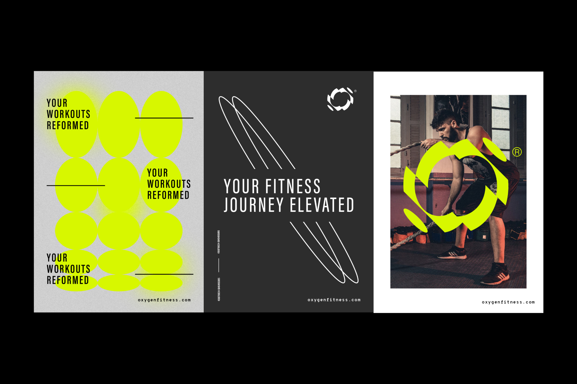
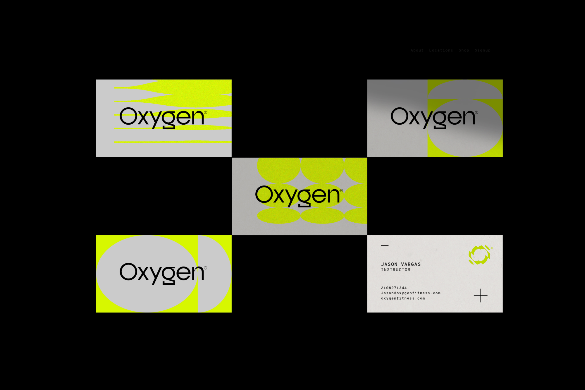
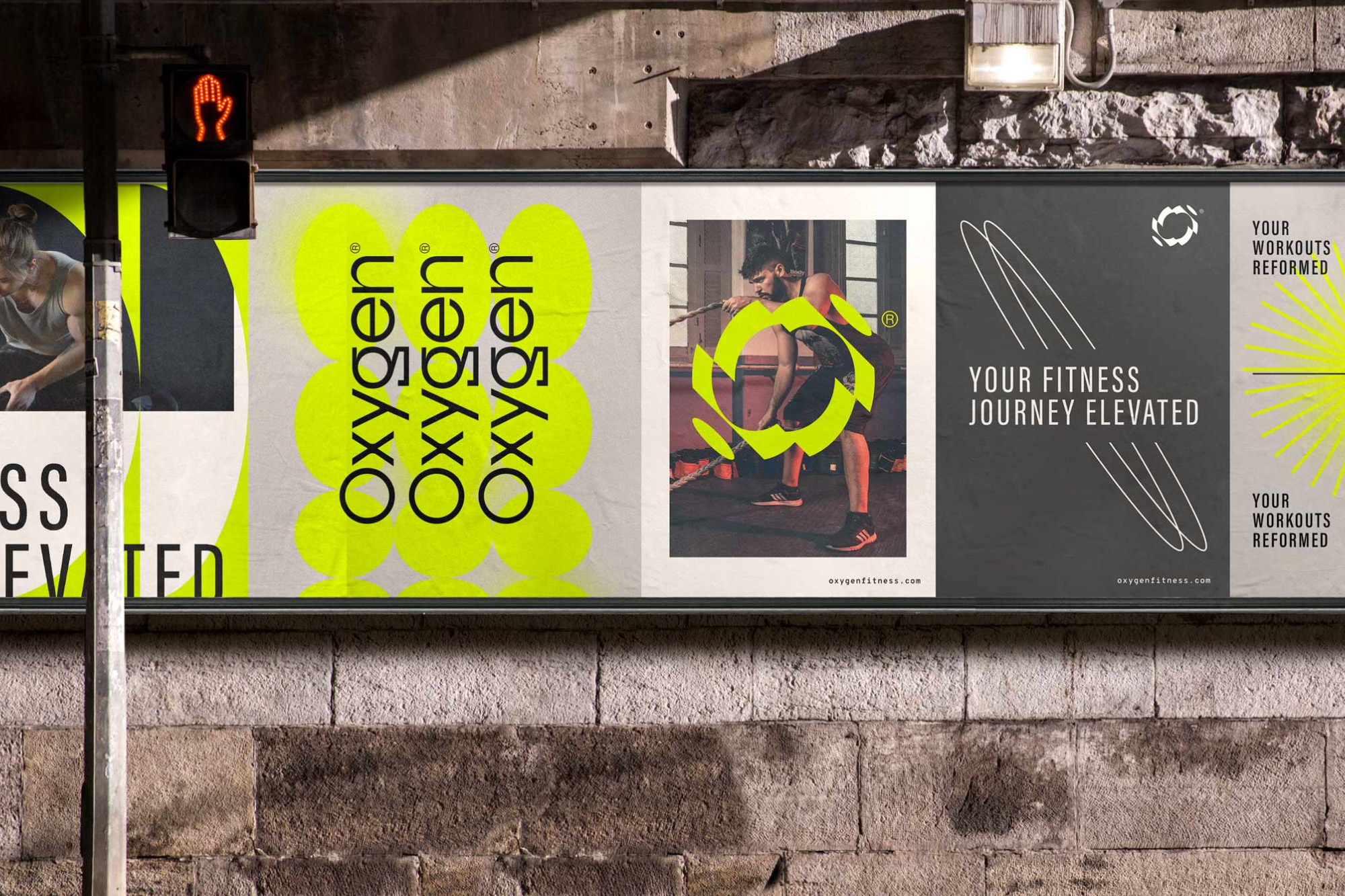
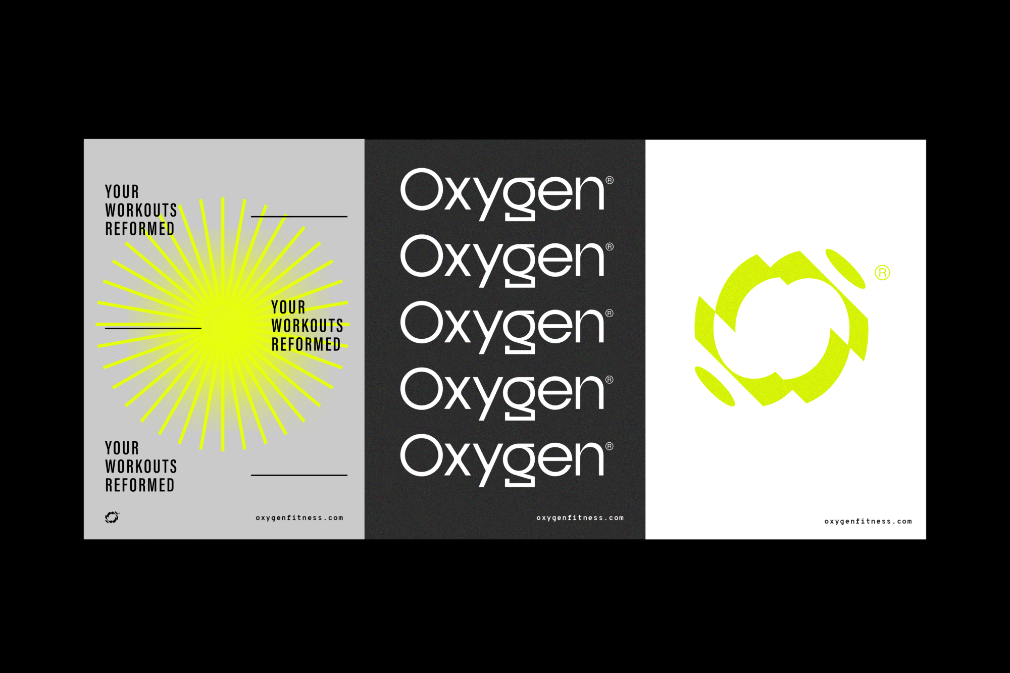
The inspiration behind Oxygen Fitness’s visual identity is rooted in the intersection of innovation, aspiration, and dynamic energy. Drawing from the essence of a futuristic fitness experience, the color scheme of neon yellow, cool grey, black, and white was carefully chosen to evoke a sense of high-end sophistication and cutting-edge technology.
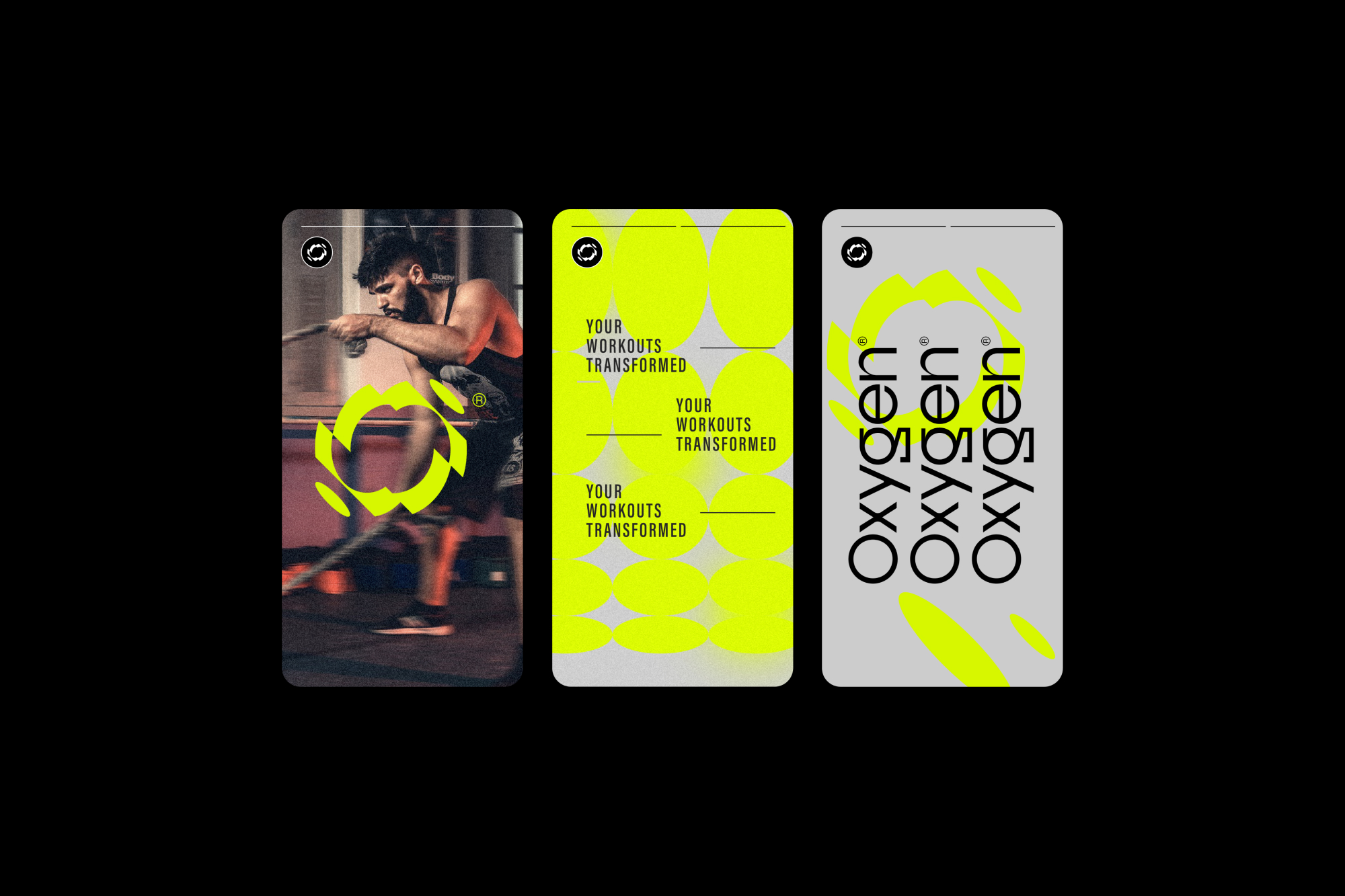
The logo, a transformative “O,” mirrors the continuous evolution and analysis embedded in our fitness philosophy. This design choice is a visual representation of the commitment to progress and personalized growth that defines Oxygen Fitness.
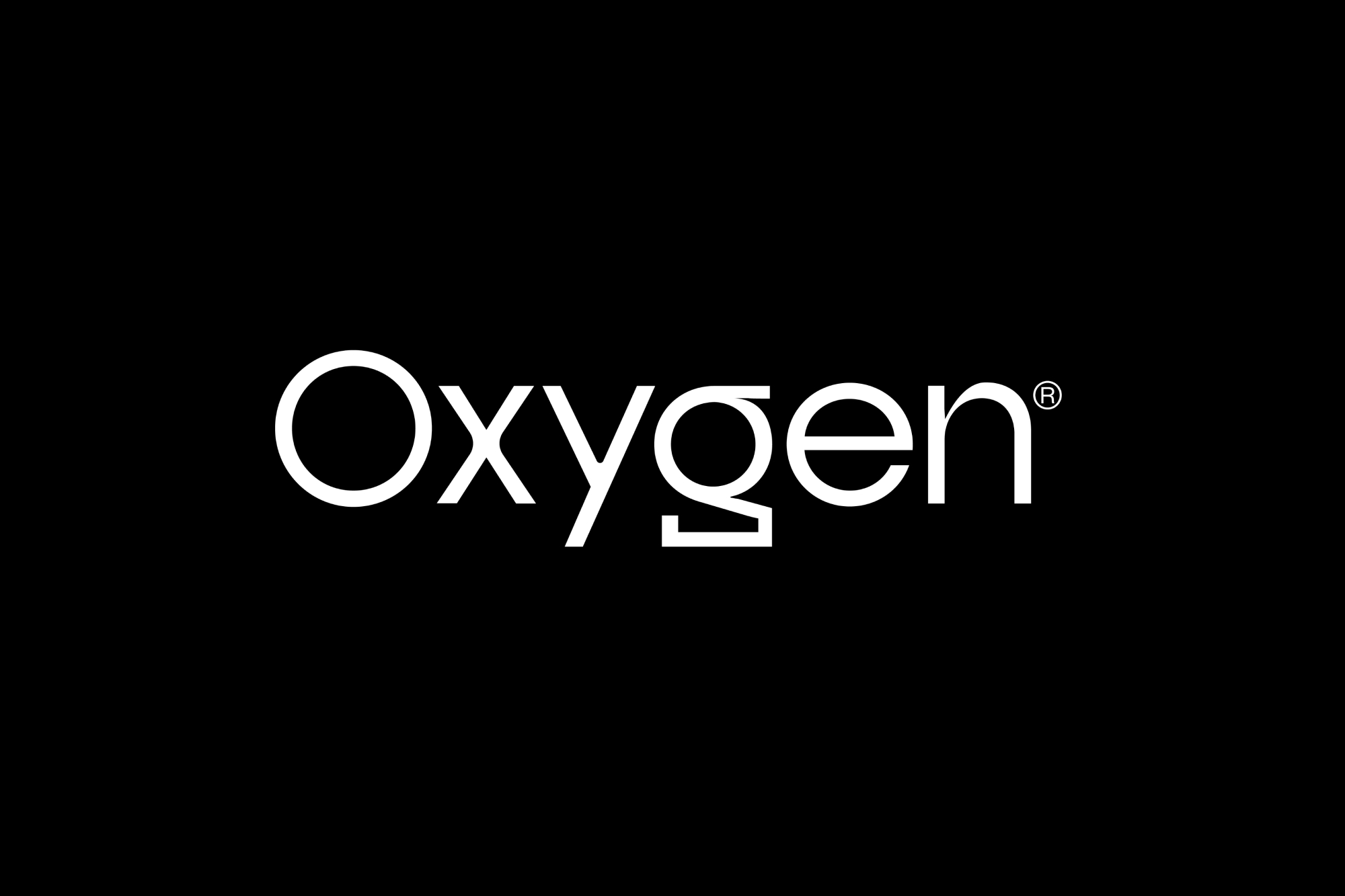
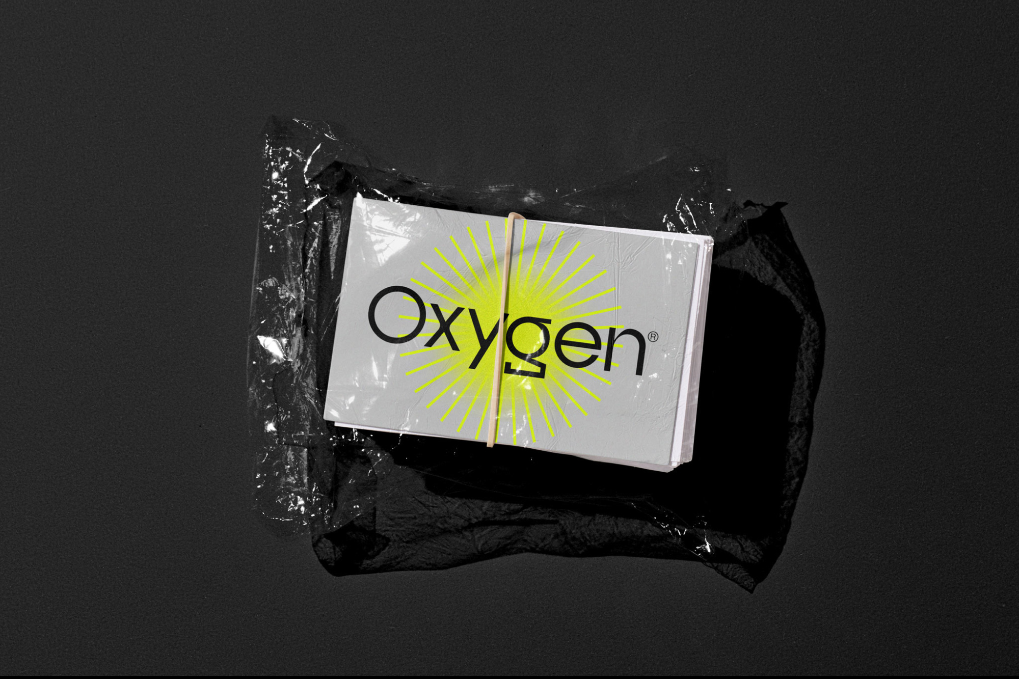
The logotype, a stylized sans serif, complements the logo mark, echoing a sense of modernity and clarity. Bold, condensed fonts with a mix of monotype inspired typefaces were used to create a visual rhythm that resonates with the dynamic energy of our brand, embodying both strength and intelligence.
In crafting Oxygen Fitness’s visual identity, the goal was to inspire members by seamlessly integrating design elements that mirror the aspirational and futuristic nature of their fitness journey. This visual narrative extends beyond aesthetics, aiming to create an immersive experience that aligns with the brand’s values of strength, achievement, futurism, and intelligence.
Logo Insight:
The dynamic representation of the brand logo resides in the letter “O” as it transforms into various segments—a visual metaphor for analysis and continuous evolution. The design incorporates motion, symbolizing the dynamic nature of our fitness approach. The logotype, a stylized sans serif, is my choice to seamlessly complement the logo mark, creating a cohesive visual identity. Bold, condensed fonts with a touch of monotype further enhance the brand’s distinctive personality.
Typography:
Beyond aesthetics, my commitment to clean, artistic typography is a hallmark of Oxygen Fitness. I’ve meticulously chosen and arranged bold, condensed fonts, creating a visual rhythm that resonates with the dynamic energy of our brand. The interplay of fonts is an artful expression, embodying a balance between bold statements and refined elegance.
Branded Spaces:
From workout zones to relaxation areas, every corner within Oxygen Fitness exudes the chosen color palette and design language. This creates a cohesive and visually stimulating brand identity that extends beyond the physical gym, shaping the overall member experience.
Photography:
Visuals tell a story of warmth, energy, and dynamism. My photography direction strategically uses warm hues of red to contrast neon yellows and cool grays, capturing the essence of motion to reflect the energy and dynamism inherent in our workouts.
Conclusion:
In closing, Oxygen Fitness embodies a harmonious blend of design and strategy, meticulously curated to elevate your fitness experience. From a futuristic visual identity to a purposeful strategy forged in collaborative workshops, every element is crafted with intent.


CREDIT
- Agency/Creative: Kevin Craft Co
- Article Title: Designing Strength: Visual Identity for Oxygen Fitness
- Organisation/Entity: Freelance
- Project Type: Graphic
- Project Status: Published
- Agency/Creative Country: United States
- Agency/Creative City: Dallas
- Market Region: North America
- Project Deliverables: Art Direction, Brand Design, Logo Design
- Industry: Professional Services
- Keywords: fitness, movement, trainer, training, personal, brand, identity, visual, graphic, design, gym, work out, health, neon, energy, O, oxygen
-
Credits:
Brand Designer: Kevin Craft


