“Thirty-something” is the stage of life between the ages of thirty and forty, during which the human being reaches maturity, self-confidence and confidence in one’s own tastes. A stage that invites calm and tranquility and that, it seems, opens the doors to a taste for wine. It turns out that it is from the age of thirty that people begin to drink and appreciate wine. It is precisely from this vital moment in life that the name of this wine originates: Treintaytantos or “Thirty-something”.
The biggest challenge of this project was to find a way to represent this ambiguous concept that refers to a stage of life in such a way that it could be understood solely by looking at the label. How did we achieve this? Using the “_” sign. The underscore is an invitation to write what is missing, to complete a concept that is under construction. It is commonly found in forms to signal that it is up to us to fill in the blanks to complete what is missing.
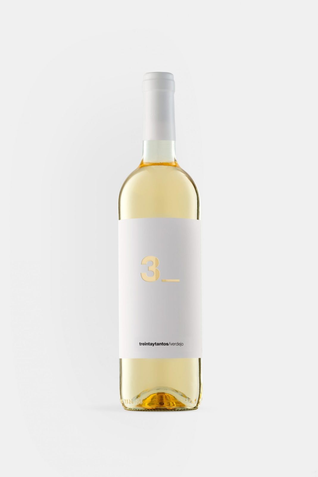
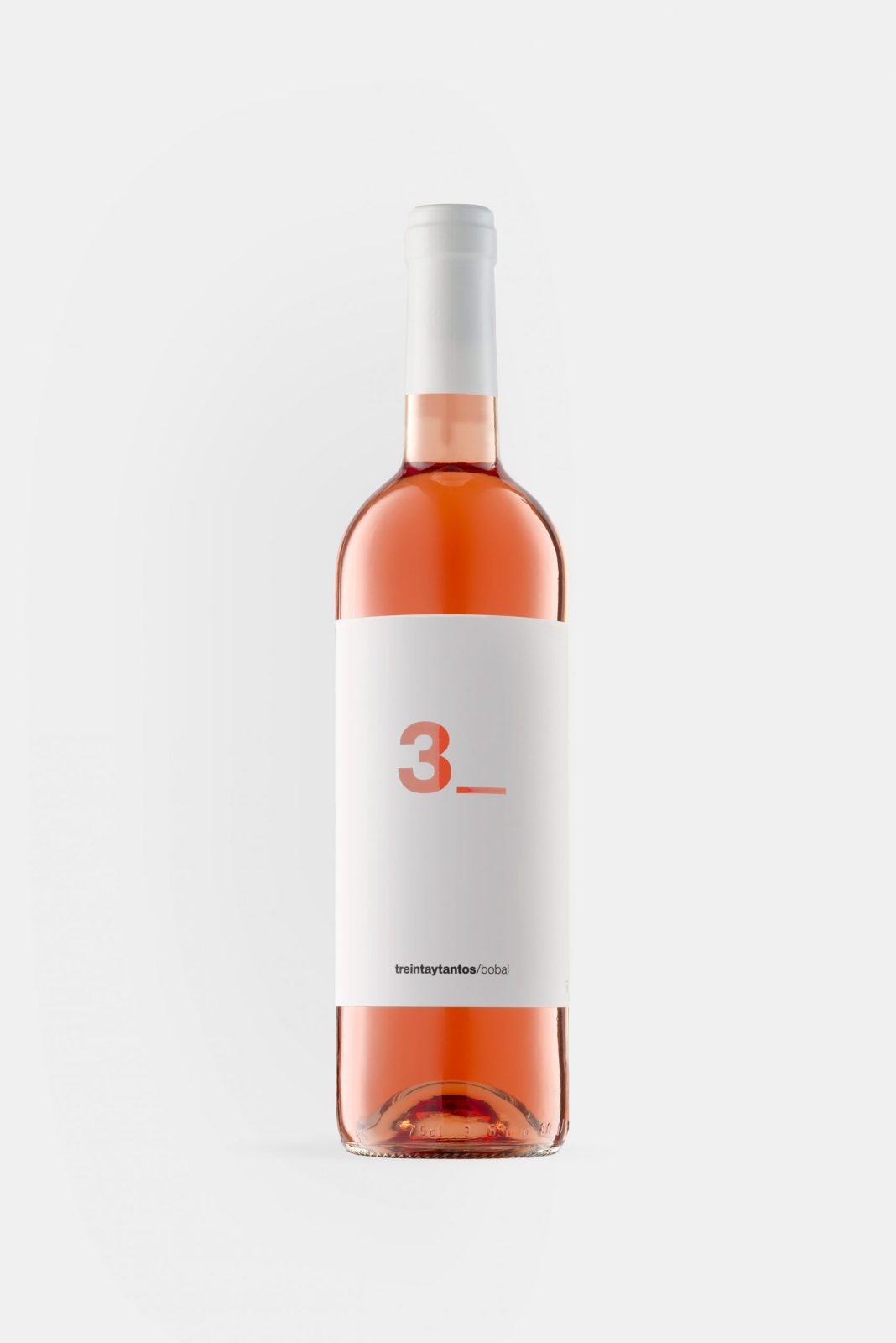
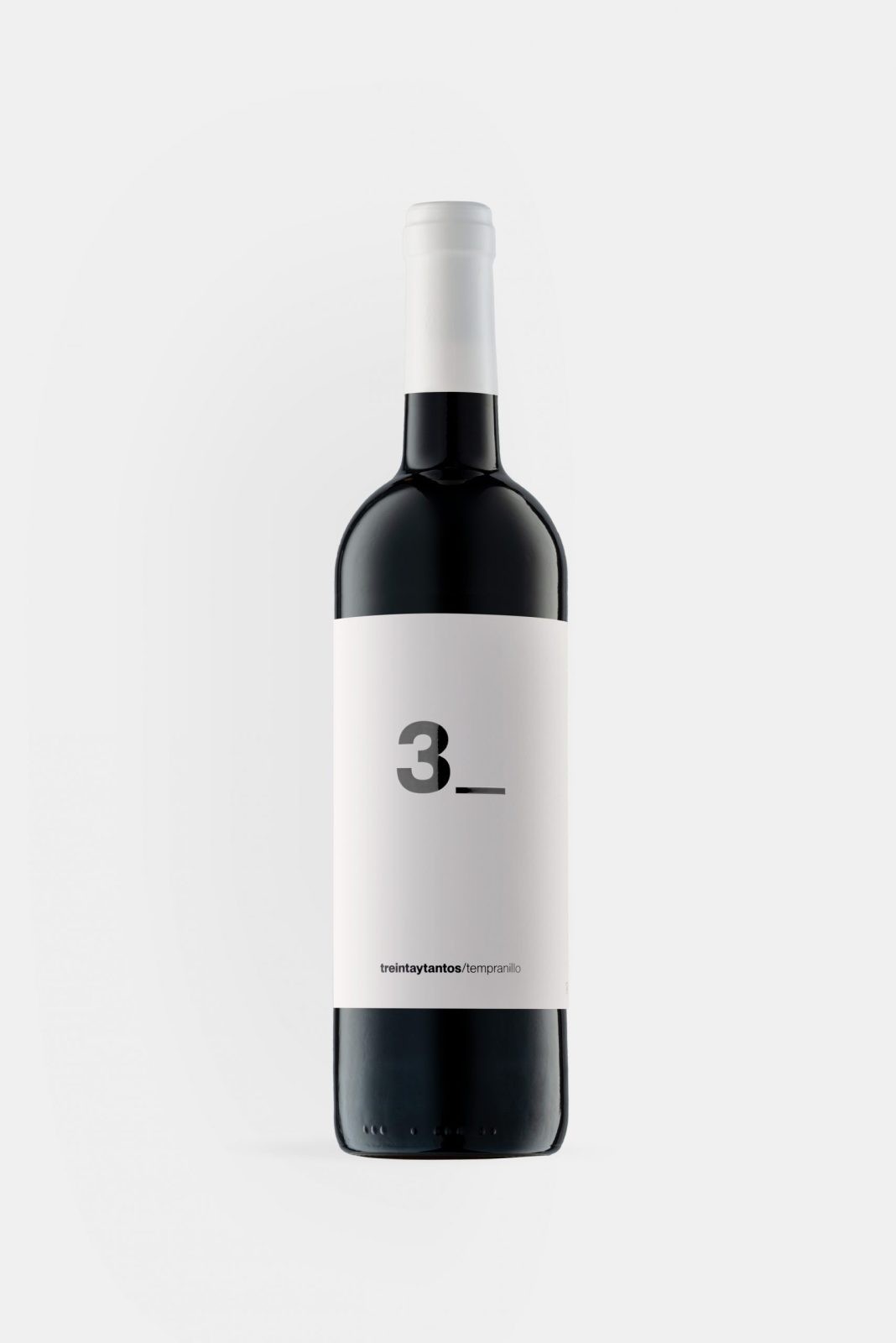
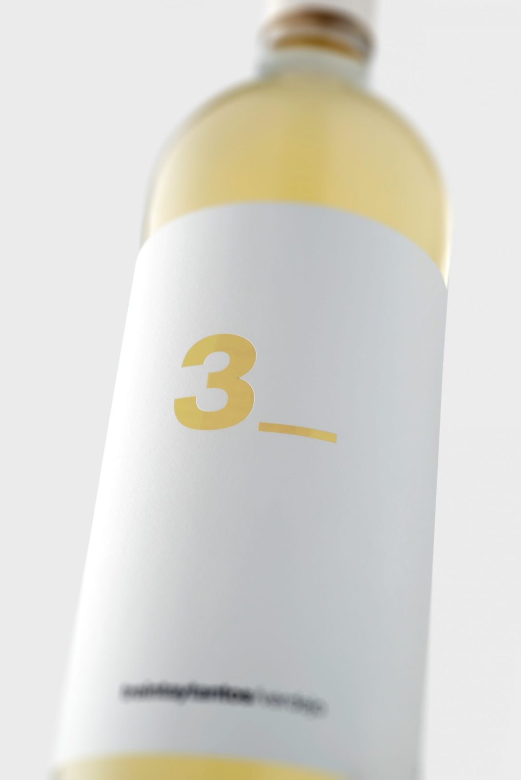
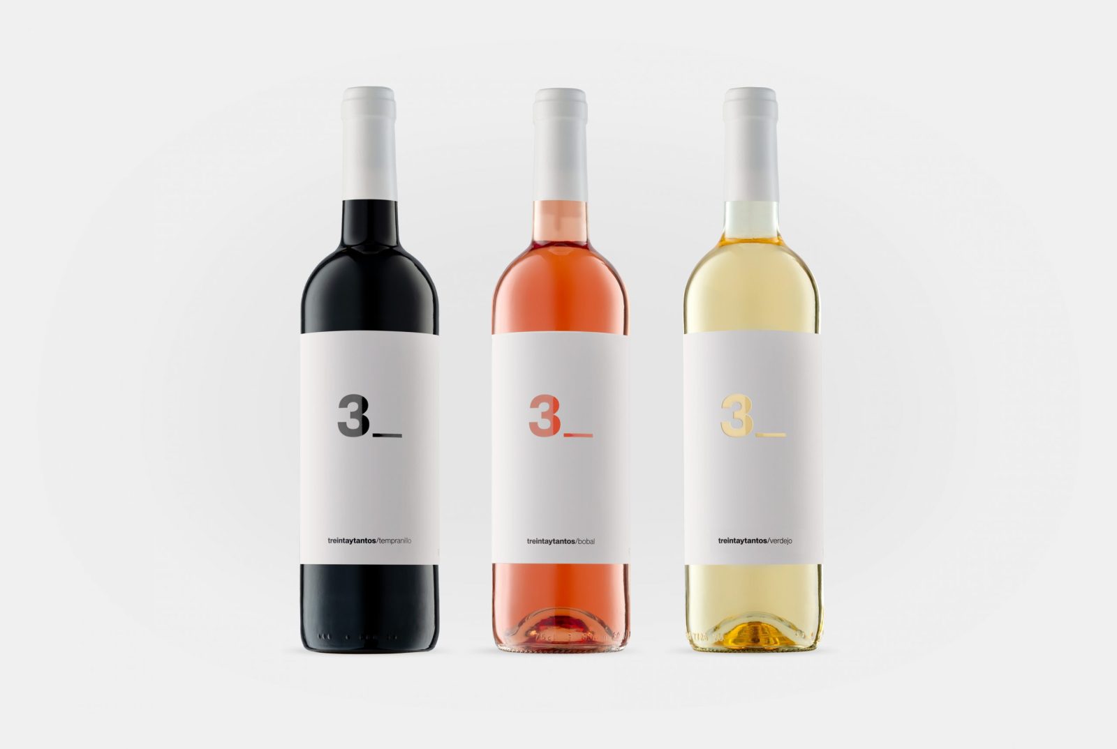
As for the label design, we opted for a sober, elegant and simple design where the name and color of the wine were the protagonists. For this reason, we decided to put only 3_ on the front label, on white paper and with the text die-cut, so that the color and character would be provided by the wine. Finally, on the stopper, we decided to also put this number that represents the name of the wine to reinforce the concept.

CREDIT
- Agency/Creative: Lavernia & Cienfuegos
- Article Title: Designing a Minimalist Label for Treintaytantos by Lavernia & Cienfuegos
- Organisation/Entity: Agency
- Project Type: Graphic
- Project Status: Published
- Agency/Creative Country: Spain
- Agency/Creative City: Valencia
- Market Region: Europe
- Project Deliverables: Graphic Design, Label Design
- Industry: Food/Beverage
- Keywords: Wine label graphic design
-
Credits:
Agency: Lavernia & Cienfuegos
Client: Bodegas Trobat


