


Askeys ice cream accompaniments, part of the Silver Spoon Company has collaborated with strategic brand design studio, DesignHawk, to deliver a rebrand for their full range of sauces & cones, reinvigorating the brand to increase its appeal and broaden its relevance.
A loved and well-known brand found in many British homes for over 100 years, Askey’s has been elevating ice cream since 1910 and continues to be the leading ice cream accompaniments & toppings brand.
But with an ambition to elevate the excitement of in-home ‘ice cream’ occasion Askeys & DesignHawk worked together to evolve Askey’s brand positioning and create a brand design refresh which would see the brand steer away from the old-fashioned children’s playtime identity towards more elevated taste experiences.
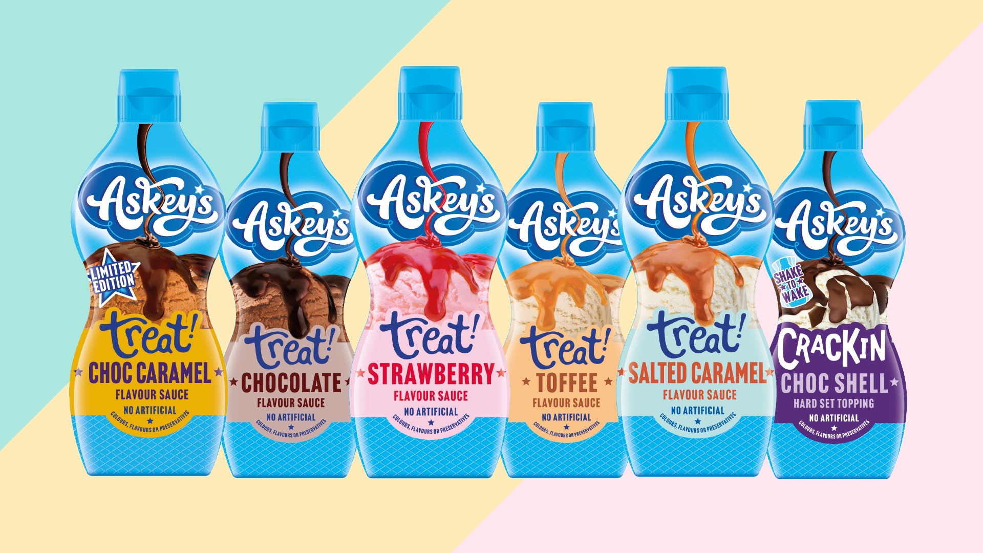
In line with the new positioning, DesignHawk rejuvenated the range to celebrate the joy of ice cream’s tastes & textures, in a way which embraced out of home trends, whilst further developing the brands distinctive assets.
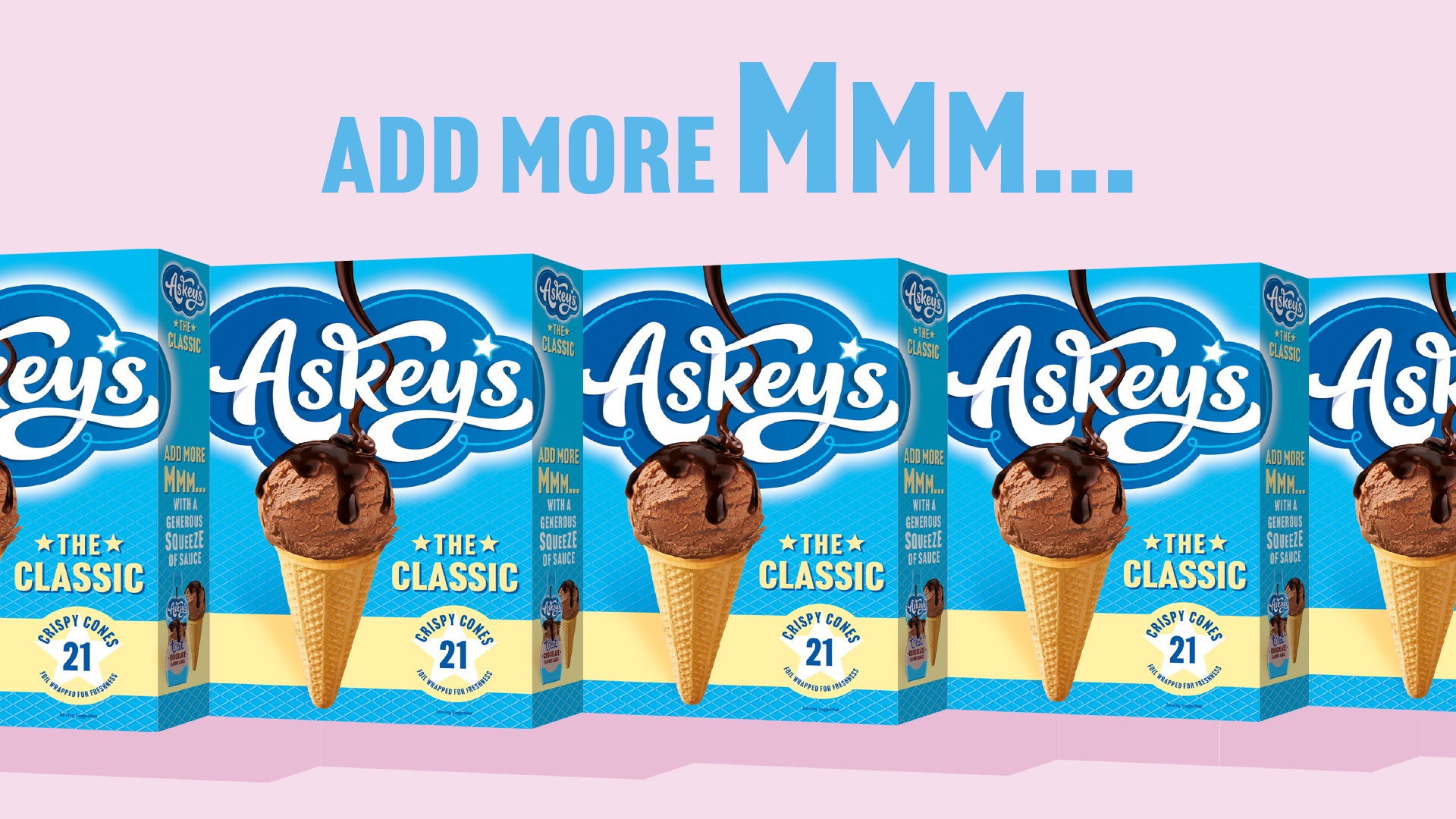
The new designs elevate the crispy, crunchy texture combinations of the cones, the soft & creamy ice cream and place the sweet, flavoursome, sticky sauce that elevates any ice-cream experience as the hero across the entire range. To hero that mouthfeel, hyper-real visuals were created to deliver mouth-watering taste appeal whilst the sauce playfully intercepts our brand marque to bring the products to life.
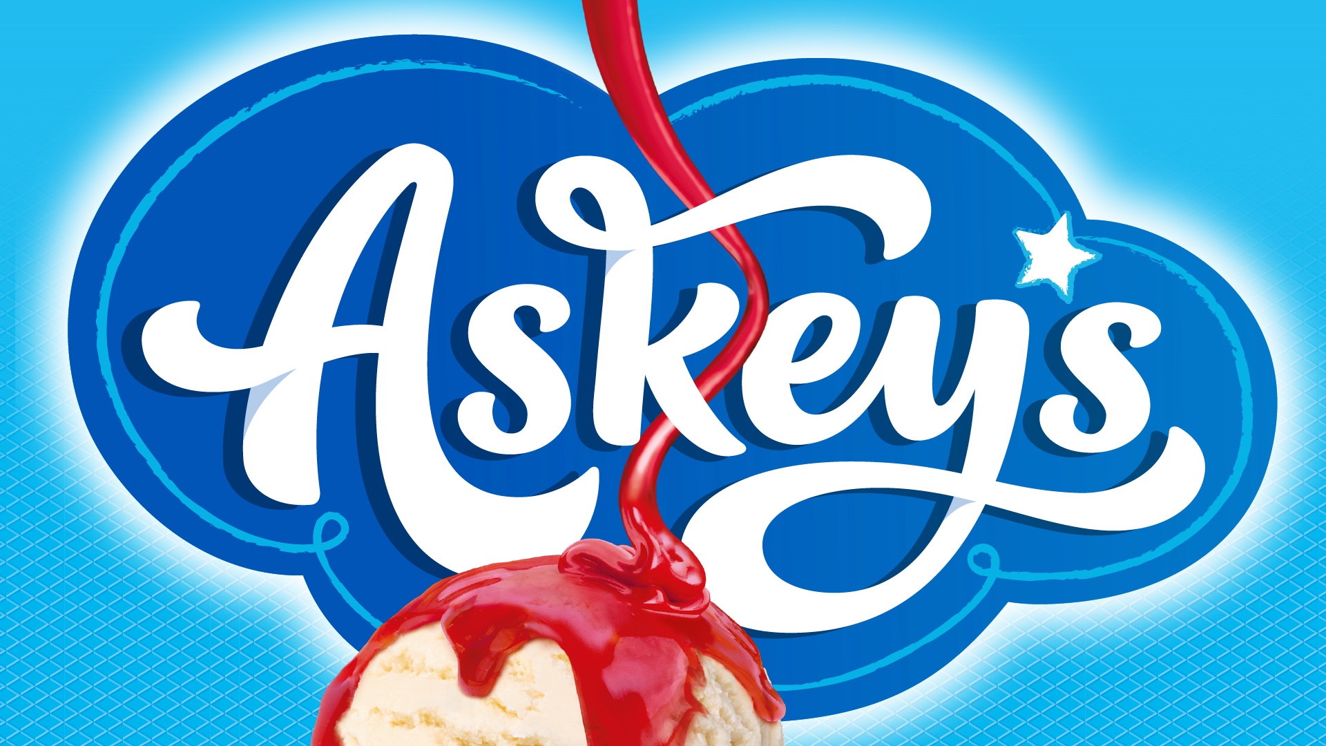
The beauty of the well-crafted word marque was retained but evolved to be bolder in colour and scale. It playfully expands off the sides of the pack to create a sense of confidence and fun, while the darker blue cloud makes the white of the brand name jump from the shelf. For variant navigation, punchy pastels better reflect the out of home experience, giving Askeys a distinctive colour palette to help build a new brand world.
A new tone of voice was established to ensure brand copy always adds more oooh & aaah consistently across packaging, website, social and campaigns.
The result is a new identity and pack design that is simple, iconic and memorable. All things which will help continue to build the brand whilst adding excitement to the category for years to come.
The Silver Spoon Company Marketing Director, Tim Albert said: We’ve thoroughly enjoyed working with DesignHawk on refreshing the Askeys brand. It’s been a fun development to work on. We’ve built stronger brand assets which alongside new products to be introduced, should help us to modernise and keep this loved brand relevant for years to come.

CREDIT
- Agency/Creative: DesignHawk
- Article Title: DesignHawk Elevates the Ice Cream Experience for Askey’s
- Organisation/Entity: Agency
- Project Type: Packaging
- Project Status: Published
- Agency/Creative Country: United Kingdom
- Agency/Creative City: London
- Market Region: Europe
- Project Deliverables: Brand Design
- Format: Box, Sleeve
- Industry: Food/Beverage
- Keywords: Brand Design, Packaging Design, Strategy
-
Credits:
Creative Director: Chris Mettrick
Client Services & Strategy: Heather Black
Visualisation: Rita Dore-Smith
Strategy: Brett Goldhawk


