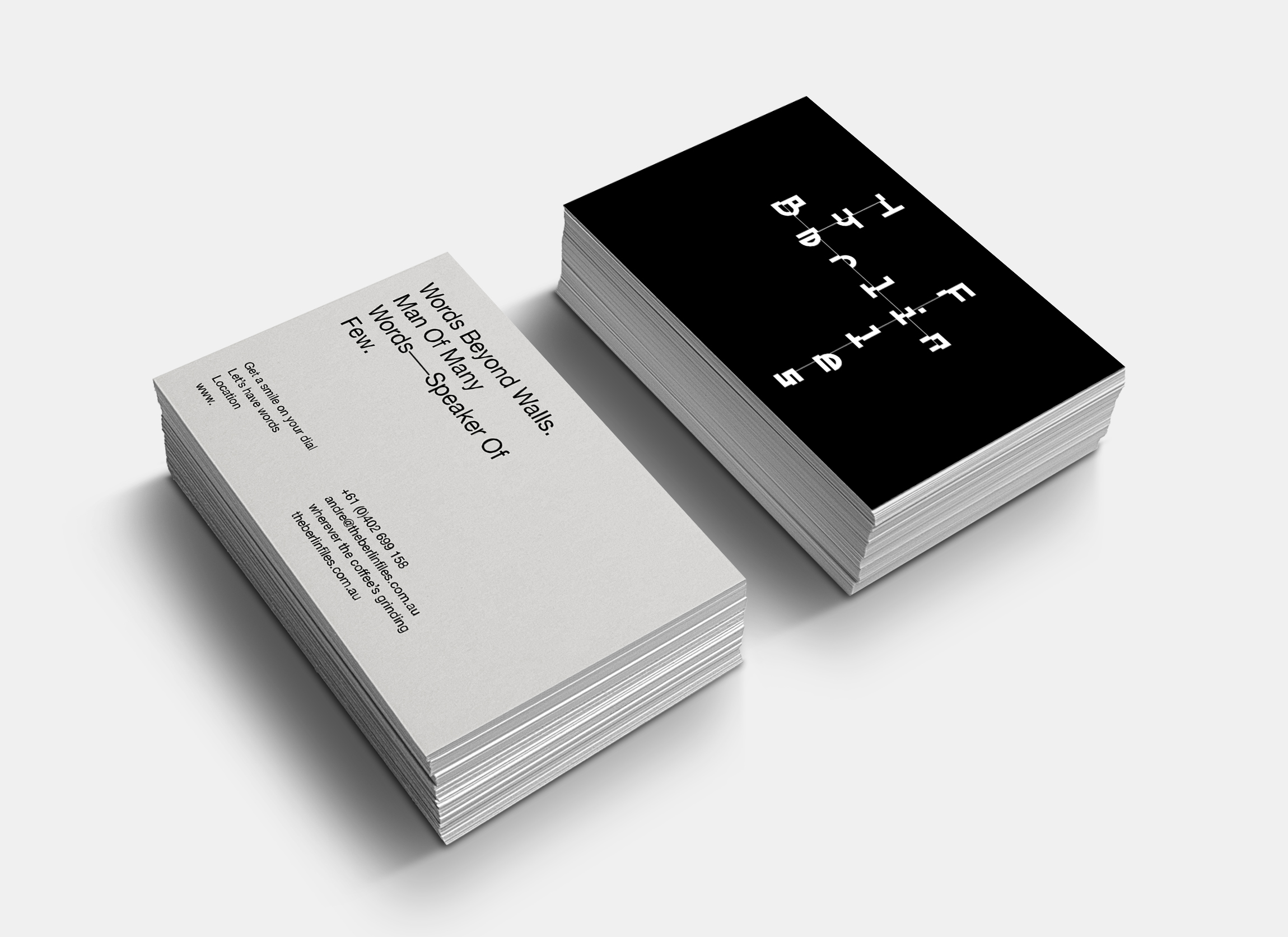
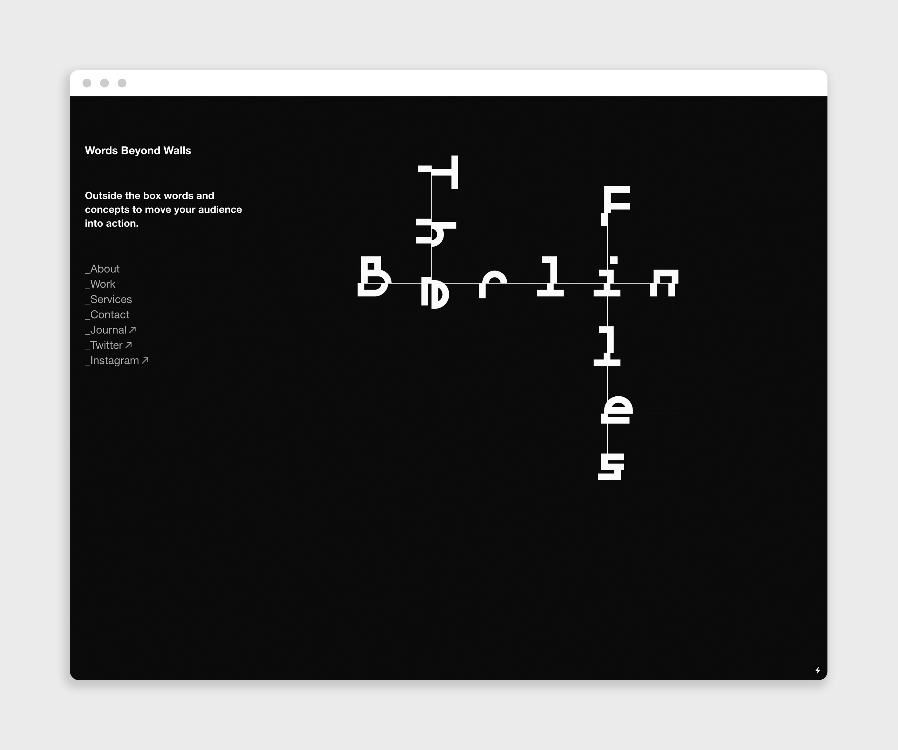
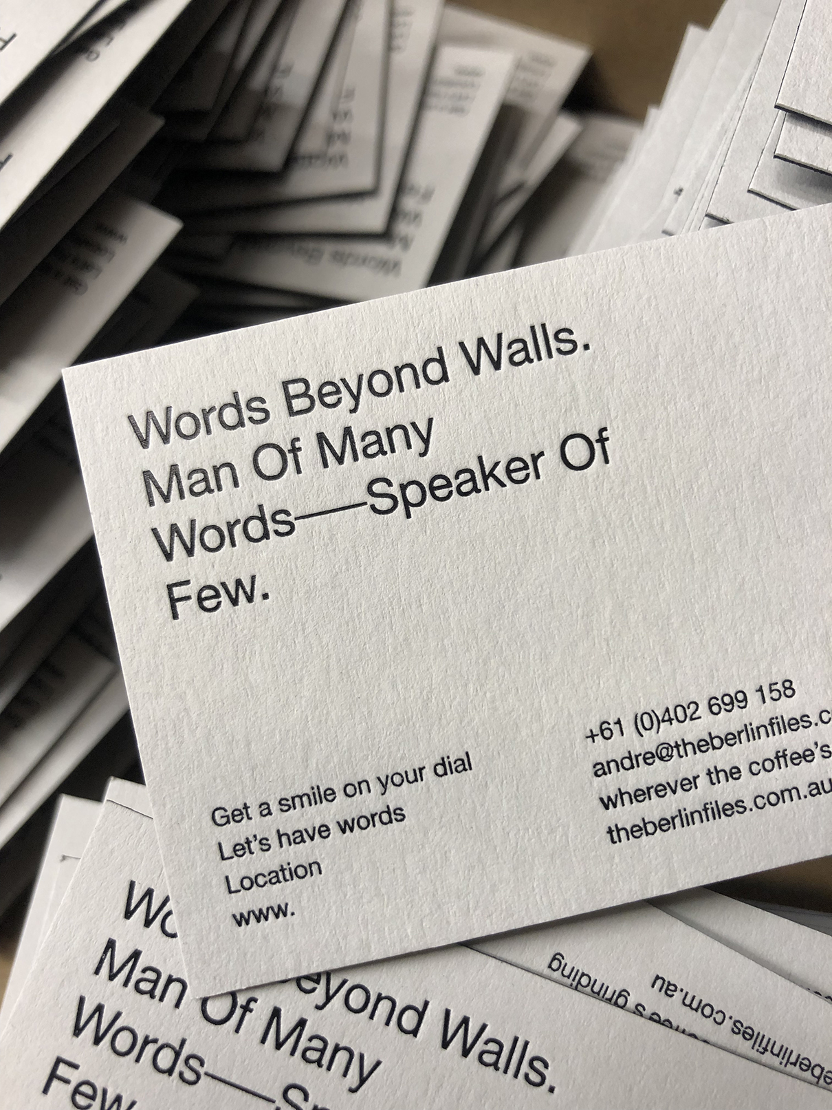
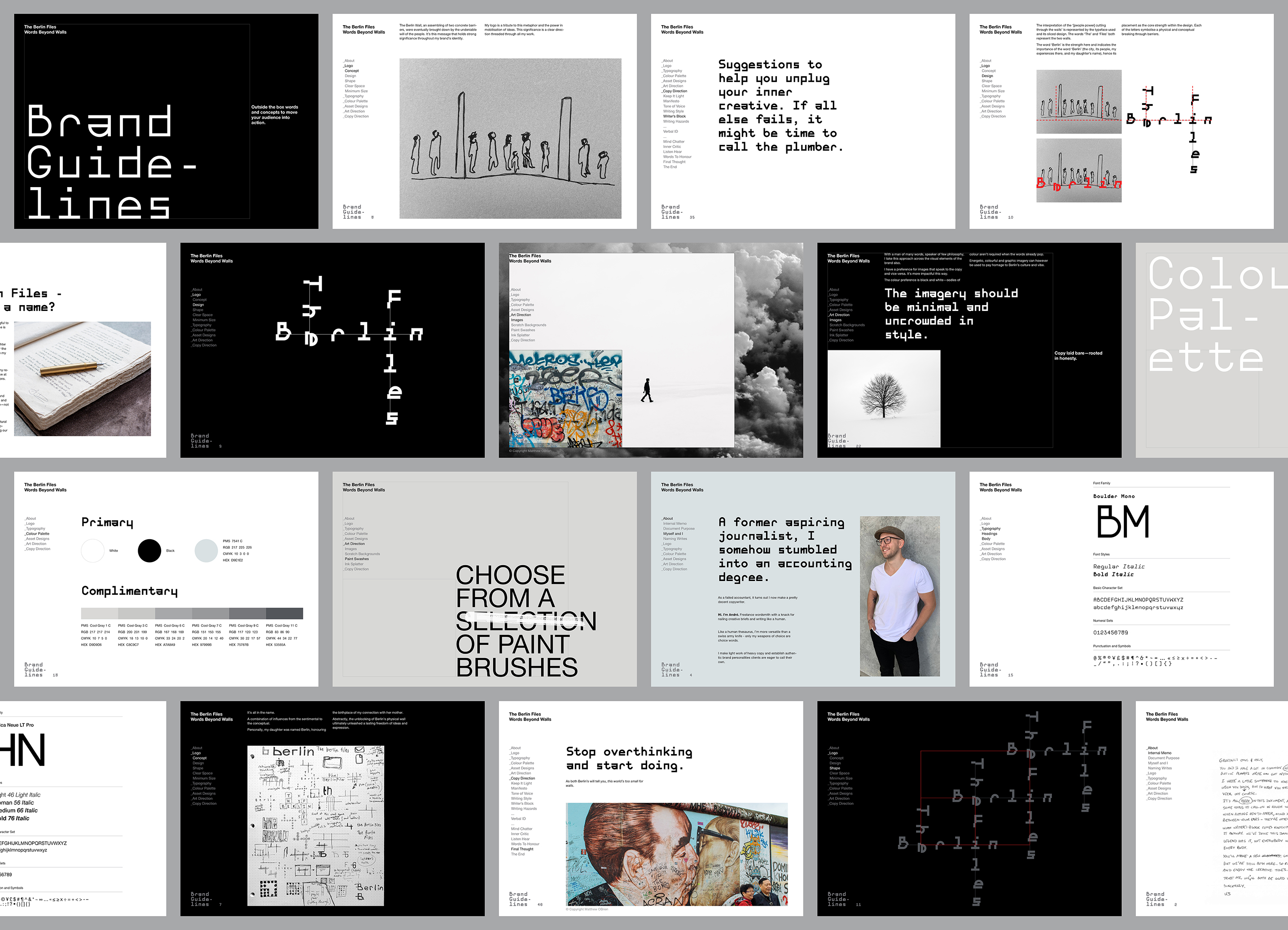
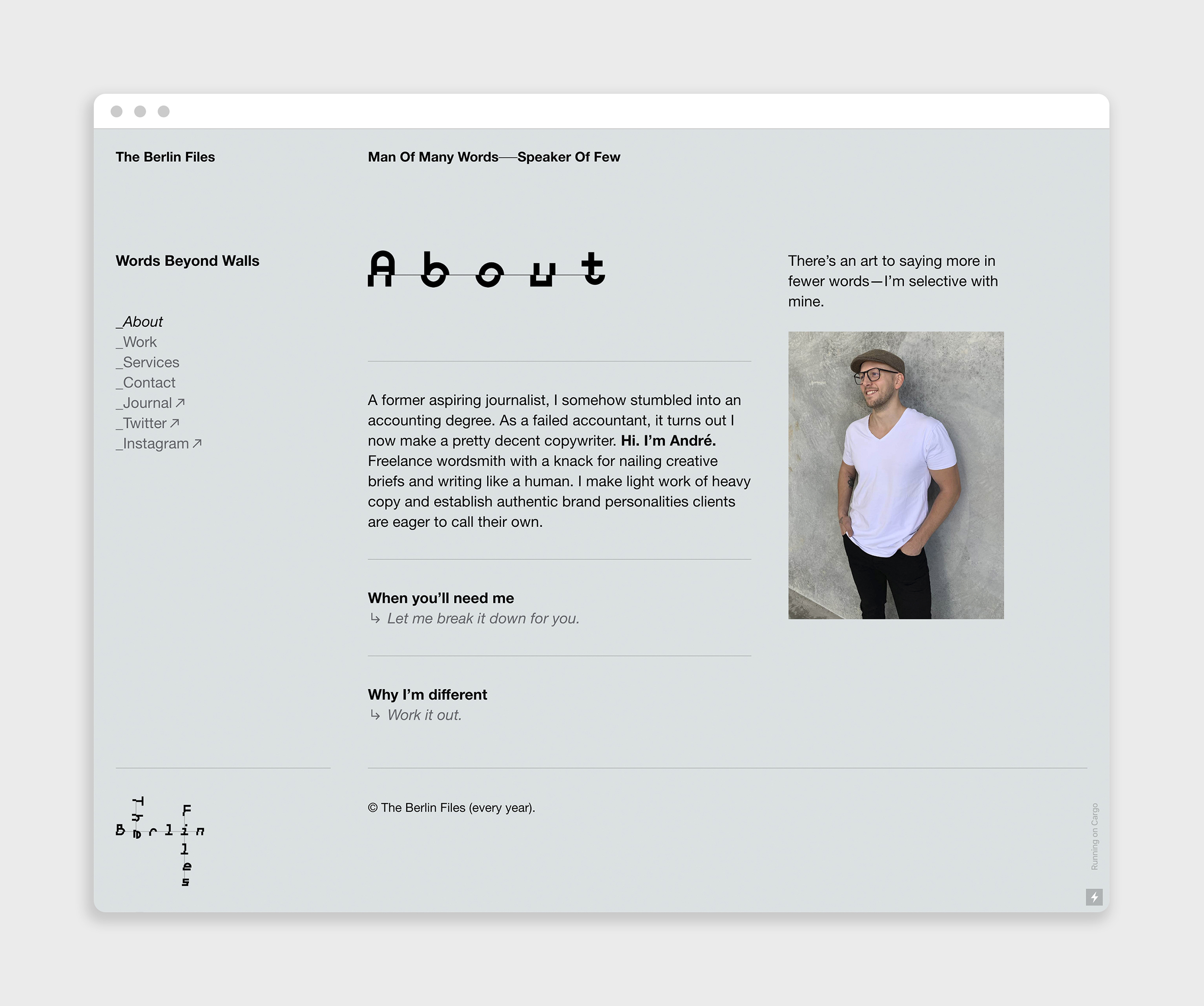
A freelance wordsmith with a very meaningful name required a logo design and complete visual identity (including a website) that spoke to the combination of influences from the sentimental to the conceptual.
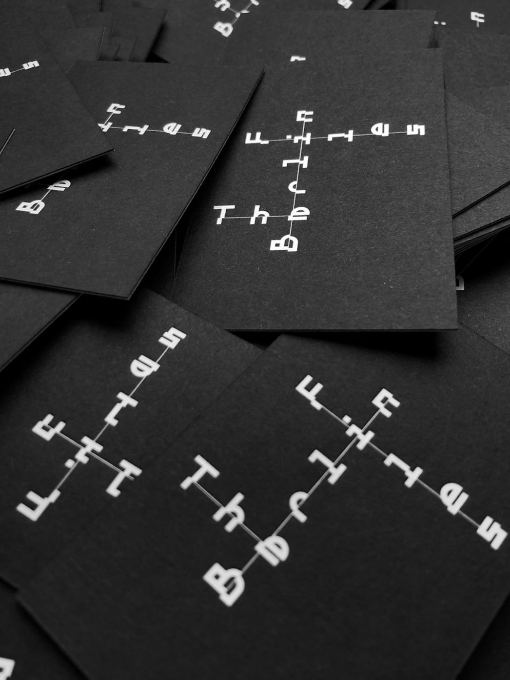
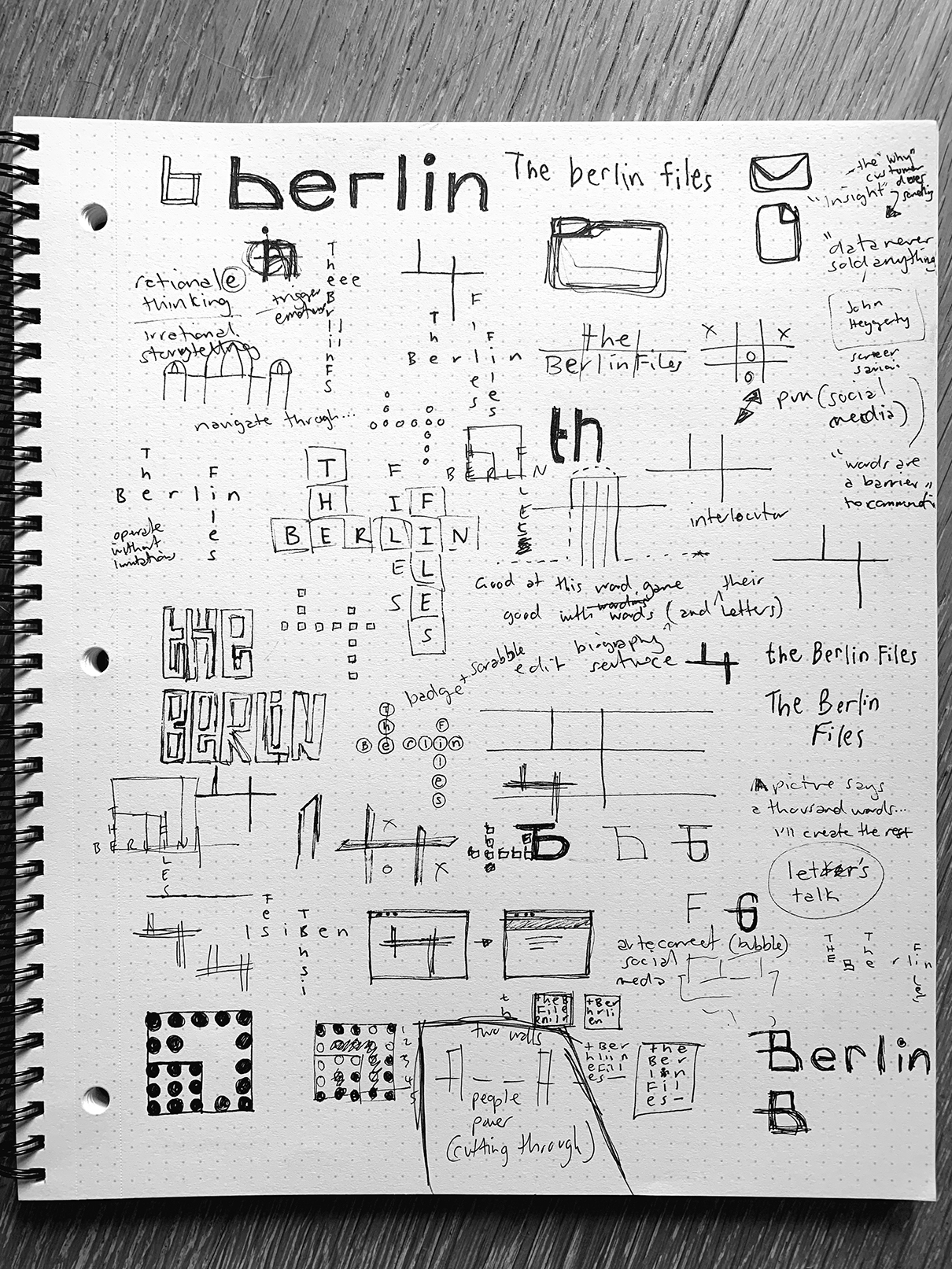
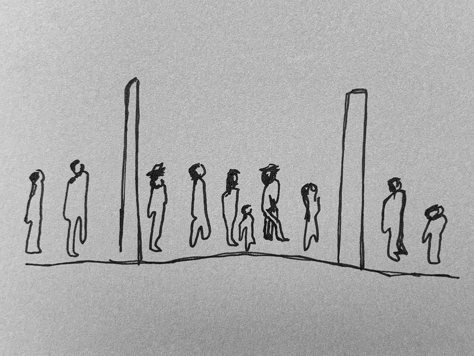
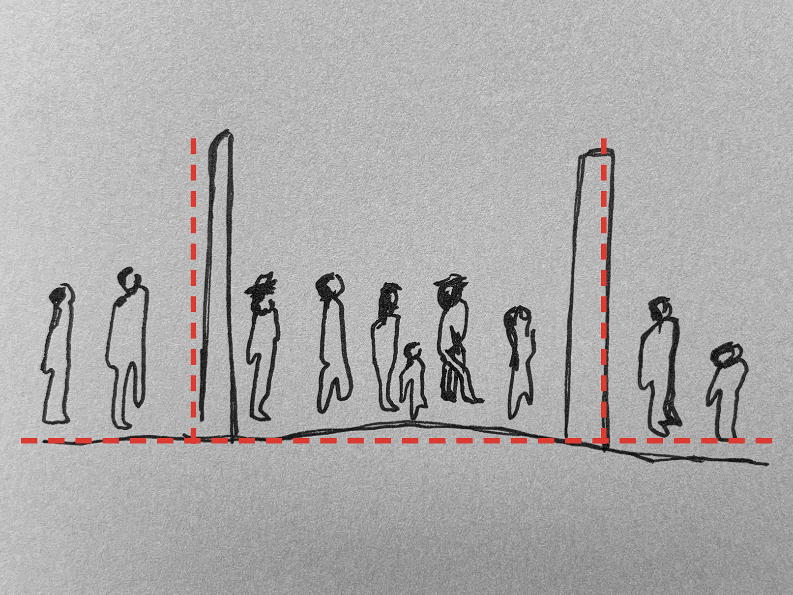
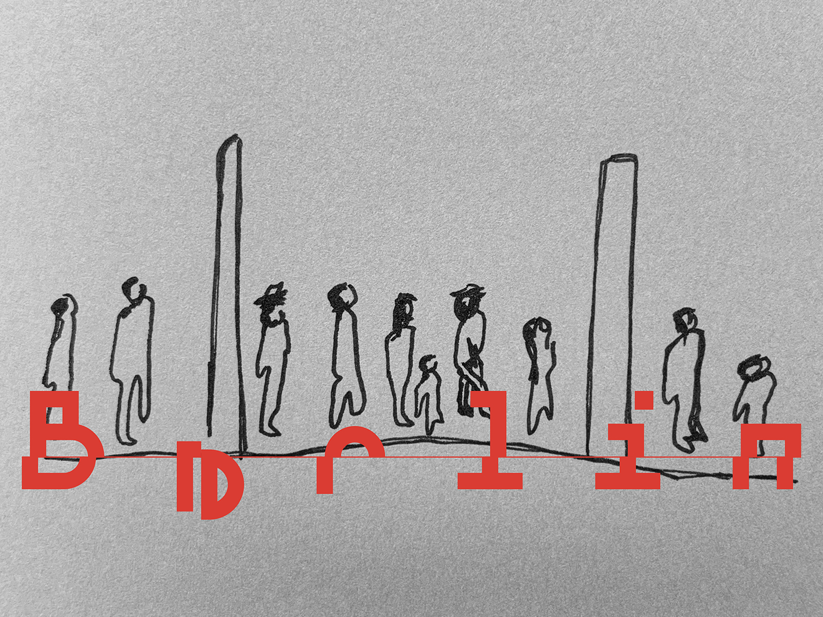
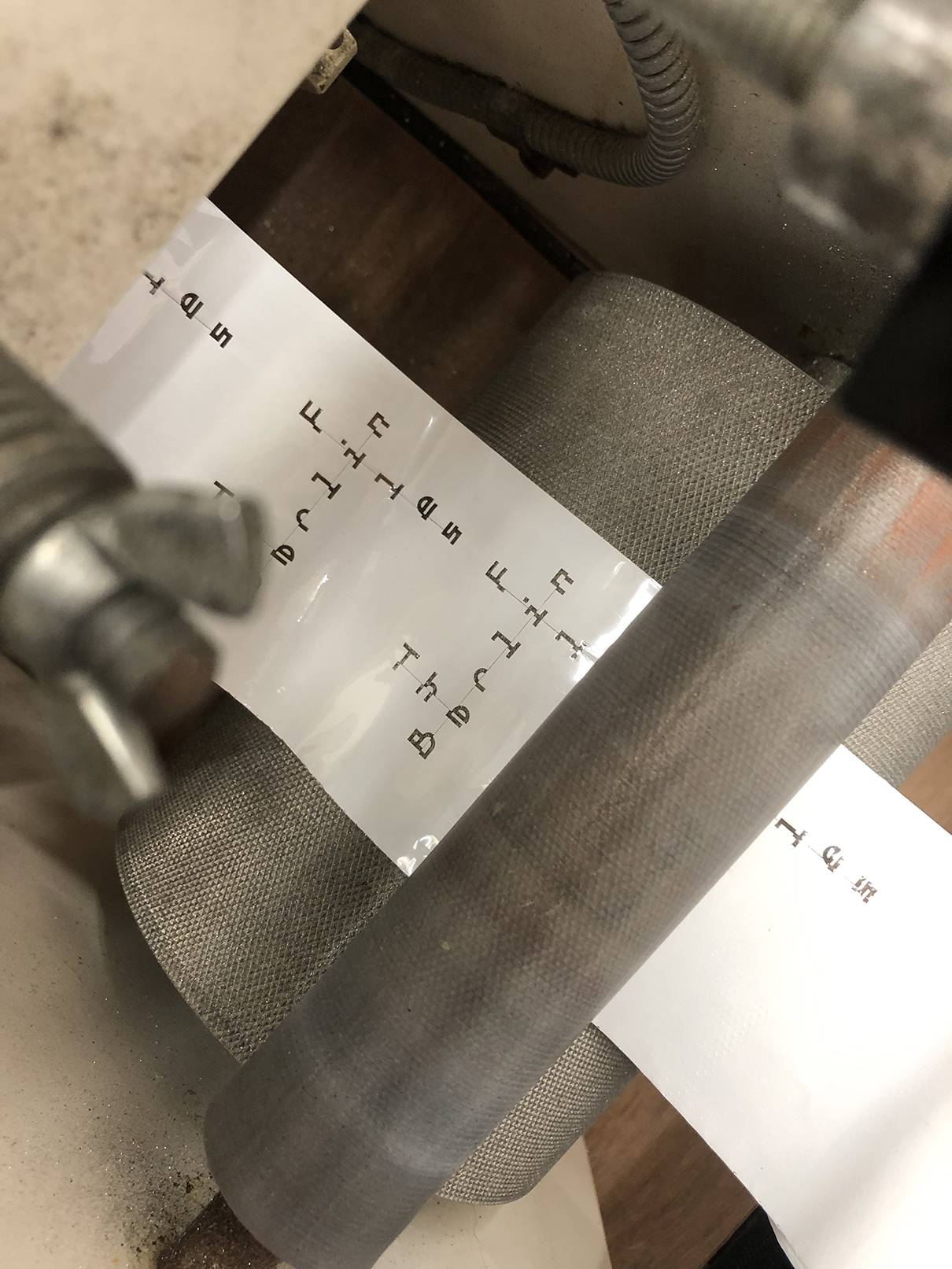
It’s all in the name. The words ‘The’ and ‘Files’ both represent the two Berlin walls. This logo is a tribute to this metaphor and the power in mobilisation of ideas. The interpretation of the ‘[people power] cutting through the walls’ is represented by the typeface used and its sliced design. Each of the letters symbolise a physical and conceptual breaking through barriers. Abstractly, the unblocking of Berlin’s physical wall ultimately unleashed a lasting freedom of ideas and expression.

CREDIT
- Agency/Creative: Louise Agency
- Article Title: Designer and Copywriter
- Organisation/Entity: Freelance, Published Self Promotional Design
- Project Type: Identity
- Agency/Creative Country: Australia
- Market Region: Global
- Project Deliverables: Brand Creation, Brand Design, Brand Guidelines, Brand Identity, Brand Naming, Branding, Graphic Design, Identity System, Tone of Voice
- Industry: Mass Media
- Keywords: Brand, Logo, Identity, Brand Guidelines, Animation
FEEDBACK
Relevance: Solution/idea in relation to brand, product or service
Implementation: Attention, detailing and finishing of final solution
Presentation: Text, visualisation and quality of the presentation


