


Wine and spirits retail in Finland is government own monopoly. Researches tell that in these alcohol monopoly countries consumers pick their wine more often because of the colorful and interestingly illustrated label.
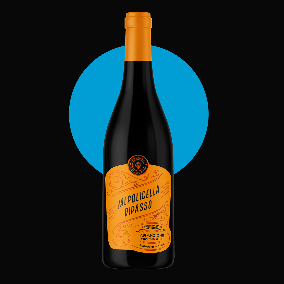
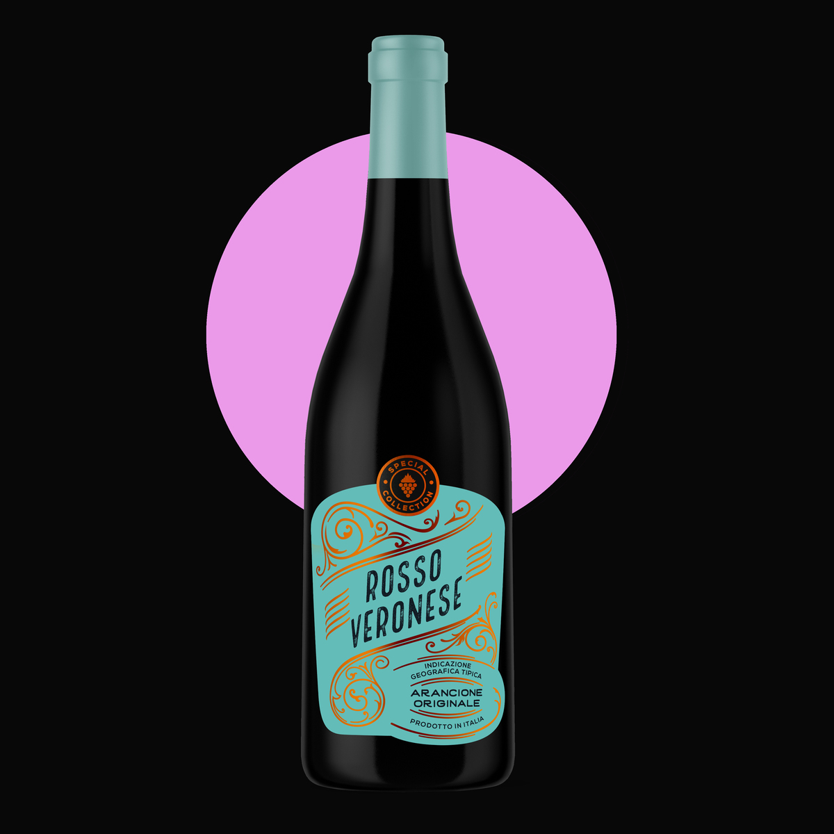
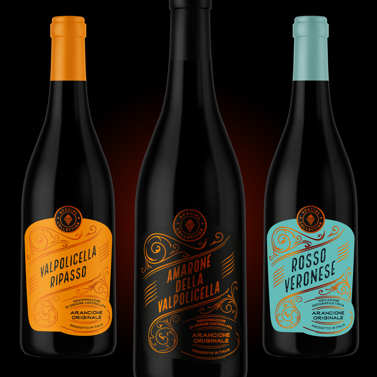
We wanted to create a range of affordable quality wines with bright, attractive and colorful labels which have a very good shelf impact. This label design got its inspiration from the vintage style with decorative illustrations. However the carefully chosen bright colors guarantee the modern design execution. The shape of the label plays a very important role when designing impactful contemporary wine label design. Visual memory trace needs to be achieved among target group and in this time it was also reached by creating a unique and memorable shape for the labels.
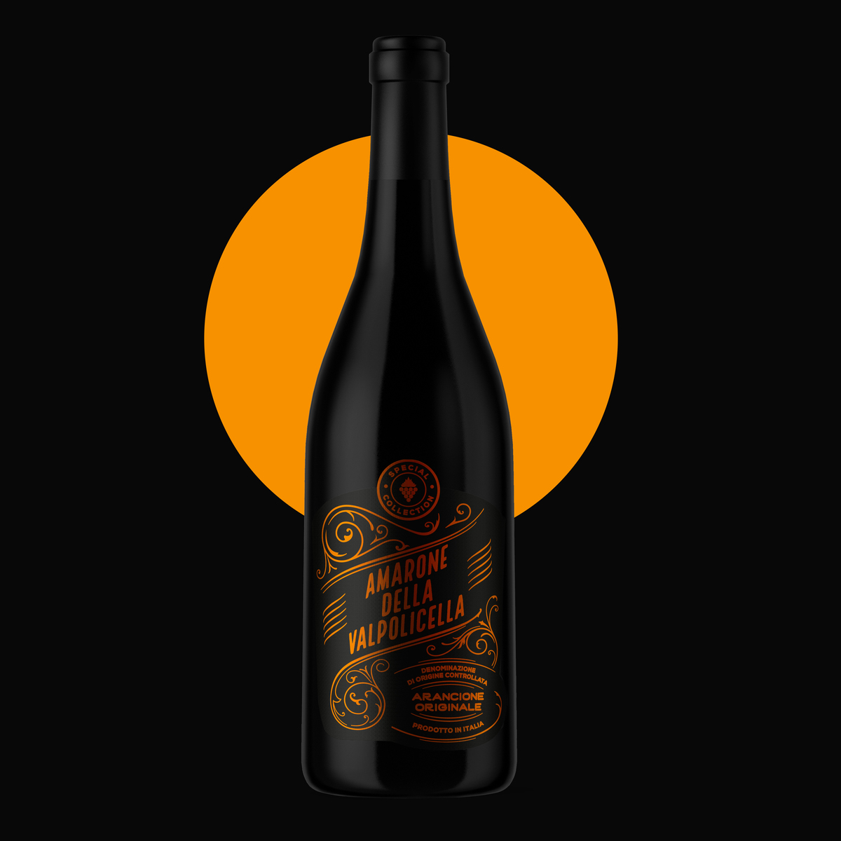
Each wine is using the same copper-toned foil finish to unify the whole series. The black Amarone label is at the moment the most exclusive variant of the range. It uses only copper foil; no print colors at all which gives a luxurious touch to the product. High-quality matt paper was selected to give the final contemporary feeling to the brand. The haptic feeling of the products is very important part of the holistic brand creating. Capsule shades were selected to fit to the label colors. Unusual bright but still luxurious satin tones of the capsules give the final shelf impact for the brand.
CREDIT
- Agency/Creative: DesignCompany
- Article Title: DesignCompany – Outi Oravainen, Arancione Wines
- Project Type: Packaging


