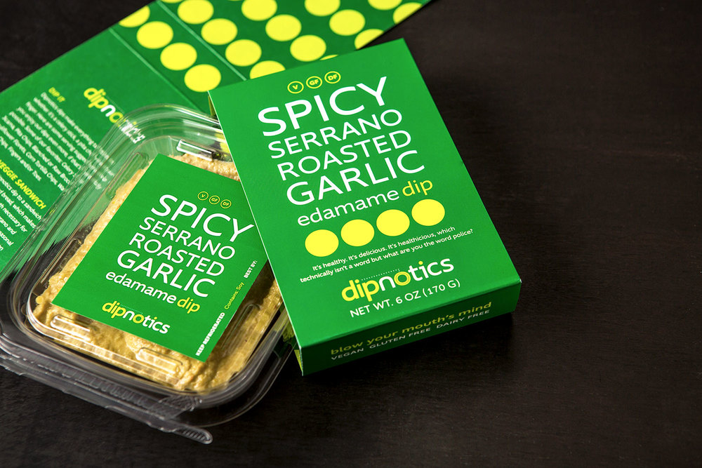
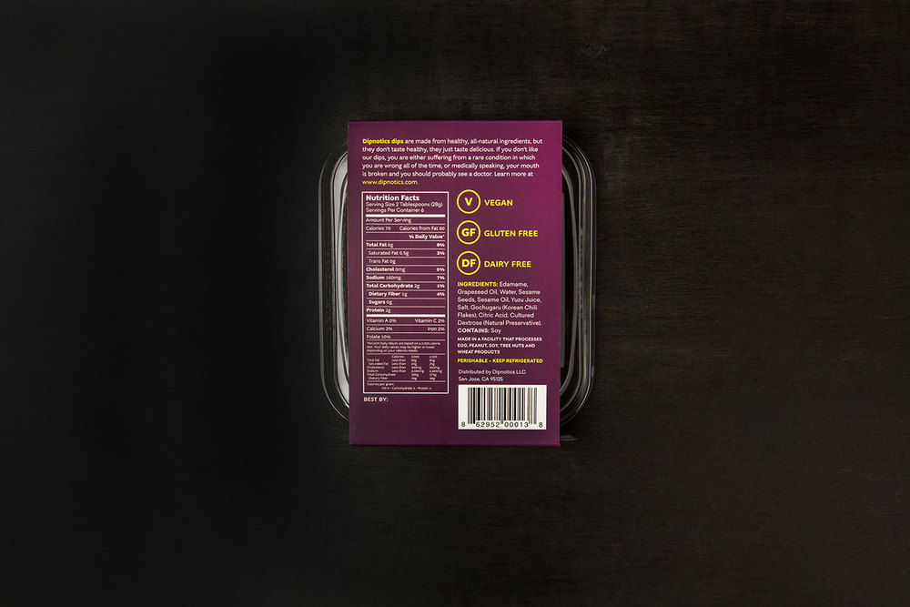
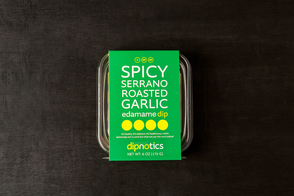
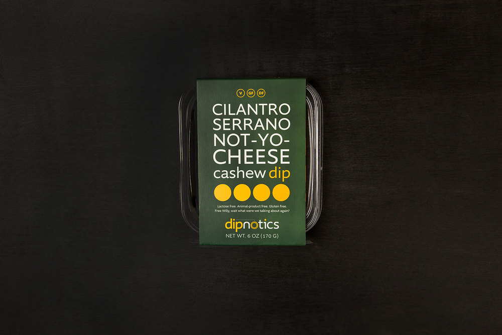
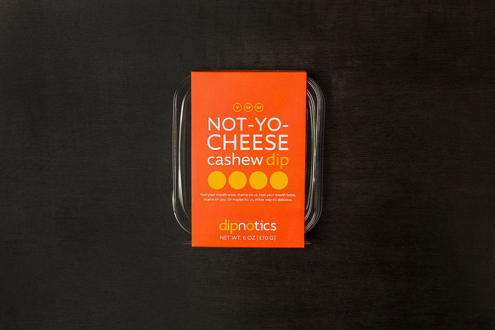
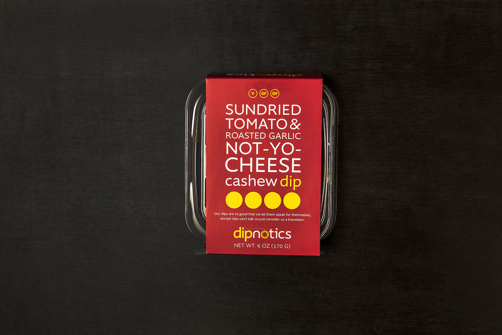
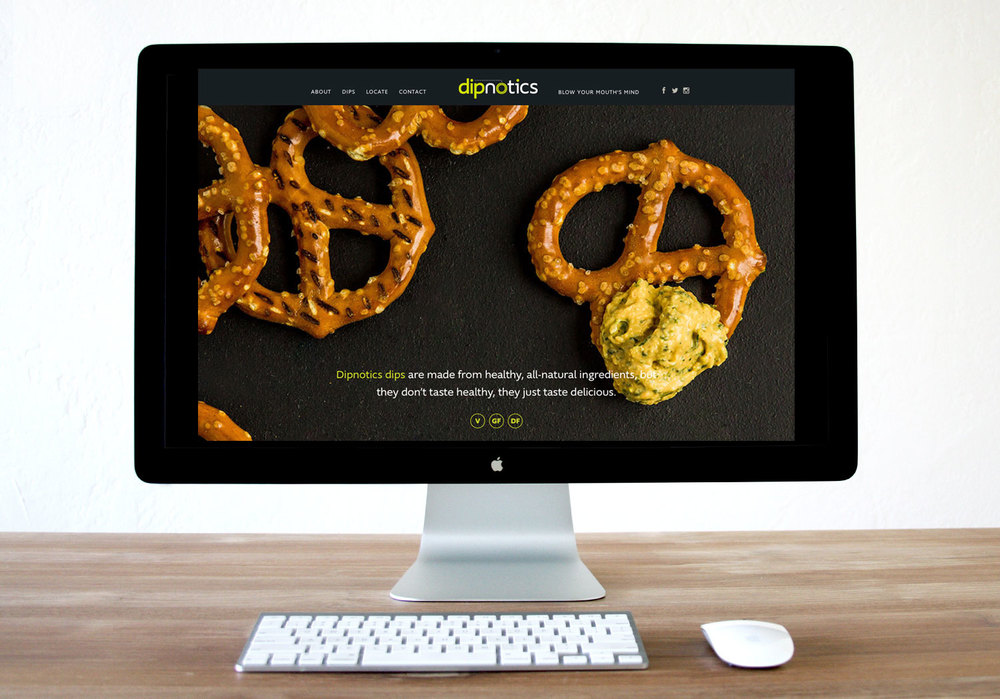
“Dipnotics dips are made from healthy, all-natural ingredients, but they don’t taste healthy, they just taste delicious.
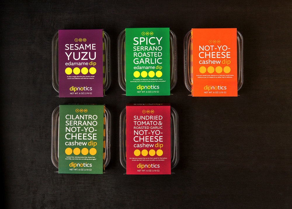
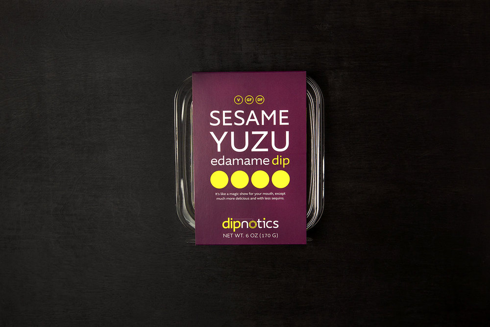
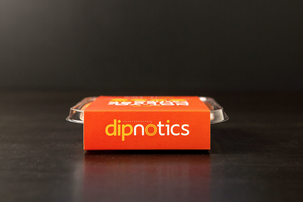
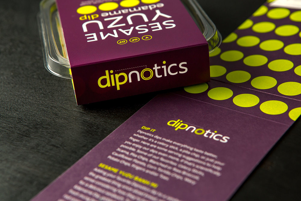
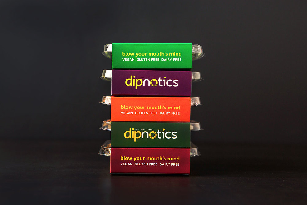
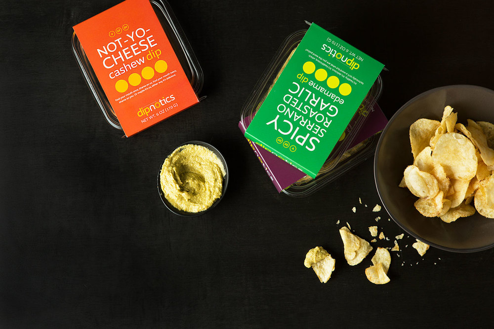
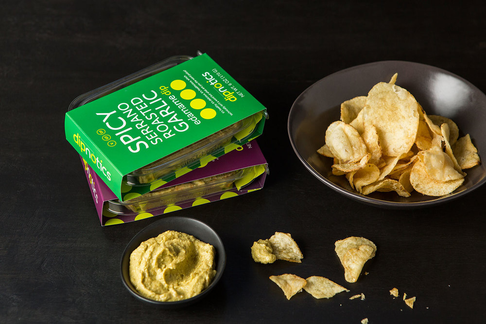
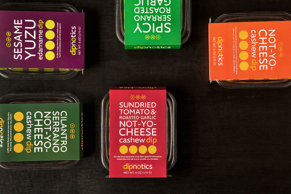
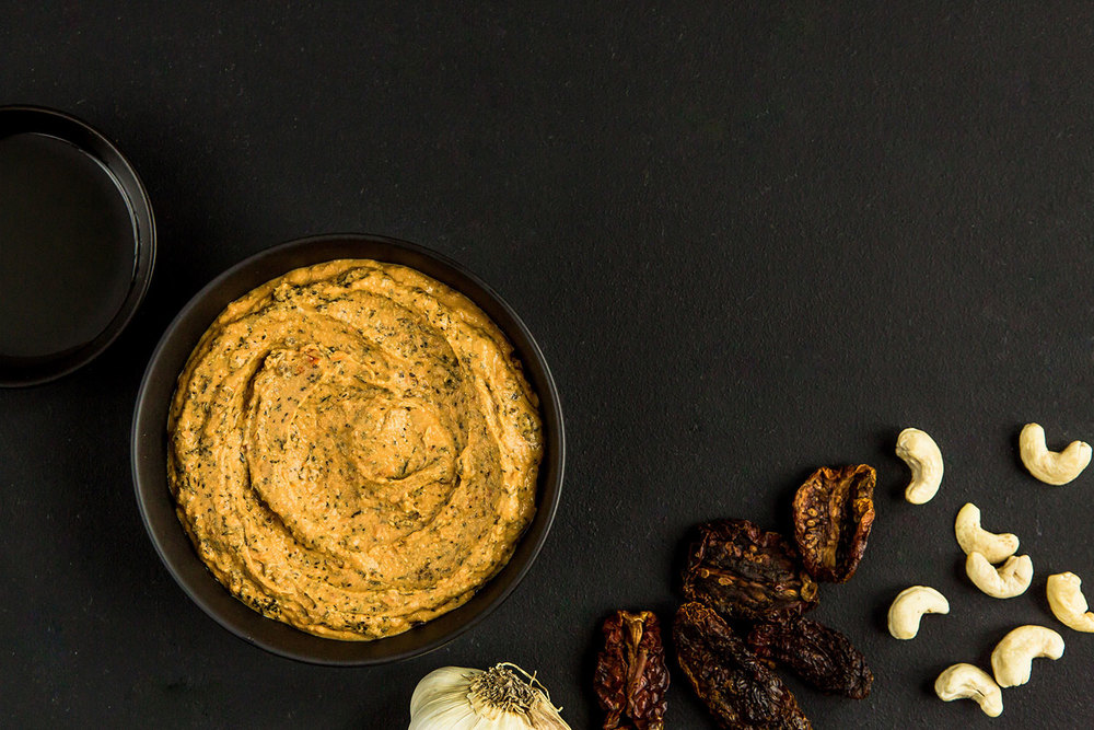
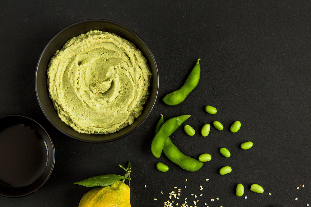
We worked to launch this brand from the ground up and the food packaging design reflects our art direction, brand voice, copywriting, photography, brand identity and logo design. We helped define the brand’s quirky personality through humor and playful lab-like layout. The dip packaging is colorful and we used humor in the brand voice to keep things light-hearted and healthy.
The results are a set of retail-ready dips which feature custom developed wrap-around sleeves and a bold mouth-watering website.”
CREDIT
- Agency/Creative: Design Womb
- Article Title: Design Womb – Dipnotics
- Project Type: Packaging
- Substrate: Pulp Paper
FEEDBACK
Relevance: Solution/idea in relation to brand, product or service
Implementation: Attention, detailing and finishing of final solution
Presentation: Text, visualisation and quality of the presentation


