


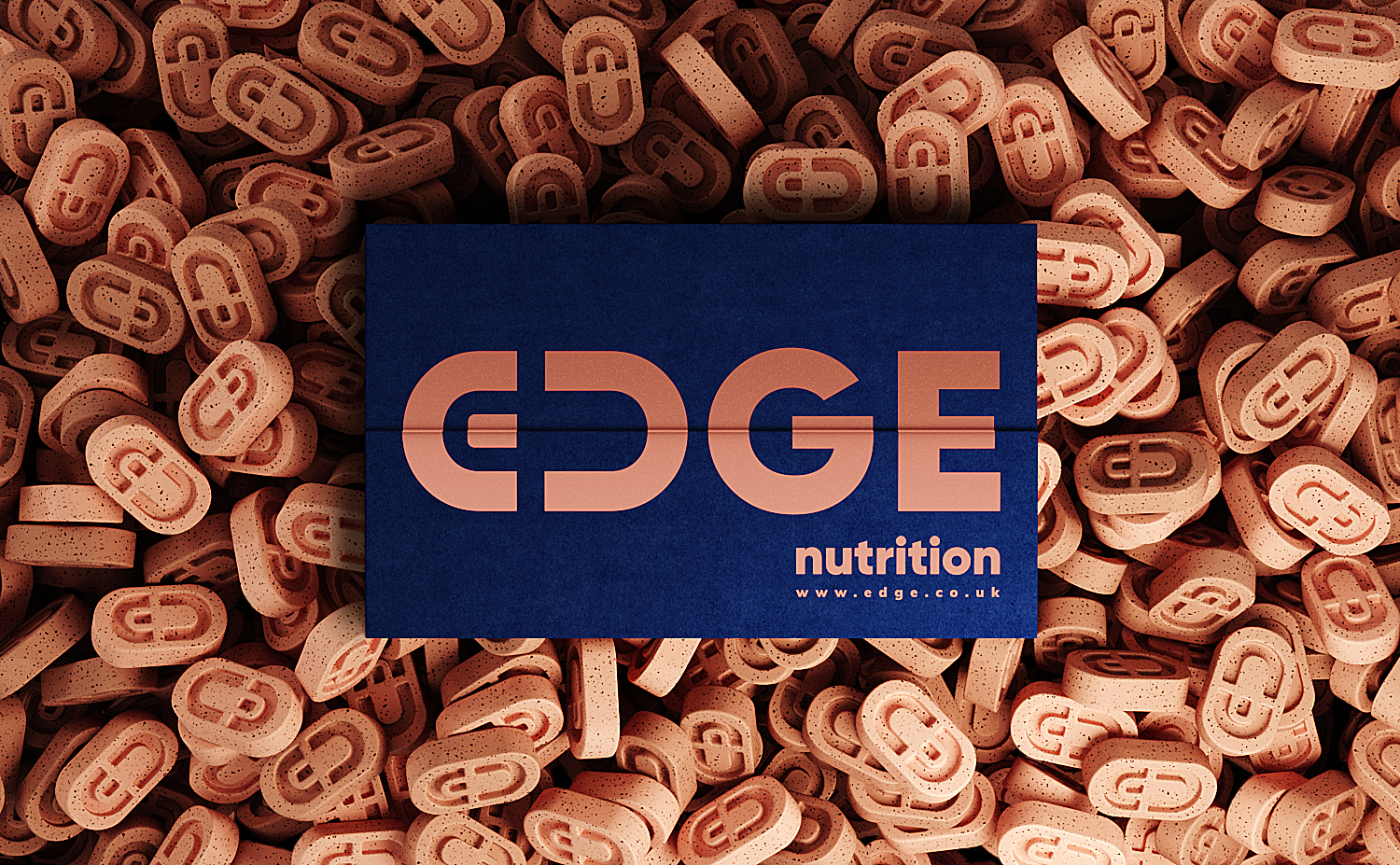
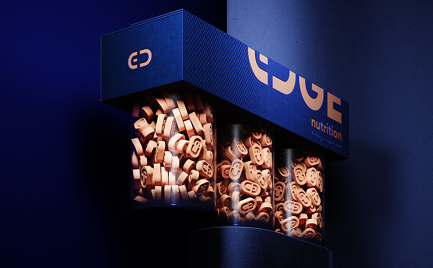
Edge Nutrition is a brand of dietary supplements that are an affordable and effective way to ensure people are getting the daily recommended intake of essential vitamins, minerals, and other important nutrients necessary for optimal health.
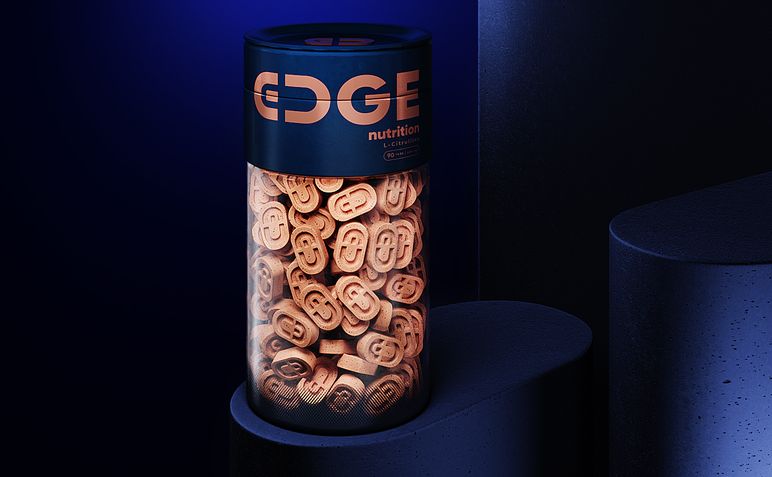
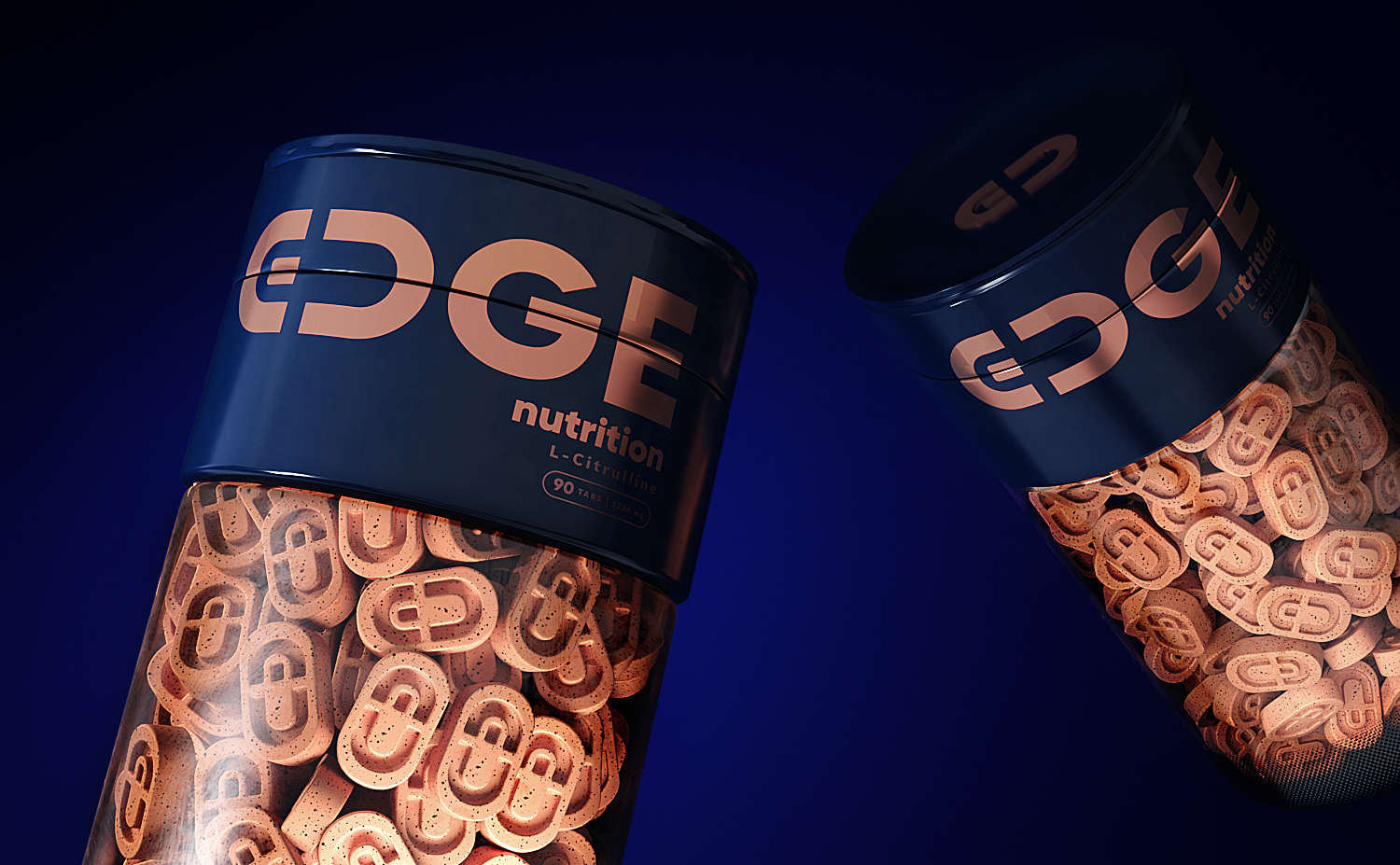
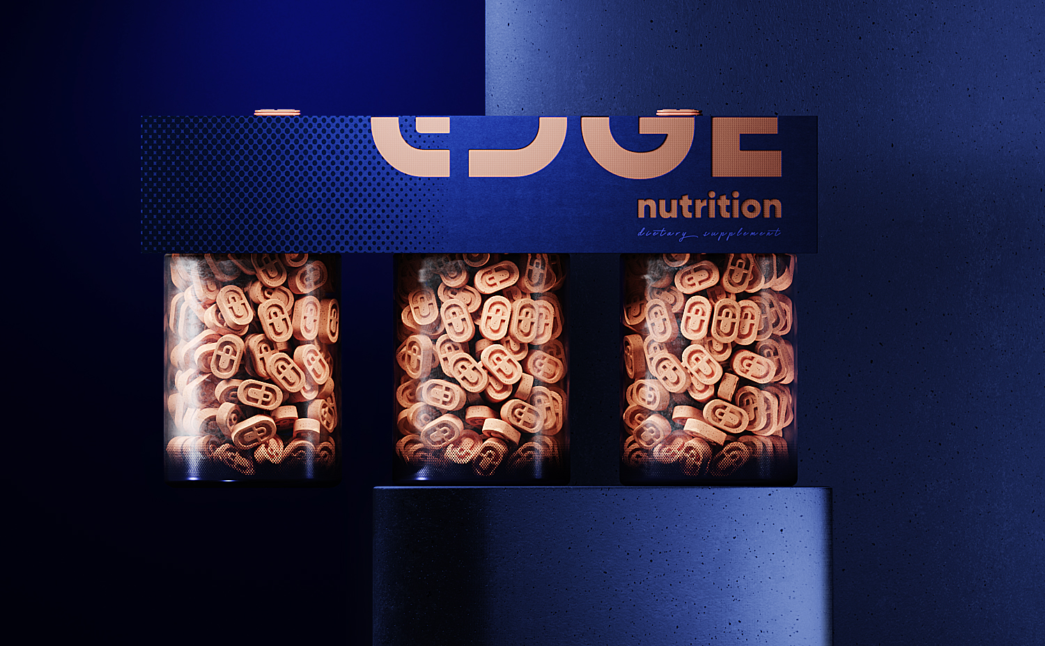
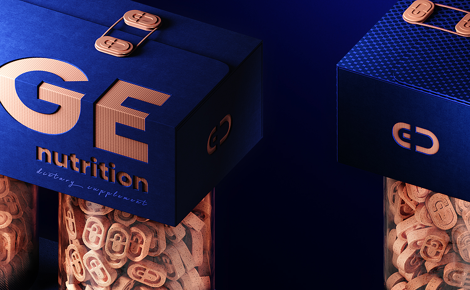
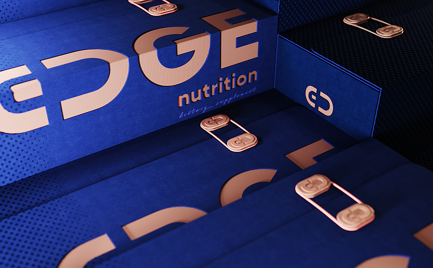
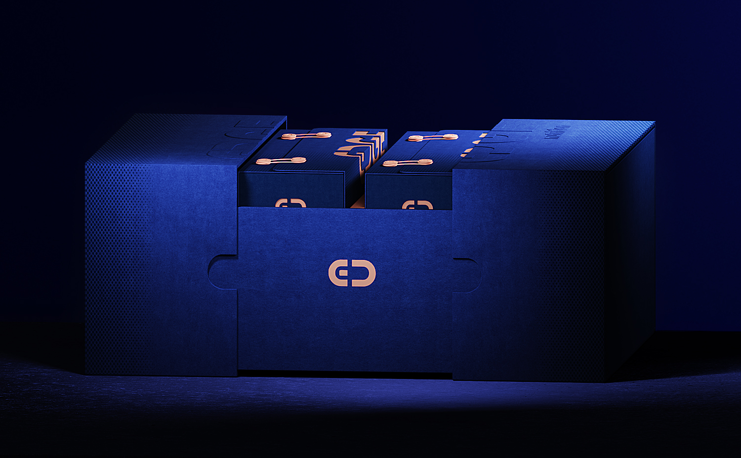
This project has a clean design where the logotype and the symbol (ED) are the main and most important part of it. We wanted to highlight the brand name itself and avoid another type of graphic element which could complement the logotype. (edge) is a line or border at which a surface ends. That is the reason why the logotype is always ubicated on a boundary or in a union of two elements. On the other hand, The (ED) symbol is a graphic representation of a pill, and it is also part of the logotype. That symbol is present on the pills, on the lid of the pill container, on the packaging, and even it is part of the system to close the packaging.
Finally, we picked just two colors for this project, orange and blue. They often symbolize serenity, calm, stimulation, energy. So we consider them a good choice to represent a brand related to dietary supplements.

CREDIT
- Agency/Creative: kendko
- Article Title: Design Studio Kendko Creates Packaging Design for Dietary Supplements
- Organisation/Entity: Agency, Published Commercial Design
- Project Type: Packaging
- Agency/Creative Country: Australia
- Market Region: Europe
- Project Deliverables: Brand Strategy, Branding, Packaging Design
- Format: Bottle, Box
- Substrate: Plastic, Pulp Board


