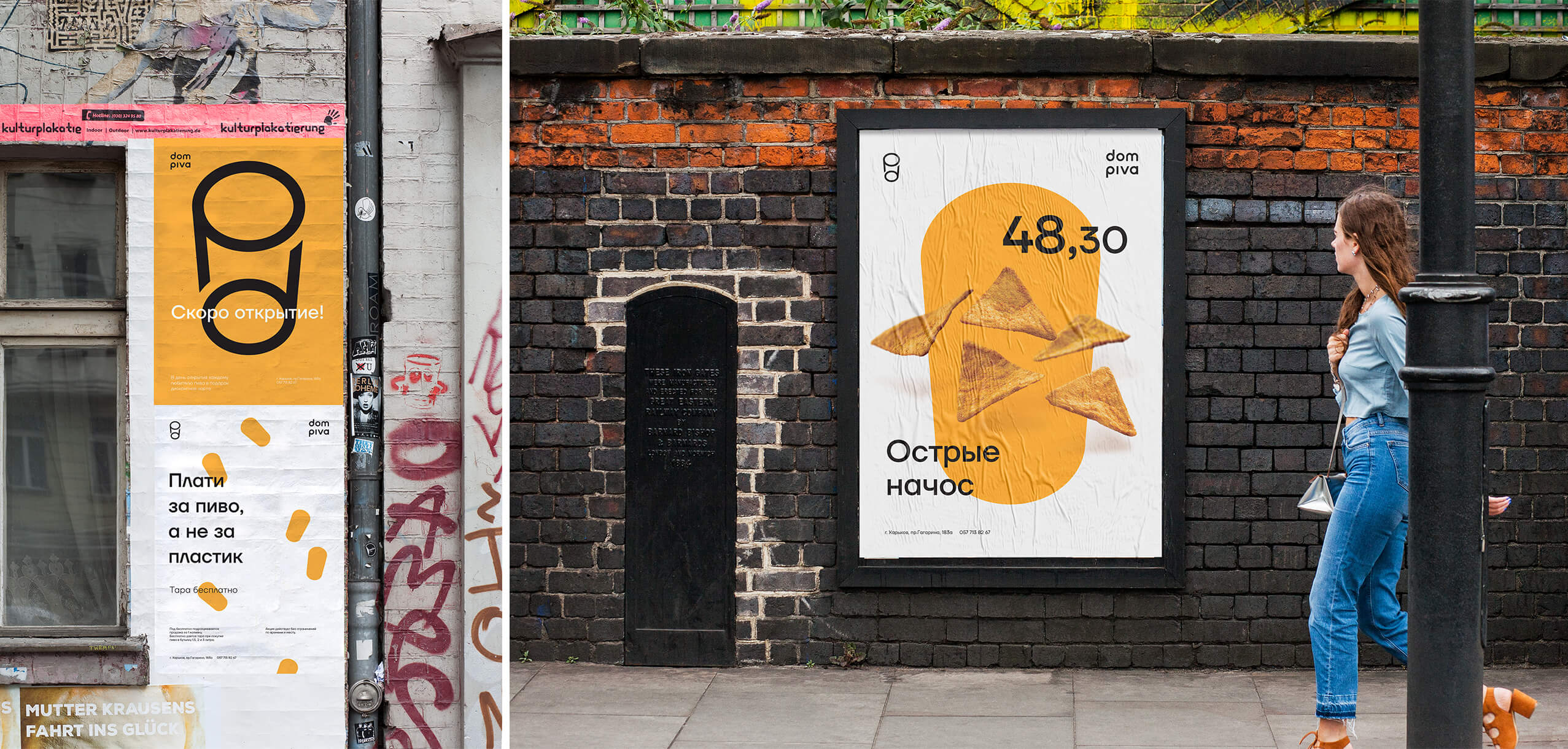
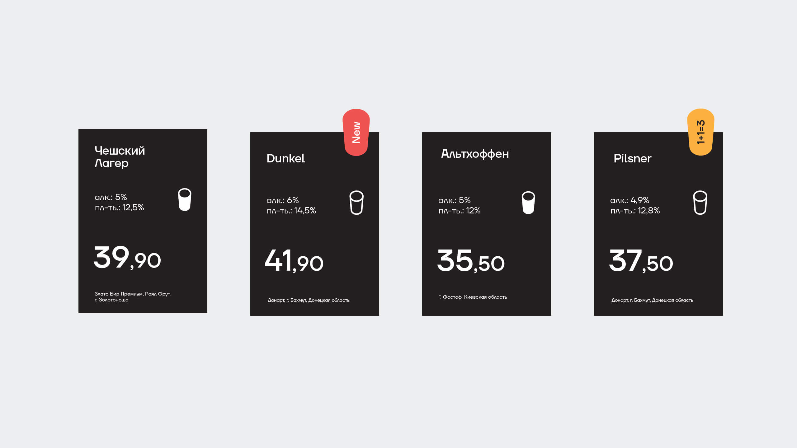
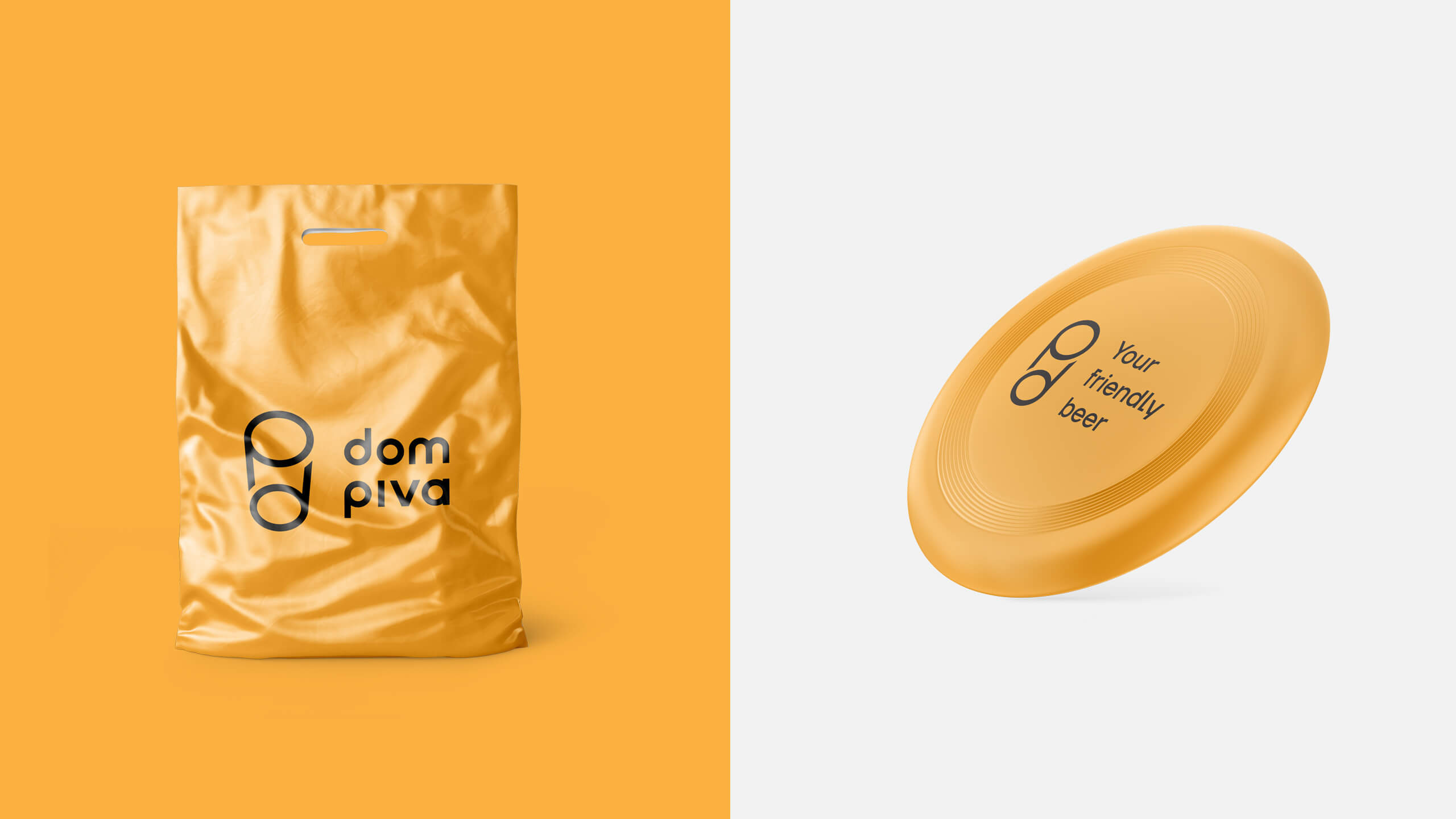
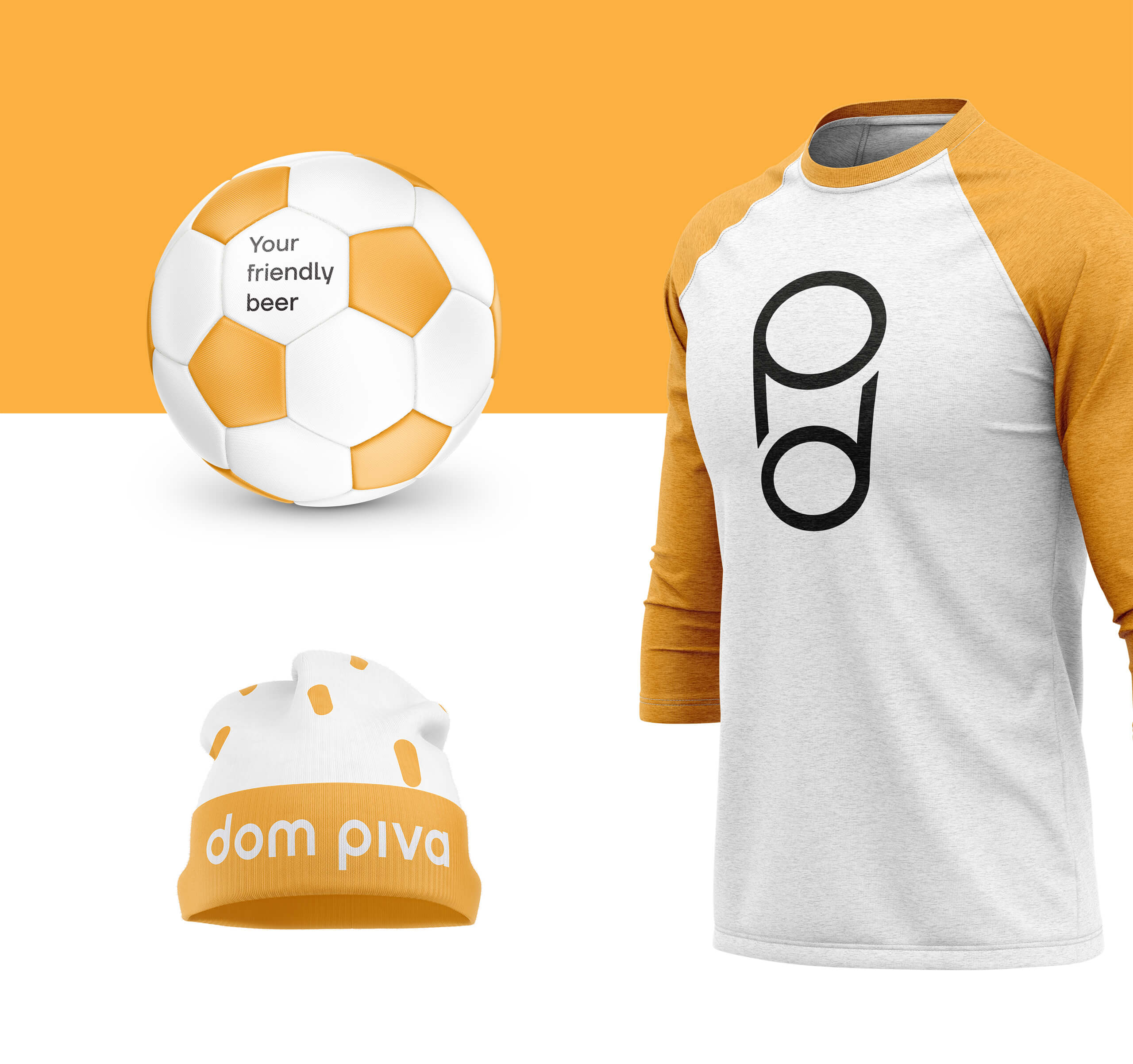
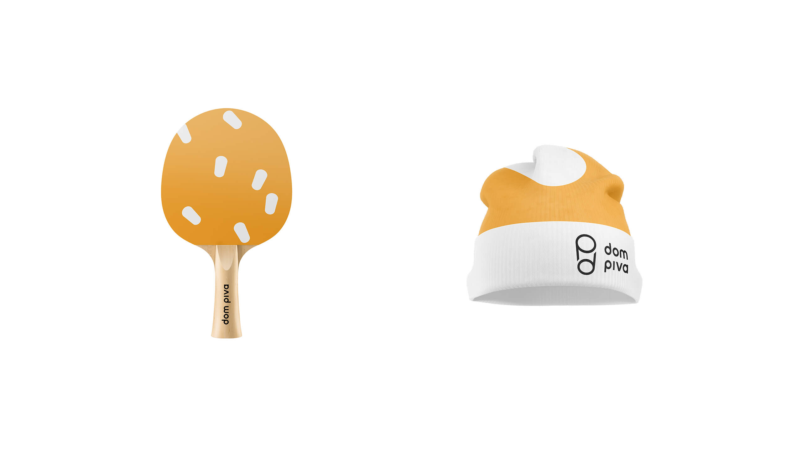
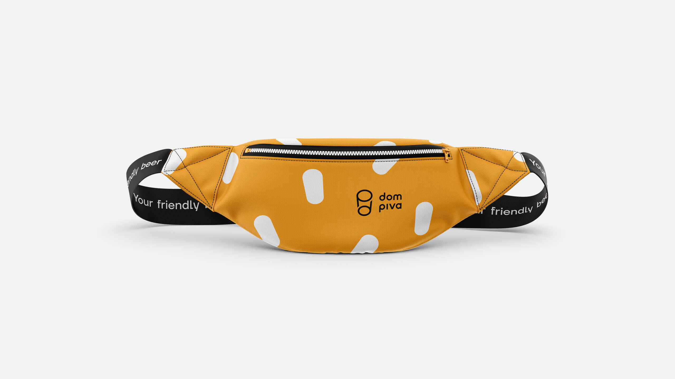
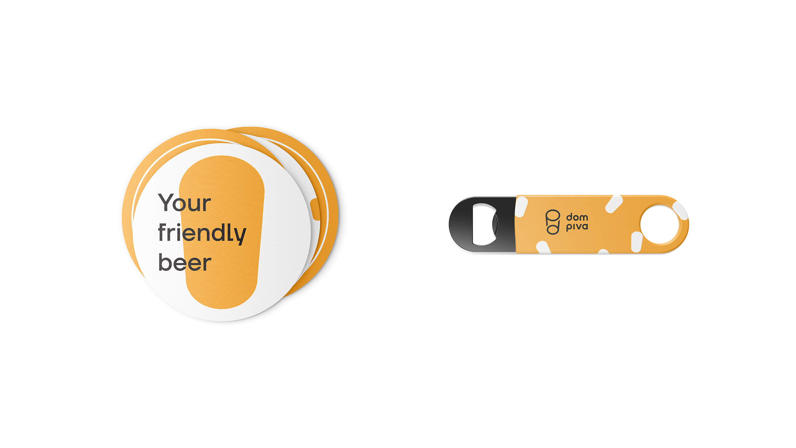
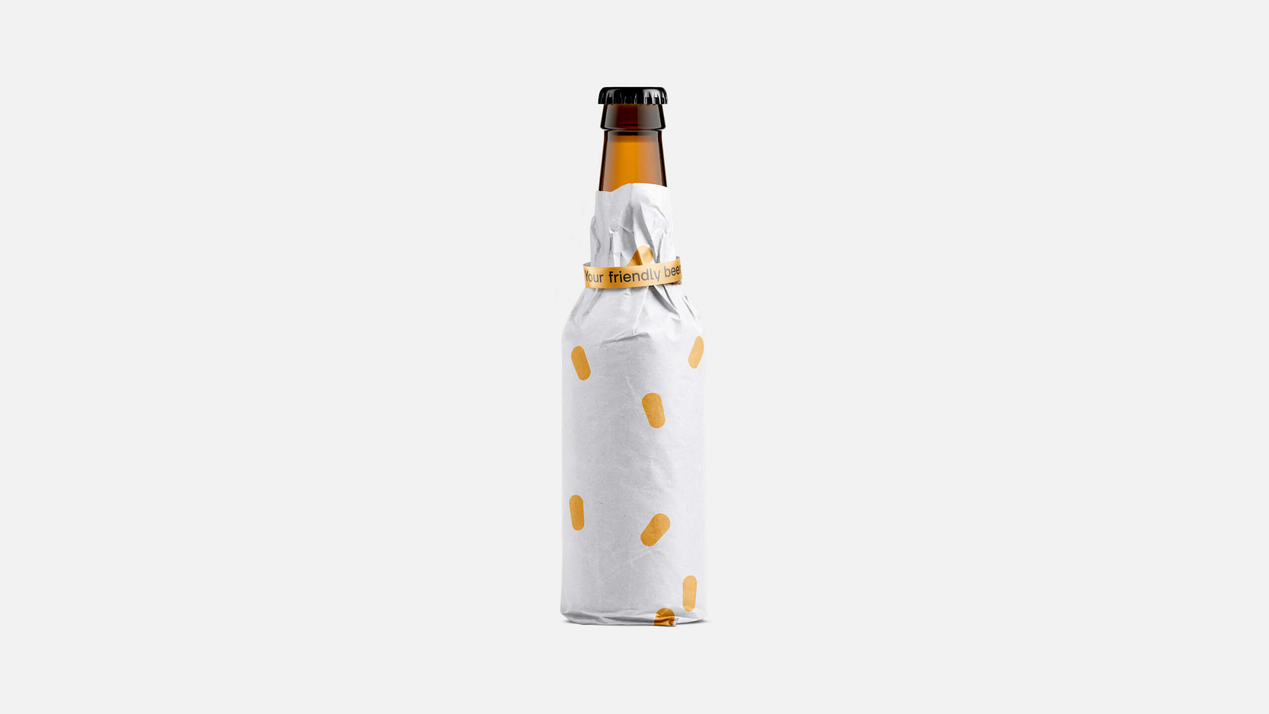
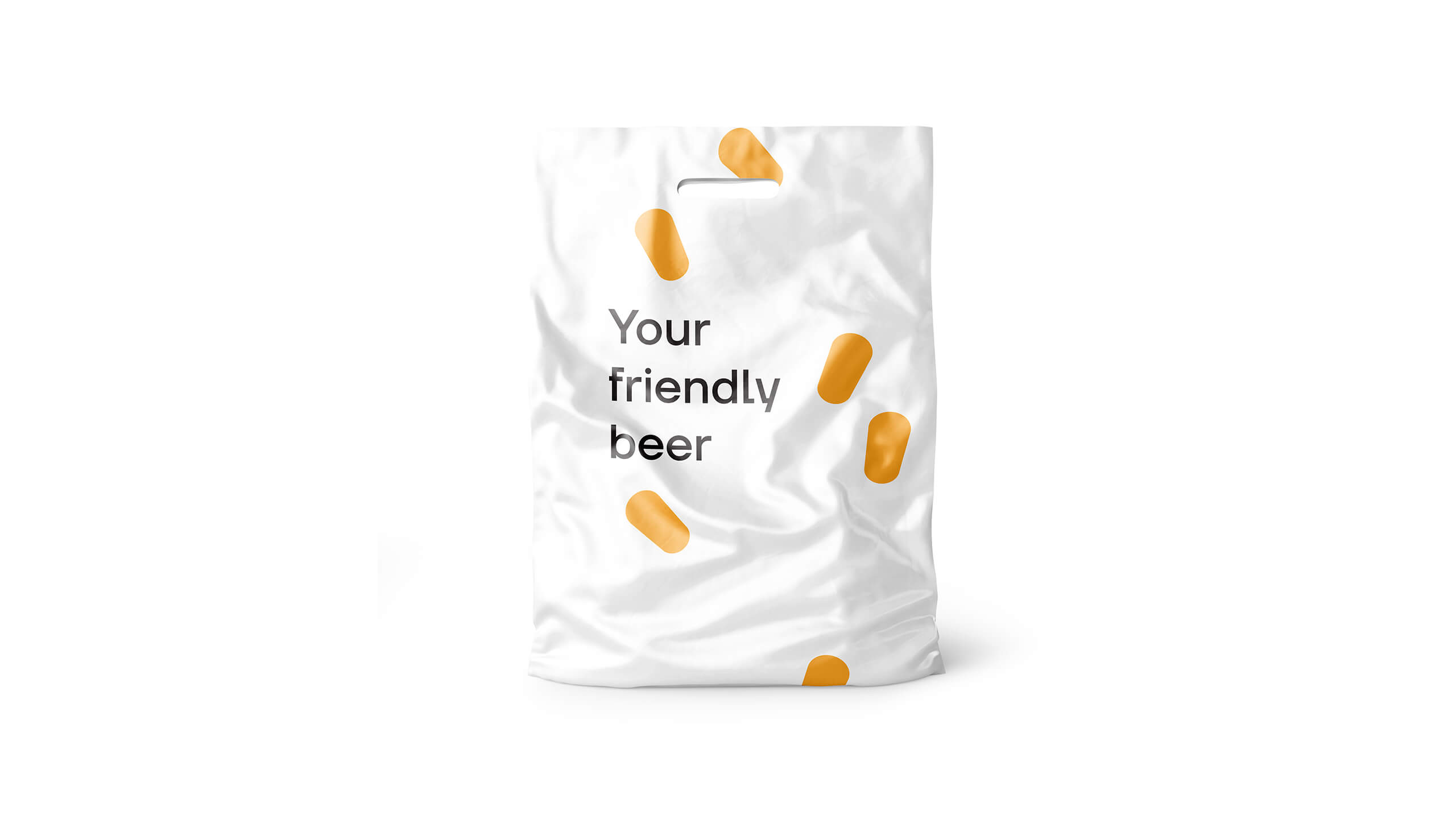
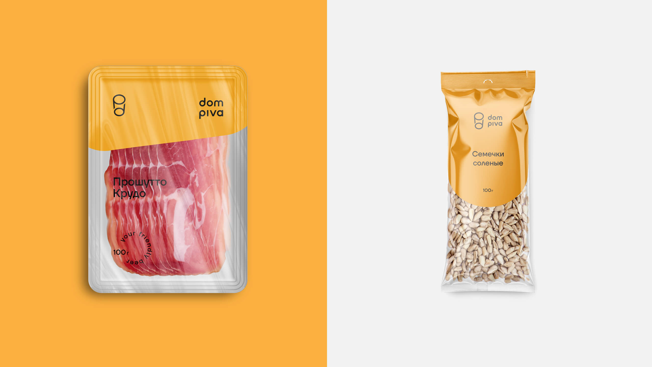
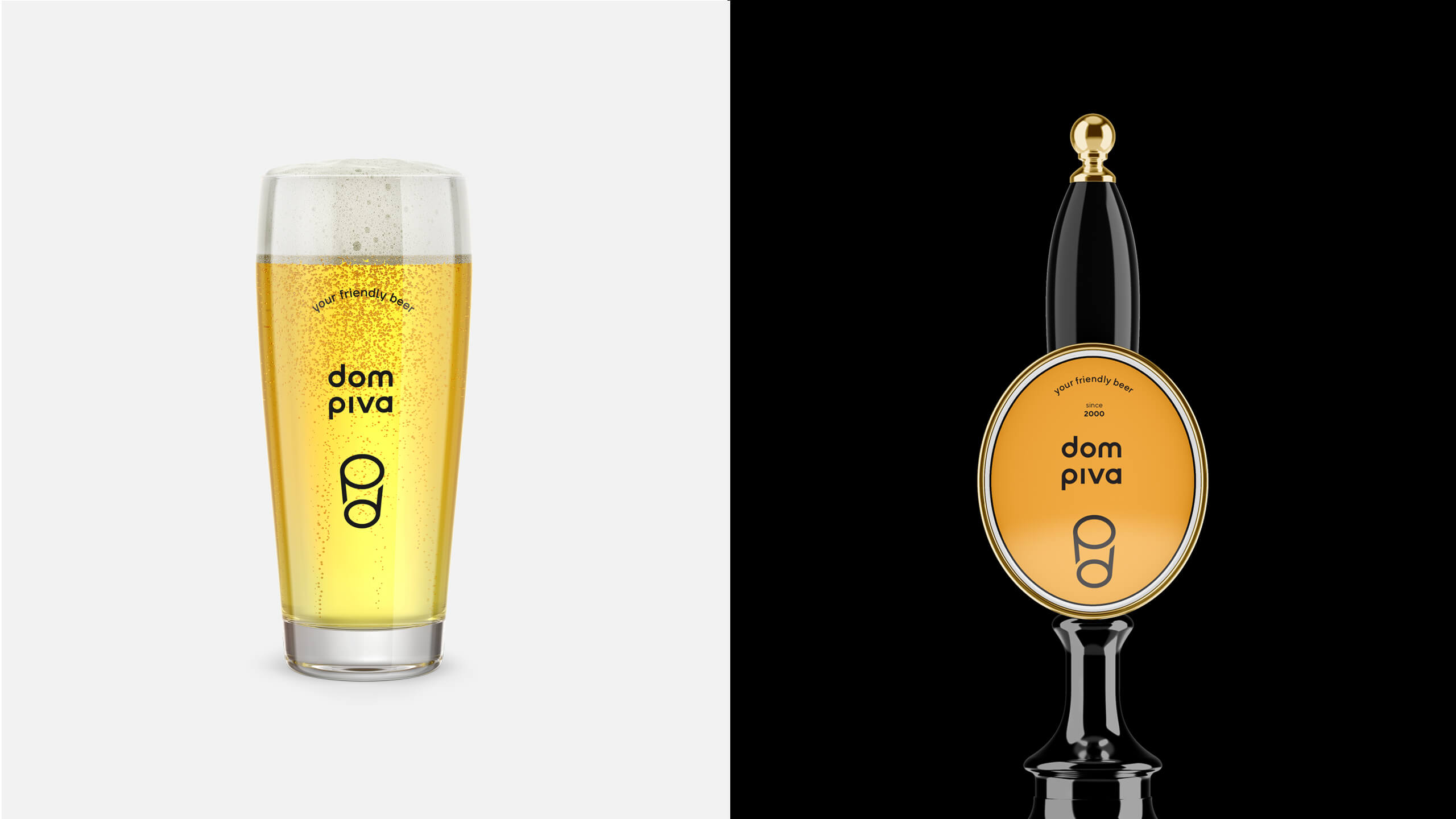
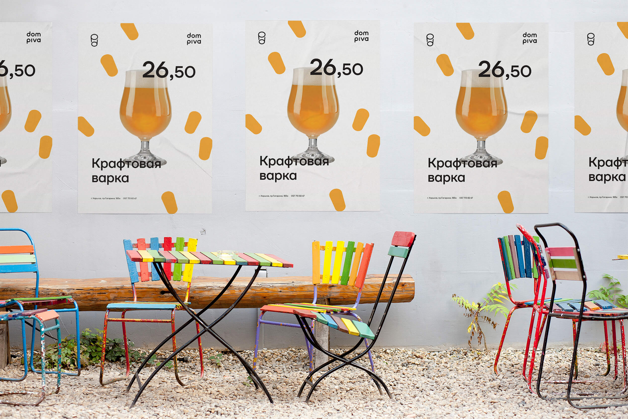
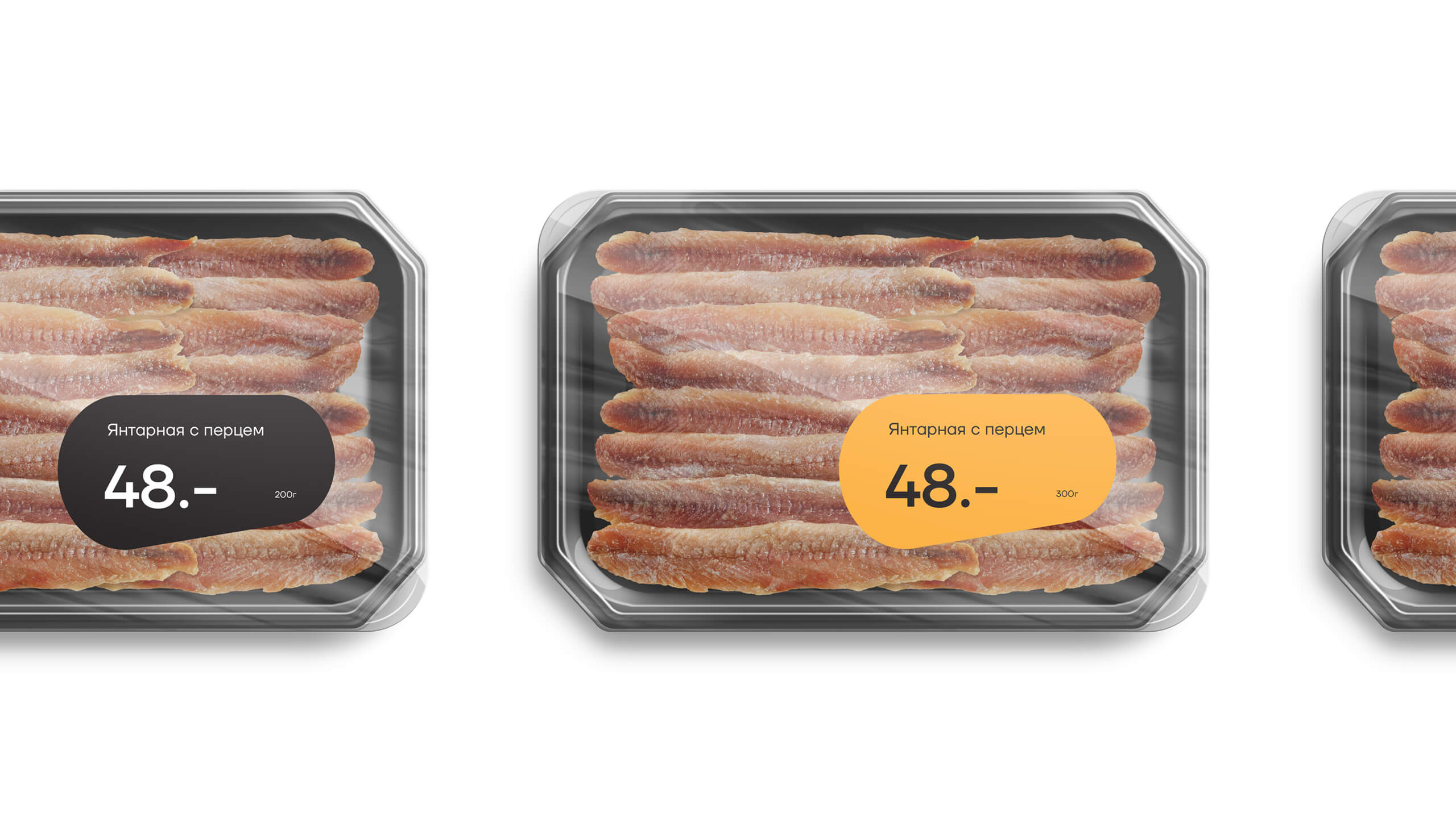
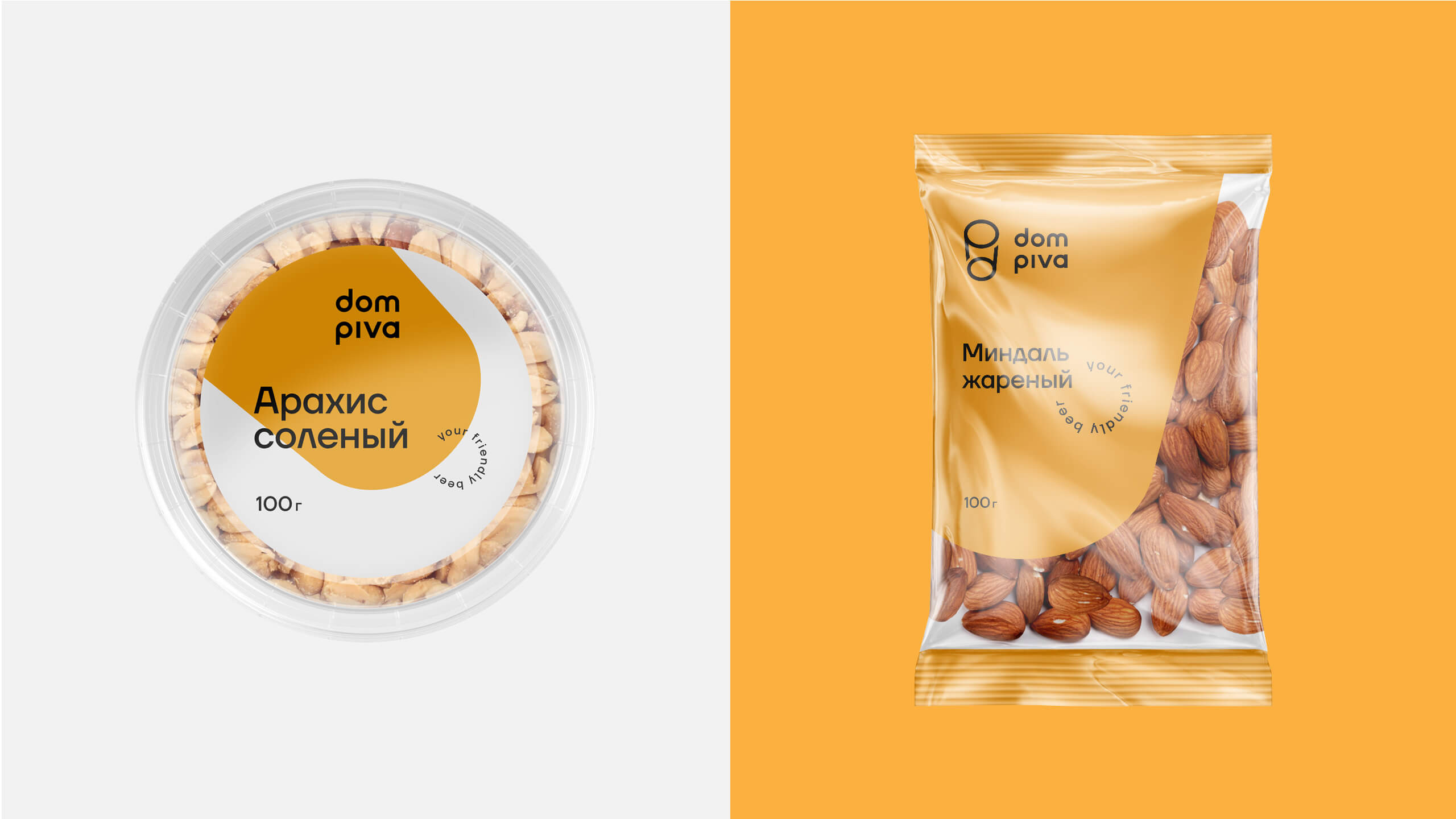
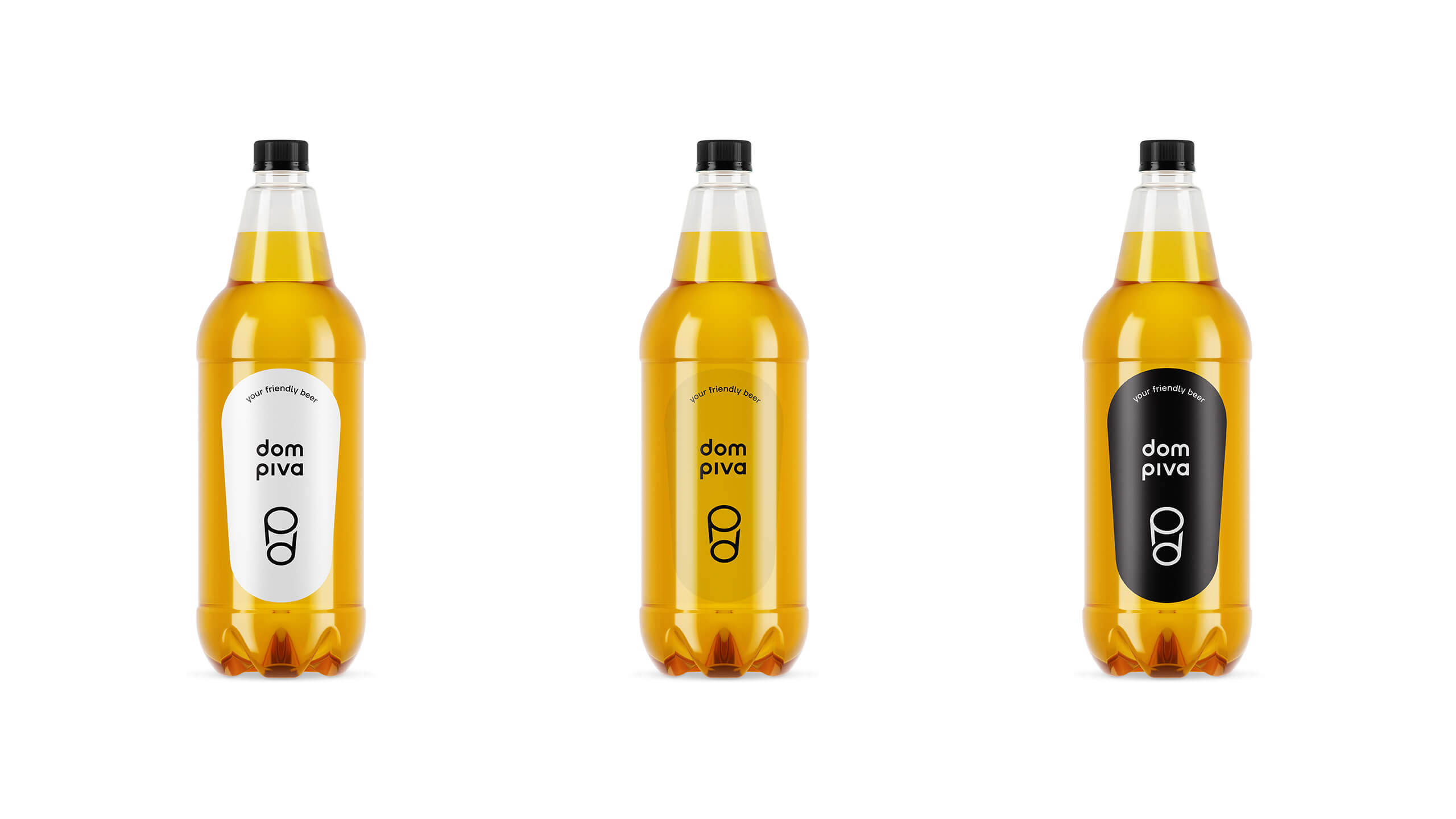
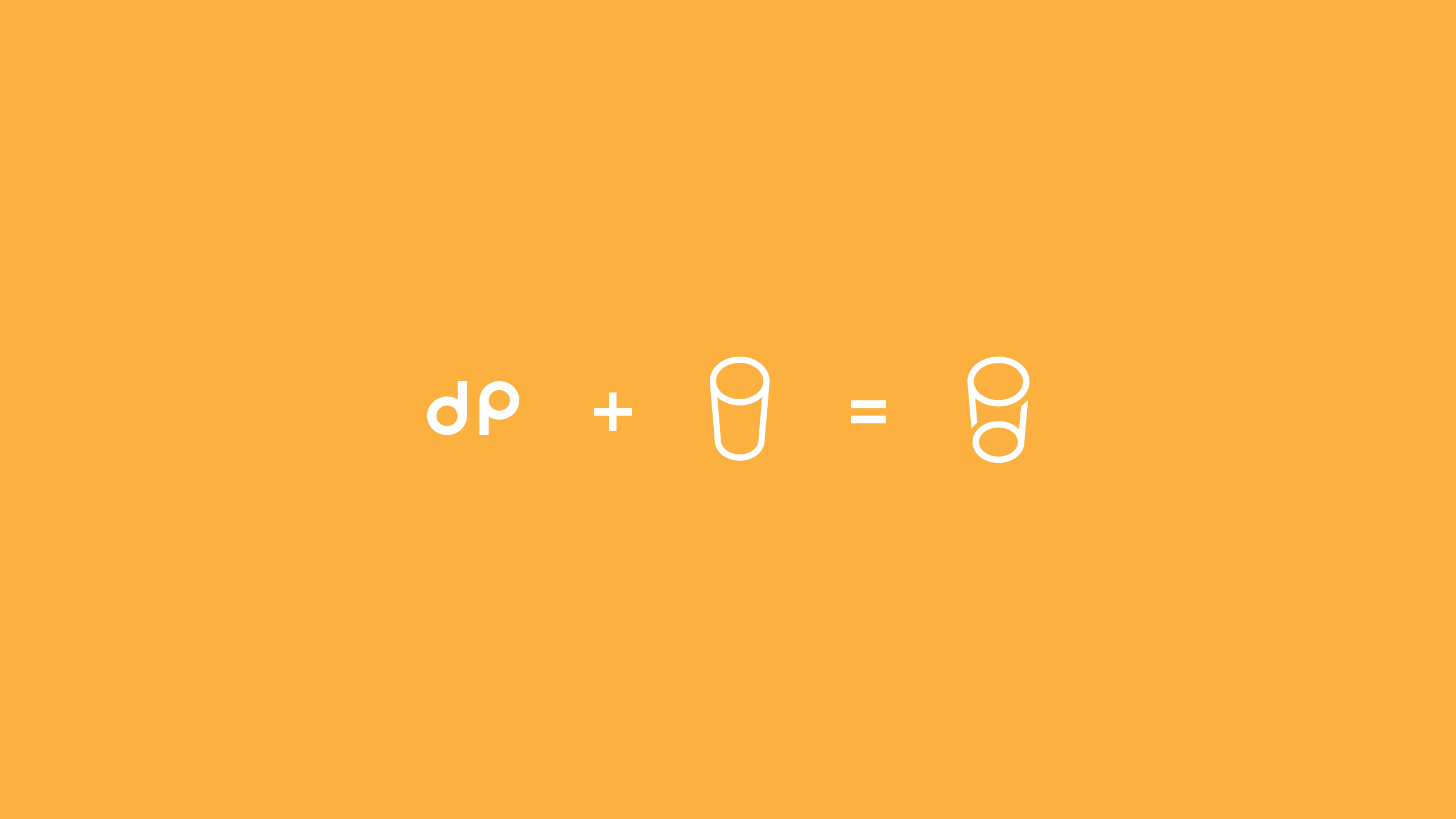
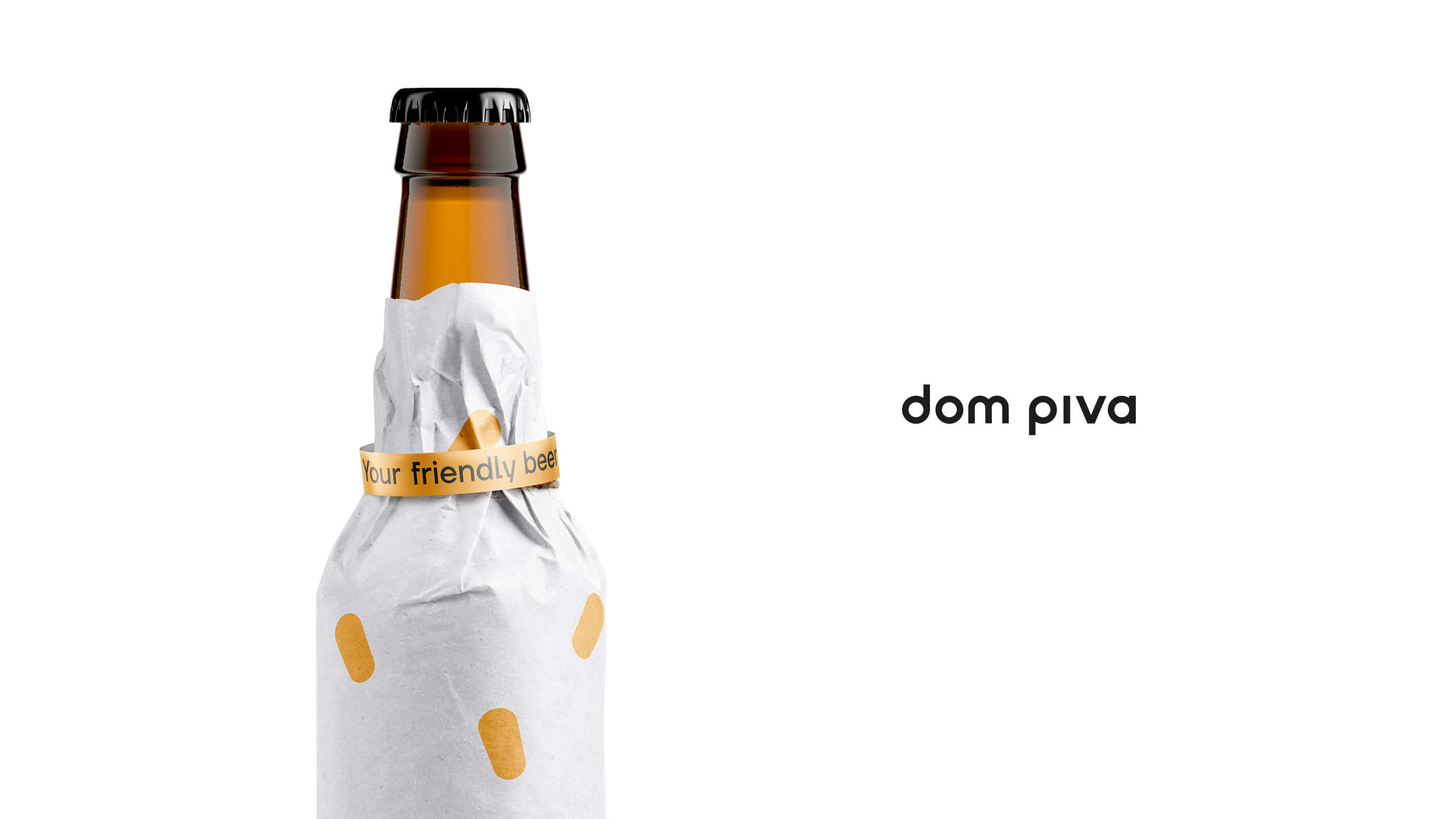
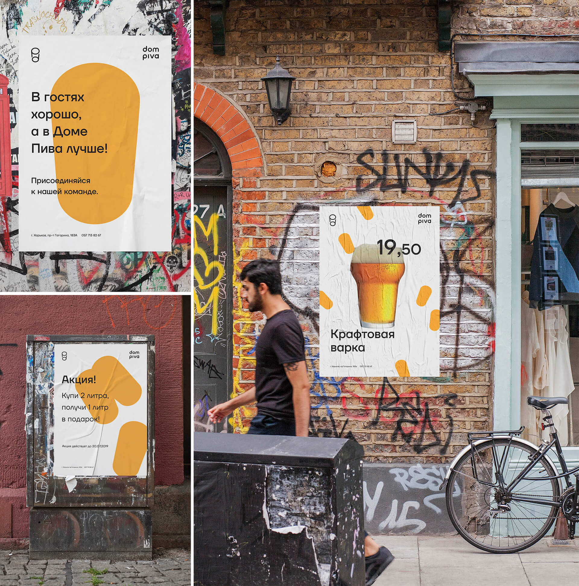
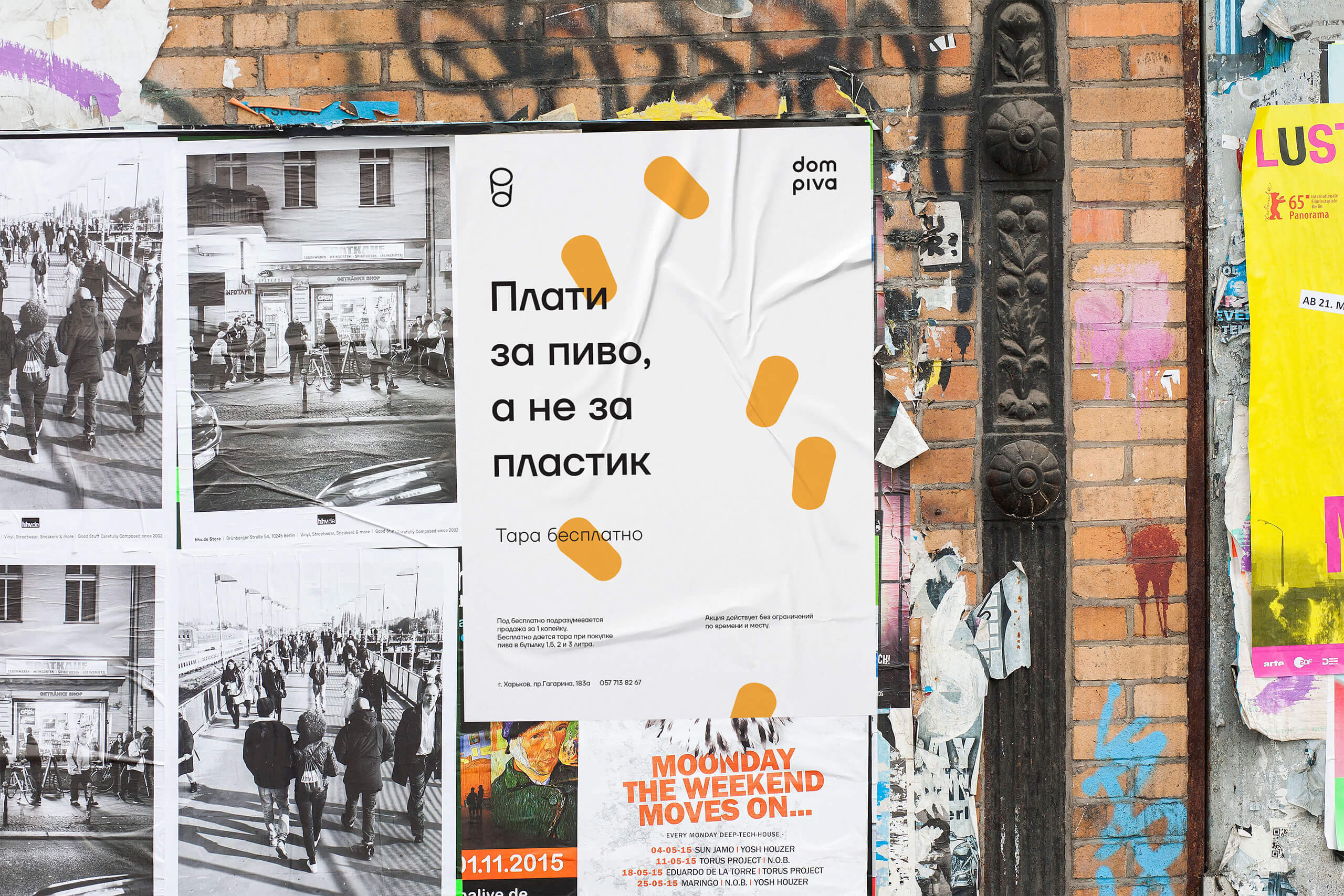
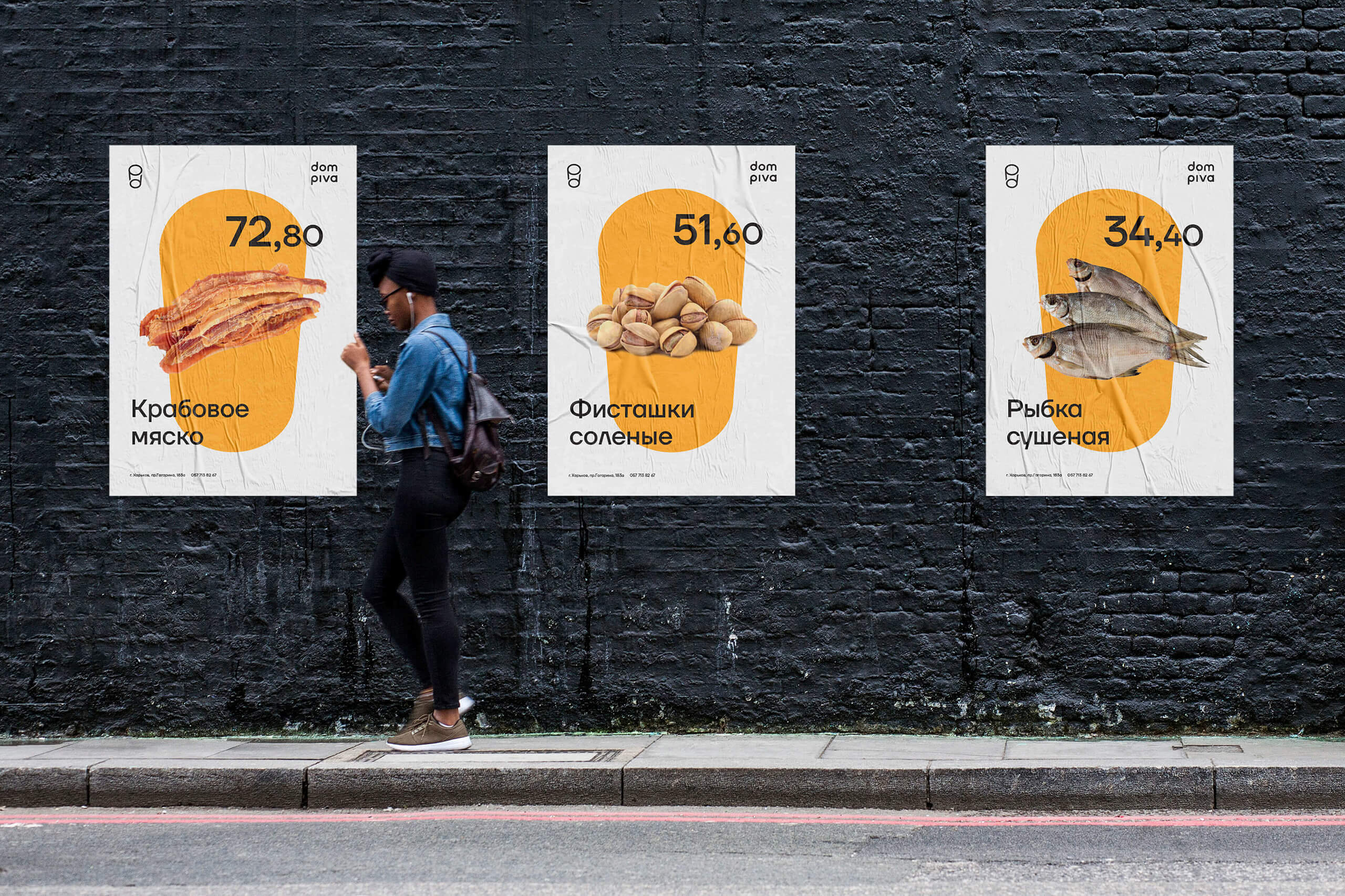
The beer house is the oldest one of the shops of the foam. They have so many beer, it is different, tasty, that they decided to talk even more loudly about it with the help of a new style. We thought that beer is so simple, that’s why the identity should be as simple as possible. The name itself formed in the form of a beer glass, which became the main styling element. It is both a sign and a signature plate and a form that can be collected in textures. The hot yellow color emphasized the simplicity of the identity and speaks directly about the product. More delicious when it is more beautiful. Your friendly beer.

CREDIT
- Agency/Creative: design studio Glad Head
- Article Title: Design Studio Glad Head Created a New Corporate Style for Beer Shops “Dom Piva”
- Organisation/Entity: Agency, Published Commercial Design
- Project Type: Identity
- Agency/Creative Country: Ukraine
- Market Region: Europe
- Project Deliverables: Brand Advertising, Brand Guidelines, Brand Identity, Branding, Graphic Design, Packaging Design, Research, Tone of Voice
- Industry: Food/Beverage
- Keywords: beer, house, chain, gladhead, Dom piva, glad head, Ukraine, Kharkiv
FEEDBACK
Relevance: Solution/idea in relation to brand, product or service
Implementation: Attention, detailing and finishing of final solution
Presentation: Text, visualisation and quality of the presentation


