


For years, Mayerhofer let its work speak for itself. Now the brand does too.
The Client
Founded as a craft-led family business in 1952, Mayerhofer has evolved over three generations into a contemporary interior design company with a strong heritage and a clear focus on cultural relevance.
The Challenge
As the company evolved over time, its external appearance struggled to reflect its internal quality. What was needed was a contemporary expression for a company that had outgrown its old narrative – one that could clearly communicate what Mayerhofer offers and how it creates value today. The challenge was not to invent something new, but to uncover, articulate and translate an existing identity into a contemporary, future-proof brand language.
The Solution
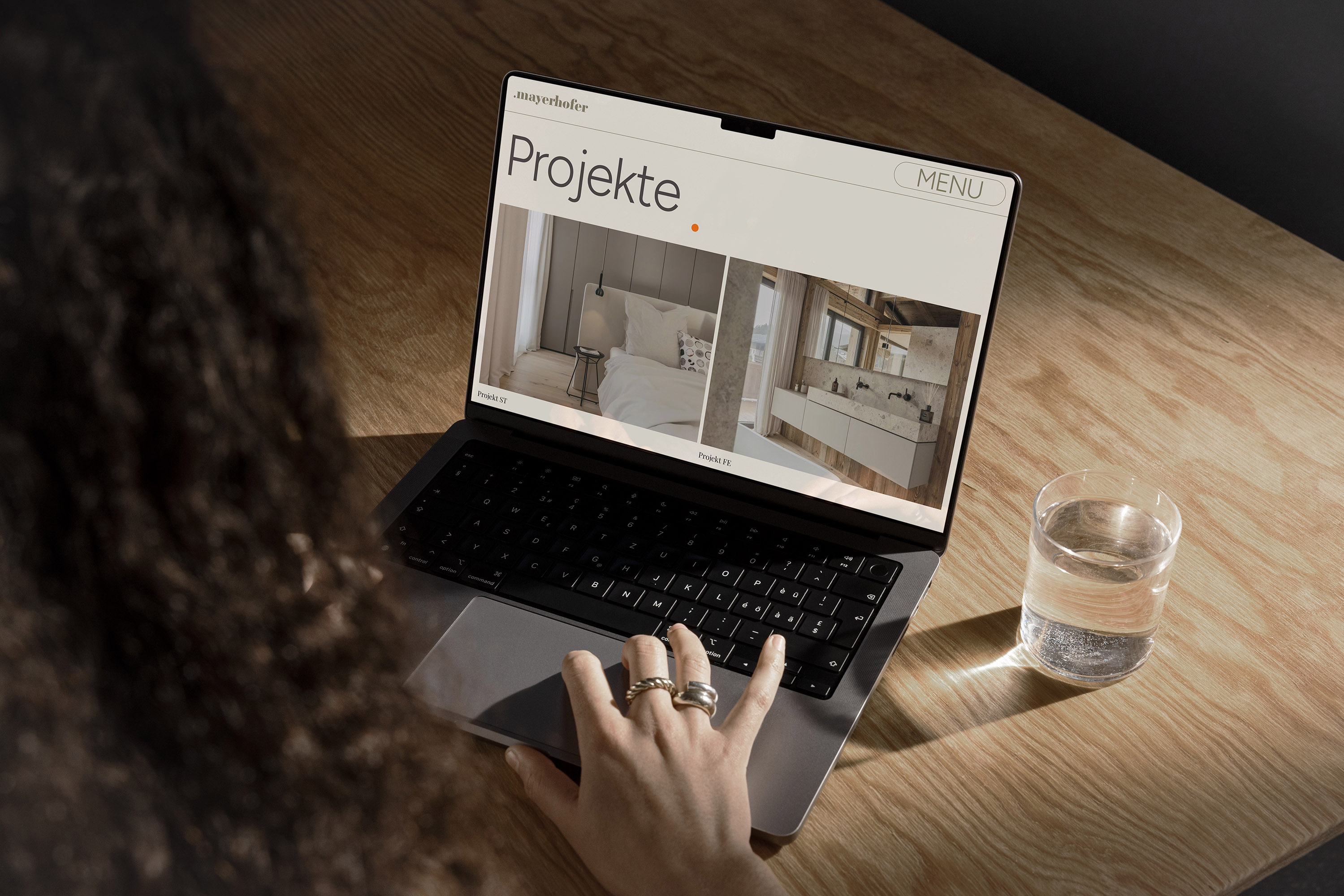
We adopted a holistic approach to the transformation, starting with a dialogue to define purpose, values and positioning. Building on this foundation, we developed the visual language. At its core is the brand mark “.m”, reflecting the three pillars that were defined together with the client: “Lab”, for interior planning and expertise; “Loft”, for the showroom and point of consultation space; and “Factory”, the production facility. The dot represents the customer navigating the company’s three pillars, symbolizing their movement across the various areas of the business.
This principle is reflected in the brand’s central message “Raum • Gefühl”, where the dot once again signifies the human focus, placing the customer between space and emotion.
The new corporate identity translates Mayerhofer’s essence into a refined and expressive identity system with a distinctive logo, color palette, typography and digital presence. The relaunch of the website serves as a key expression of the new identity, clearly defining Mayerhofer’s proposition, as well as the interplay of its three pillars, through an intuitive user experience.
During the creative process, it is often impossible to anticipate which conversations or insights will ultimately influence the outcome. One such moment occurred during a workshop when a team member described Mayerhofer as a light, modern, lively drink, much like an Aperol Spritz. This idea later became one of the brand’s key accent colors, demonstrating how concepts emerge through collaborative thinking and shared creative dialogue.

CREDIT
- Agency/Creative: Design Network GmbH
- Article Title: Design Network GmbH Defines a Contemporary Brand Identity for Mayerhofer
- Organisation/Entity: Agency
- Project Type: Identity
- Project Status: Published
- Agency/Creative Country: Austria
- Agency/Creative City: Innsbruck
- Market Region: Europe
- Project Deliverables: Brand Design, Brand Guidelines, Brand Strategy, Branding, Logo Design, Rebranding, Web Design
- Industry: Construction
- Keywords: Brand Identity, Rebranding, Brand Strategy, Visual Identity, Logo Design, Brand System, Craftsmanship, Brand Positioning
-
Credits:
Design Network: Design Network


