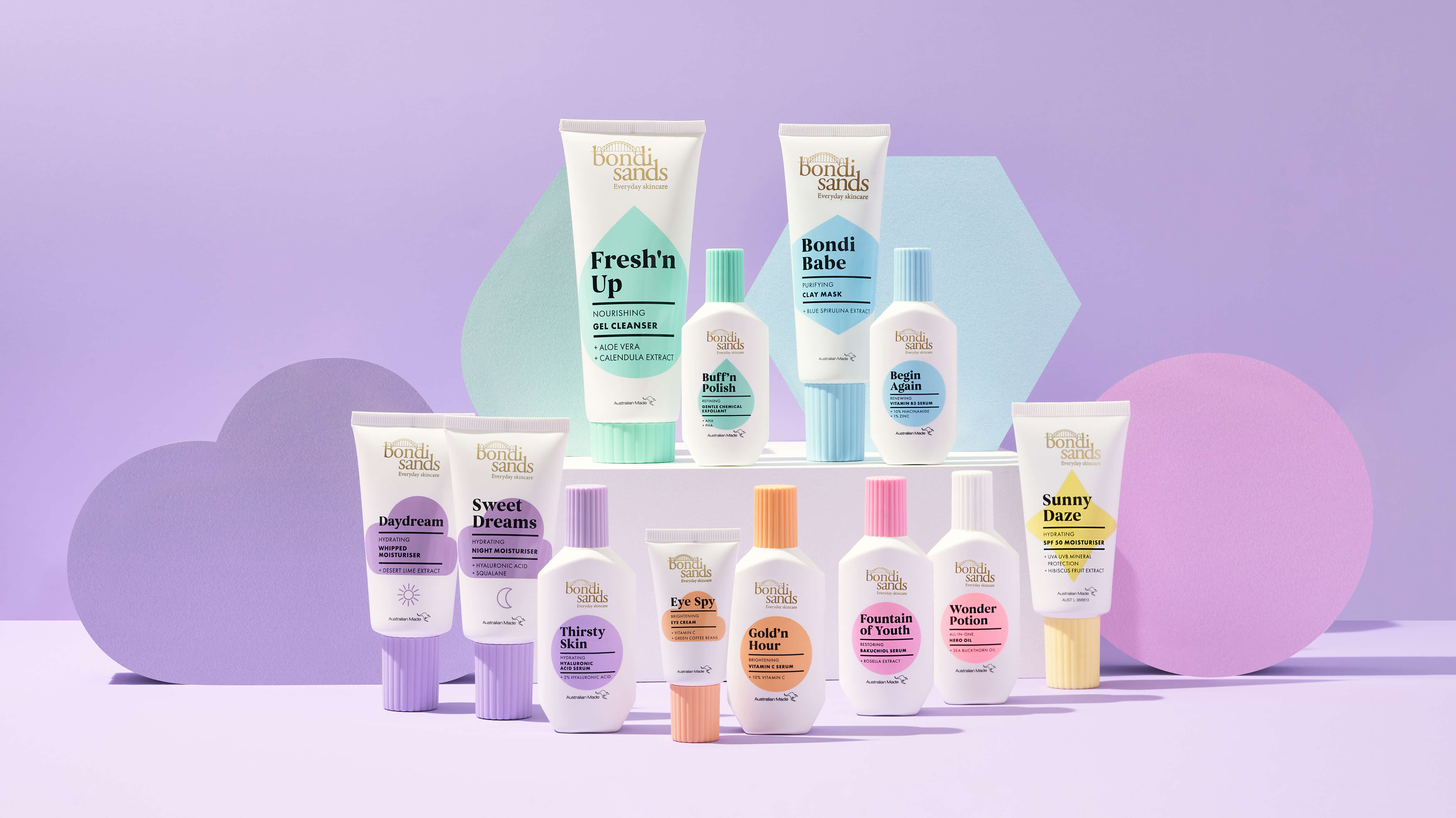
The Brief: Already a well established self tanning brand, Bondi Sands were looking to extend their offering into skincare. It was crucial that this new range not only had a ‘Bondi Sands’ familiarity to it but also cut thought the very competitive market whilst feeling both credible and accessible.
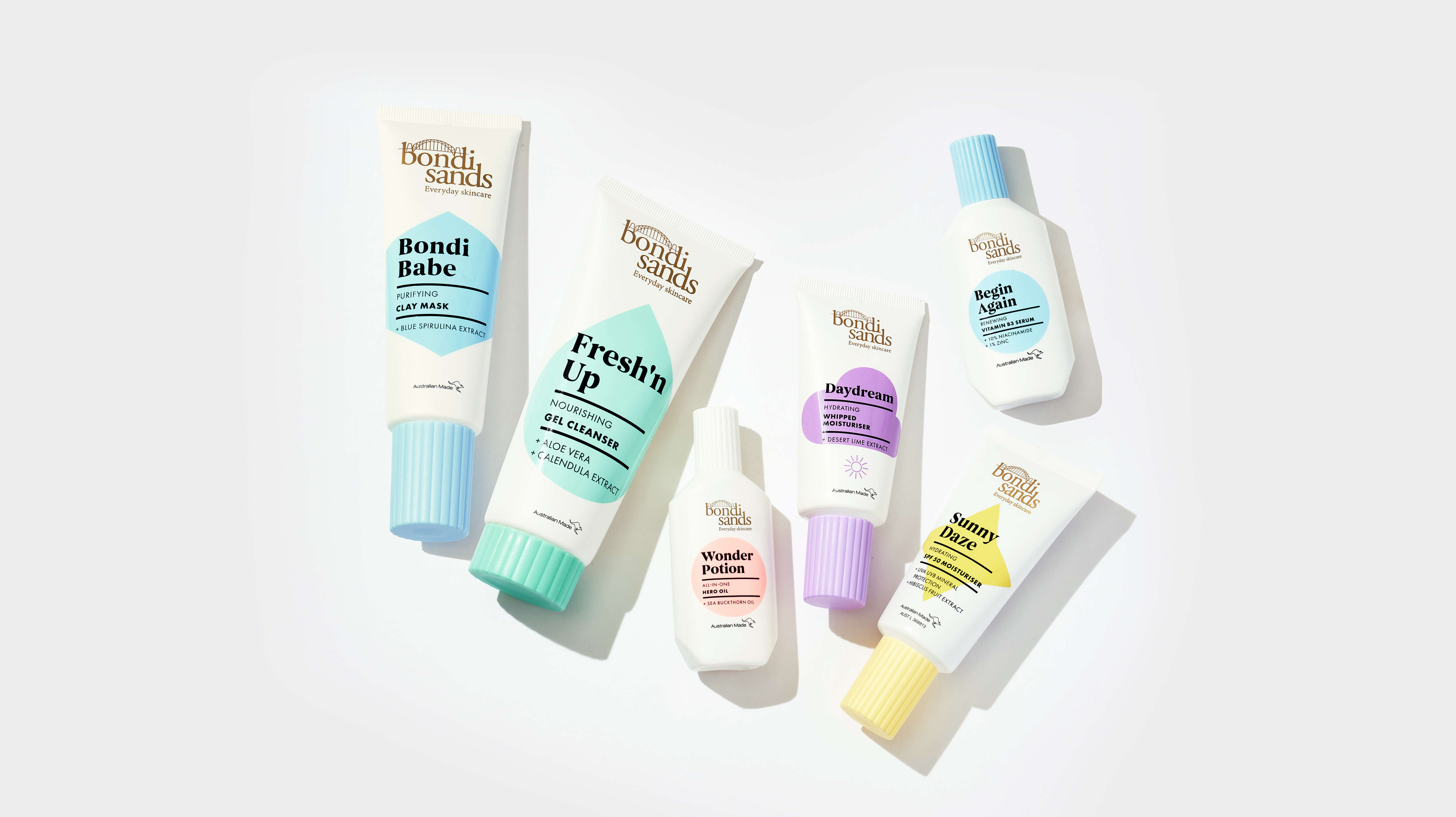
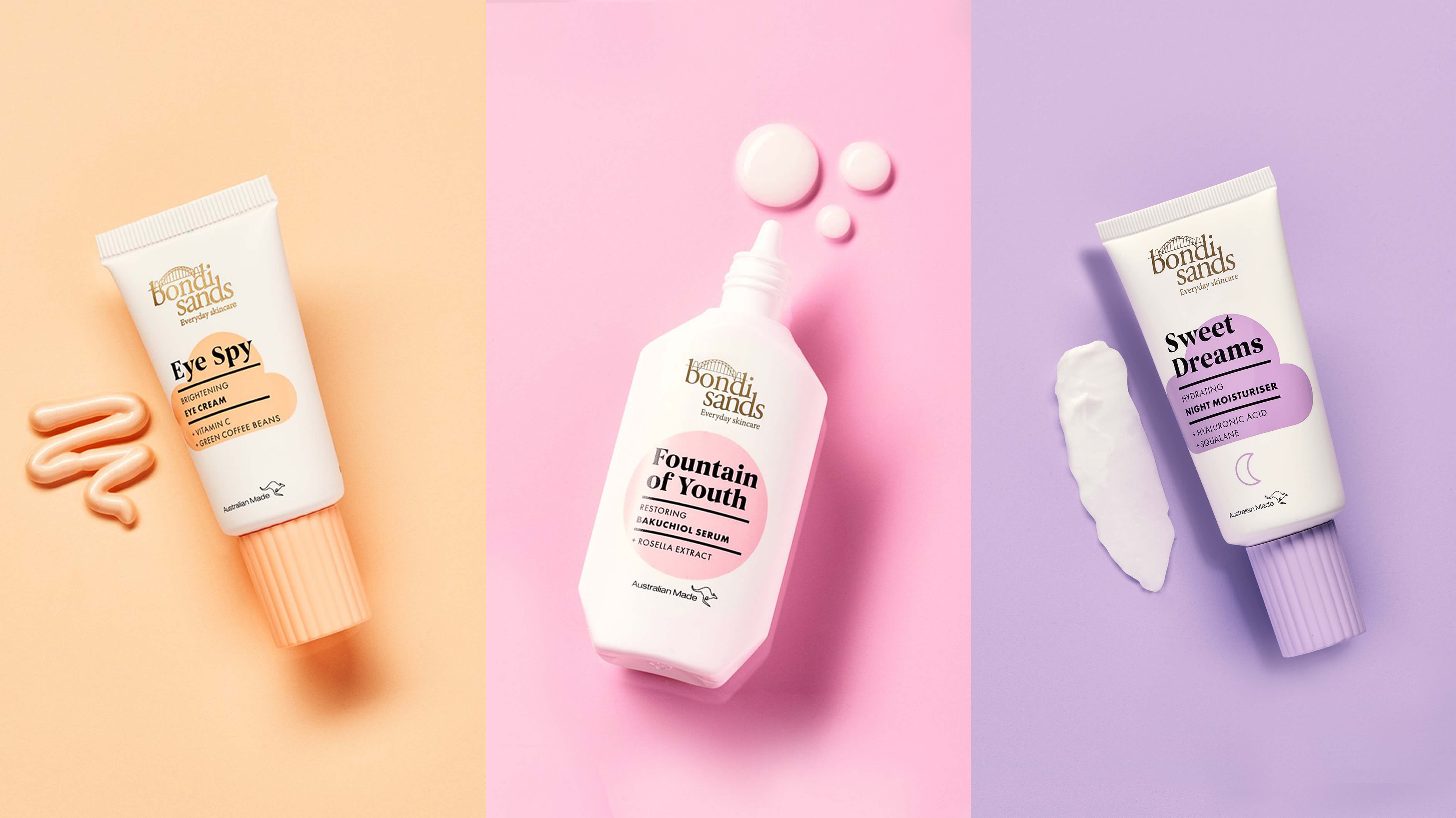
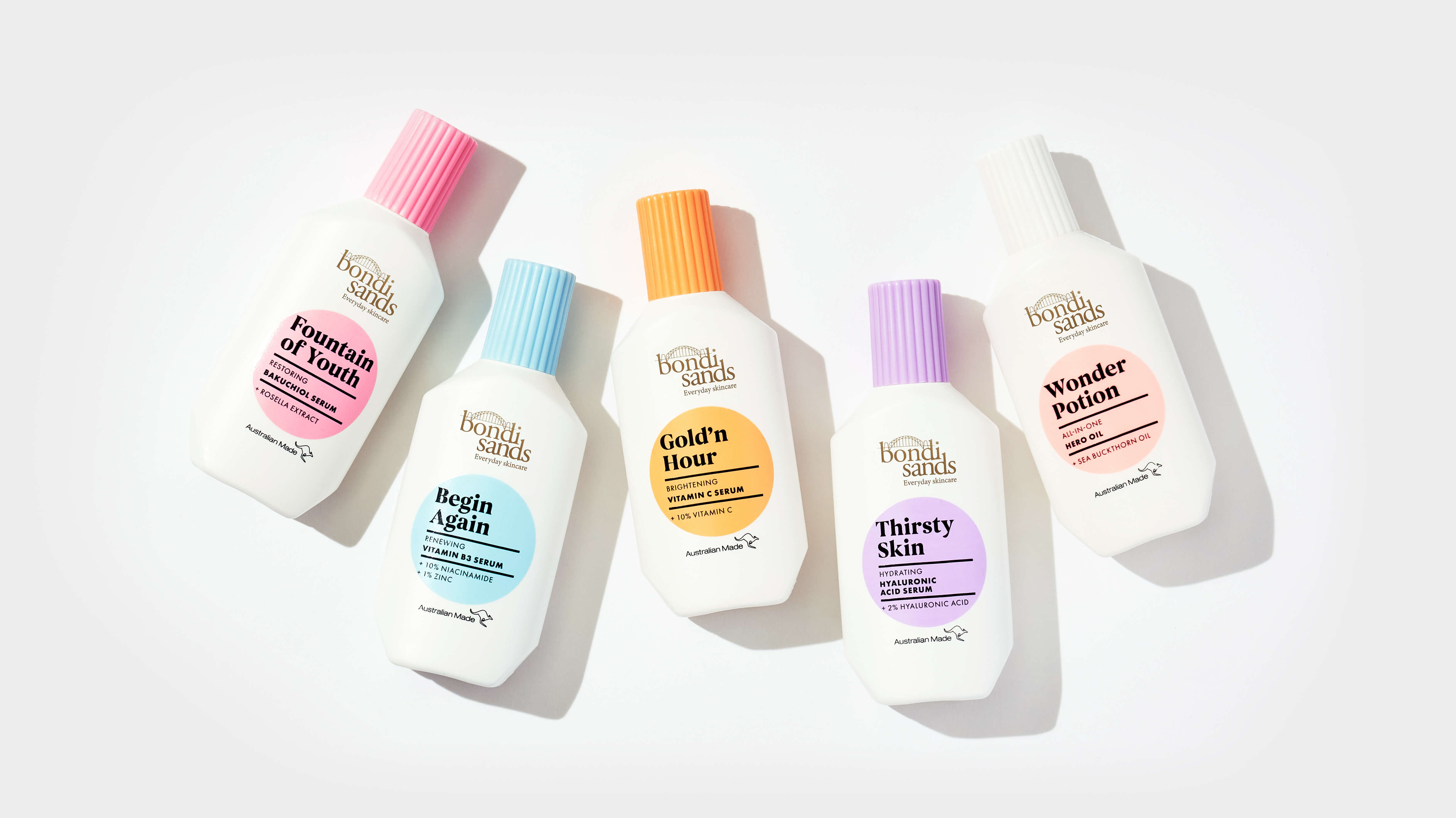
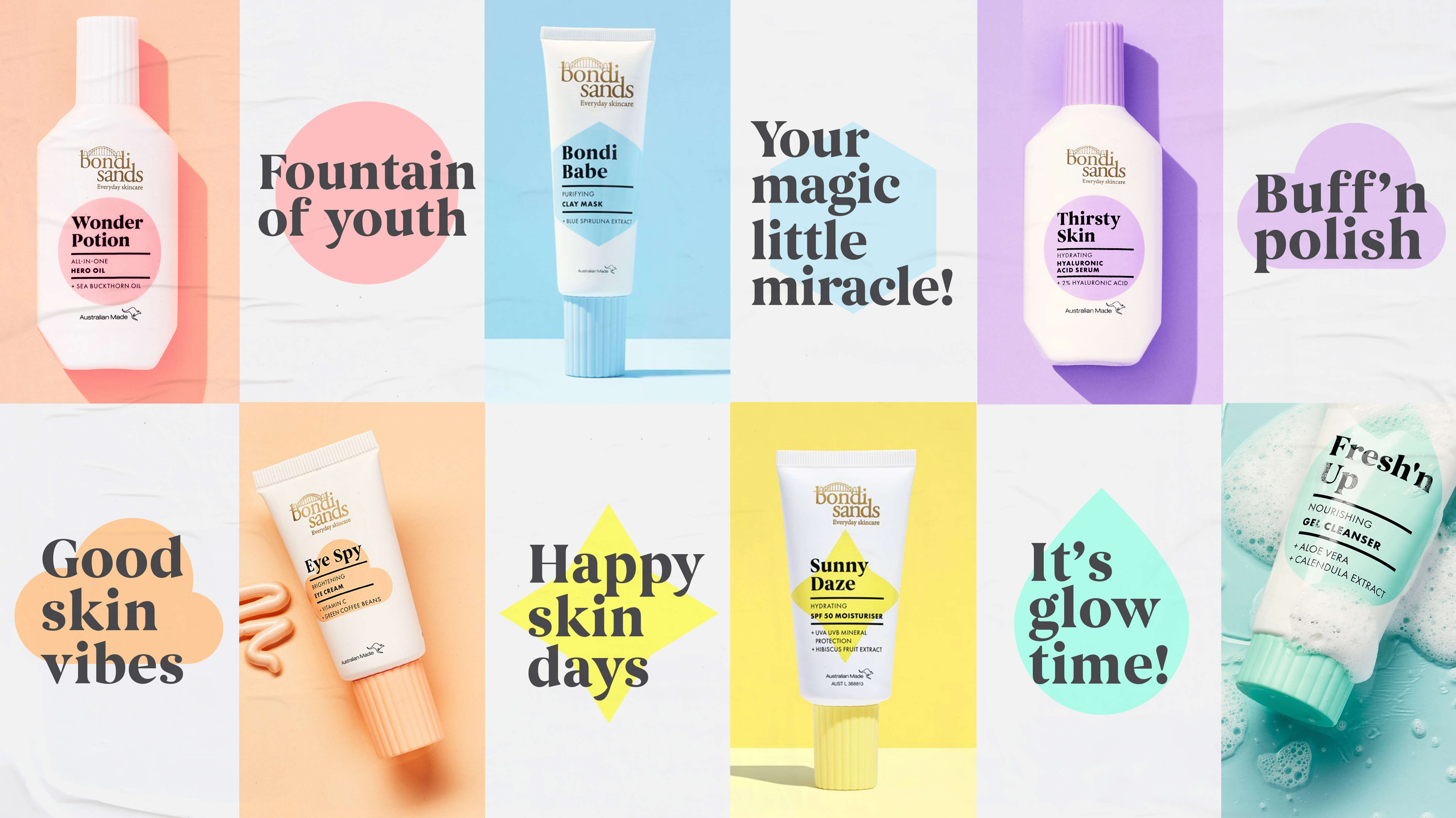
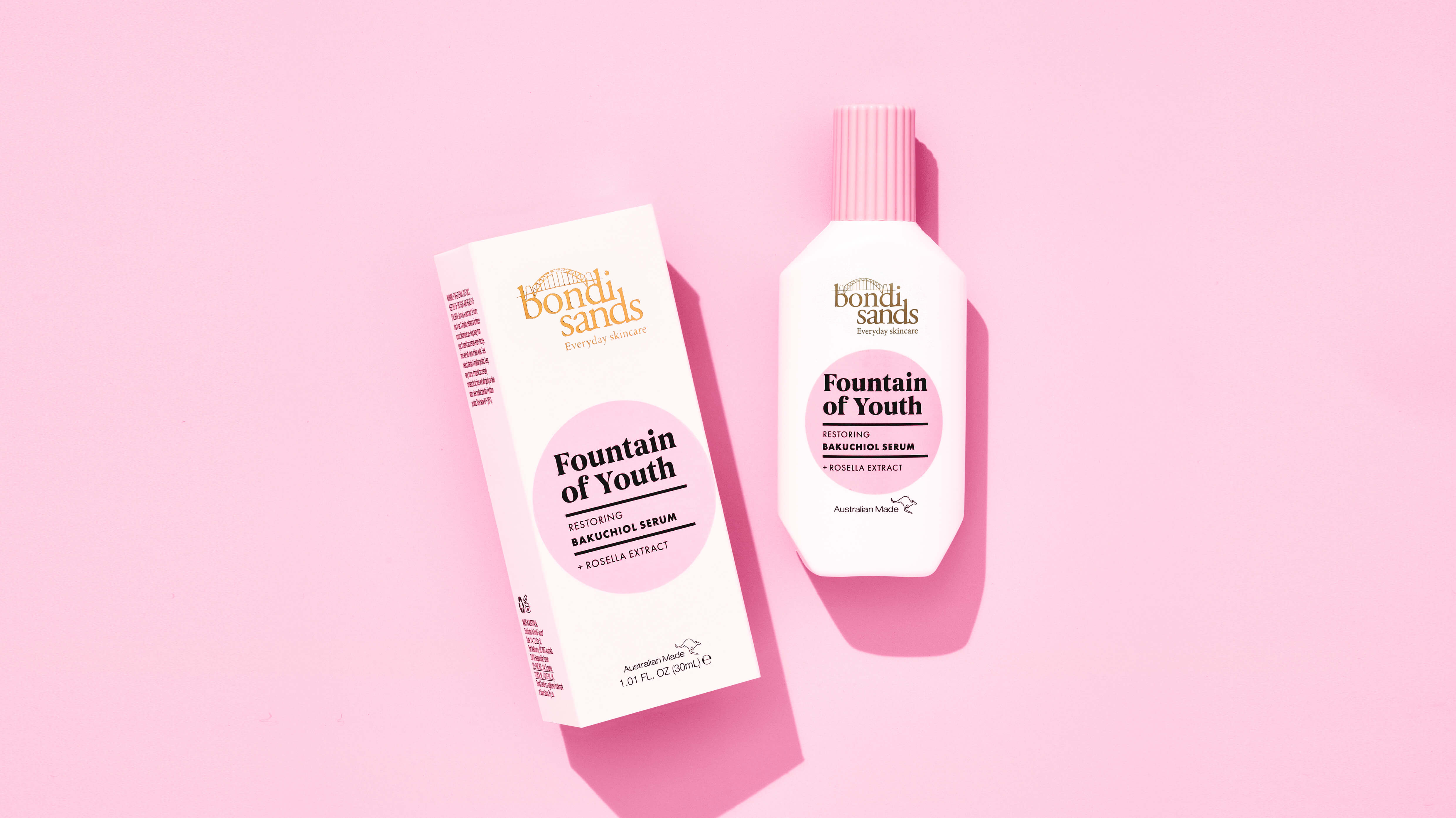
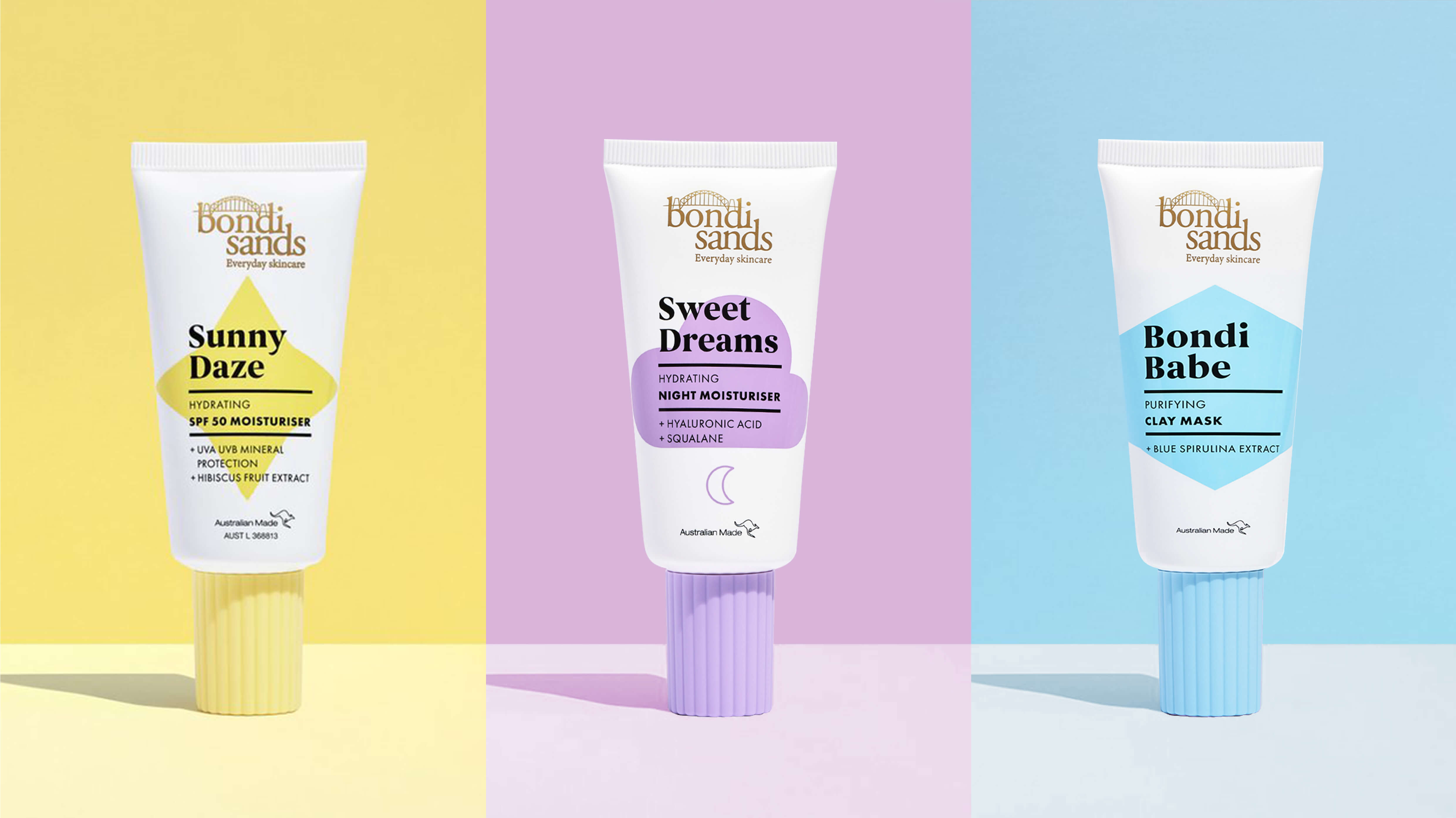
Our Approach: With an initial launch of a broad range it was important to establish key fundamentals that not only made the range easy to navigate but also clearly signposted the benefit of each product. The clean, white background gave the range a clinical, efficacious feeling whilst the use of bold coloured iconography acted as playful signposting to navigate the range. Emotive language gave each product it’s own personality whilst still being underpinned with science-backed ingredients.
CREDIT
- Agency/Creative: Design Happy
- Article Title: Design Happy Creates Packaging Design for Bondi Sands Skincare
- Organisation/Entity: Agency
- Project Type: Photography
- Project Status: Published
- Agency/Creative Country: United Kingdom
- Agency/Creative City: London
- Market Region: Global
- Project Deliverables: Packaging Design
- Industry: Health Care
- Keywords: #packagingdesign #designhappy #skincarebranding #skincarebrand #beautybranding #skincarepackaging #packaginglove #productpackaging #lifestyle #branding #design #packaginginspiration #packagingoftheworld #packagedesign #bondisands
-
Credits:
Designer: Rebecca Farr


