
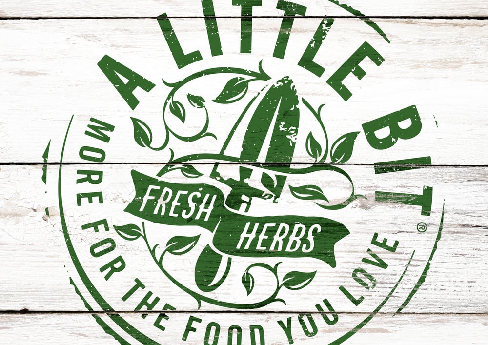
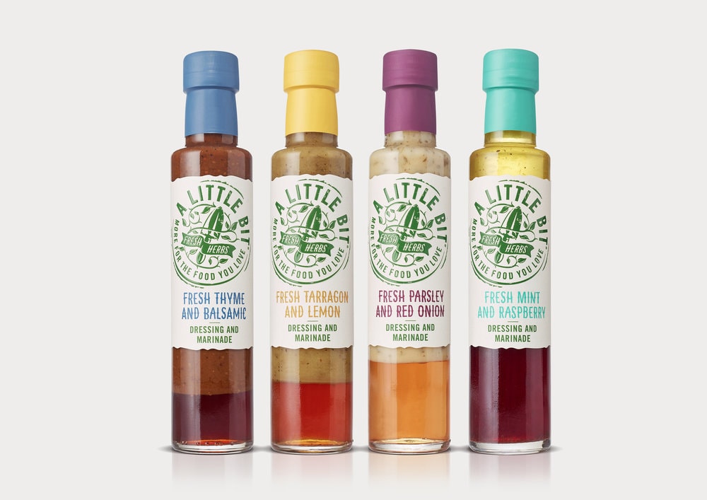
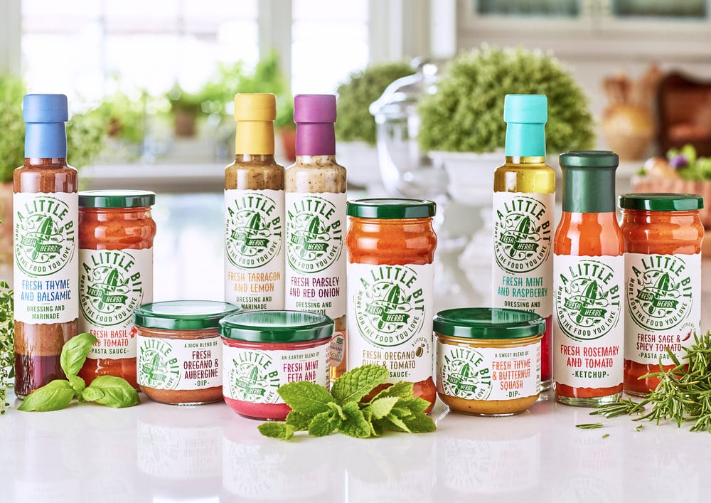
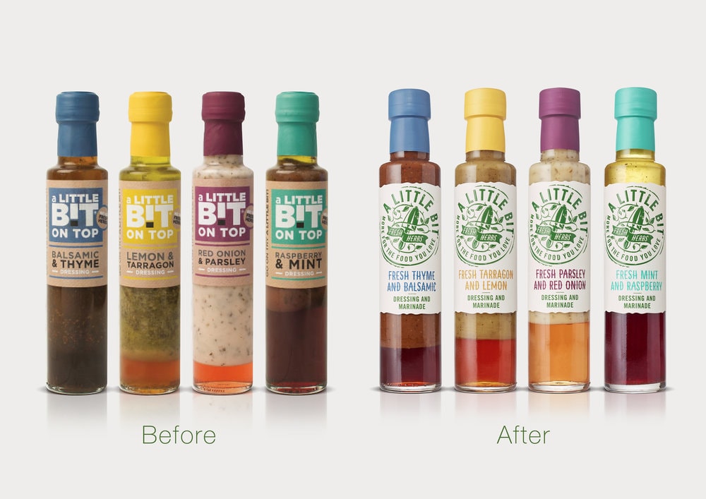
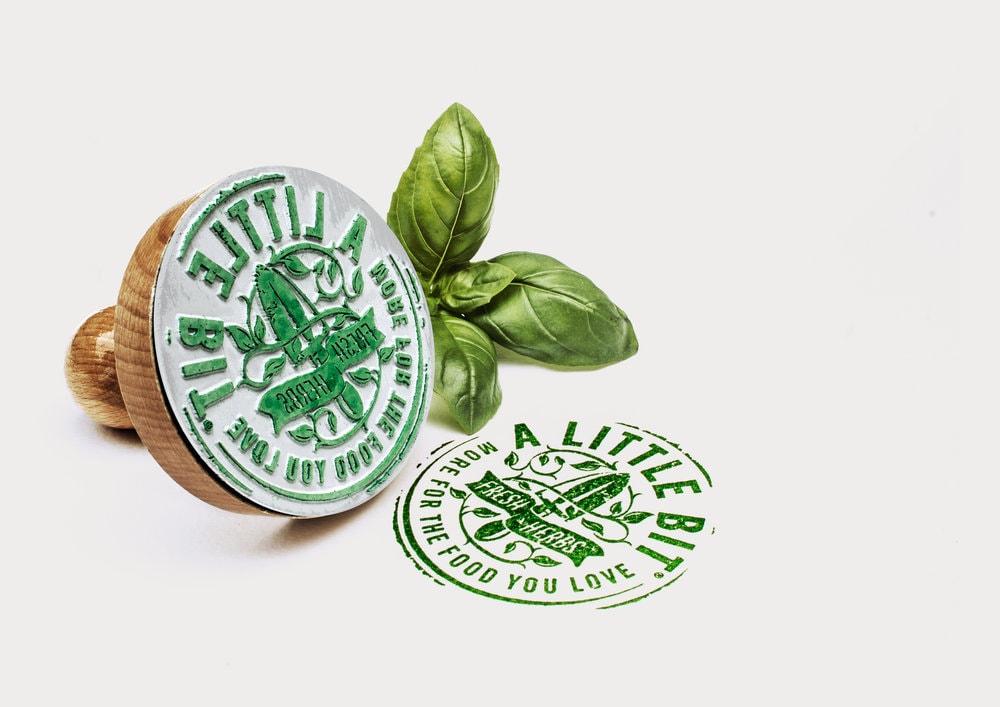
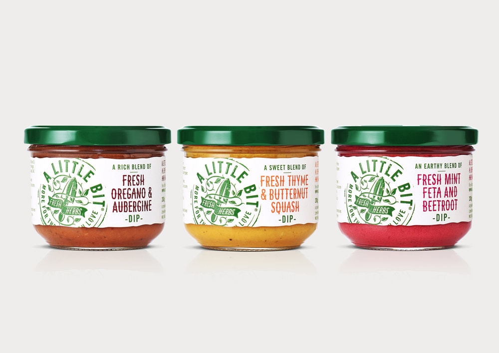
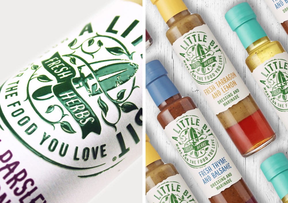
” Where A Little Bit differs from other sauces and dressings is the use of fresh – not dried herbs, a brand promise that was lost on the ambient aisle which is not associated with the term ‘fresh’.Design Happy crafted a new master brand identity that had fresh herbs at it’s heart and played to the world of modern, handmade, allotment credentials. The new identity was made to resemble a rubber stamp, giving each pack a wholesome personal touch whilst the descriptor typography was made to feel as if it had been lovingly crafted by hand.It was important that the finish of each label felt as natural and authentic as possible too. A natural, uncoated substrate was diecut with torn edges to simulate a hand finished look and feel.The new A Little Bit brand was launched at the Farm Shop & Deli show to great reviews from retailers. Founder Sophie Lane Fox says ‘I couldn’t be happier with the rebrand, I have seen a huge increase in orders and have received so many great comments on the designs.’We can’t wait to see A Little Bit on shelves soon.”
CREDIT
- Agency/Creative: Design Happy
- Article Title: Design Happy – A Little Bit / Lovingly Branded By Hand
- Project Type: Packaging
- Format: Bottle, Jar
- Substrate: Pulp Paper


