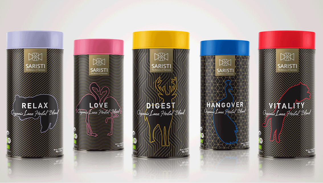
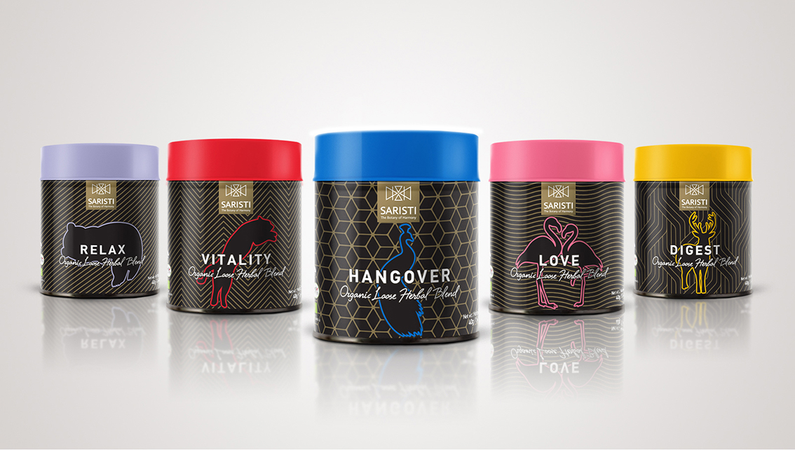
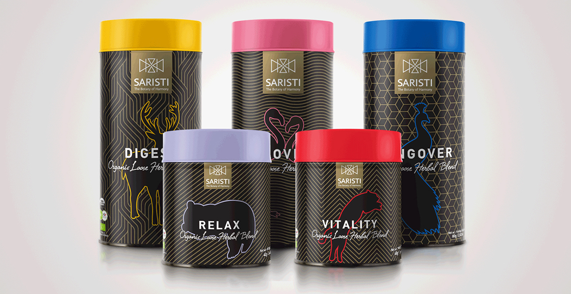
What kind of packaging do the best herbal mixtures require? In the place where the notion of harmony was born, the design process for the packaging that should embrace the art of preparing special beverages (brand: SARISTI) has to follow the principles of balance, simplicity, harmony…
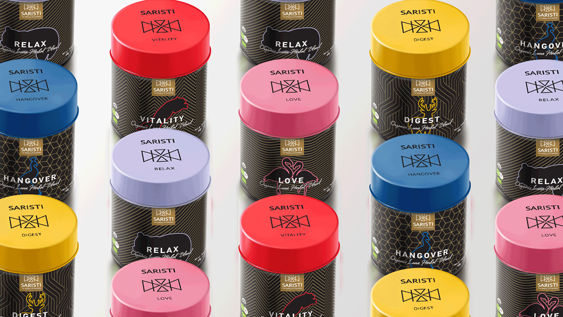
The artful, eye-catching packaging expresses the energetic vibe we wish people to achieve by enjoying the infusions. Each blend has its own lively, characteristic color and is represented by a different personality of the animal kingdom, conveying the desired effects of each blend and how we feel when savoring a cup. We would like to introduce you to the animals that capture the essence of each blend: a leopard for vitality, a peacock for strength after a hangover, a panda for relaxation, a flamingo for love and a deer to digest. The minimalistic design and style of the packaging, inspired by the simplicity of the geometric complexity and the magic and power of black shades, represents the premium, extravagant and one-of-a-kind nature of the blends; an impeccable gift in itself.


CREDIT
- Agency/Creative: A.S. Antonia Skaraki
- Article Title: Design for Metal Can for Herbal Infusions
- Organisation/Entity: Agency, Published Commercial Design
- Project Type: Packaging
- Agency/Creative Country: Greece
- Market Region: Global
- Project Deliverables: Brand Creation, Brand Identity, Branding, Graphic Design, Illustration, Packaging Design, Product Architecture, Research
- Format: Can, Tin, Tube
- Substrate: Metal


