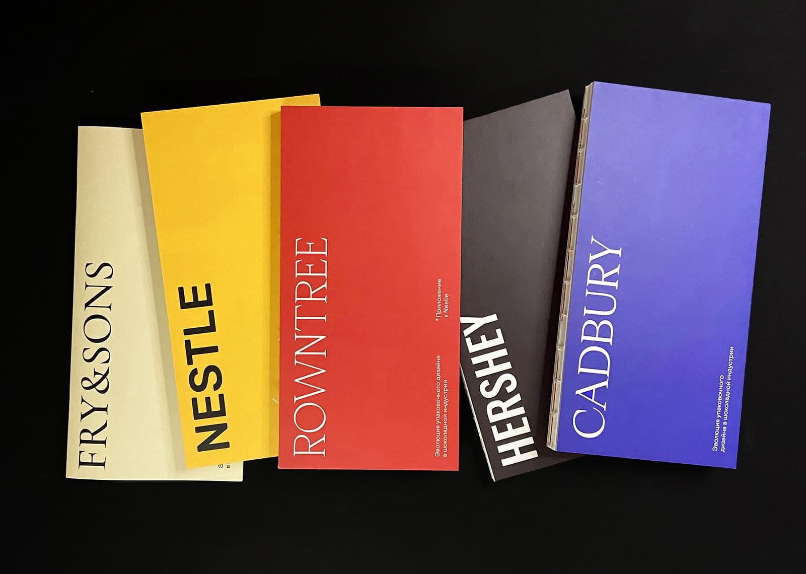
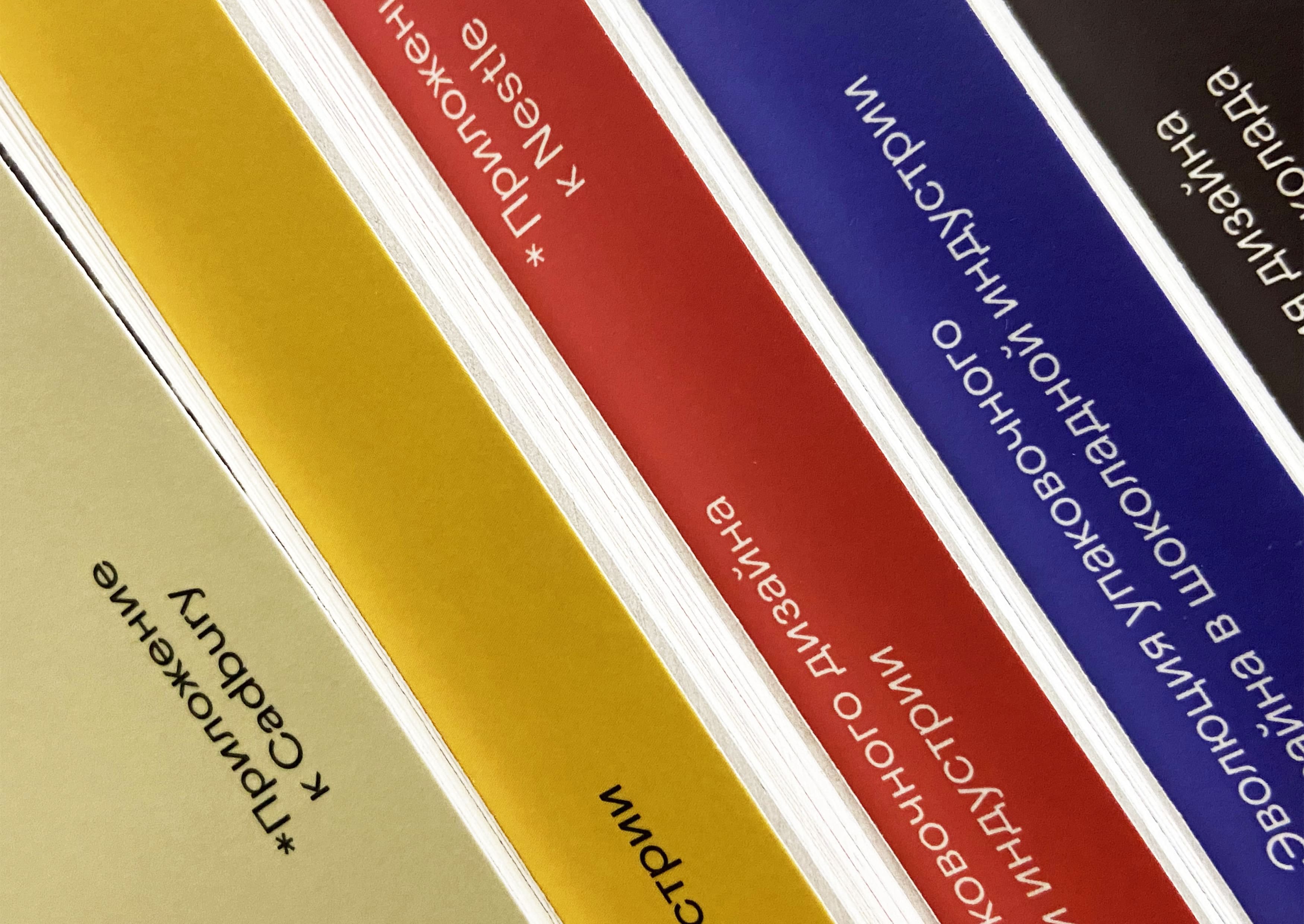
A 5-part visual research exploring the evolution of chocolate packaging design. Their example shows how the attitude towards the product itself has changed, the importance of its positioning and appearance. Each chocolate company has its own unique corporate identity, which took decades to develop.
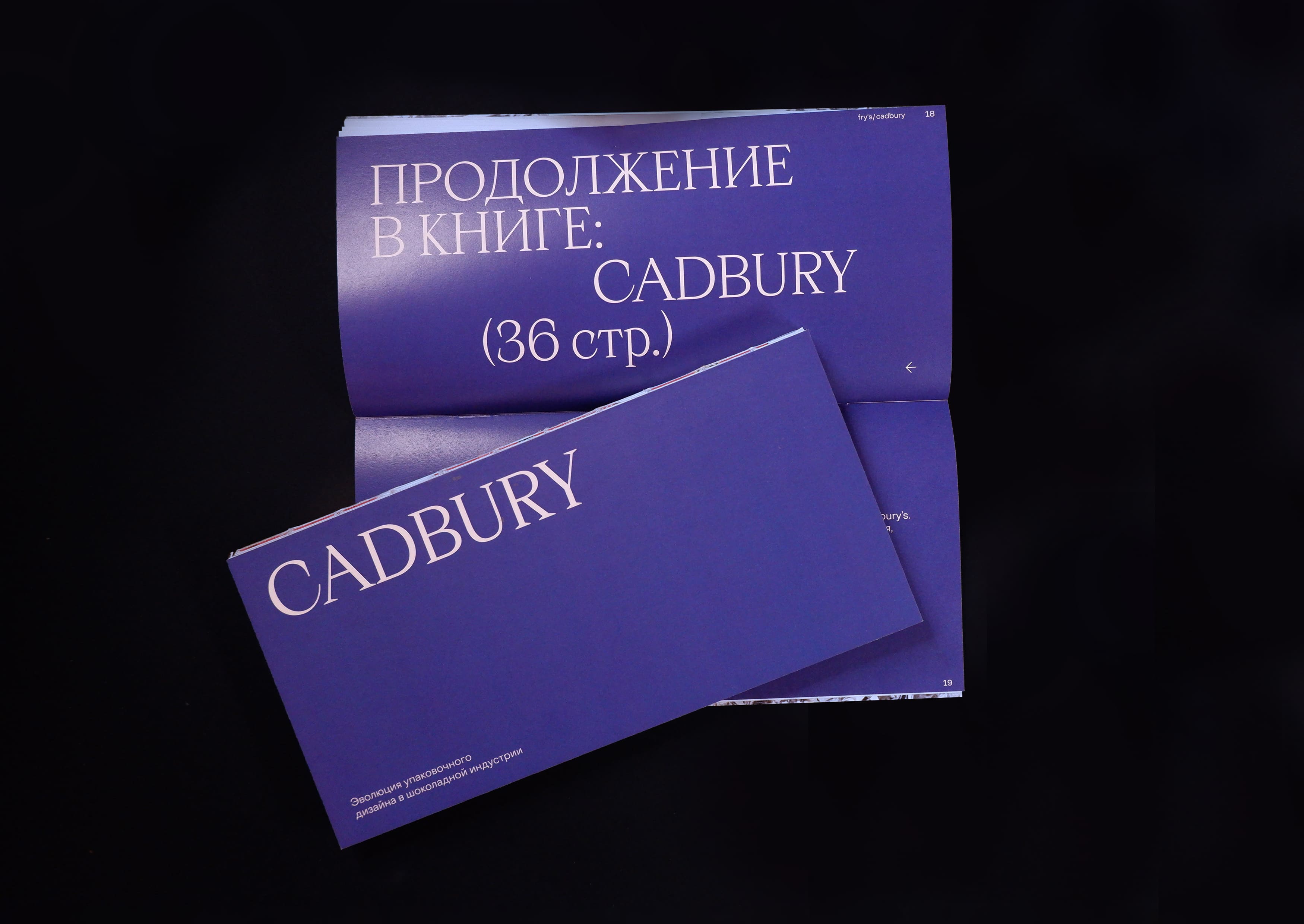
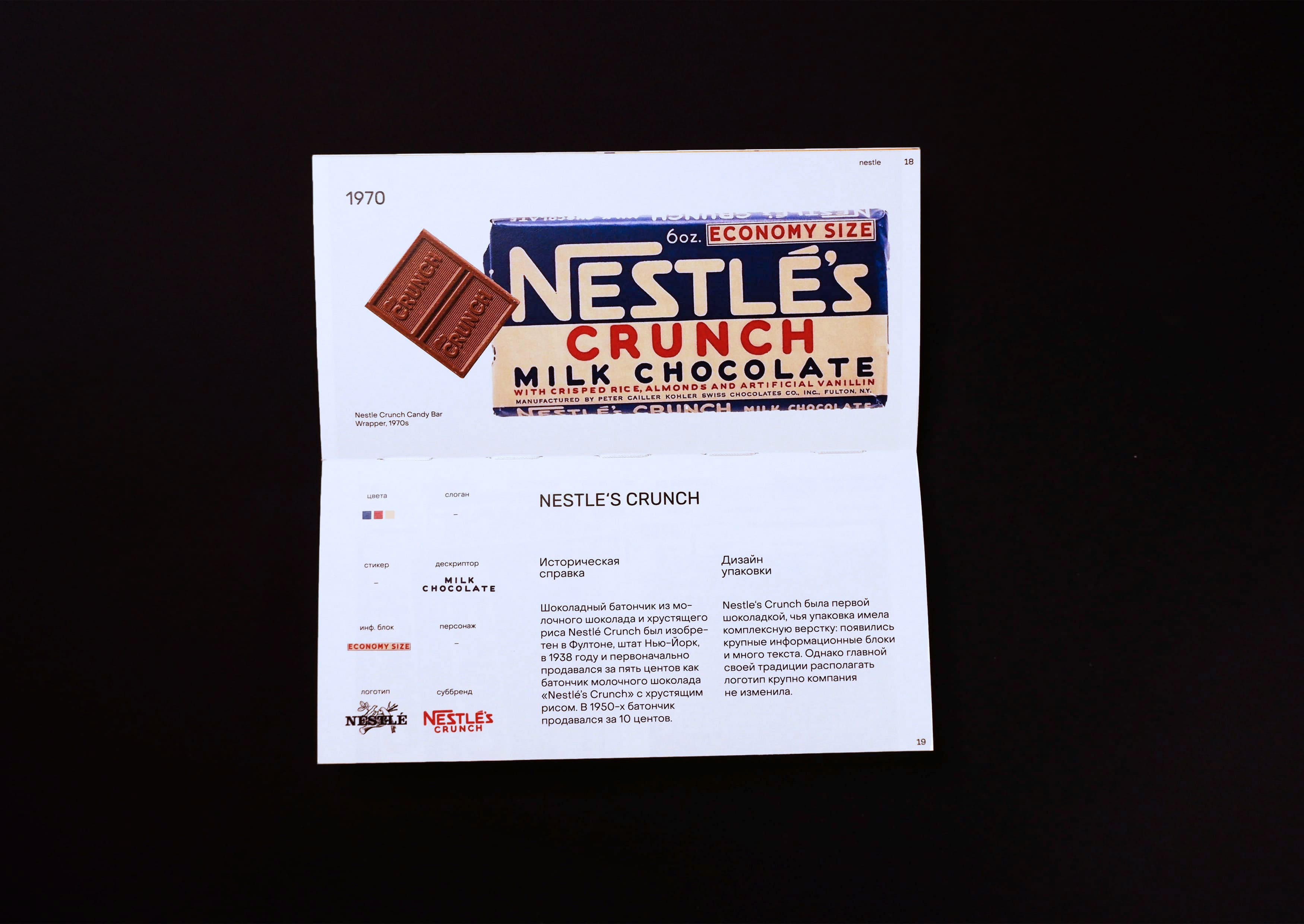
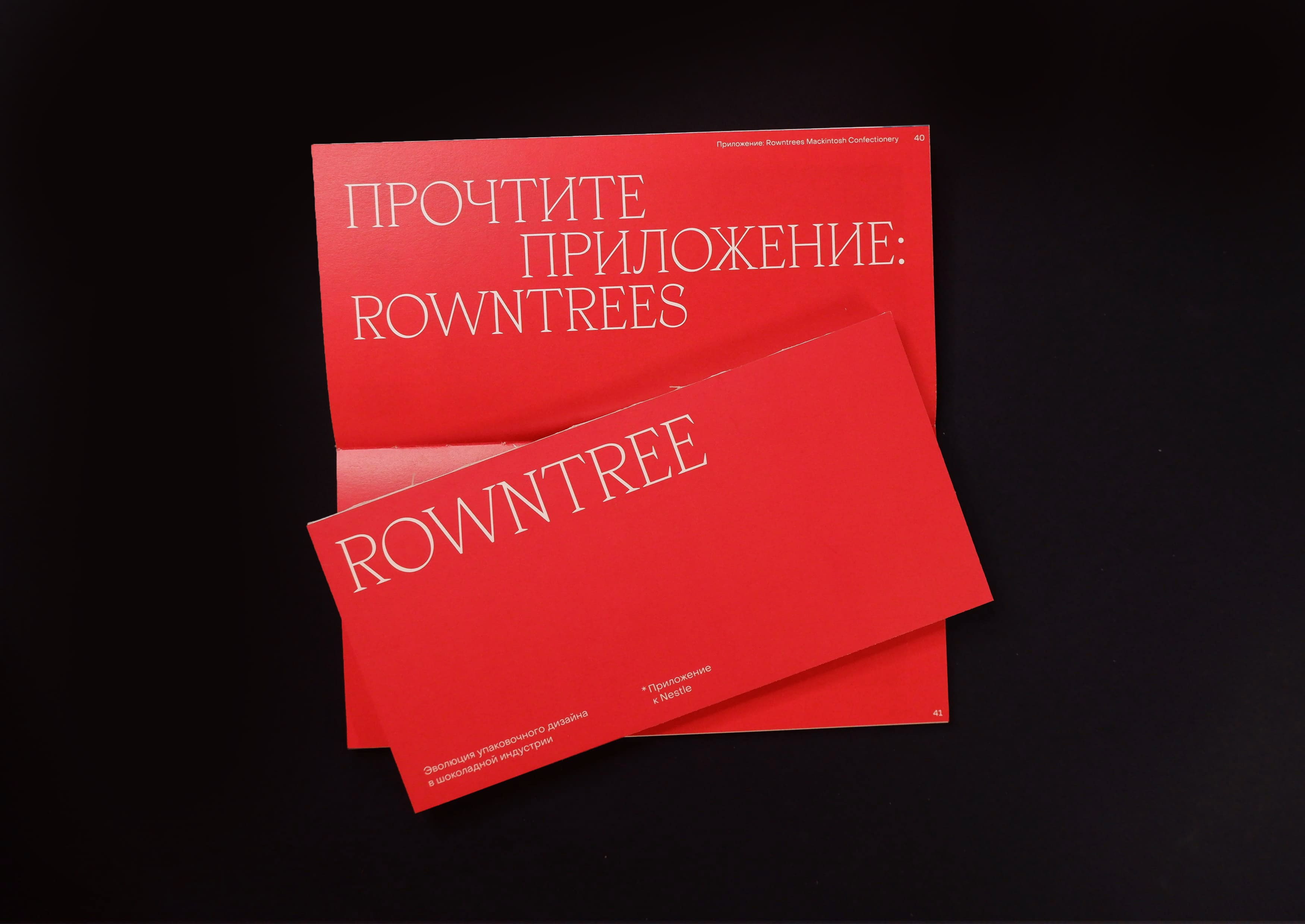
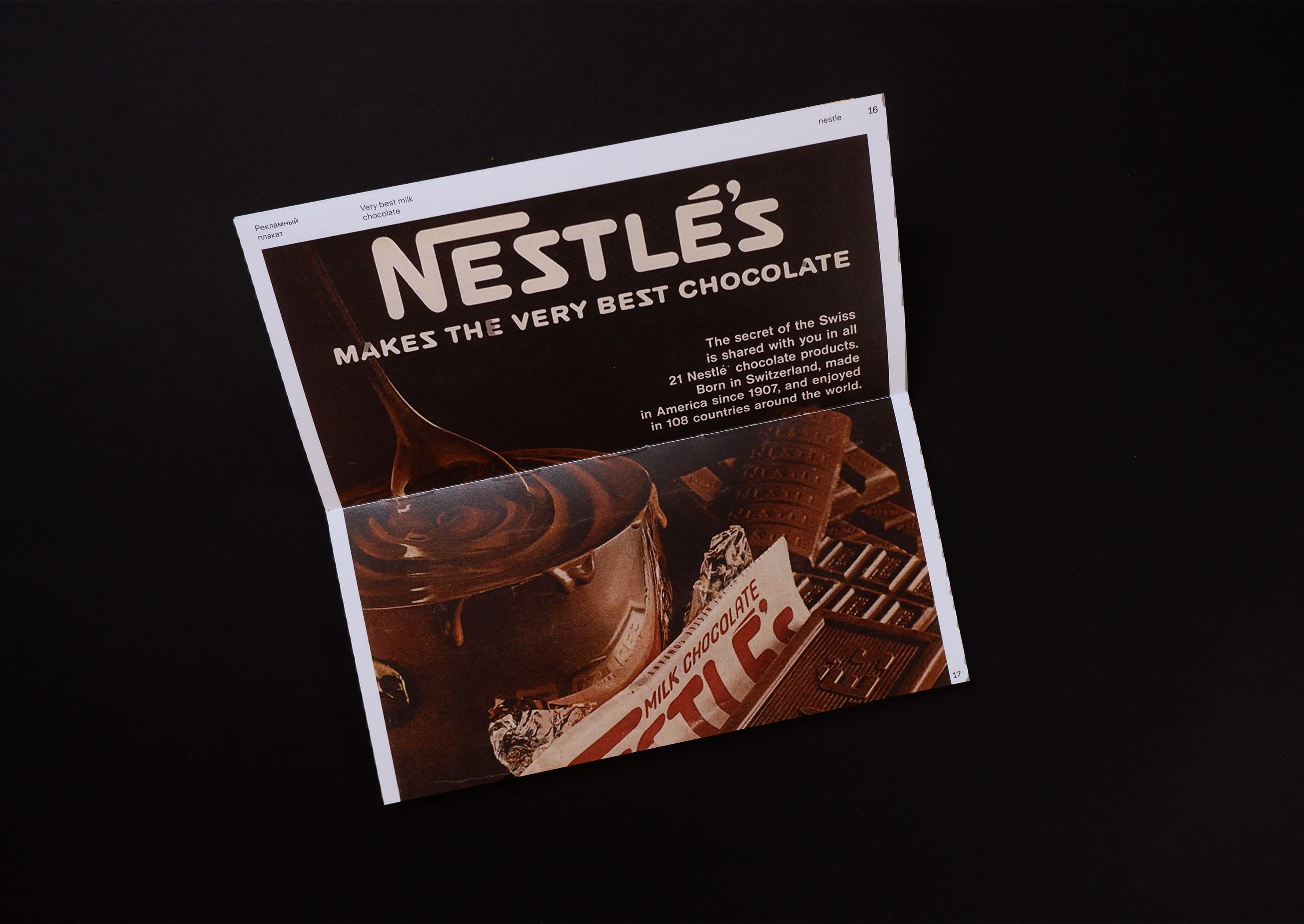
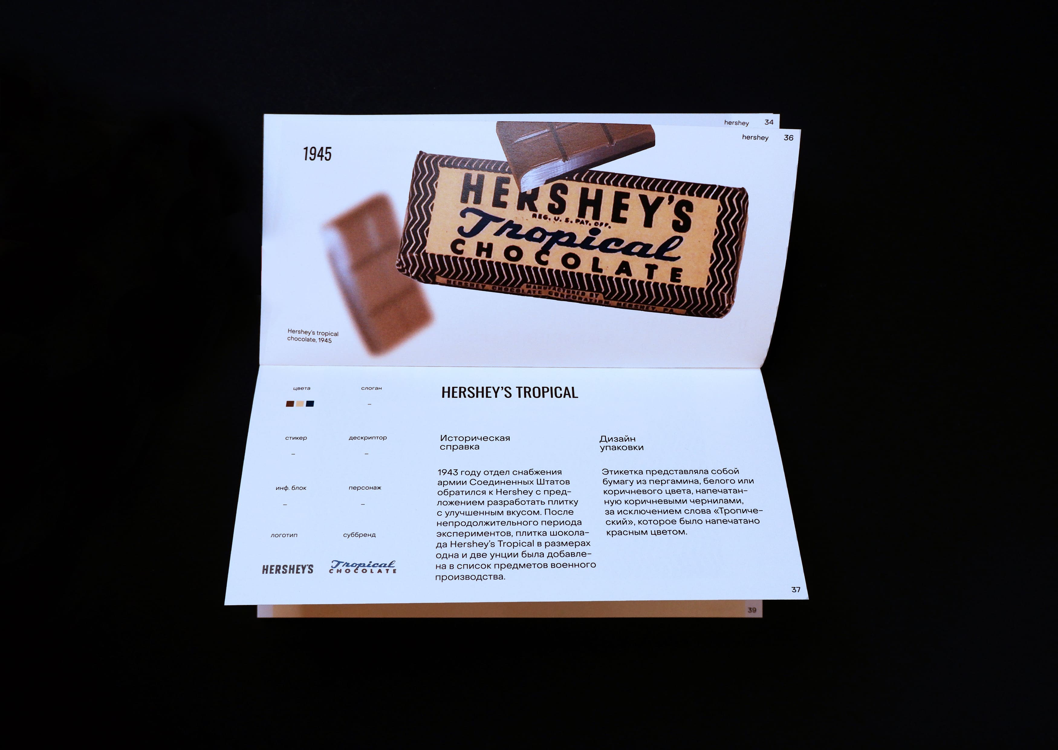
The research looked at 5 large chocolate companies to identify common trends in the development of chocolate packaging design. From here comes the division into 3 independent parts, two of which have applications. Thus, the reader can read the history of the style of his favorite chocolate, see all the historical background that influenced the appearance of the package. The study shows not only the packages themselves, but also the graphic materials that surrounded them: commercials and posters. Many of them are united by a single concept and style.
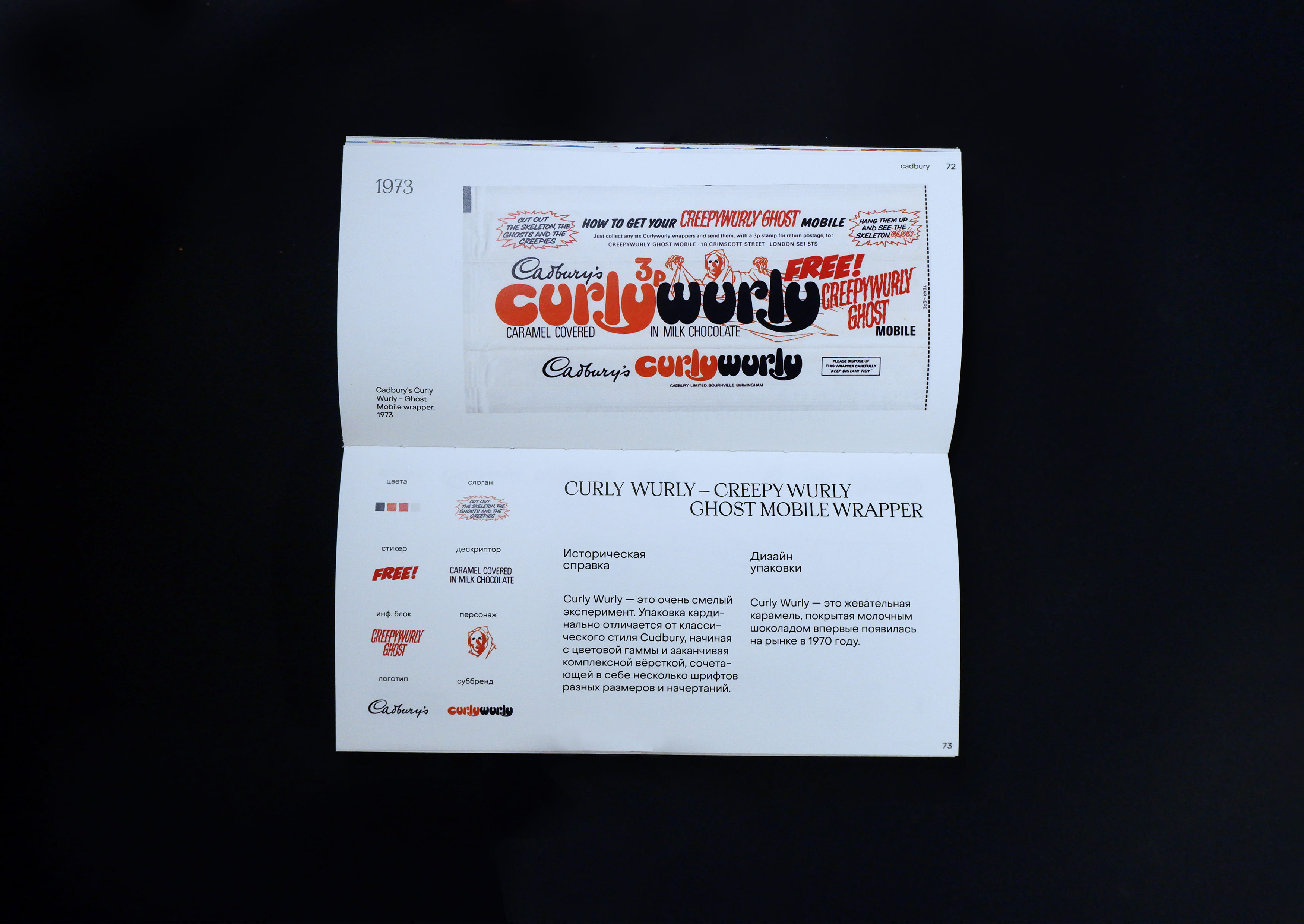
In order to most effectively analyze the appearance of the packaging in terms of design, the following elements are highlighted in typical spreads: the current logo, sub-brand logo, slogan, taste descriptor, information block, colors and stickers. At the end of each part, a more detailed analysis of the colors of the entire brand is presented in order to trace which colors have become key in a particular company. The whole visual research is built on the chronological principle, because with this method it is easiest to trace the evolution of packages.
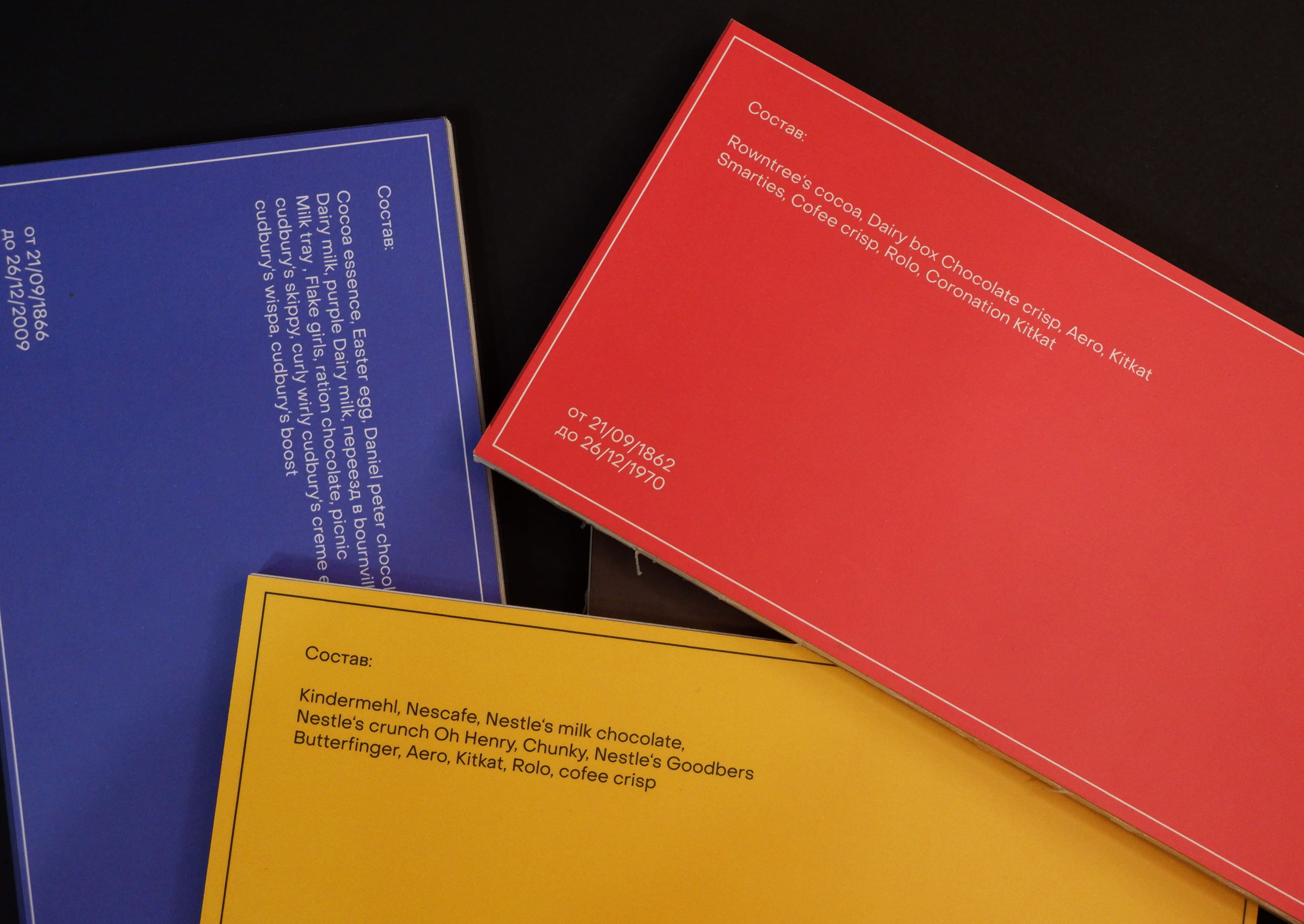
The book itself tries to imitate a chocolate bar, starting from the format and ending with the principle of constructing headings. The “composition” of the book is written on the back of the cover – all the chocolates that were shown in this book

CREDIT
- Agency/Creative: Timofey Kirin
- Article Title: Design Evolution of Chocolate Packaging
- Organisation/Entity: Student
- Project Type: Typography
- Project Status: Published
- Agency/Creative Country: Russia
- Agency/Creative City: Moscow
- Market Region: Global
- Project Deliverables: Design, Packaging Design, Typography
- Industry: Food/Beverage
- Keywords: Chocolate/Cadbury/Nestle/Hershey/Fry's/Rowntree/layout/visual research
-
Credits:
curator: Evgeny Kashirin


