


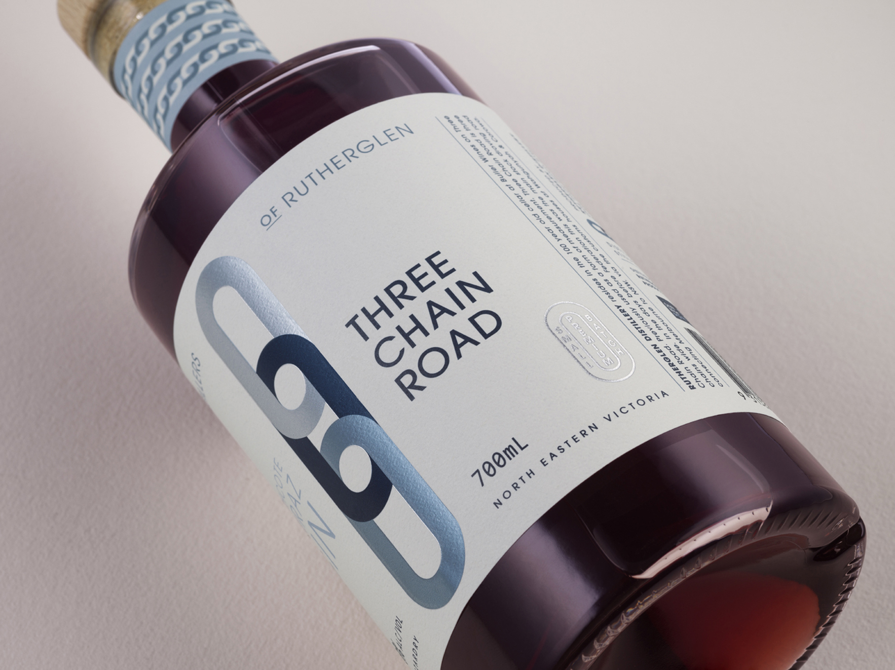
Rutherglen Distillery resides in the 100 year old cellar at Buller Wines on Three Chain Road. Previously used as a form of measurement, Three Chain Road is three chains wide. In the days before Federation this was the main stock droving road connecting Melbourne to NSW, via the customs houses at Wahgunyah & Corowa.
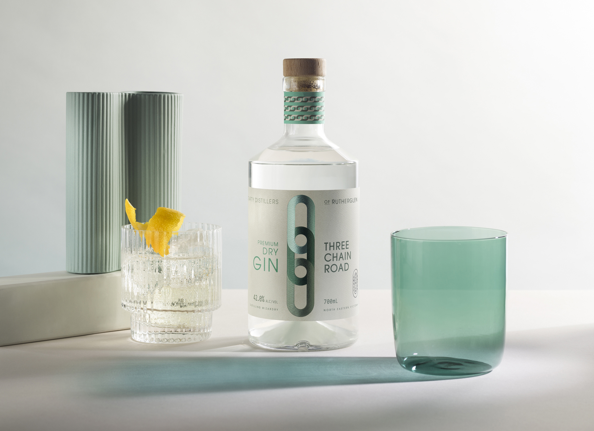
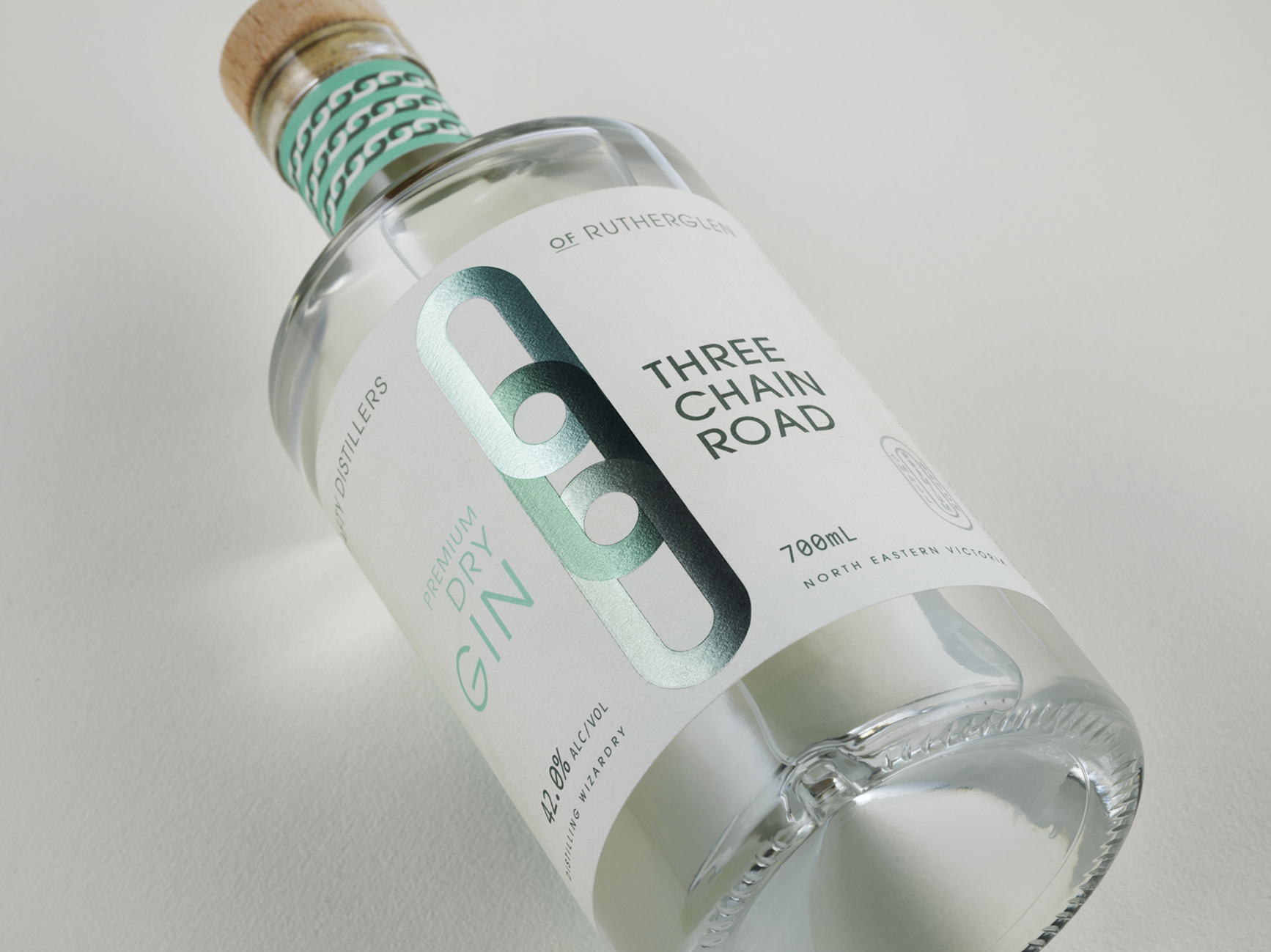
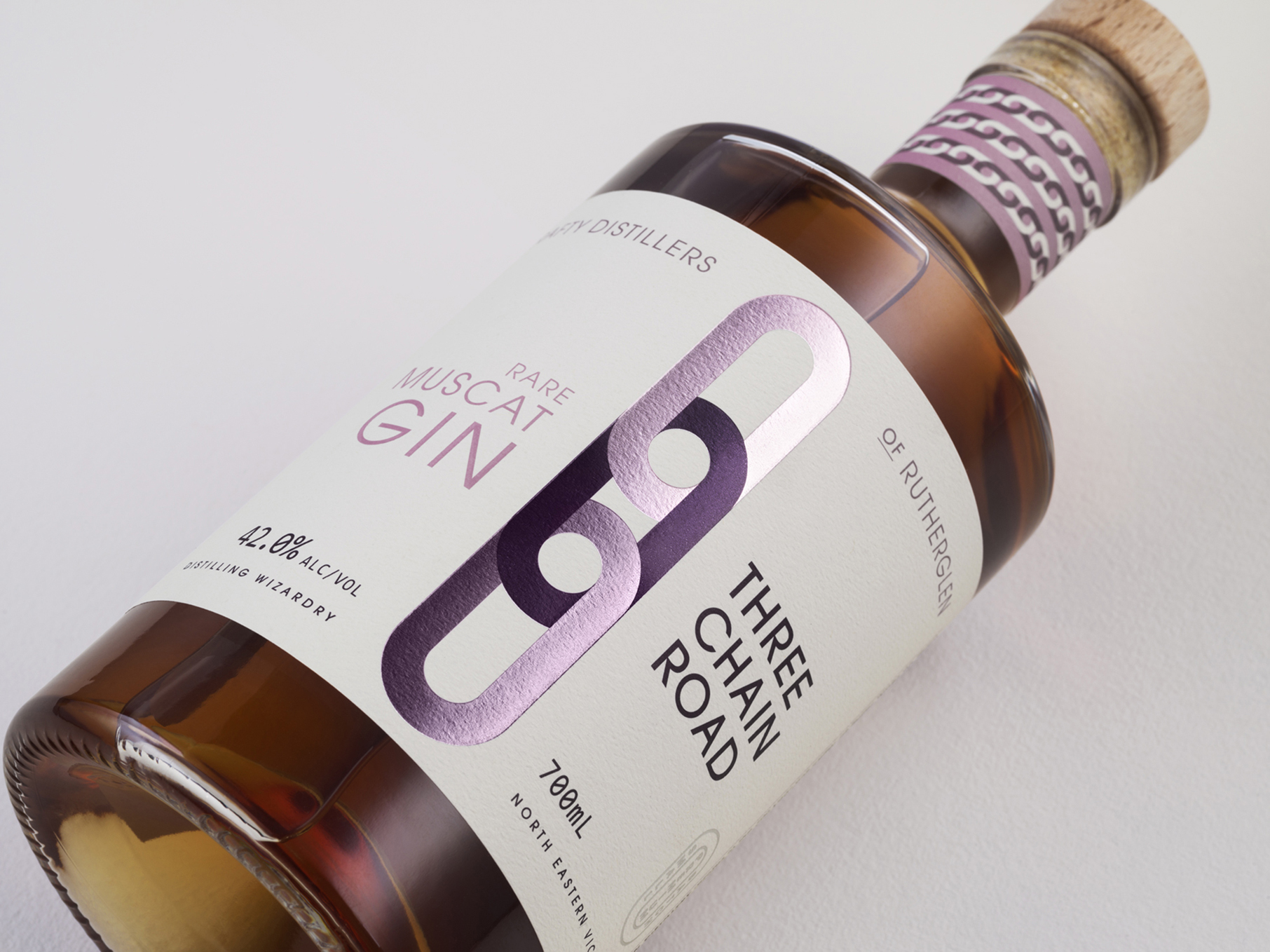
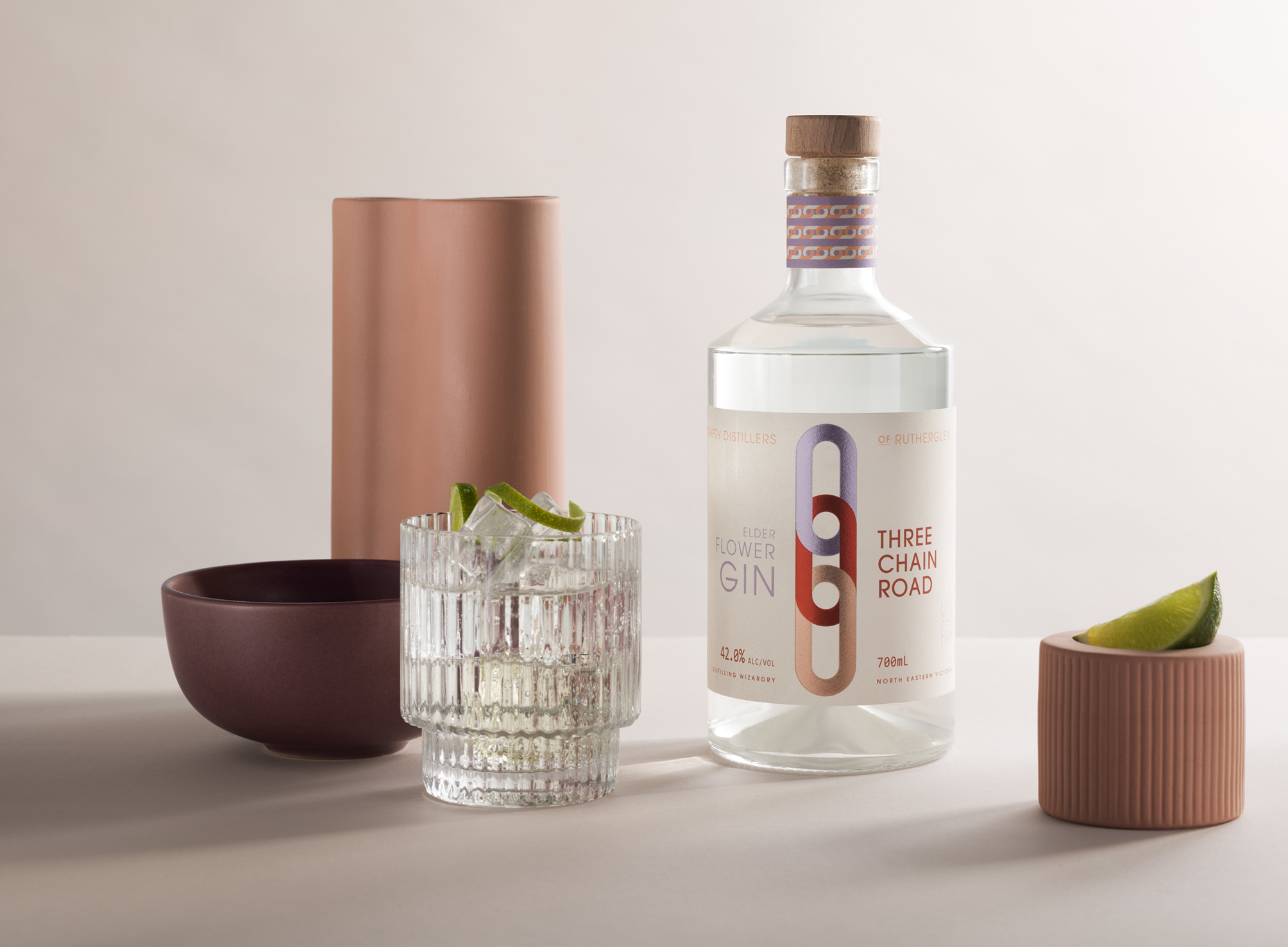
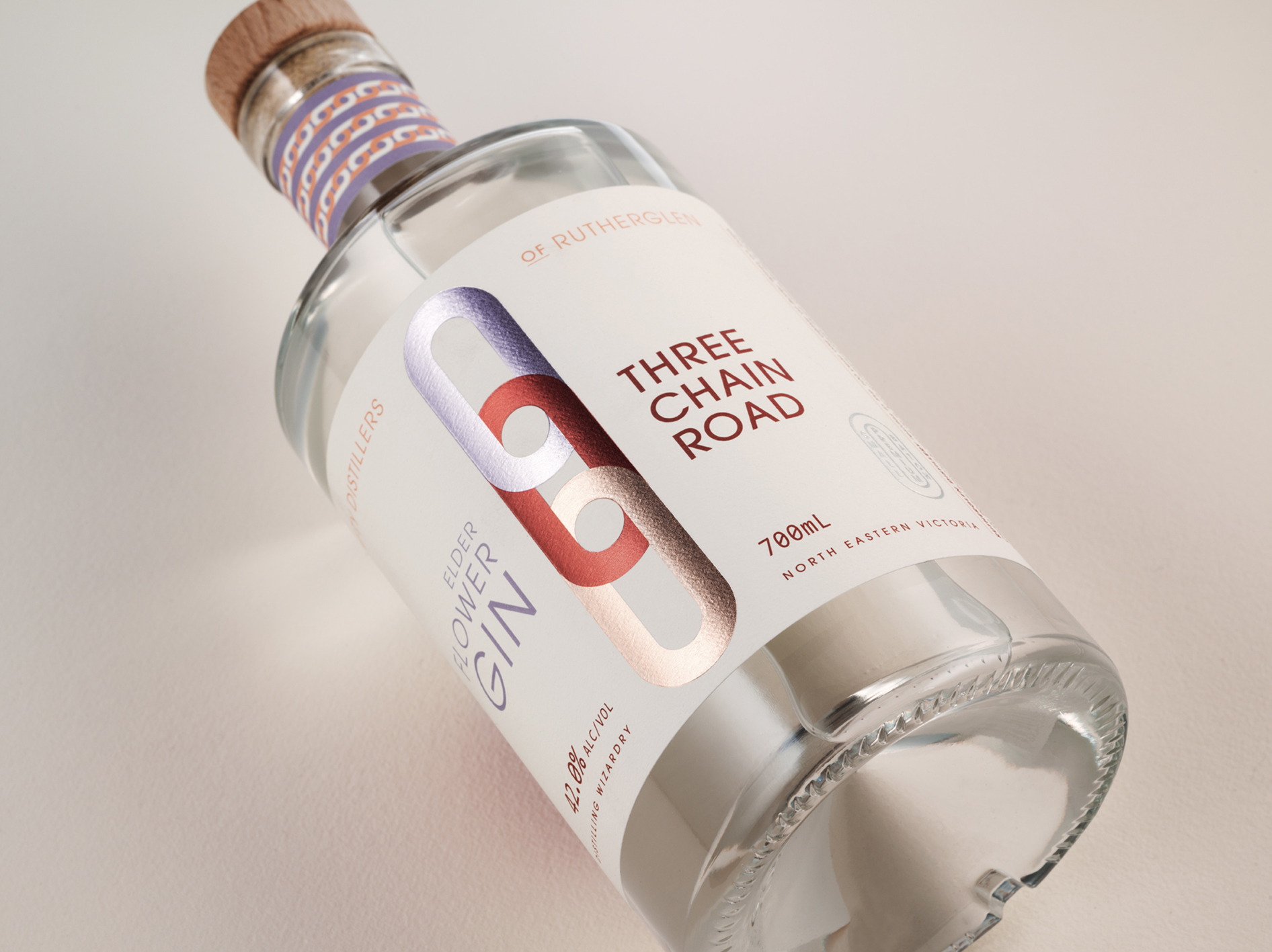
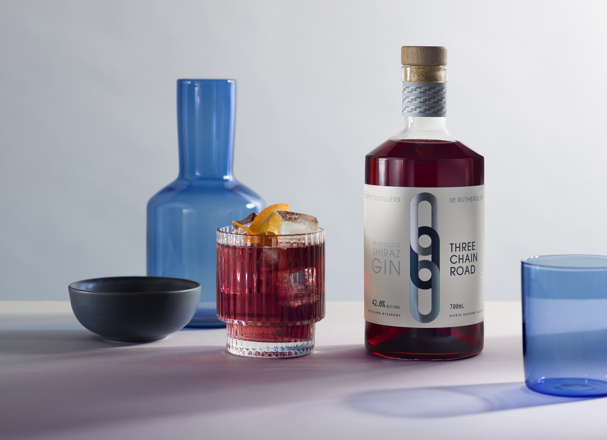
The gin segment has grown rapidly due to its appeal to a broad consumer base and second only in consumption to whisky in the spirits sector. With so many gin brands on offer, we set out to create a point of difference. There are many beautiful brands using traditional spirit cues, which are beautiful, but side by side not a lot pop out against their competitors on the shelf. Our strategy was to create a dominant graphic icon that becomes the brand, so eventually it becomes recognisible without the brand name. Working with the brand name Three Chain Road, we needed to make sure that the brand didn’t appear to be too traditional or old fashioned.
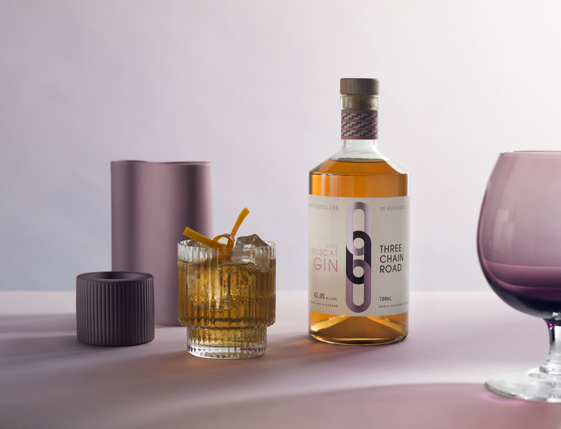
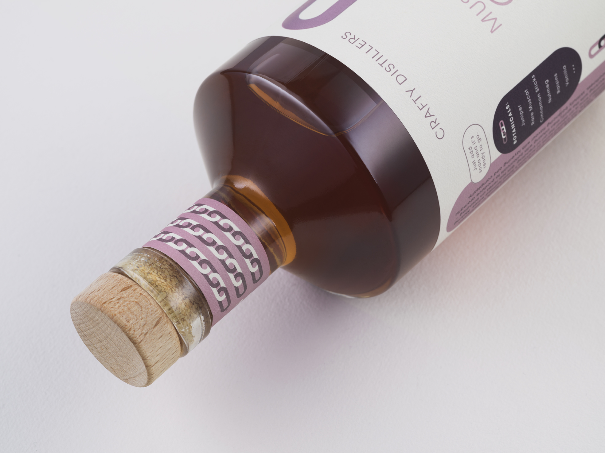
With flavours of Premium Dry, Elderflower, Shiraz and Rare Muscat we have blended modern colour combinations for impact. Gin too relies on blending – artfully working with the spirit, then infusing with botanicals to produce aromatic smoothness, skillfully balancing flavour with layering and complexity.
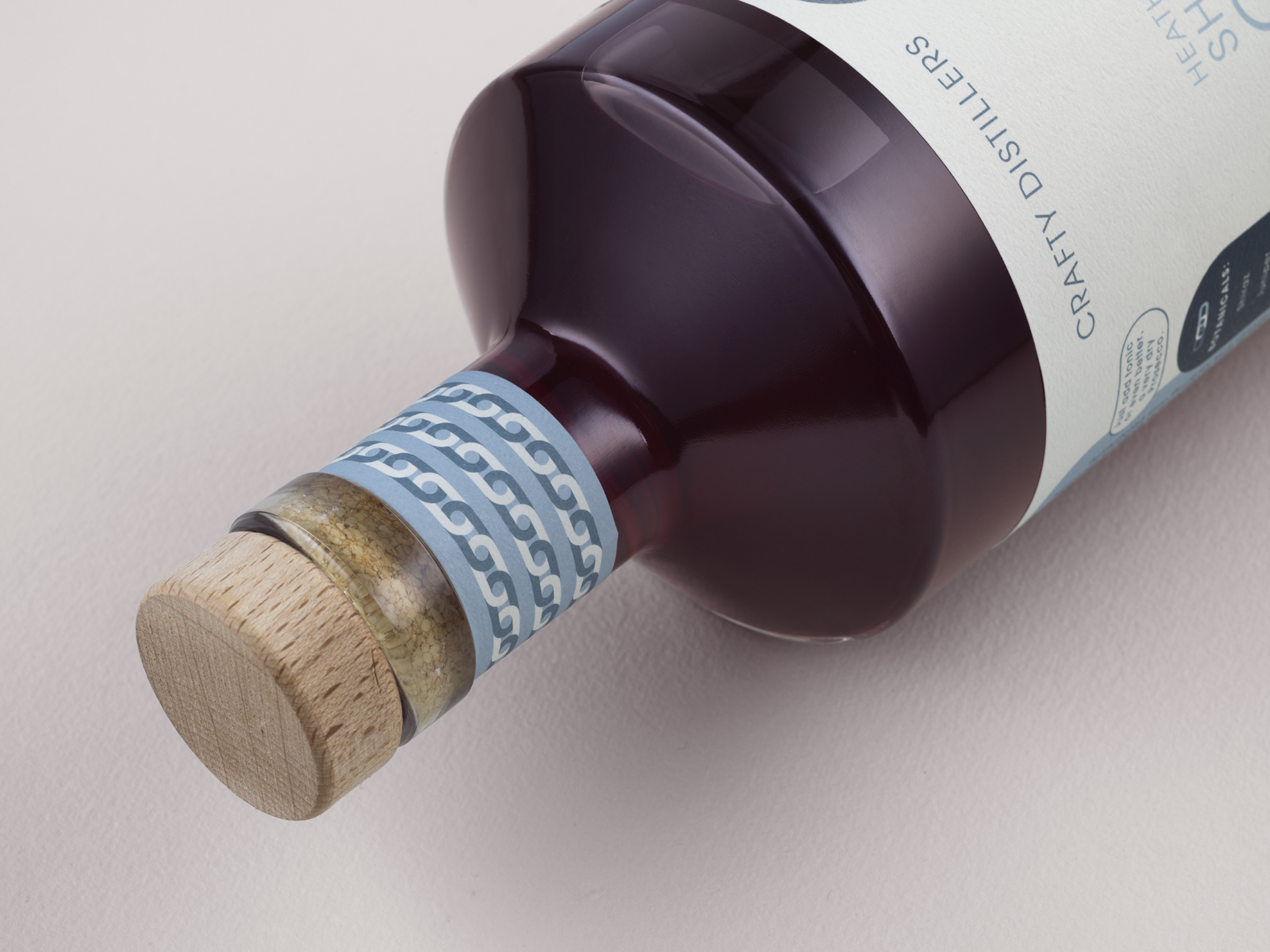
To add to the shelf ‘pop’, we have added a common silver foil underneath each colour, which makes them appear as custom foils. This printing technique is also conceptual, a metallic surface that ties into the physical nature of metal chains.
Throughout the label we have carried through the chain link shape to create a connection to the logo and reinforce the icon to the consumer. The final touch – a decorative chain pattern to wrap around the neck. After researching other gin brands, we often struggled to find what the flavour profiles were, so our design has incorporated a simple list of botanicals clearly communicating to the consumer the flavours they can expect.
CREDIT
- Agency/Creative: Design Energy
- Article Title: Design Energy’s Label Design for Rutherglen Distillery Premium Gin Range
- Organisation/Entity: Agency
- Project Type: Packaging
- Project Status: Published
- Agency/Creative Country: Australia
- Agency/Creative City: Melbourne
- Market Region: Oceania
- Project Deliverables: Art, Art Direction, Brand Creation, Brand Design, Brand Mark, Brand Strategy, Brand Tone of Voice, Branding, Copywriting, Creative Direction, Design, Graphic Design, Icon Design, Label Design, Logo Design, Packaging Design
- Format: Bottle
- Substrate: Pulp Paper
- Industry: Food/Beverage
- Keywords: WBDS Agency Design Awards 2021/22
- Keywords: Branding, Brand Design, Packaging Design, Drinks Design, Drinks Brand, Logo Design, Spririts Design, Gin
-
Credits:
Creative Director: Trish Dunstone


