“From household commodity to craft and creativity: Design Bridge rebrands iconic Tate & Lyle’s Sugar Range
Brand design agency Design Bridge today announces its latest work in refreshing the brand identity and packaging for Tate & Lyle’s sugar range.
Tate & Lyle, an iconic household name that has dominated the sugar cane industry for over 130 years, partnered with Design Bridge to help build a stronger brand with a more clearly defined personality. Central to this was moving the perception of the brand on from its role as a simple household commodity to a brand with a rich heritage and colourful personality that is a trusted partner to baking and cooking in the home. On a practical level, Design Bridge’s task was also to help Tate & Lyle clearly communicate usage for their varied product range that has mystified many consumers for years.”
“Andy Kirk, senior brand strategist at Design Bridge explained, “Many people find the sugar aisle in the supermarket confusing and often default to using granulated sugar for everything – from sweetening their tea to baking cakes. Part of our job was to create a simple and engaging design to help people understand Tate & Lyle’s different sugar-types and their functions, whilst also injecting more personality into the brand.”
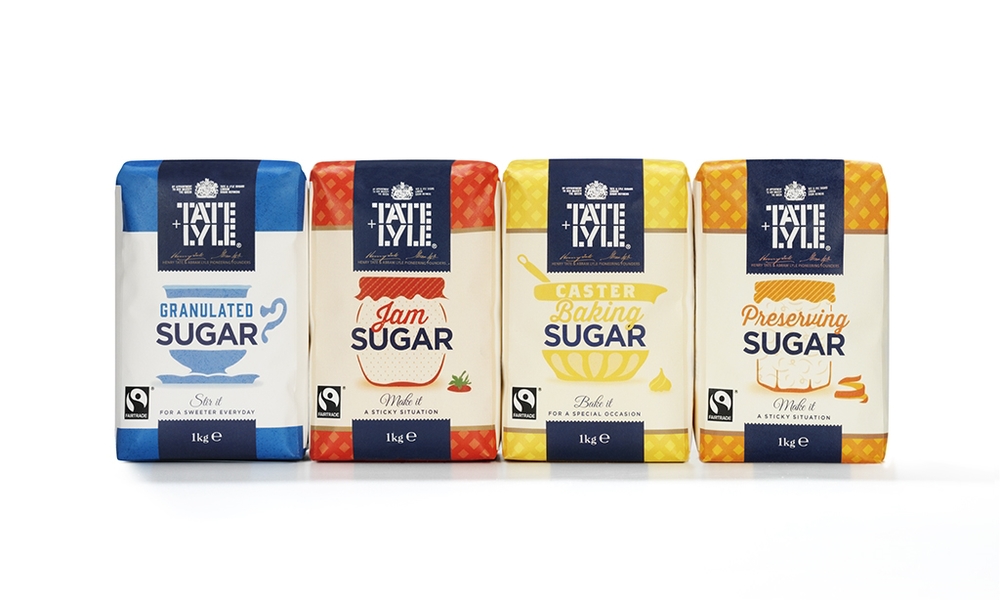
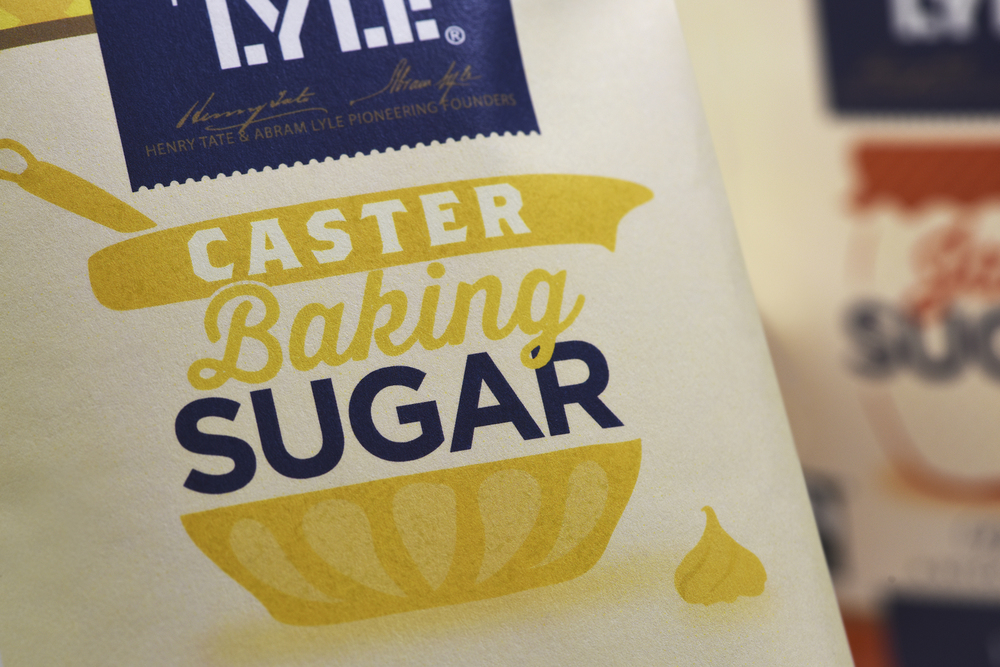
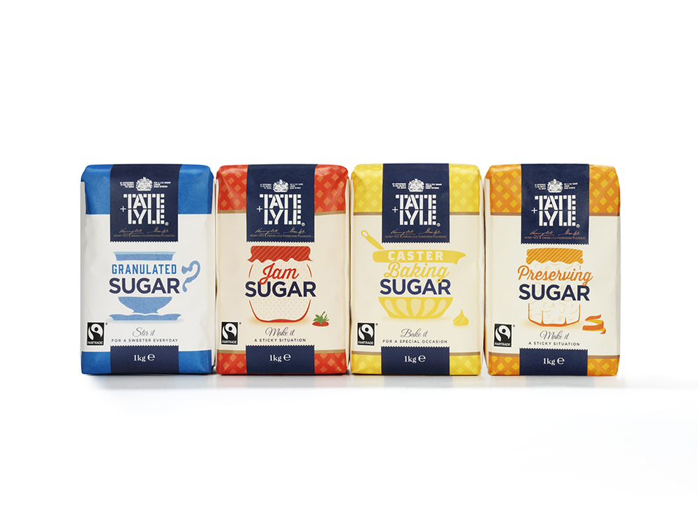
Developing a distinct tone of voice through both on-pack copywriting and illustration was key to achieving product differentiation and an engaging brand identity. Mike Stride, creative director at Design Bridge commented, “Visually, we divided the range up using a series of quirky on-pack illustrations to communicate the usage of the different sugars while also revealing a playful, warm and witty personality. For example a fabric-covered jam jar for Preserving Sugar, a porcelain tea-cup and saucer for Granulated Sugar, and a mixing bowl with a stray dollop of cake-mix on the worktop for Caster Baking Sugar.”
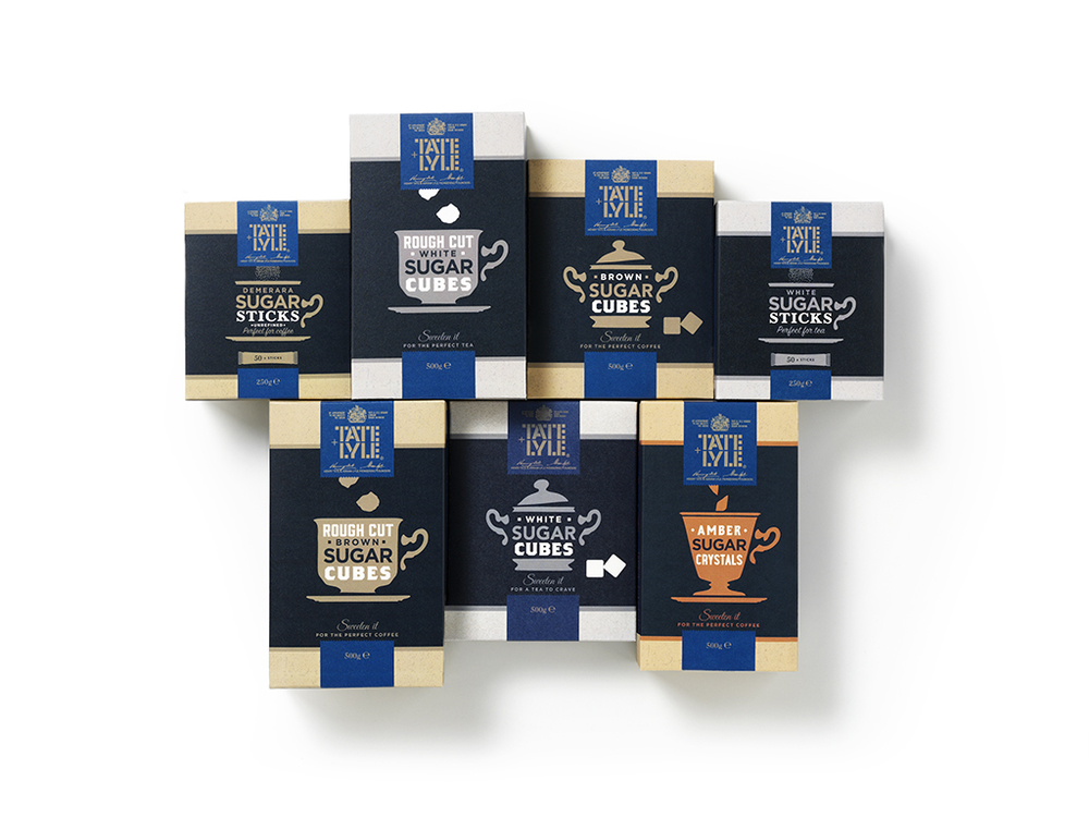
“Meanwhile the variant descriptions reinforce what the product is for in a charming way, expressing the brand’s personality and wit. Holly Kielty, creative director, brand language highlighted, “The Amber Sugar Crystals are illustrated with a silhouette of a coffee cup accompanied by ‘Sweeten it – for a perfect coffee’, while Royal Icing Sugar has the description, ‘Ice it – for the fancy flourish.'”
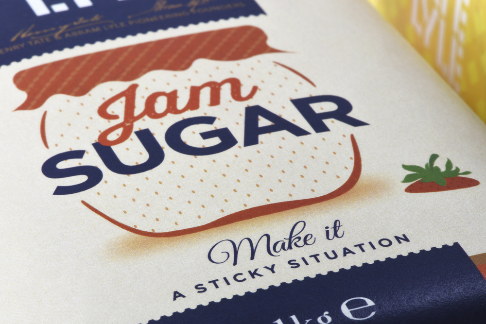
As part of its strategic approach, Design Bridge examined the rich provenance and heritage of Tate & Lyle, drawing inspiration from vintage iconography, signage and even old Tate & Lyle delivery trucks. A gingham tablecloth background is used on the baking range of sugars, evoking an affectionate sense of the ‘homemade’ and referencing the brand’s very British heritage. This is coupled with a font that mimics the hand-written labels of homemade preserves echoing the playful quality of the pack illustrations.”
“Mike Stride, creative director at Design Bridge commented, “With the popularity of shows like the Great British Bake Off, many people have a renewed passion for baking and creative cooking at home. With sugar being at the heart of much baking, we worked to create a brand sentiment that really celebrated this national love of culinary exploration in a quirky, vibrant and unpretentious way.”
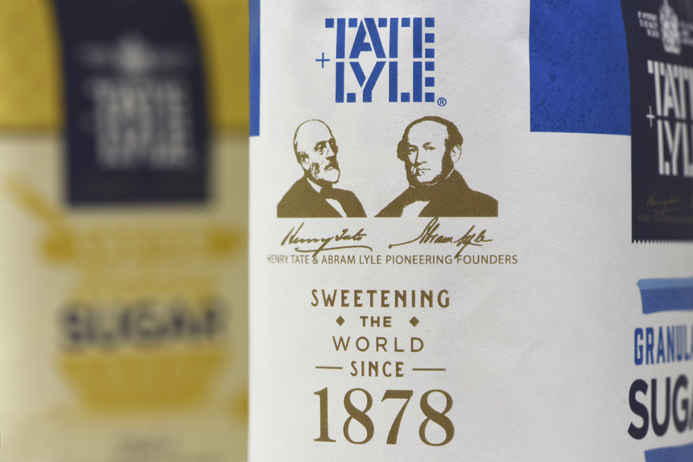
Elsewhere Tate & Lyle’s rich heritage comes into play on the pack design with illustrations of the founders – Henry Tate and Abram Lyle – and their signatures on the side of the box. Accompanied by the caption, “Sweetening the world since 1878″, this detail celebrates Tate & Lyle’s status as a beloved heritage brand steeped in crafting, imaginative eccentricity and British wit.”
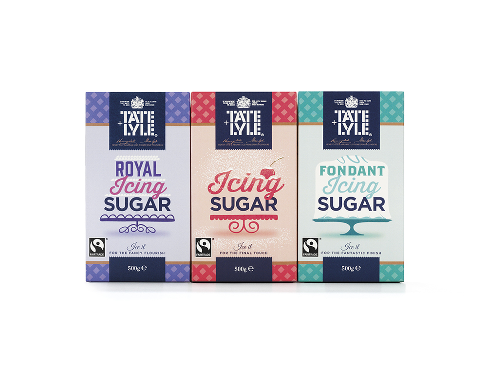
“Other core elements of the new brand identity include:
– A rustic organic texture to the packs and beverage sweeteners, which plays on the homemade ‘perfect imperfections’ look and feel inherent in the new identity.
– A consistent royal blue background to the Tate & Lyle logo that resonates heritage and alludes to its prestigious royal warrant
– Touches of gold or silver on the logo and packaging across all the core sugar range”
“Tamas Fuzer, European Marketing Director at Tate & Lyle Sugars commented, “We are a brand with a rich history and our ingredients have been at the heart of homemade culinary inventions ever since sugar has lived in our store cupboards. Design Bridge have helped bring our heritage and brand sentiment to life and created an identity and brand that is affectionate, inherently British, educational and fun.””
CREDIT
- Agency/Creative: Design Bridge
- Article Title: Design Bridge – Tate & Lyle’s Sugar Range
- Project Type: Packaging
- Format: Bag
- Substrate: Pulp Paper


