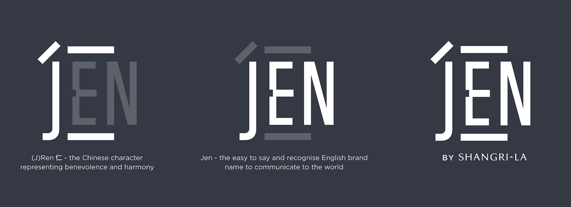
Discover New Asia: Design Bridge Shanghai reinvents hotel chain JEN by Shangri-La for a new generation of travellers. As the travel and tourism industry in China and the rest of Asia continues to re-open for business, this dynamic hotel rebrand captures the true vibrancy of New Asia. An innovative dual-language logo builds in inclusivity for both Chinese and English-speaking travellers.
Design Bridge Shanghai is excited to announce details of the Studio’s work rebranding JEN: the Shangri-La Group’s chain of upscale hotels aimed at sophisticated urban travellers. The dynamic rebrand draws inspiration from Asia’s vibrant and progressive cityscapes, inviting curious explorers to discover new Asia. Completed before the Covid-19 outbreak, the rebrand will begin rolling out across hotels from July and includes a new logo, full visual identity suite, brand touchpoints and amenities, plus a brand launch video that will play when guests enter their rooms.
Tom Gilbert, Executive Creative Director of Design Bridge Shanghai commented: “We wanted the new visual identity to capture the true vibrancy of JEN’s destinations across Asia’s most dynamic cities, as well as reflect the shifts in the hospitality sector and rise in Chinese tourism within an increasingly competitive hotel market. Re-branding from ‘Hotel Jen’ to ‘JEN by Shangri-La’ is a move that takes the brand beyond a physical place to a community of likeminded travellers, reassured they are in the safe hands of Asia’s leading hospitality group.”
At the heart of the rebrand is a radically innovative dual-language wordmark that simultaneously reads in Chinese and English. The Chinese character rén, representing benevolence and harmony, has been seamlessly combined with the English word ‘Jen’, building inclusivity and appeal into the brand for both the Chinese tourism market as well as English-speaking travellers.
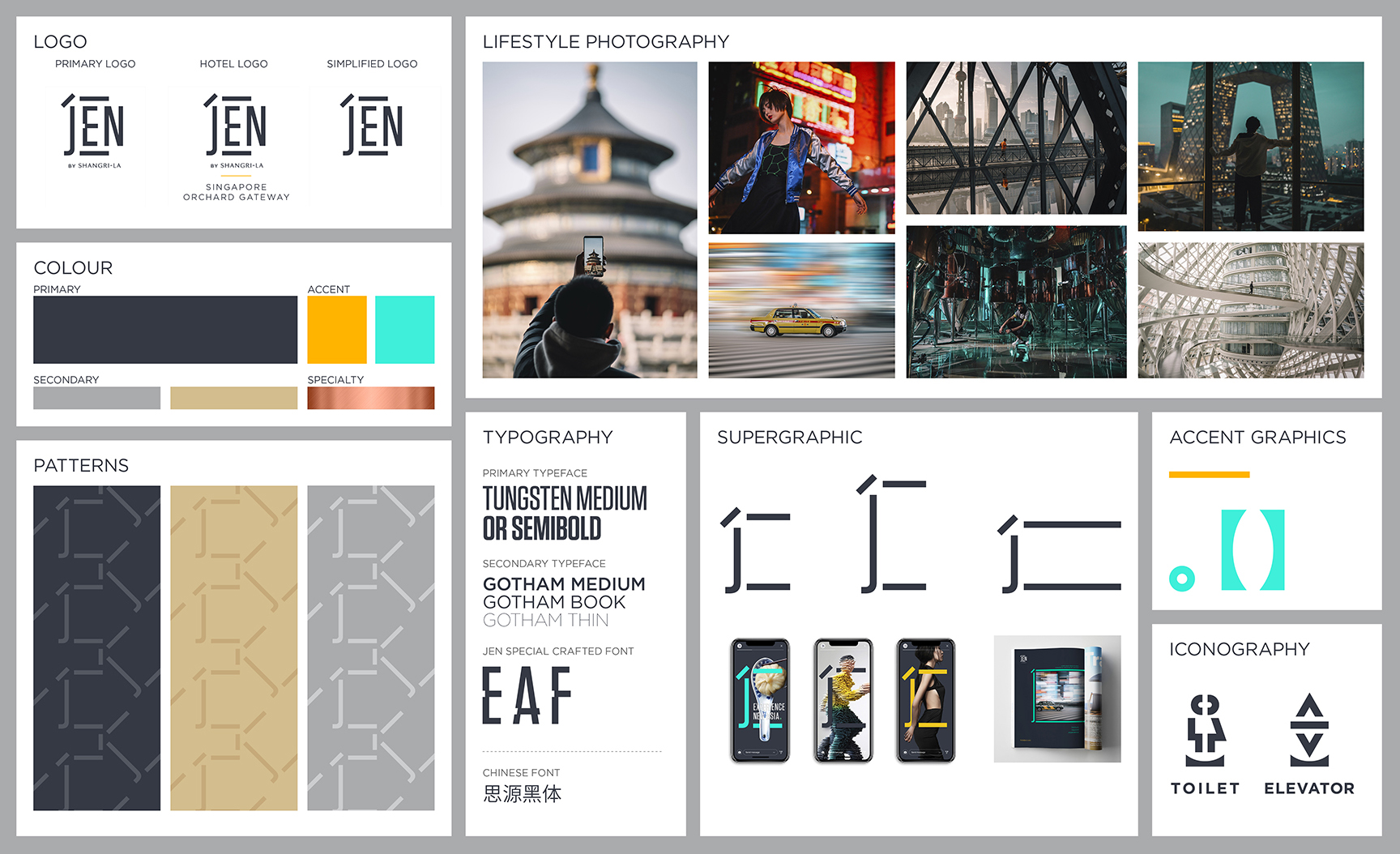
Design Bridge’s iconic interpretation of the ‘rén’ symbol has also been used as a flexible supergraphic, imbuing print and digital touchpoints with JEN’s signature bold and graphic identity. The symbol has also been used to create a bespoke Jen typeface and a series of striking geometric patterns in a new colour palette drawn from the contemporary urban environment.
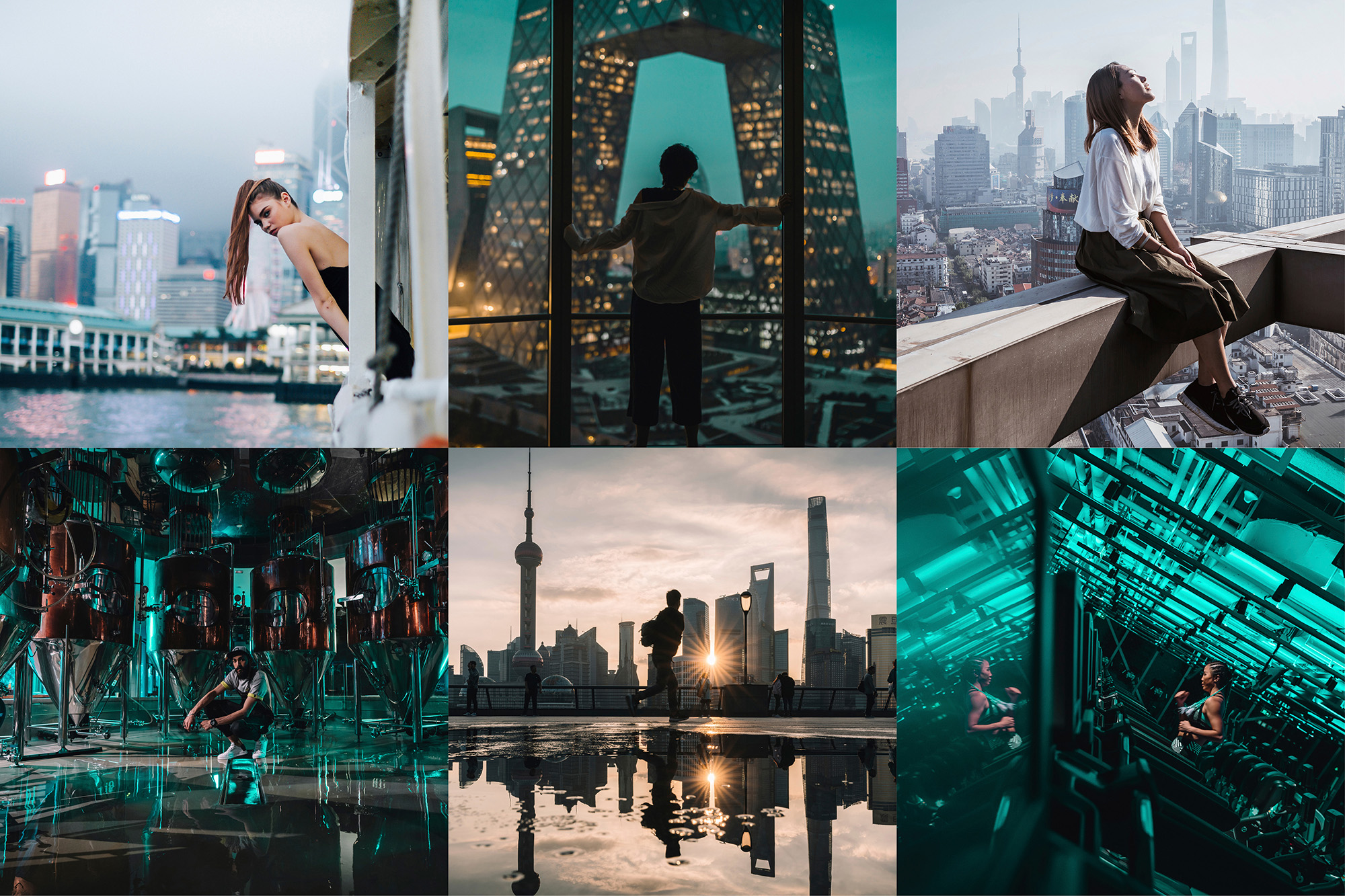
Creating new brand photography and a brand launch video were also a crucial part of the project, as Tom Gilbert from Design Bridge Shanghai explains, “We collaborated with photographers Tristan Zhou and Vivien Liu, both of whom specialise in capturing dynamic Asian cityscapes, to create a bespoke set of brand imagery to bring the new JEN to life. We also led a 4-day film shoot across Beijing, Shanghai and Singapore to create a new launch video directly appealing to the community of sophisticated urban explorers that the new JEN by Shangri-La is fostering.”
Design Bridge’s work also underpins the visual direction of a new suite of digital assets, including a new website.
Kevin Siew, Vice President, JEN, Shangri-La Group commented: “We love the new JEN branding. It’s exciting our partners, intriguing new consumers and helping our team roll-out our new vision as the brand continues to expand across Asia. The whole visual language builds on our roots as an iconic Asian hospitality group and positions JEN perfectly amidst the changing landscape of hospitality.”


CREDIT
- Agency/Creative: Design Bridge
- Article Title: Design Bridge Shanghai Reinvents Hotel Chain JEN by Shangri-La
- Organisation/Entity: Agency, Published Commercial Design
- Project Type: Identity
- Agency/Creative Country: China
- Market Region: Asia
- Project Deliverables: Brand Identity, Brand Redesign, Brand World, Branding, Rebranding
- Industry: Hospitality


