


“Design Bridge re-position Flora ProActiv as a premium, healthy lifestyle brand with new packaging and visual identity.
New packaging positions Flora ProActiv as a premium quality health brand with clinically proven, cholesterol-lowering benefits.
Visual identity captures the duality of the ProActiv name: scientific efficacy that supports a healthy, active lifestyle.”
“Independent brand design agency Design Bridge today announce details of their work creating the new packaging design and visual identity for Flora ProActiv. The new logo, typography, visual identity and photography style position ProActiv as a premium lifestyle brand and reflect the powerful duality of the ‘pro’ and ‘activ’ of its name: the scientific expertise behind its active ingredient, plant sterols, and the healthy lifestyle it promotes.
Birgitte Woehlk, Group Brand Guardian at Design Bridge commented, “ProActiv launched 15 years ago as a premium sub-brand of Flora with a mission to help people reduce their cholesterol. Over the years the packaging has lost the sense of what makes it so unique: its active ingredient, plant sterols, that help reduce cholesterol levels. Our challenge was to create a new identity system that clearly positioned Flora ProActiv as a premium brand with clinically proven cholesterol-lowering benefits; a brand that people who aspire to look after their health are proud to have in their home and which warrants the higher price point.
To achieve this Design Bridge have strengthened the ProActiv brand name and identity on and off the pack.”
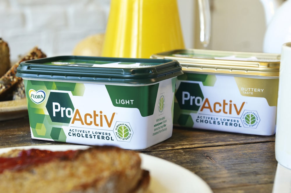
“Chloe Templeman, Design Director at Design Bridge, “The new identity enhances the duality of ProActiv’s name. ‘Pro’ appears in a clean, white font against a dark green background, representing ProActiv’s professional expertise, scientific efficacy and important health benefits. In contrast we used an energetic, vibrant orange font for ‘Activ’ to symbolise the positive benefits of a healthier, more active lifestyle that ProActiv encourages.”
The brand’s scientific credentials are reinforced by the framing of ‘Pro’ within a hexagon shape, a visual cue that became a central part of the new identity.
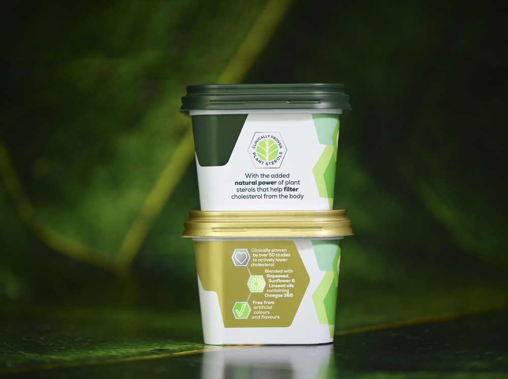
Chloe Templeman at Design Bridge continues, “The clinically proven benefits of ProActiv’s plant sterols stand it apart from generic margarines. We brought this unique ‘science of nature’ out on the pack by creating a precise pattern of hexagons, the scientific symbol used for molecular structures. The hexagons subtly suggest the science behind ‘cluster and flow’, the process by which ProActiv’s plant sterols attract cholesterol molecules in clusters and allow them to be flushed out of the body. Layering the hexagons in soft, natural green shades suggests dappled light through trees, symbolising plants, nature, the great outdoors and a healthy, active lifestyle. Placing the focus on both scientific expertise and an active lifestyle in this way once again relates back to the duality of the ProActiv brand name.
Continuing this exacting approach, Design Bridge aligned key graphic elements on the pack with the 66-degree angles of the hexagon shapes, a subtle hint at ProActiv’s scientific precision and efficacy. These traits are emphasised further by the introduction of silver detailing on the packaging, which also reflect the premiumness of the brand.
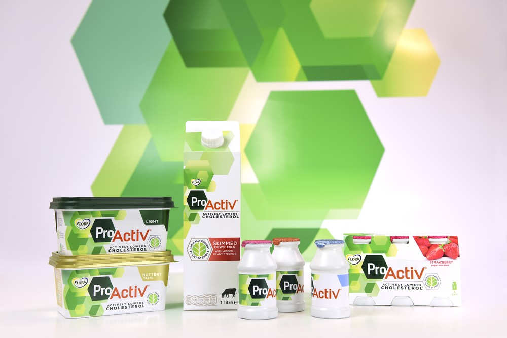
The new identity extends beyond the margarine spreads to ProActiv’s wider range of cholesterol-lowering products designed to suit people’s needs and preferences.
Chloe Templeman at Design Bridge explains, “When creating the identity we ensured that it worked across other ProActiv products, such as milk and mini yoghurt drinks, and even the brand’s broader visual identity. We’ve developed a colour palette, typography and photographic guidelines to align ProActiv’s brand and marketing messaging with the new identity. Photography features greens with warm and rich orange highlights, shot outdoors in late summer – reflective of both an active lifestyle and the life stage of ProActiv’s 40-50 year-old target consumers. Hexagon-shaped crops and key-lines on photography reference the science behind the brand, while two contrasting typefaces reflect the duality of the brand name. Just like the packaging design, the overall effect communicates both a healthy lifestyle message and the cholesterol lowering benefits of ProActiv’s range of products.”
“Kaarthik Subramani, Global VP Spreads at Unilever commented, “Design Bridge have managed to radically change the visual identity for ProActiv so it communicates its purpose more clearly, while still remaining recognisable and familiar. In fact in tests, consumers now find ProActiv even faster. Congratulations to Design Bridge on doing such a good job.””
CREDIT
- Agency/Creative: Design Bridge
- Article Title: Design Bridge – Flora ProActiv
- Project Type: Packaging
- Format: Bottle, Pot
- Substrate: Plastic, Pulp Carton


