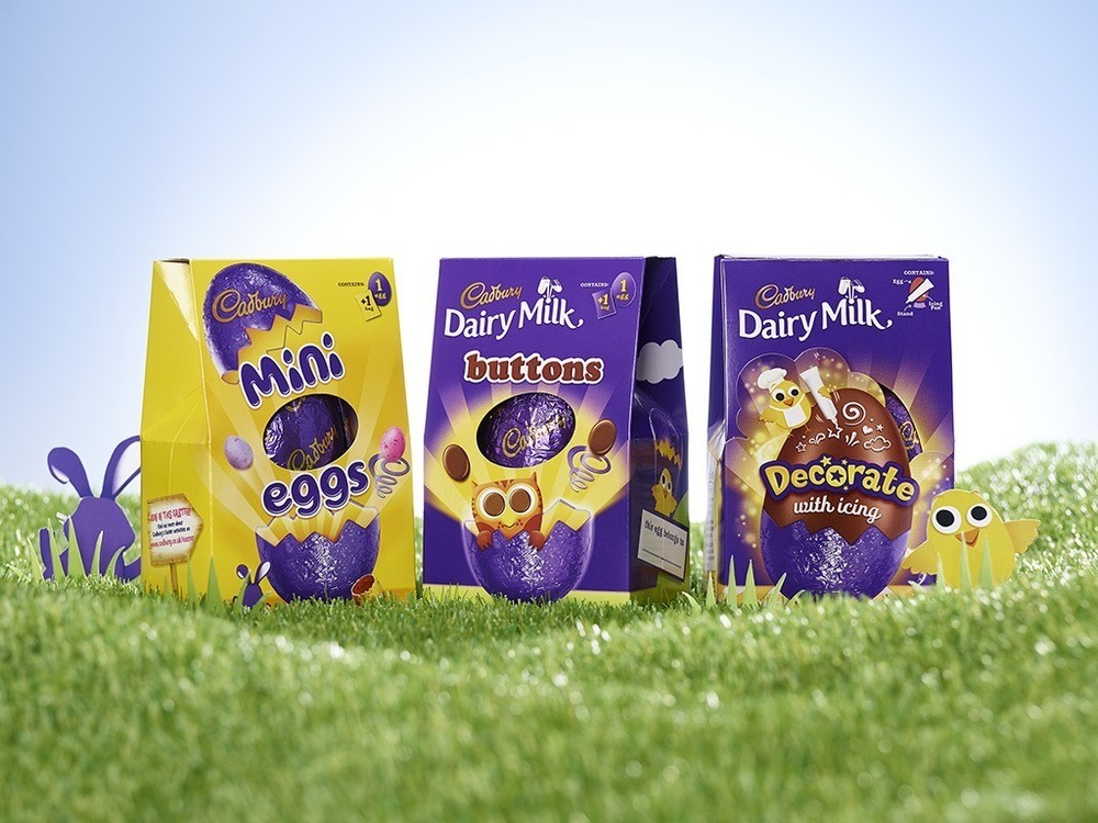
” Independent brand design agency Design Bridge today announce details of their work creating the packaging for this year’s Cadbury Easter range. Design Bridge have united the whole range using the much-loved Easter icon of the Cadbury purple egg, which sits on pack amidst a burst of Easter joy and revelry.
David Annetts, Executive Creative Director from Design Bridge commented, “Easter is a very special time for Cadbury and their customers and we wanted to express the sense of joy, anticipation and celebration of Easter and springtime through our designs. More than just the long Easter weekend, spring is about positivity and optimism. Our challenge was to bring the magic of the season to the designs, using one idea to unite and add meaning to the range.”
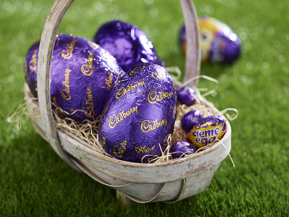
Design Bridge intuitively knew that people had fond childhood memories of the Cadbury’s purple foil-covered chocolate Easter egg and set about giving it a central role within the design. A playful and imaginative key visual was created to celebrate the purple egg’s role within the Easter ritual and to position it at the heart of Cadbury’s Easter story.””
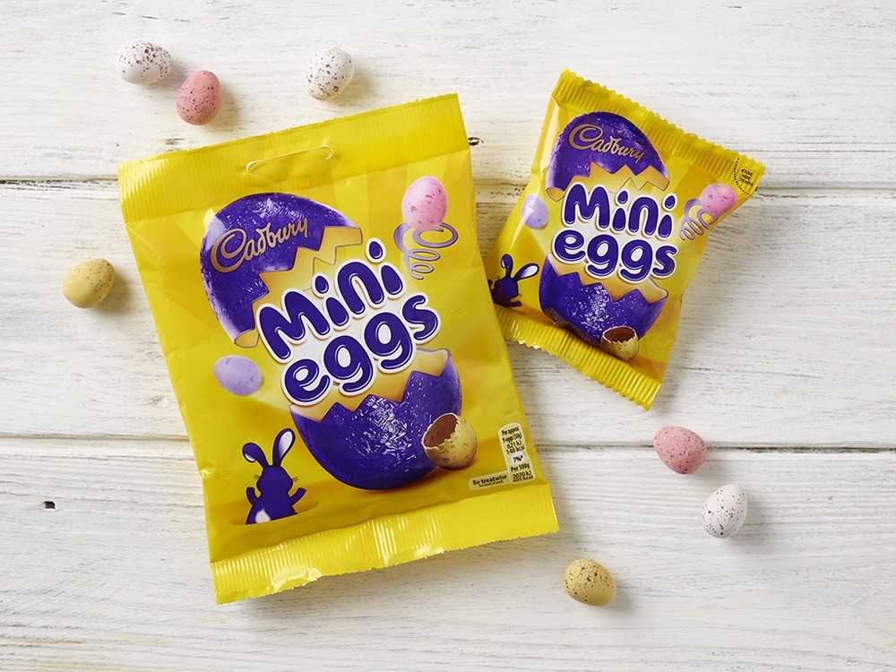
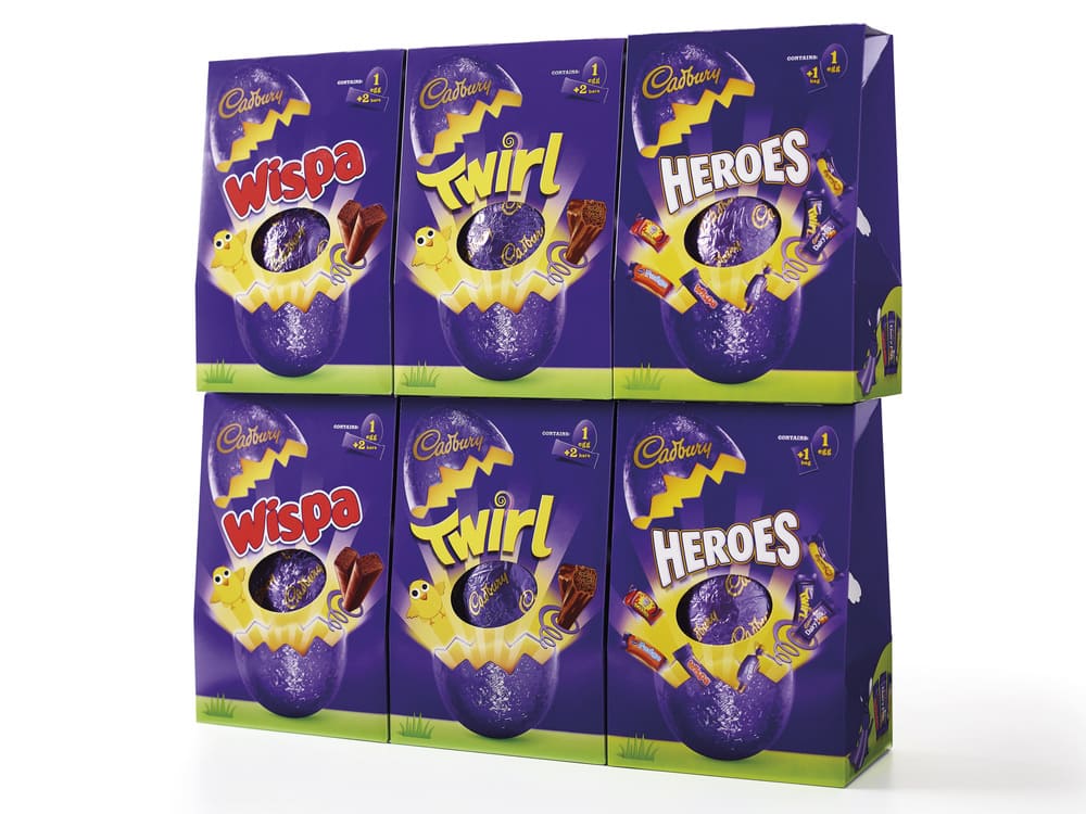
“Kate Galle, Creative Director from Design Bridge continues, “On pack, the purple egg bursts open to reveal bright rays of sunshine glowing from inside that lead up towards the product logo and a tempting picture of the chocolate inside. A coiled spring crafted out of the Cadbury ‘C’ also bounces out, along with ‘Chick’ and ‘Bunny’ – playful Easter characters we developed to add an extra sense of personality to the range. The whole scene is set on a field of fresh green grass, bringing the optimism of springtime out on pack.”
The purple egg key visual provides a consistent expression of Cadbury Easter revelry to the range while remaining flexible for use on different product types. It has been adapted for the packaging of Cadbury sub-brands with strong individual personalities, such as Cadbury Mini Eggs and Cadbury Creme Eggs. For Gesture Eggs, Cadbury’s range of sophisticated Easter eggs at a higher price point, the Chick and Bunny characters and green landscape have been replaced with gifting cues, such as elegant yellow-gold ribbons, to create a more premium feeling. Elements of the key visual have also been incorporated onto the packaging for Cadbury Easter novelties, which include mini chocolate hollows and small chocolate eggs.”
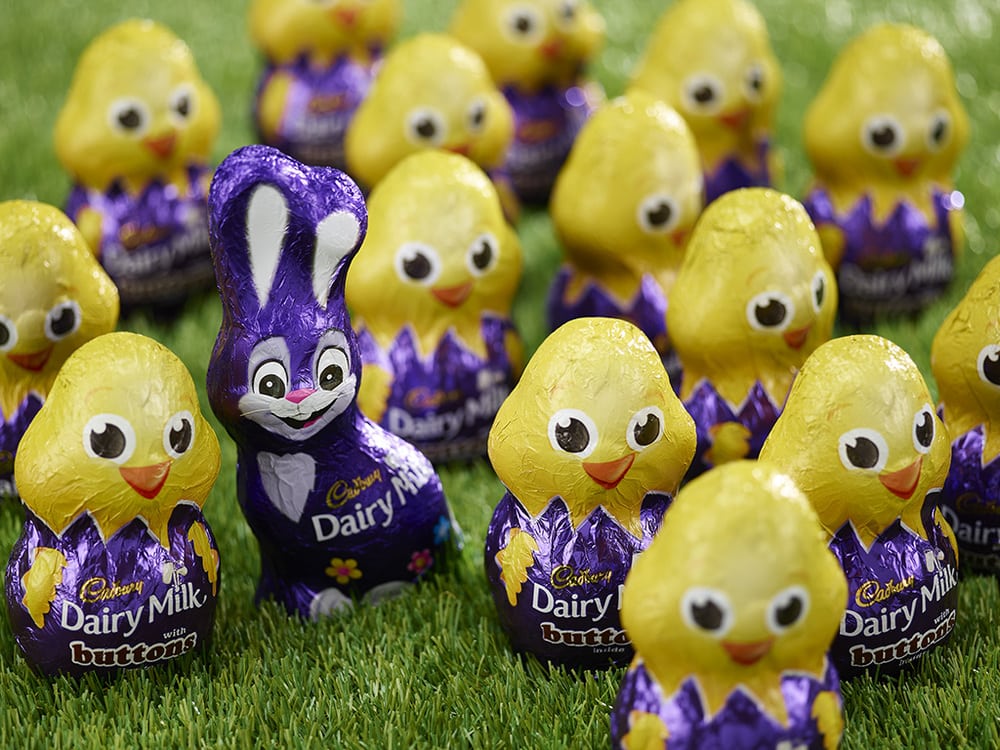
“On Cadbury Easter Eggs a feeling of excitement continues on the sides and back of the packaging, where Chick and Bunny interact with the product in fun and surprising ways. Chick can be spotted parachuting into an Easter landscape while Bunny juggles and twirls pieces of chocolate or sports a purple superhero cape on Cadbury Heroes products. The pair of characters really come into their own for the novelties range, where Chick performs magic tricks and Bunny paints Easter eggs or wears swimming gear. The characters bring originality and warmth to the range and allow Cadbury to express the fun and playful side of its personality.
Pawel Ozierski, Senior Brand Manager from Cadbury commented, “Design Bridge have successfully captured Cadbury’s unique sense of what Easter means to us and our customers. The packaging not only communicates the excitement of the Easter celebration, it also conveys the love people have for Cadbury’s history and heritage, not to mention the chocolate, that’s all wrapped up in our iconic purple Easter egg.””
CREDIT
- Agency/Creative: Design Bridge
- Article Title: Design Bridge – Cadbury Easter
- Project Type: Packaging
- Substrate: Metal, Plastic


