In the 90s, Harvey Nichols was bold, iconic and visionary. It dared to be different as a pioneer in fashion—the first flagship in London to bring in Gucci, where Nicole Farhi and Max Mara collections were inspired, and vibrant designers like Jacquemus were welcomed to host pop-ups. And in food—the first conveyor belt sushi in London, with a destination restaurant on the 5th floor with its private lift for late nights.
An attitude that always led from the front, Harvey Nichols was the cutting edge purveyor of culture. But the British luxury landscape was always moving, while the brand had begun to stand still. With the rise of a new magpie generation, it was time to sharpen the vibrant edge of the brand again. One of fabulous, hedonistic pleasure.
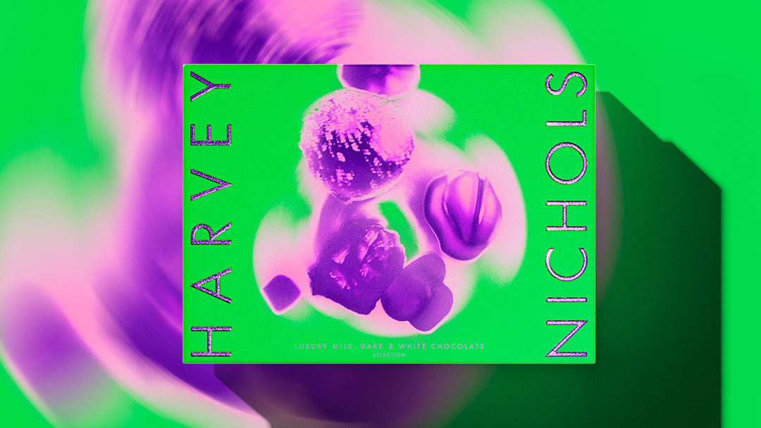
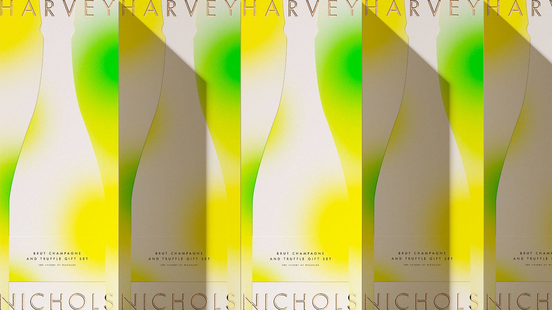
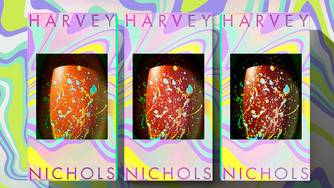
Emboldened, we took Harvey Nichols’ legacy to new heights, starting with its flagship food & beverage collection. Reclaiming the brand’s place in culture as the most iconic, talk-worthy and giftable destination in the world of luxury retail.
British Luxury retail’s moda operandi usually focuses on heritage, or scale. But Harvey Nichols isn’t merely a place to shop. It indulges customers in the boldest brands in fashion and food that the luxury world has to offer: A pioneer in retail creativity, building a riotously irreverent experience, that only ignites when customers are immersed into our wonderfully heightened sensation of hedonistic pleasure.
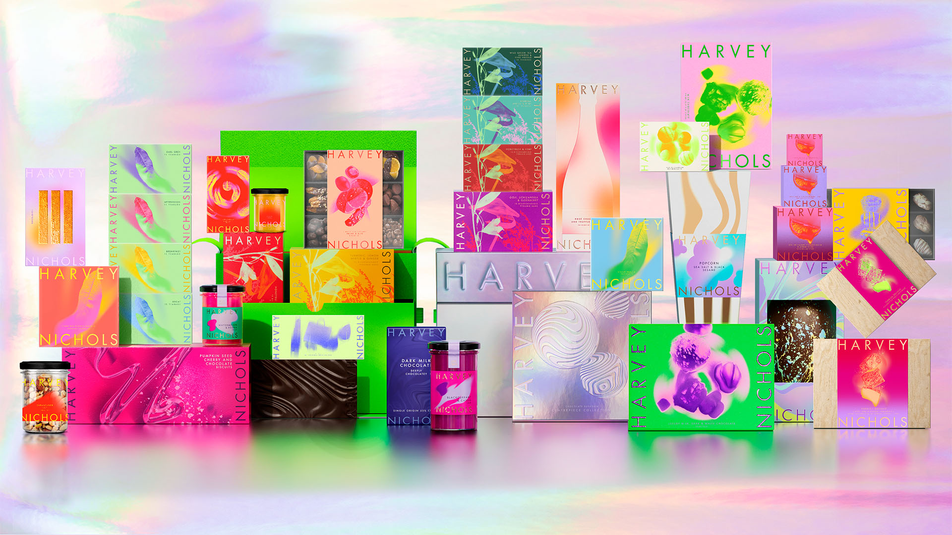
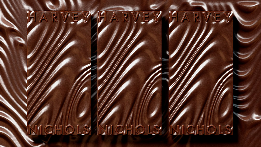
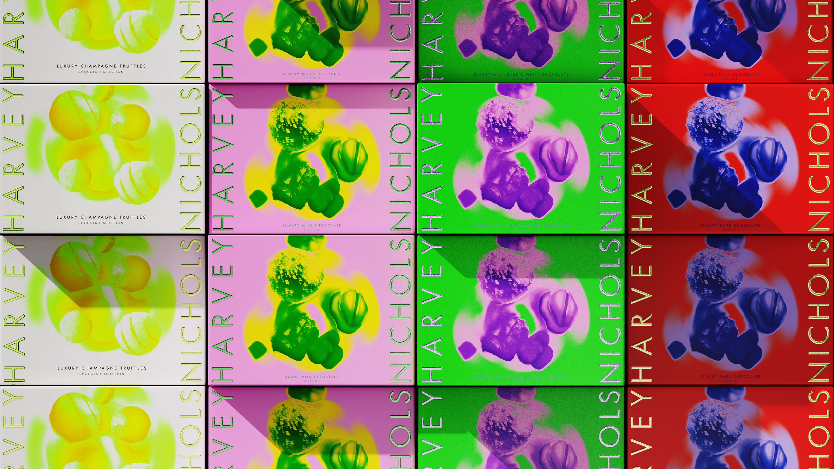
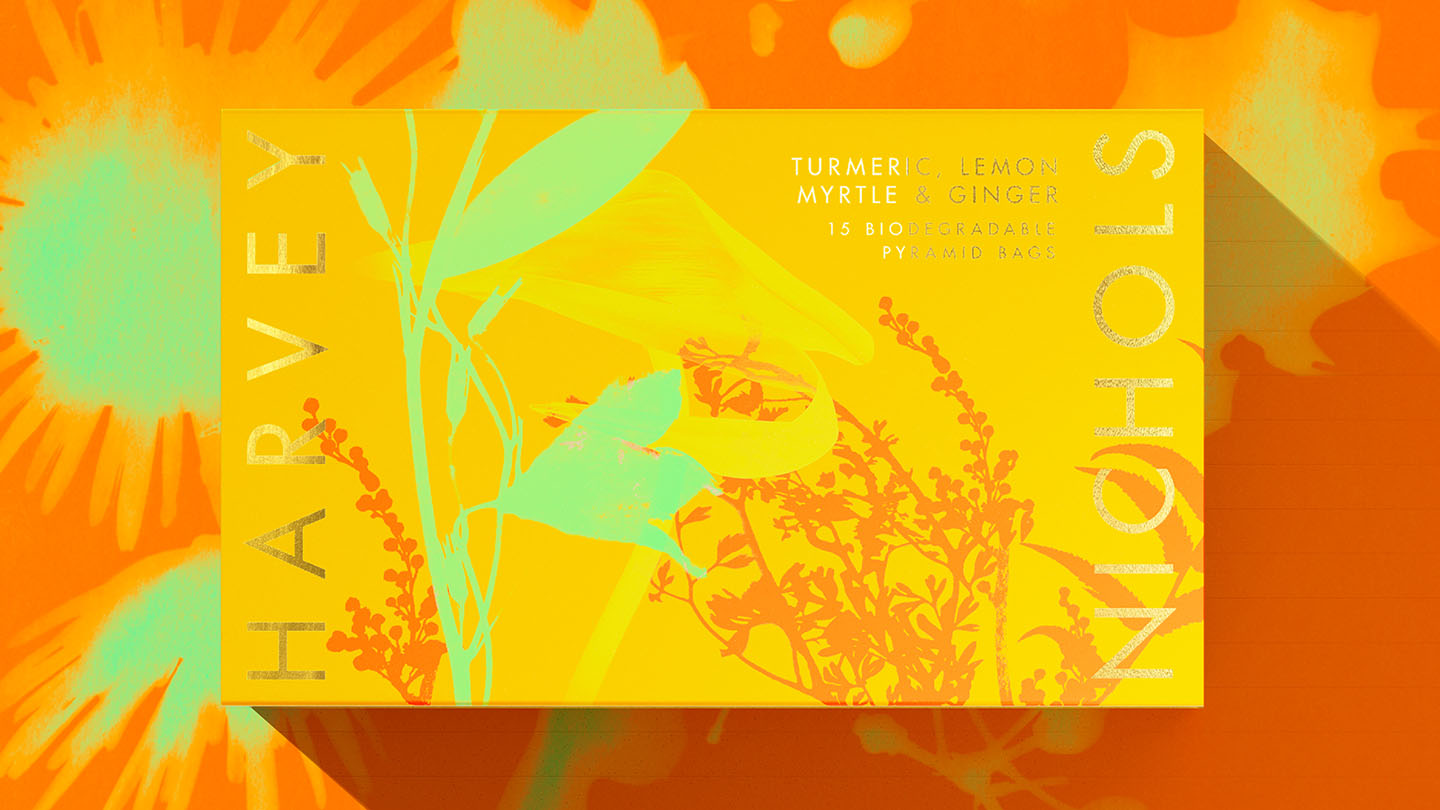
We created a unifying vision for redefined luxury: Pleasurama. A heady mix of hedonism, a joyful riot of colour, texture and of course, a full-on sensory overload. Elevated, but never cold; always welcoming and inclusive. Transforming this fashion icon from black-and-white 90s nostalgia, into an unapologetically maximalist world. One that embraces the pursuit of unadulterated pleasure.
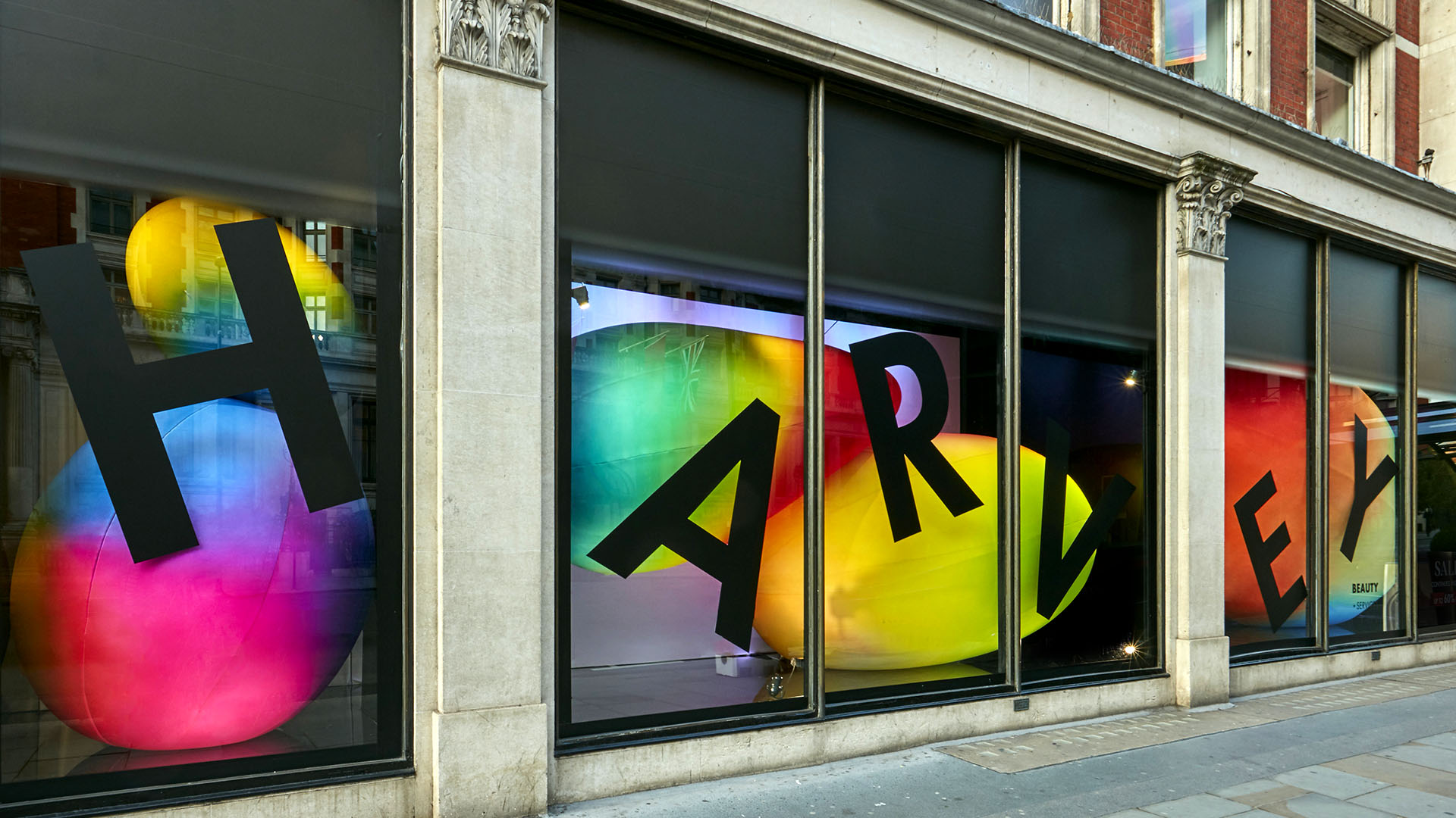
The new Harvey Nichols brand is a fresh disruption to the traditional luxury scene of Knightsbridge. Originally designed for the food & beverage range, this bold new identity has gone on to inspire every facet of the brand, from Harvey Nichols’ fashion campaigns, interior design, socials and seasonal collections, to their stand-out window displays.

CREDIT
- Agency/Creative: Design Bridge and Partners
- Article Title: Design Bridge and Partners Reignite Harvey Nichols with Bold Pleasurama Identity
- Organisation/Entity: Agency
- Project Type: Packaging
- Project Status: Published
- Agency/Creative Country: United Kingdom
- Agency/Creative City: London
- Market Region: Europe
- Project Deliverables: Brand Identity, Packaging Design, Retail Design
- Format: Bottle, Jar, Tin
- Industry: Retail
- Keywords: Brand Identity, Packaging Design, Luxury Retail
-
Credits:
Designer: Ella Smith
Design Director: Andrew Hirst
Designer: Amelia Cherrill
Designer: Eve Wallis
Digital Art Director: Vicky Yang
Senior Designer: Lisa Napier
Co-CCO: Emma Follett
Creative Director: Yvonne Eng-Hall
Senior Designer: Gill Sheraton
Senior Designer: Harry Meakin
Creative Director: Michael Stride
Design Director: Samuel Neill
Senior Designer: Mario Pimenta
Senior Designer: Sam Harvey
Client Director: Phoebe Hillier
Client Director: Errol Velinor
Client Director: Laura Richards
Strategy Director: Will Rees-Hooper
Group Client Partner: Meg Patel
Creative Director: Alessandro Foschini
CGI Director: Rodrigo Ortega
Senior CGI Artist: Nina Marie Girod
Junior CGI Artist: Gan Lin
Creative Director: Luke Burley
3D Branding Director: Phil Stead
Production Project Director: Julia Thompson
Production Director: David Clabon


