BrandOpus. – McCormick Herbs & Spices
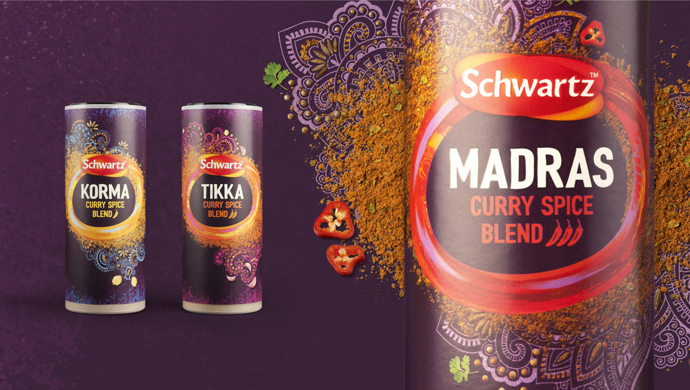
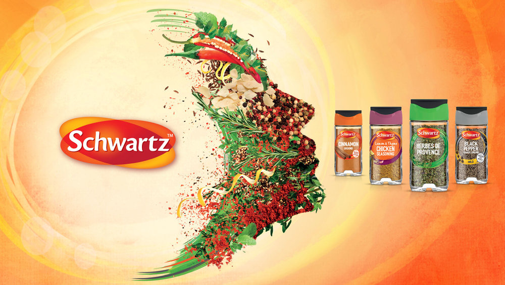
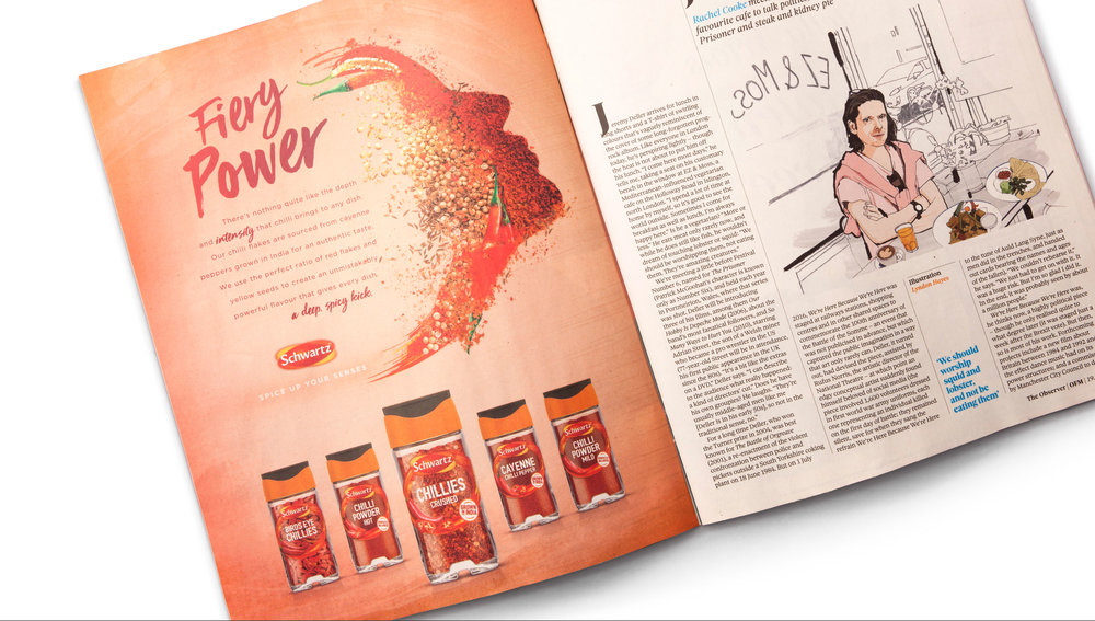
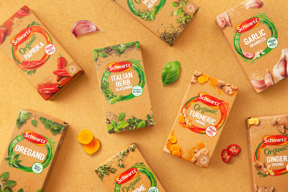
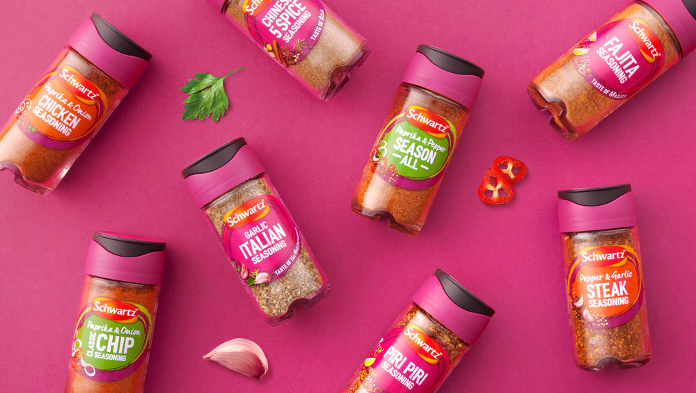
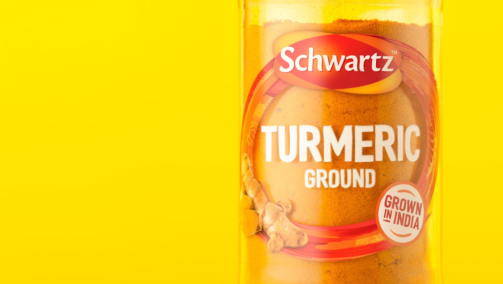
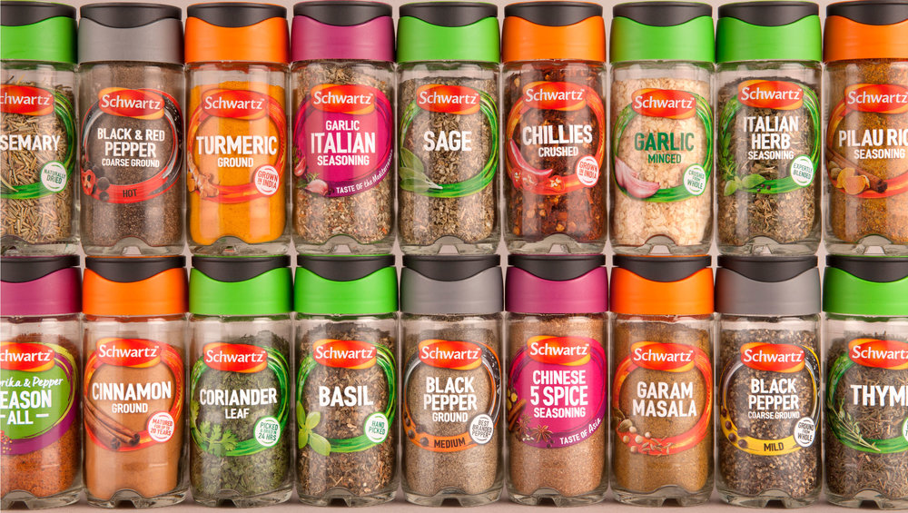
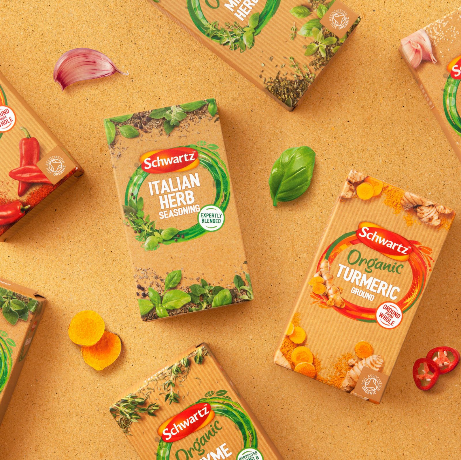
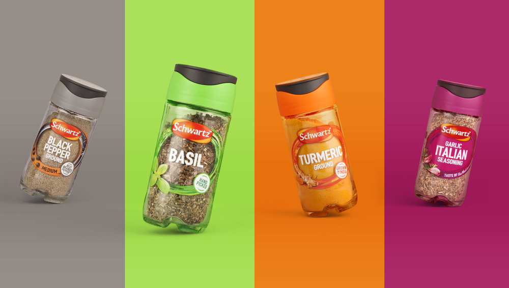
“ Schwartz & Ducros owner McCormick has unveiled a European-wide redesign by global brand agency BrandOpus. The redesign injects a sense of dynamism and modernity across the entire European portfolio, showcasing the superiority and quality of the ingredients. The new visual identity is part of a multi-million pound 360 marketing campaign. As part of the campaign BrandOpus created a new key communications visual and redesigned over 1,500 pieces of packaging, set to launch across seven markets over the forthcoming months. The world turns to McCormick for flavour expertise; their wide portfolio of trusted ingredients is sold globally under brands including Schwartz in the UK, Ducros in France, Spain & Belgium, Margao in Portugal and Silvo in the Netherlands. Looking to further drive brand preference and relevance in today’s modern, foodie world, McCormick embarked on a full strategic relaunch with long-term brand partners BrandOpus. Encouraging food enthusiasts to get the best out of their home cooking, the redesign shifts perceptions of the brand from a provider of high quality functional ingredients, to an inspiration for creativity in the kitchen. The new design heroes the flavours, colours and textures of the natural ingredients through greater transparency, graphics that showcase the ingredients, combined with key benefit messaging and dynamic product photography. To further bring the sensorial nature of the brand to life, BrandOpus developed an evocative and distinctive key communications visual that evokes the brand positioning around ‘stimulating the senses’ and captures the superiority and quality of products. Olivia Neville, EMEA Marketing Manager, McCormick says “This is an incredibly exciting time for McCormick as we relaunch our herbs, spices, peppers and seasonings portfolio into a new modern jar with transparent label, to highlight the quality of our ingredients. The stand out on shelf and ease of navigation across the range has also been improved allowing shoppers to find what they need more easily. Since the jar now allows a spoon to be used, consumers can also perfect their favourite recipes!” Paul Taylor, Chief Creative Officer, BrandOpus says “We wanted to create a more vibrant & dynamic look and feel that will drive impact at shelf and shift perceptions from a commoditised ingredient to an exciting source of flavour & inspiration for their cooking.””