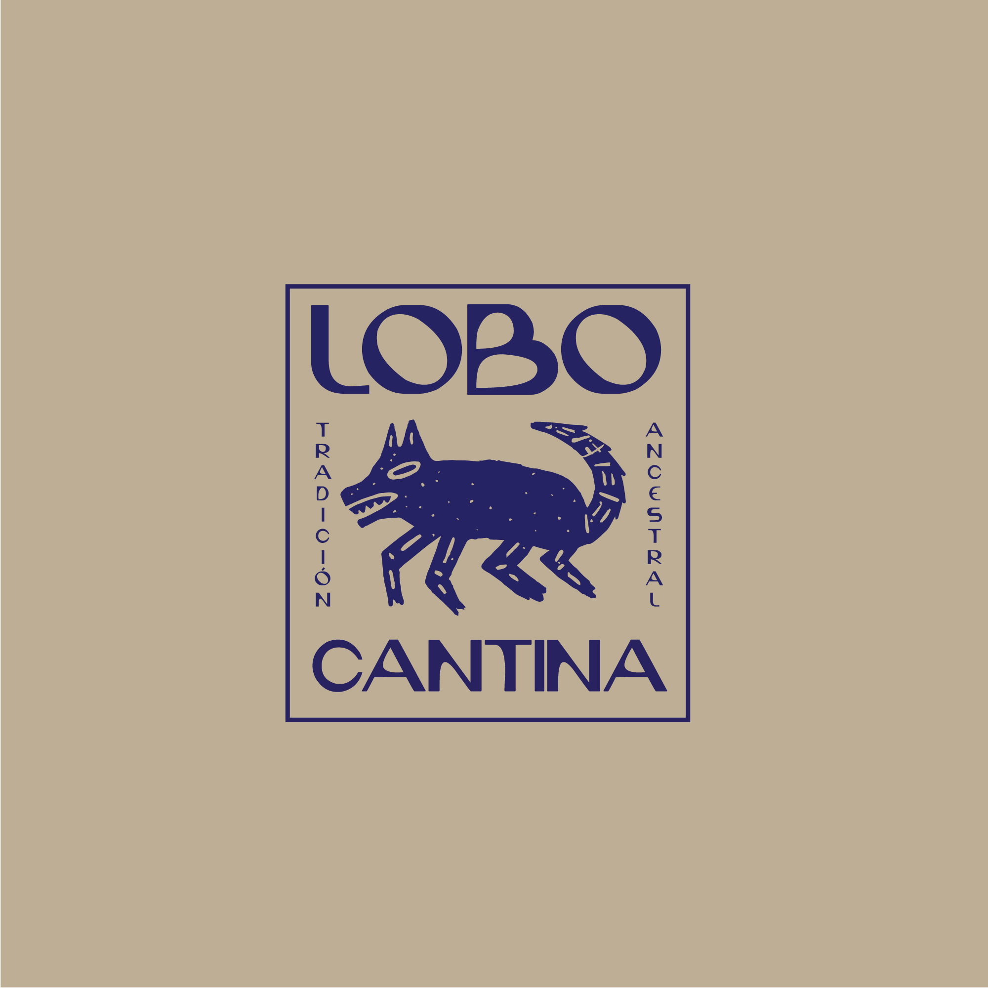
I designed the brand inspired in the Nahuatl tradition. Specifically in the “Nahuas”, people with the ability to assume animal forms. Always ready eat and devore.
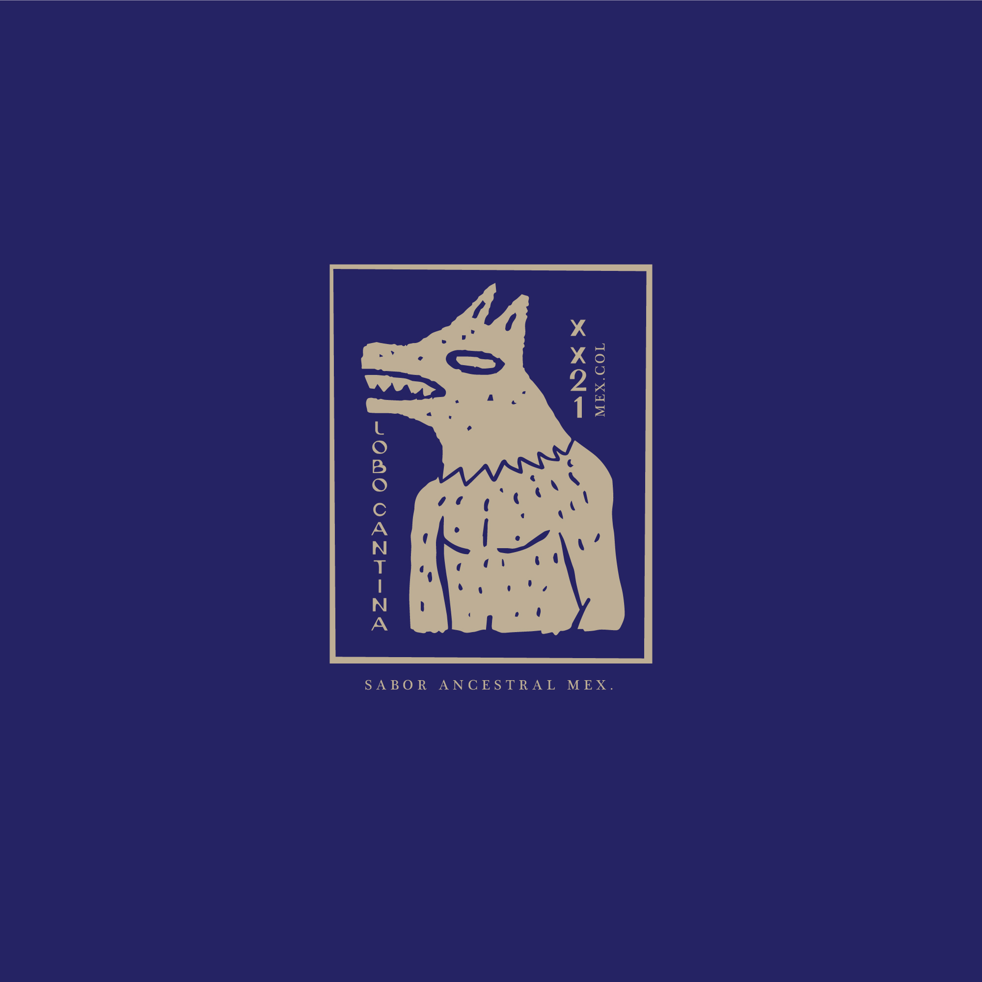
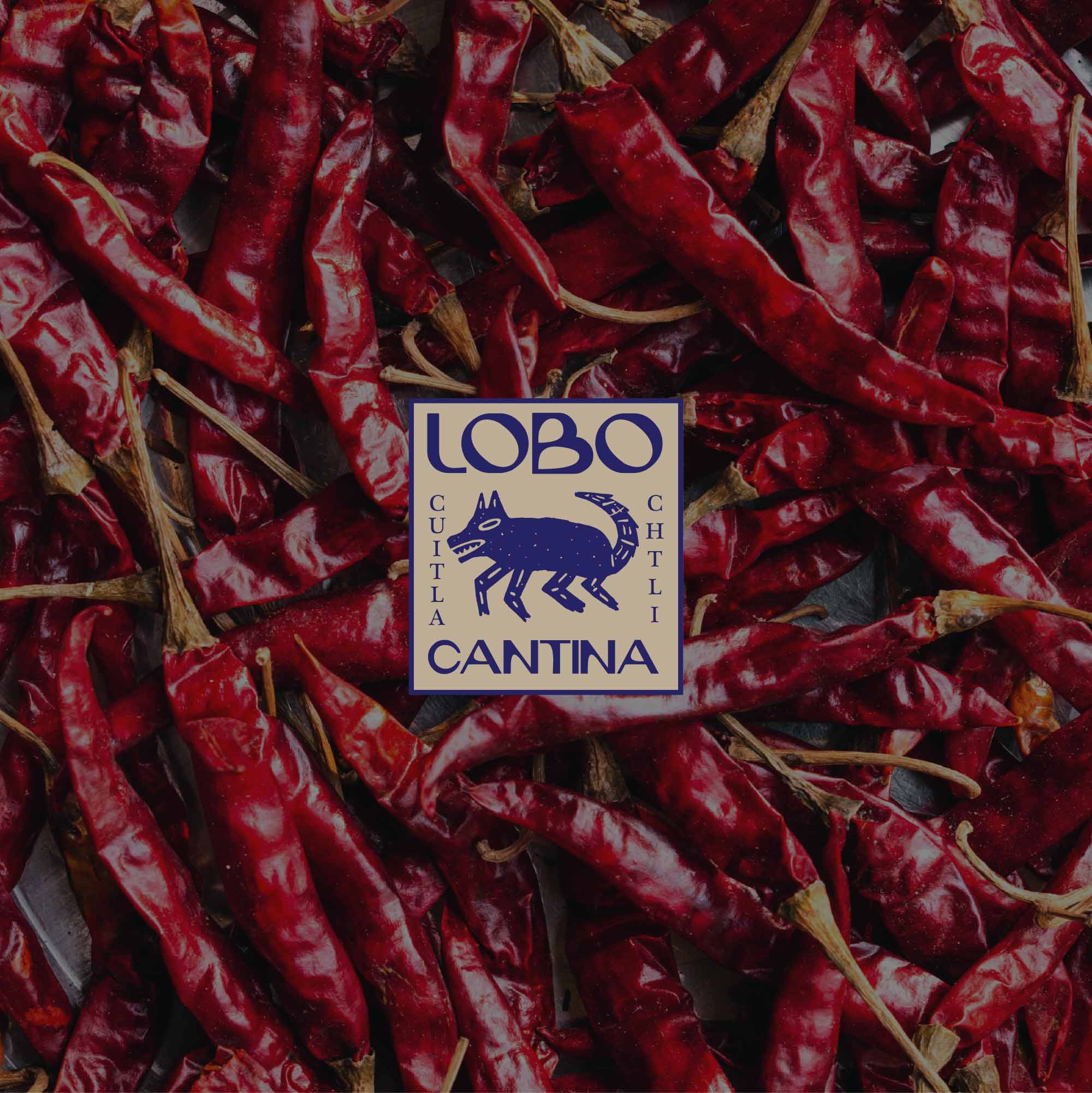
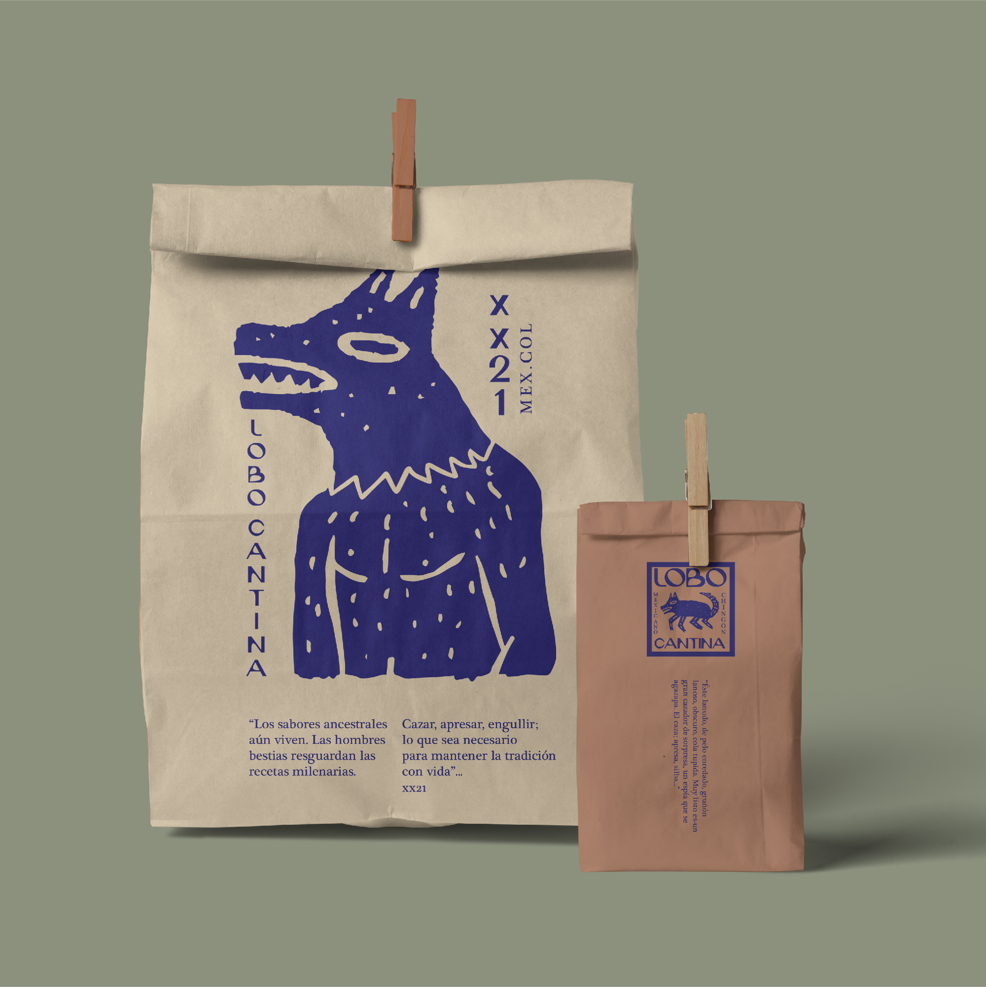
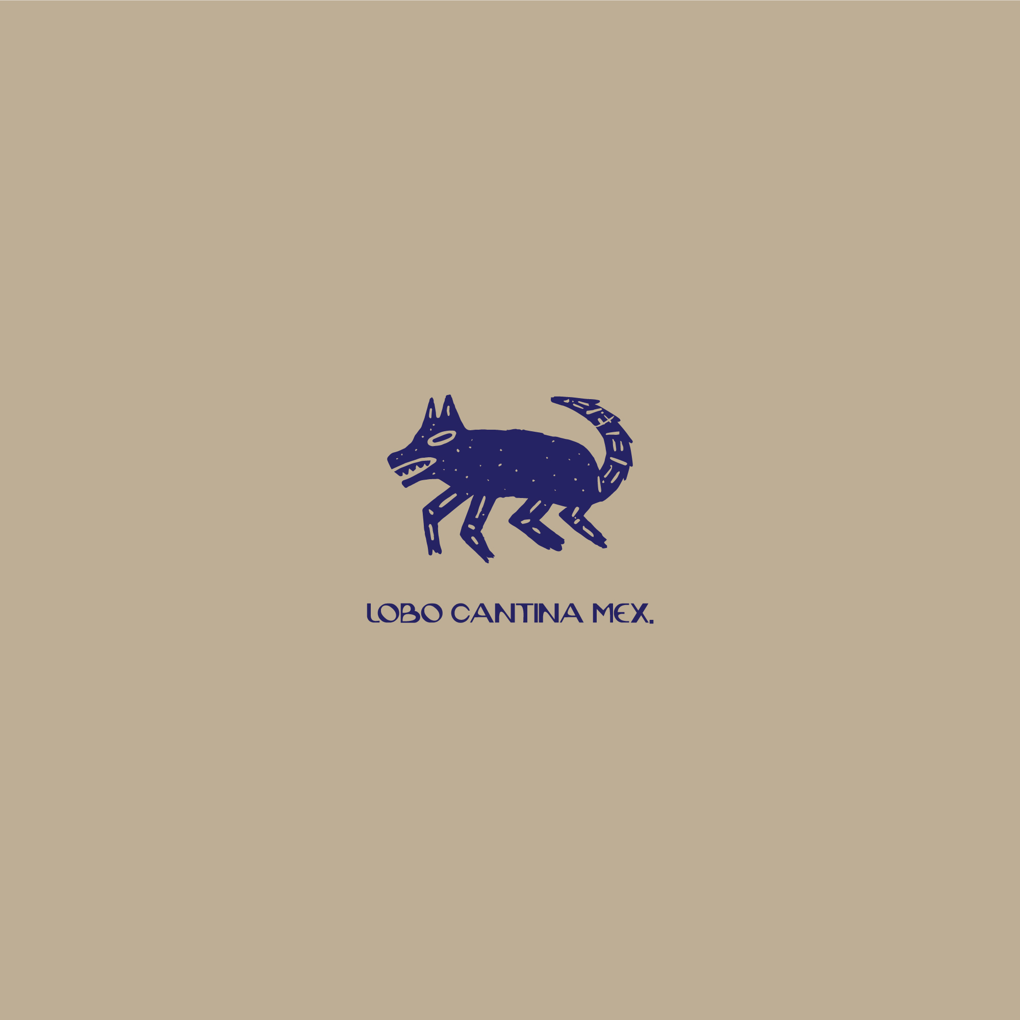
Based on this cultural belief I crafted a visual identity with a dynamic handmade icon that can be used with the animal spirit —the wolf— and the werewolf form. Both icons can be used as badges, graphic assets or even as logo. The main logo is represented by the wolf in animal form next to the word mark.
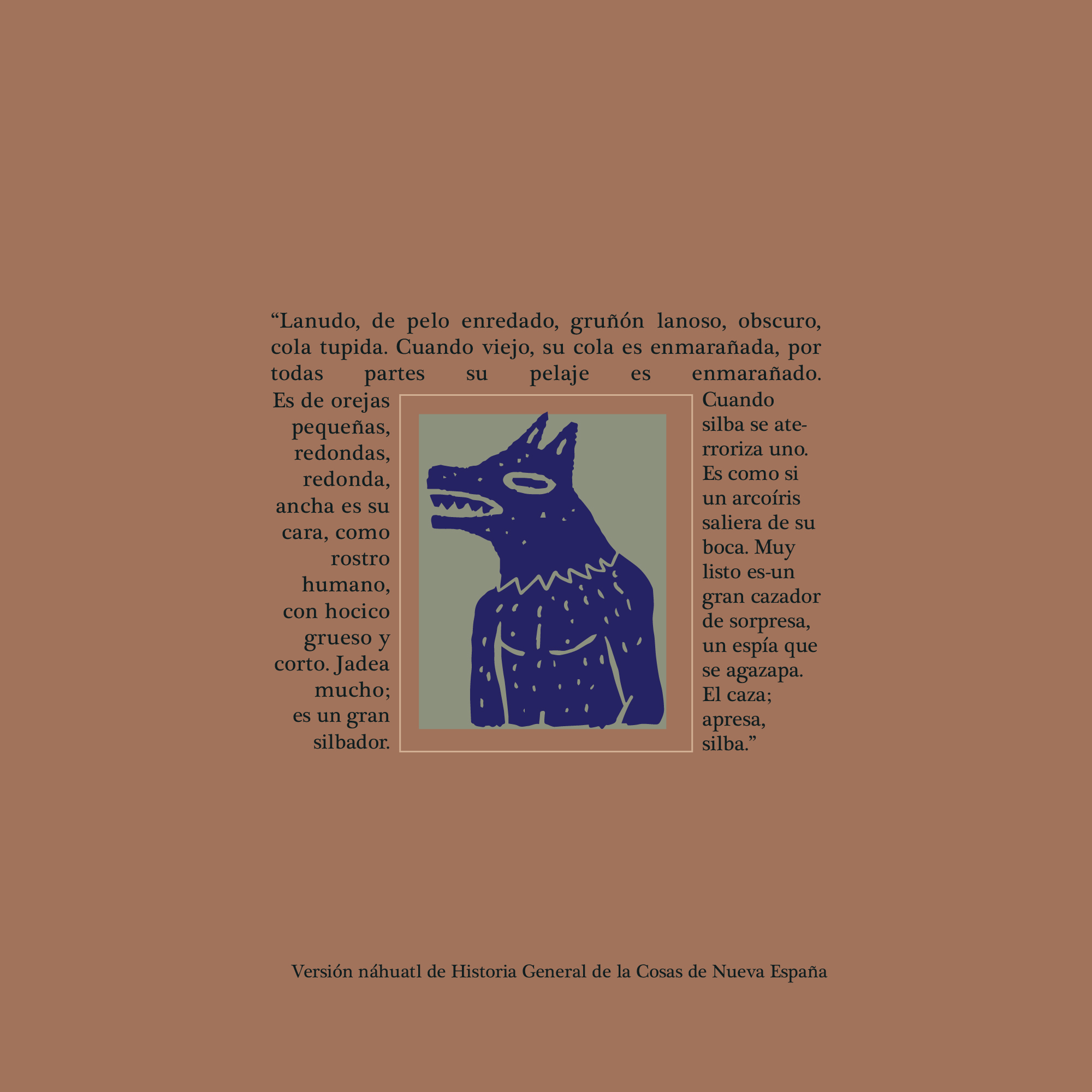
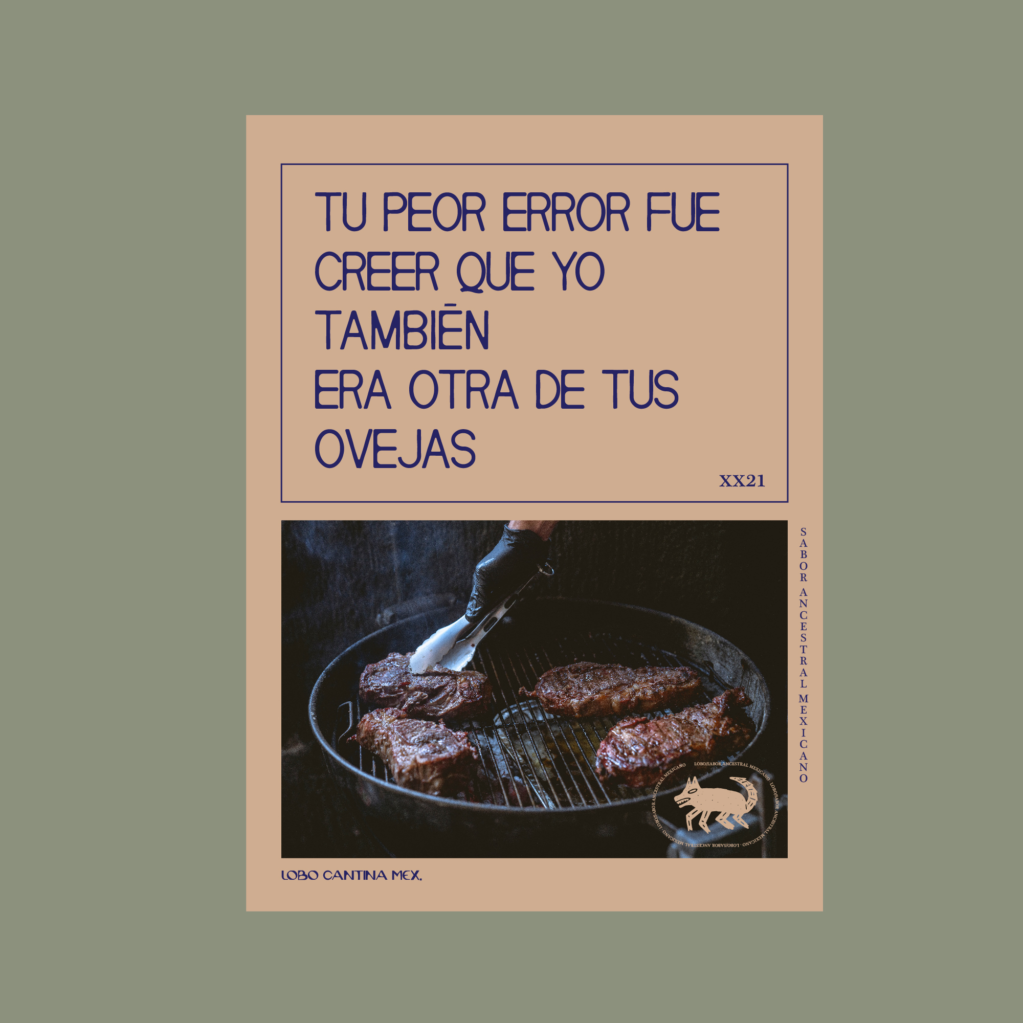
The fonts I used matched really well with the visuals, creating a rustic, handmade connection with the illustrations and colors. For body copy I decided to use a serif font, which can be found in some old text books.
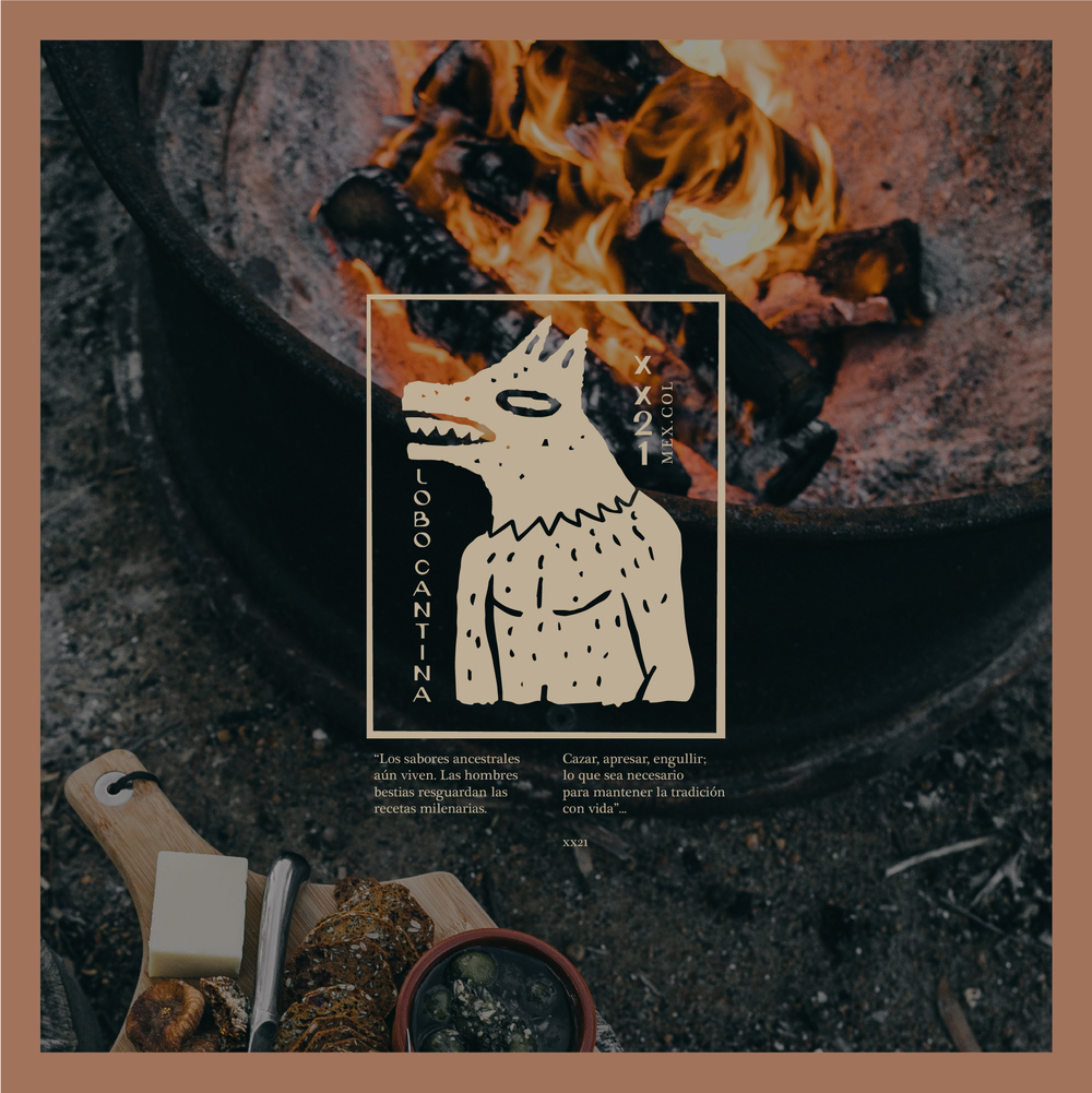
Rustic imagery with a earthy color palette create a strong visual with a Mexican tradition feeling. It remains and connect to the food. Sabor ancestral mexicano – “Mexican ancestral flavor” is the main tag line for the brand. It represents the traditional foods with a mystical touch. The tone for the brand is literature/ poetic, but with an irreverent twist. Is like something you would find inside the mythical Popul Vuh, but with a clear objective to making you hungry.
“No como, devoro e ignoro”, I don’t eat. I devore and ignore; a perfect example of the animal we all have inside and it’s ready to come out and devore.
CREDIT
- Agency/Creative: Kev Pineda Design
- Article Title: Design and Illustration for Lobo Cantina Traditional Mexican Grill
- Organisation/Entity: Freelance
- Project Type: Identity
- Project Status: Published
- Agency/Creative Country: Colombia
- Agency/Creative City: Medellín
- Market Region: South America
- Project Deliverables: Brand Design
- Industry: Food/Beverage
- Keywords: Mystical, tradition, pre-hispanic, rustic
-
Credits:
Designer / Art Director / Illustrator: Kev Pineda
Client: Lobo Cantina


