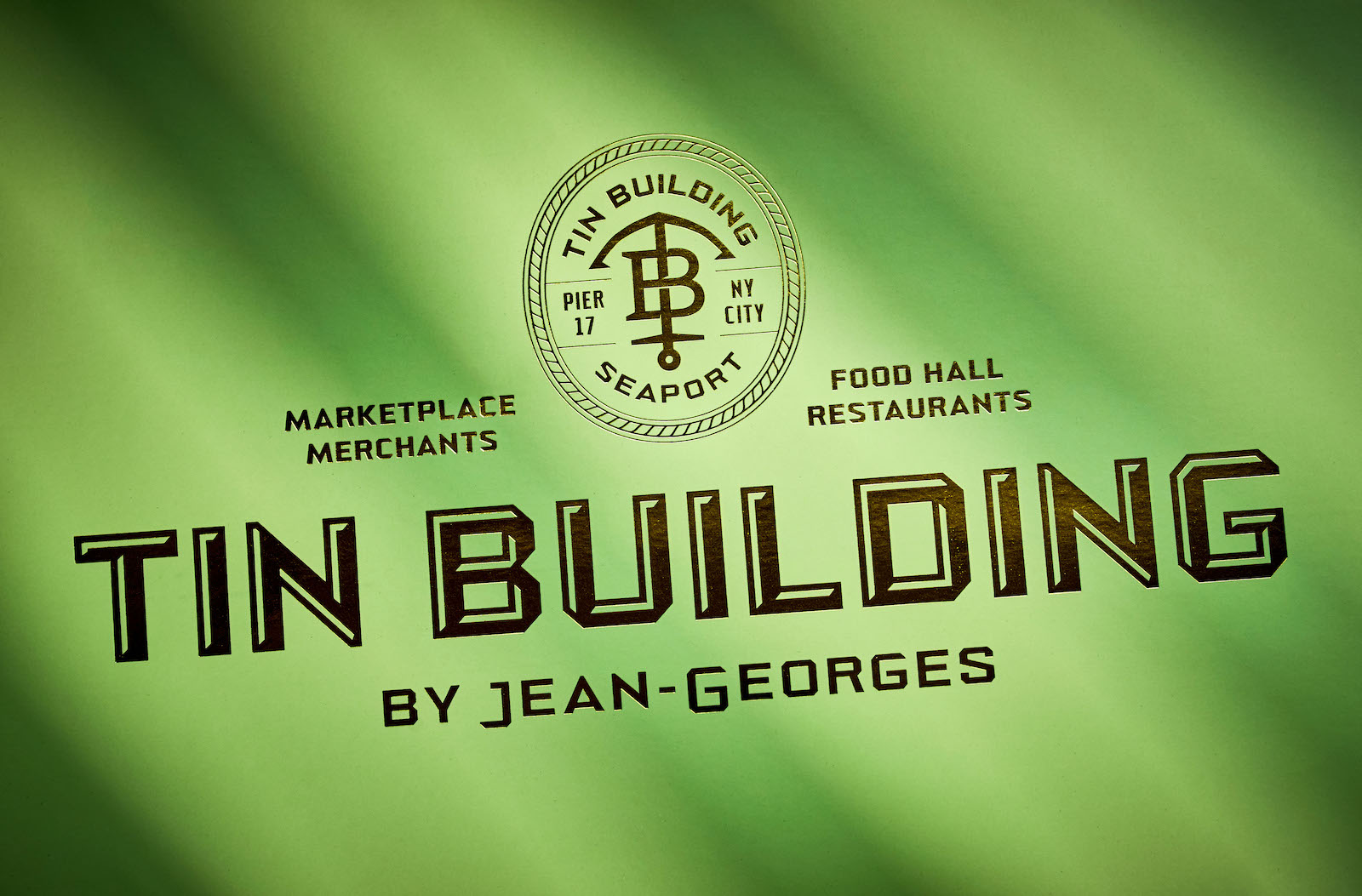
New York City is known for its ambitious approach to retail but few projects have generated as much excitement as the Tin Building by Jean-Georges – Michelin-award-winning chef Jean- Georges Vongerichten’s 53,000 sq.-ft., 2-story sprawling culinary marketplace at the former site of NYC’s historic Fulton Fish Market. Featuring 6 full-service restaurants, 6 fast-casual counters, 8 marketplace vendors, 4 bars, a candy store, a private line with 24 collections, and more than 400 SKUs, the eagerly anticipated project has set its sights on transforming the district by redefining what a marketplace can be. Looking to build a brand to match this vision, Vongerichten teamed with NY-based creative studio Mucca in a years-long effort to conceive the identity systems and creative direction for the massive, multilayered Tin Building brand – taking a design-centered approach to creating an unforgettable experience.
Longtime collaborators, Mucca and chef Jean-Georges previously worked together on uptown restaurant Jean-Georges, seafood concept The Fulton and Paris Café at TWA Hotel, leveraging the studio’s pedigree in hospitality, restaurants and packaging. This time, Mucca was tasked with not only branding the Tin Building itself, but also an extensive array of sub-brands. The visual language they developed is unified by a robust custom typeface they designed that acts as a design foundation for use by other collaborators working on this ambitious project.
Mucca was engaged to develop the brand strategy in a series of workshops — using research and insightful exploration to unearth the core aspects of the brand’s promise, personality and values. For Tin Building, this was not only vital in creating a brand that was unified despite its various touchpoints and sub-brands, but in selecting key visual and textual references from The Seaport’s storied past.
“The Seaport and the Tin Building itself have a rich heritage as the center of commerce and the meeting point of many cultures, so we had plenty of historical content and visual context to pull from for inspiration,” explains Mucca Founder and Creative Director Matteo Bologna. “We conceived the brand as a venerated trading company that has established a portside hub for merchants from near and far. So, the logo system took cues from traditional billheads that granted proprietors a sense of prestige and authority, and typography referenced the original vendor signage from the building’s heyday – a perfect fit for a modern brand referencing the history of the Fulton Fish Market and the sophistication of Jean-Georges.”
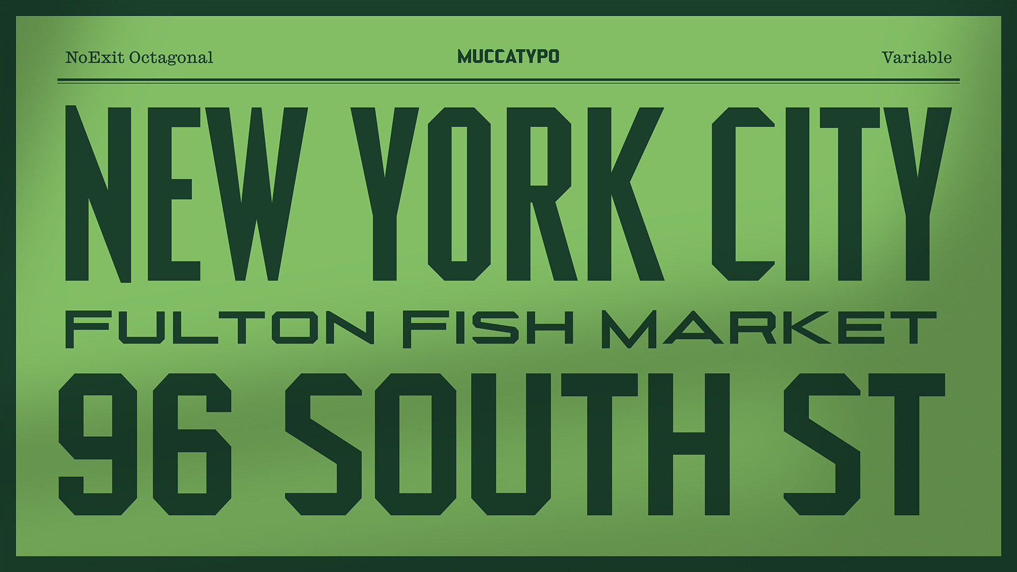
These inspirations also led the studio to define the colors, graphic styles and, most importantly, a custom typeface called NoExit Octagonal — a visual voice for the brand inspired by the historical signs of the vendors in the historic Fulton Fish Market. The Mucca-designed typeface became the central element in developing the identities for all the venues and brands contained within the Tin Building — defining countless touchpoints.
“Designing a visual universe with a custom typeface at its core gave the brand a clear foundation to build off of; one that concurrently had the same voice but allowed for different intonations,” adds Mucca Designer Sean O’Connor. “Whenever possible, every brand application incorporated the typeface, and while doing that, we played with its different styles by using it bolder, lighter, condensed or extended, adapting it to different contexts. This led to some disparate brands that carried the same design and brand DNA — Mexican-themed venue Taquito, Italian pizza and pasta counter, The Frenchman’s Dough, French/Indian-inspired Crepes and Dosas and more — all offering decidedly distinct experiences that still feel aligned to the overall Tin Building brand.”
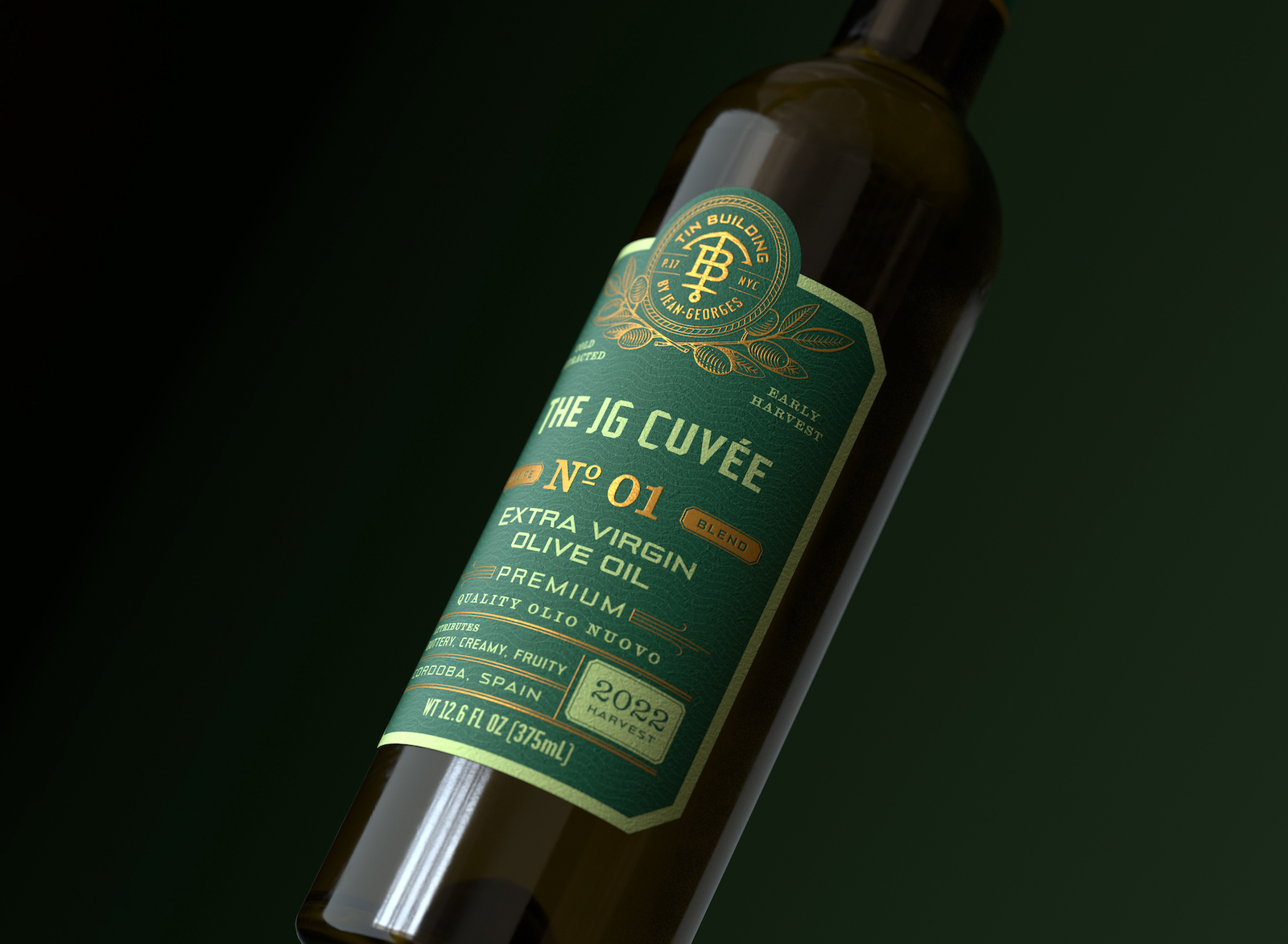
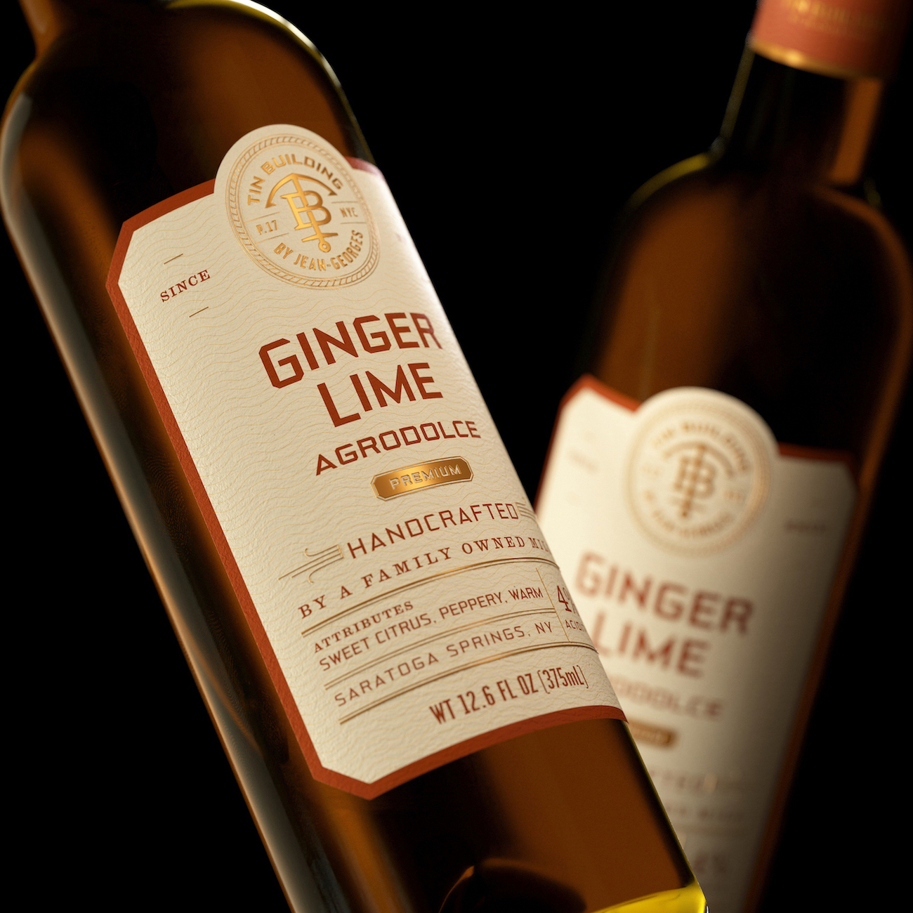
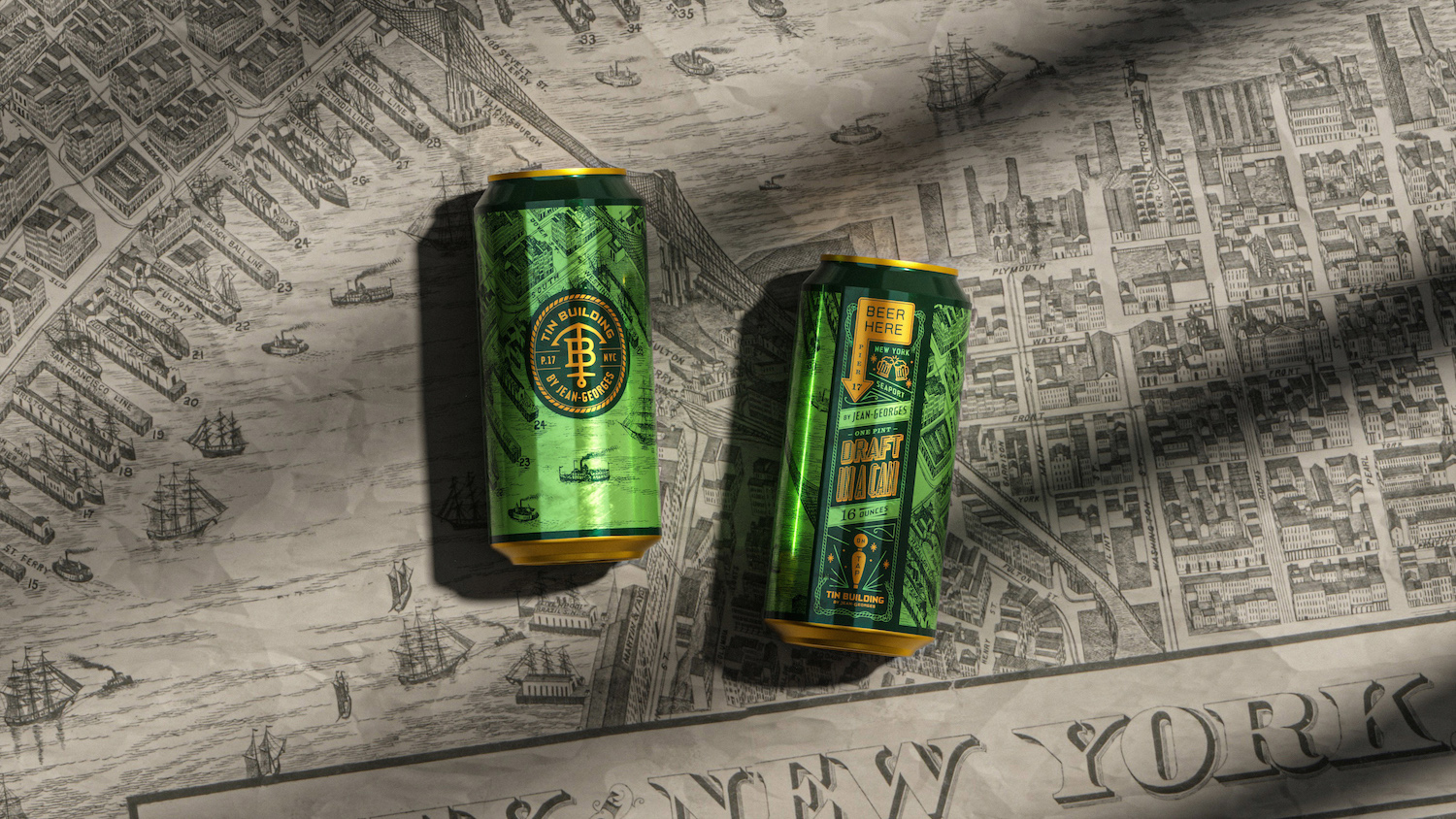
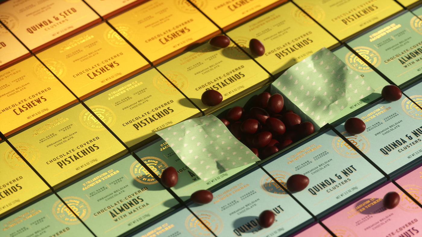
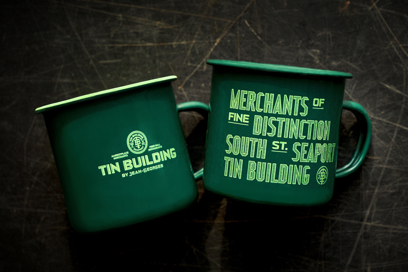
Packaging design also played a big role across the broad range of Tin Building’s 24 product lines. Mucca selected materials that were not just pleasing to the eye, but that also leveraged the benefits of in-person retail with their unique tactile qualities. This level of great detail was taken across all food packaging, using foils, special coatings or finishes, and other materials to differentiate the premium goods from the everyday goods. Similarly, home goods and apparel lines were conceptualized with fabrics and colors reflecting premium quality. Not only are the ceramic coffee mugs and espresso cups custom molded with unique finishes, but apron patterns and prints, silk scarves, kitchen towels, and even snow globes were created from scratch.
The result of this attention to detail is an epicurean experience that completely breaks the mold and sets new standards for retail design. “We’re no stranger to building big design systems but this project’s scope presented the creative challenge of a lifetime,“ says Bologna. “The fact that we were able to help the Tin Building find its voice and tell its amazing story through design and branding is immensely rewarding. It took a close collaboration and a lot of hard work that was entirely worth the effort.”
CREDIT
- Agency/Creative: Mucca
- Article Title: Design and Branding Firm Mucca Teams Up with Chef Jean-Georges’ Tin Building Redefining The Food, Grocery and Retail Experience
- Organisation/Entity: Agency
- Project Type: Identity
- Project Status: Published
- Agency/Creative Country: United States
- Agency/Creative City: New York
- Market Region: North America
- Project Deliverables: Brand Identity, Packaging Design
- Industry: Food/Beverage
- Keywords: Tin Building, Jean-Georges, Mucca, Packaging, Retail
-
Credits:
Founder and Creative Director: Matteo Bologna
Senior Designer: Sean O'Connor


