


The Glorious Mess – Brand Identity Redesign
Summary
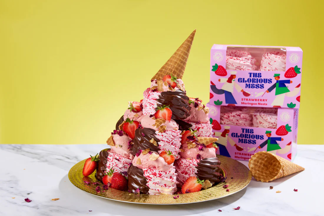
The Glorious Mess transforms meringue from an overlooked baking ingredient into a vibrant, character-led brand. Inspired by the chaotic origins of Eton Mess, the identity uses playful illustration, vivid colour and abundant typography to celebrate joyful imperfection, bringing bold personality and new energy to an under-branded category.
1. Background
Meringue is universally known and universally enjoyed, yet it remains one of the most under-branded categories in grocery. In supermarkets it is often relegated to the baking aisle as an own-label commodity, despite its unique qualities, joyful texture and deep cultural associations. Flower & White successfully carved out a niche in lighter, better-for-you meringue snacking, but their next move aimed to celebrate indulgence, abundance and delight.
Inspired by the iconic Eton Mess dessert, they created a more playful, more expressive and more joy-filled product: The Glorious Mess. To bring it fully to life, they needed a brand identity capable of elevating the category, introducing character and defining a new world for meringue.
2. Business Challenge
Meringue is a fascinating example of a product that is well known, well liked, and yet lacks memorable brand associations. In supermarkets, it exists primarily as a commodified, own label ingredient for home baking.
The team at Flower & White first embraced this niche to create delicious, better-for-you snacking options.
Their next innovation was intended to revel in the more indulgent side of life, evoking the iconic Eton Mess dessert with added wow-factor, and The Glorious Mess was born.
How can design be used to bring new life to an under-branded category?
3. Creative Solution
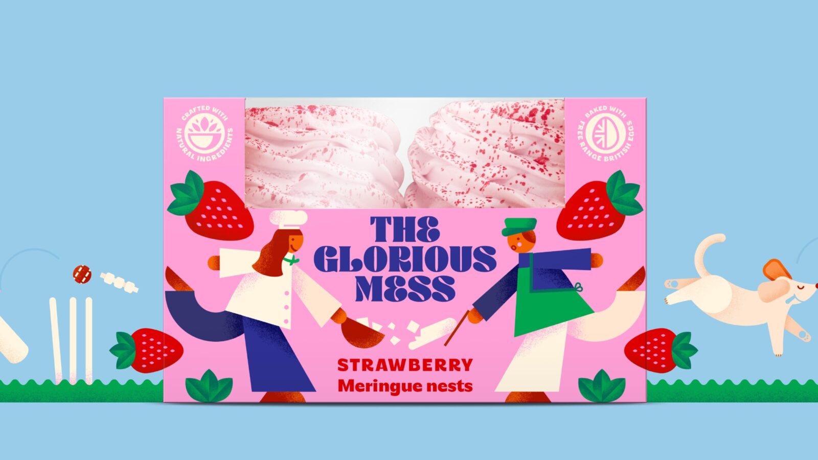
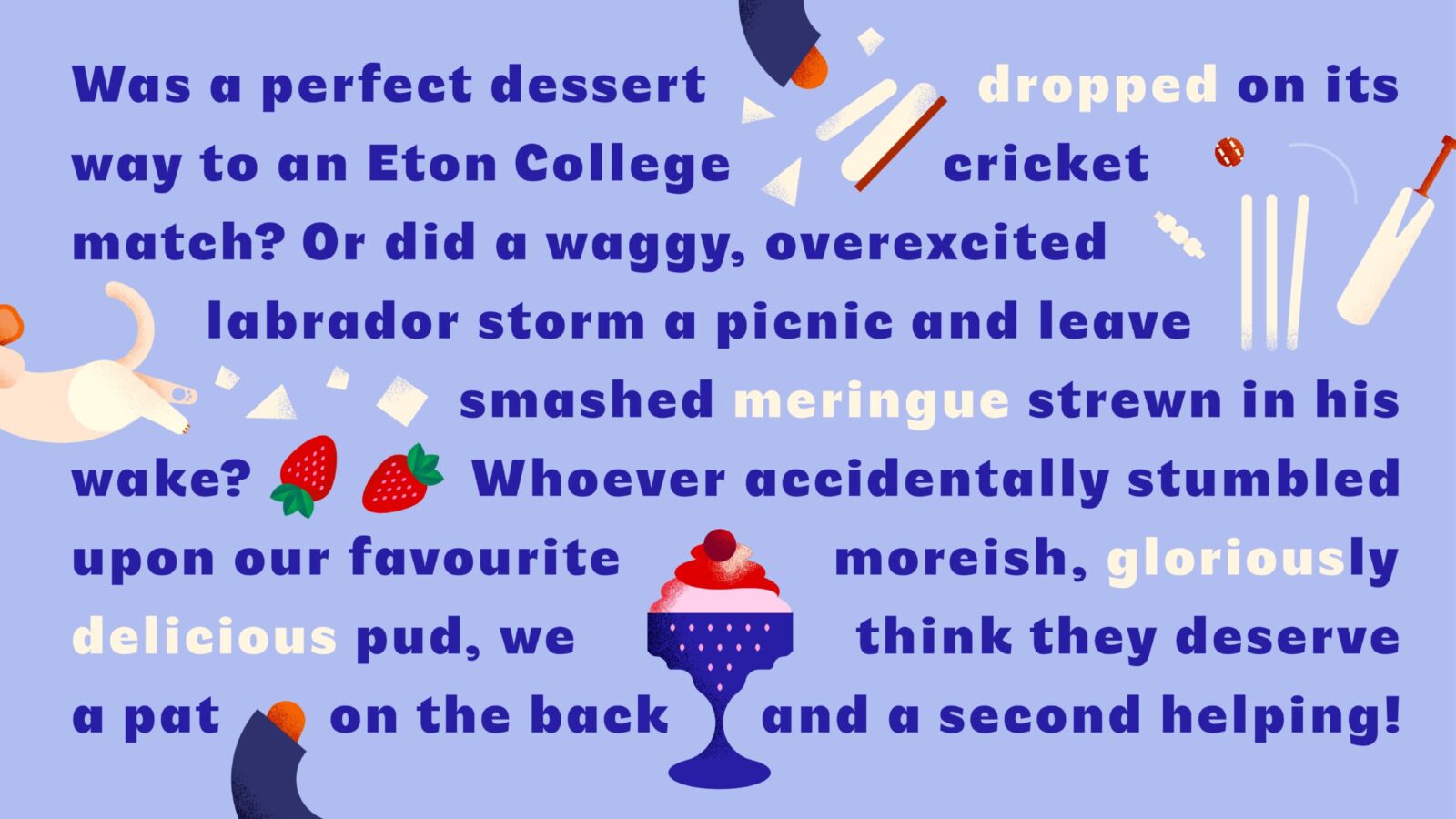
Eton Mess is a quintessentially British culinary invention, generous and uncomplicated. But the story of how it came to be is a matter of some debate.
Some say that one fine day a meringue dessert was being oh-so-carefully carried to an Eton College cricket match… when it was accidentally dropped. Or perhaps it was a playful pooch careering into a pavlova?
Our design brings these classically whimsical tales to life with a modern vibe, featuring playfully crafted characters, vividly elevated colours and delectably bountiful typography.
Sometimes, you’ve just got to embrace the mess.
4. Strategic Insight
Eton Mess is more than a dessert. It is a cultural symbol of joyful imperfection. A celebration of things going wrong in all the right ways. This insight became the heart of the brand: meringue does not need to be neat to be delightful. In fact, its charm lies in its chaos.
The identity therefore needed to shift the category from tidy baking ingredient to expressive, character-driven indulgence. The strategy embraced narrative, humour and abundance to create the first meringue brand with true personality.
The Glorious Mess would stand proudly apart by celebrating the beauty of the imperfect.
5. Design Execution
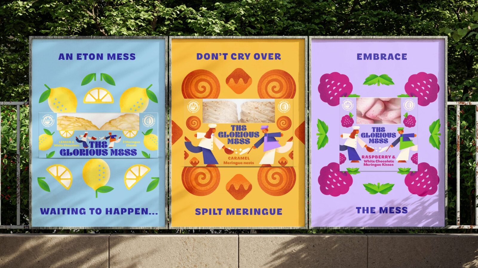
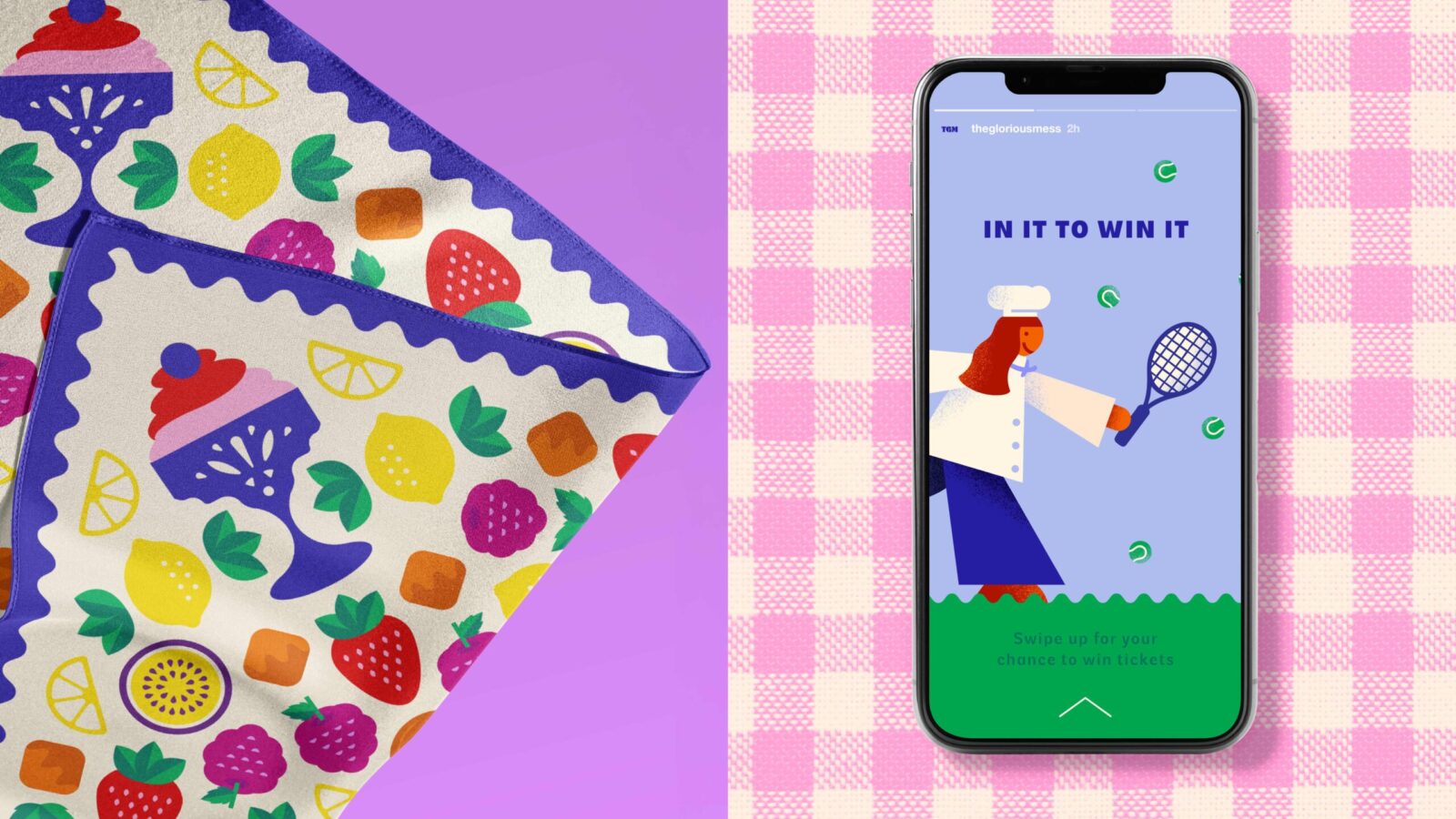
To bring this bold new world to life, Derek&Eric developed a distinctive visual system rooted in storytelling, playfulness and vivid appetite appeal.
Key components include
• A cast of bespoke illustrated characters, each capturing the mischievous origins of Eton Mess
• Vivid, elevated colours designed to energise shelves and escape the dull tones of the category
• Generous, indulgent typography inspired by abundance and the explosive textures of meringue
• Dynamic compositions that feel lively, layered and unapologetically messy
• A tone of voice that invites people to delight in imperfection
The result is a brand world full of energy, humour and expressive craft. A world where mess is not a flaw but a feature.
6. Outcome and Impact
The Glorious Mess brings new life to a forgotten category by transforming meringue from a quiet baking ingredient into a vibrant, character-led brand with cultural and commercial appeal.
Key impacts include
• A category-defining visual identity that stands out immediately in store
• A flexible system capable of driving future innovation across flavours and formats
• A distinctive brand story rooted in play, imperfection and British culinary folklore
• Greater emotional resonance and clearer shopper navigation within a previously undifferentiated space
With its bold narrative, expressive design and joyful sense of mischief, The Glorious Mess establishes meringue as a modern, distinctive and delightfully indulgent brand experience.

CREDIT
- Agency/Creative: Derek&Eric
- Article Title: Derek&Eric Turn Meringue Into a Joyful Category Disruptor With The Glorious Mess
- Organisation/Entity: Agency
- Project Status: Published
- Agency/Creative Country: United Kingdom
- Agency/Creative City: London
- Market Region: London
- Project Deliverables: Packaging Design
- Industry: Food/Beverage
- Keywords: WBDS Agency Design Awards 2025/26 , Packaging Redesign
-
Credits:
Managing Director: Jon Gibbs


