


Tamria – Brand Identity Redesign
Agency: Derek&Eric
Client: Gandour (Middle East)
Summary
Tamria elevates Middle Eastern dates into a premium global brand. Combining hand crafted illustration, calligraphy inspired typography and bold layered compositions, the identity bridges cultural heritage with modern ambition. The result is a distinctive, culturally resonant system that proudly showcases the region’s craftsmanship to the world.
1. Background
Saudi Arabia’s relationship with dates is more than culinary. It is cultural, generational and deeply symbolic. The fruit represents hospitality, generosity and gratitude, and sits at the heart of daily rituals. As global taste shifts toward natural ingredients and elevated gifting cultures, Saudi dates stand uniquely positioned to enter a more premium and internationally recognised space.
For decades, Tamria has been Gandour’s home for date-based products, yet its identity lacked the distinctiveness, flexibility and cultural richness required to support an ambitious programme of innovation and growth. With a renewed vision to bring Saudi dates to the world, the brand needed a contemporary identity anchored in authenticity and national pride.
2. Business Challenge
Dates are a fruit with immense cultural significance in Saudi Arabia, a part of the fabric of life representing the best qualities of hospitality, gratitude and generosity.
Naturally sweet, high in fibre and many key nutrients, the date is a wonderful ingredient within confectionary.
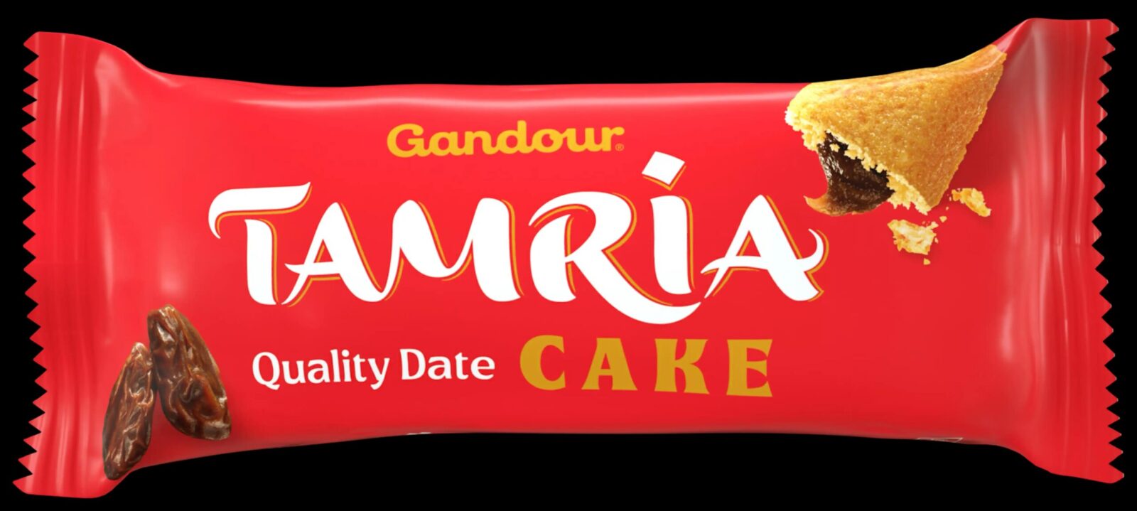
The Tamria brand (derived from the Arabic word tamr, meaning “dates”) has long been the home of the Gandour date offering.
But the identity lacked the distinctiveness and flexibility to allow for an ambitious program of innovation and a plan to bring Saudi dates to the world.
How can design be used to express the spirit of a culture?
3. Creative Solution
Saudi Arabia is a county in a period of great transition, filled with energy and ambition.
In contrast, dates are still largely grown and harvested by traditional means, even as the world changes around them.
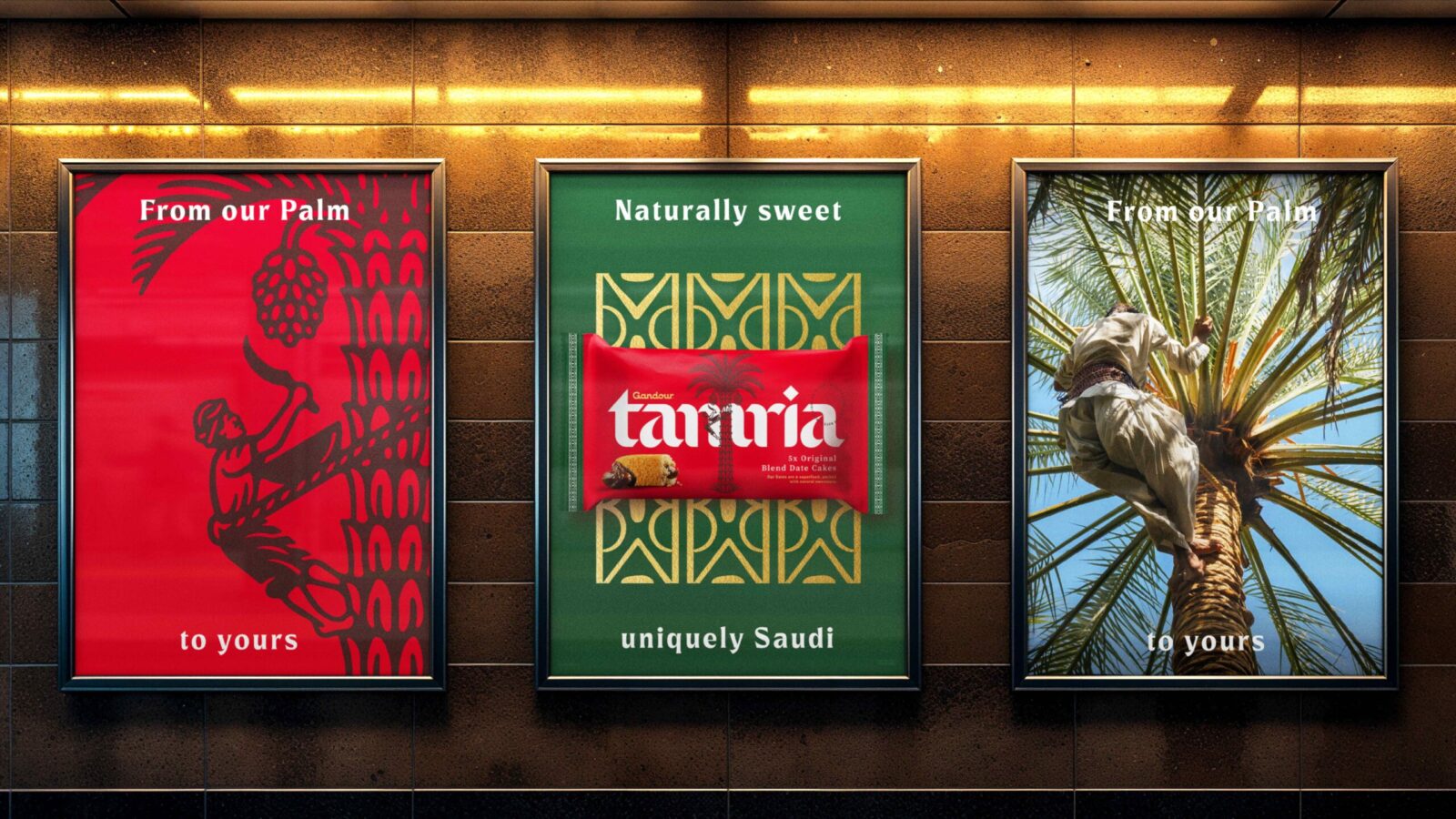
Our strategy was to capture both sides of this dichotomy, showing the world that dates are to Saudi as tea is to the UK.
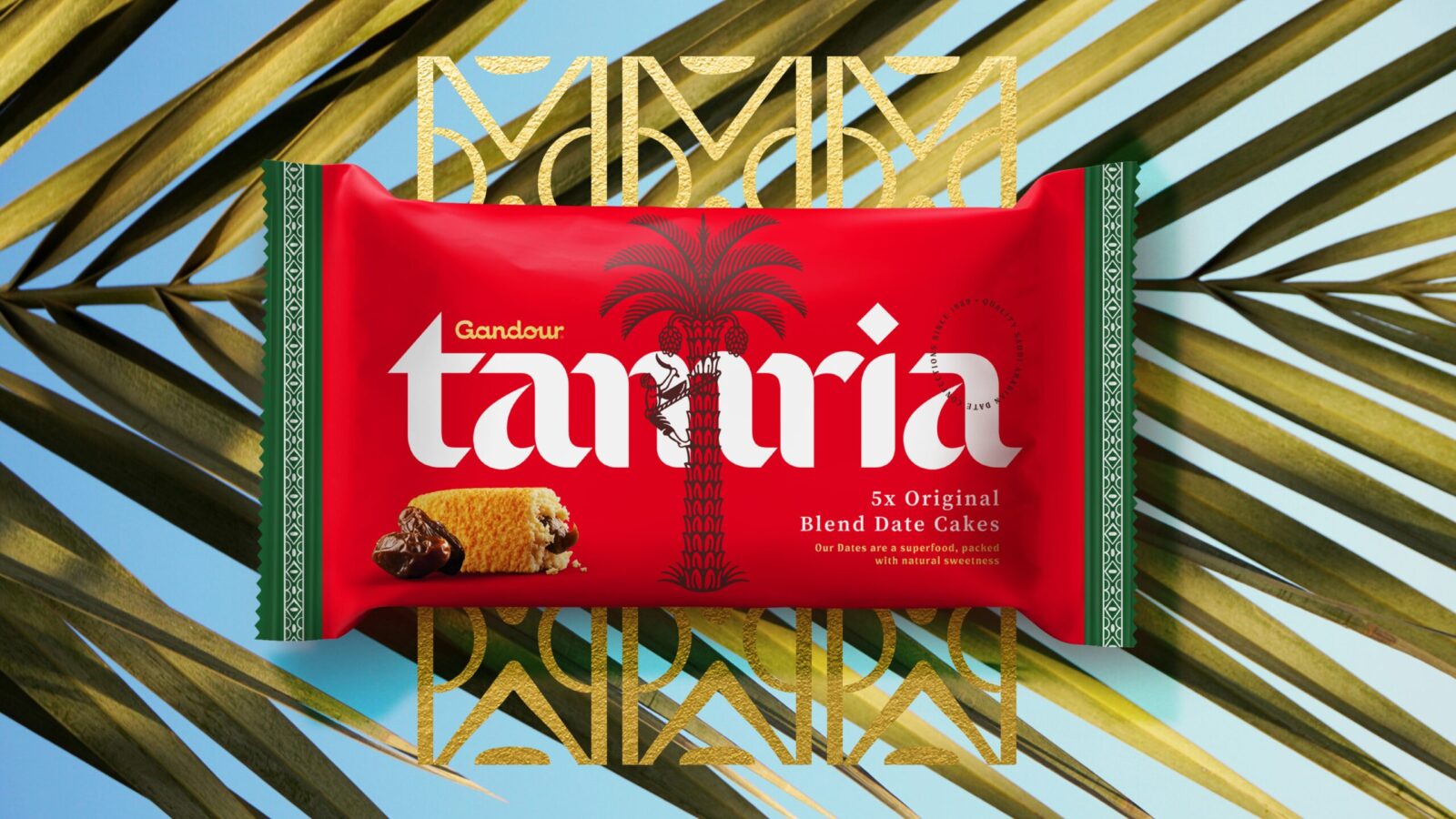
To this end, every element was thoughtfully crafted by experts in analogue disciplines, from the date tree illustration to the Arabic calligraphy inspired logotype.
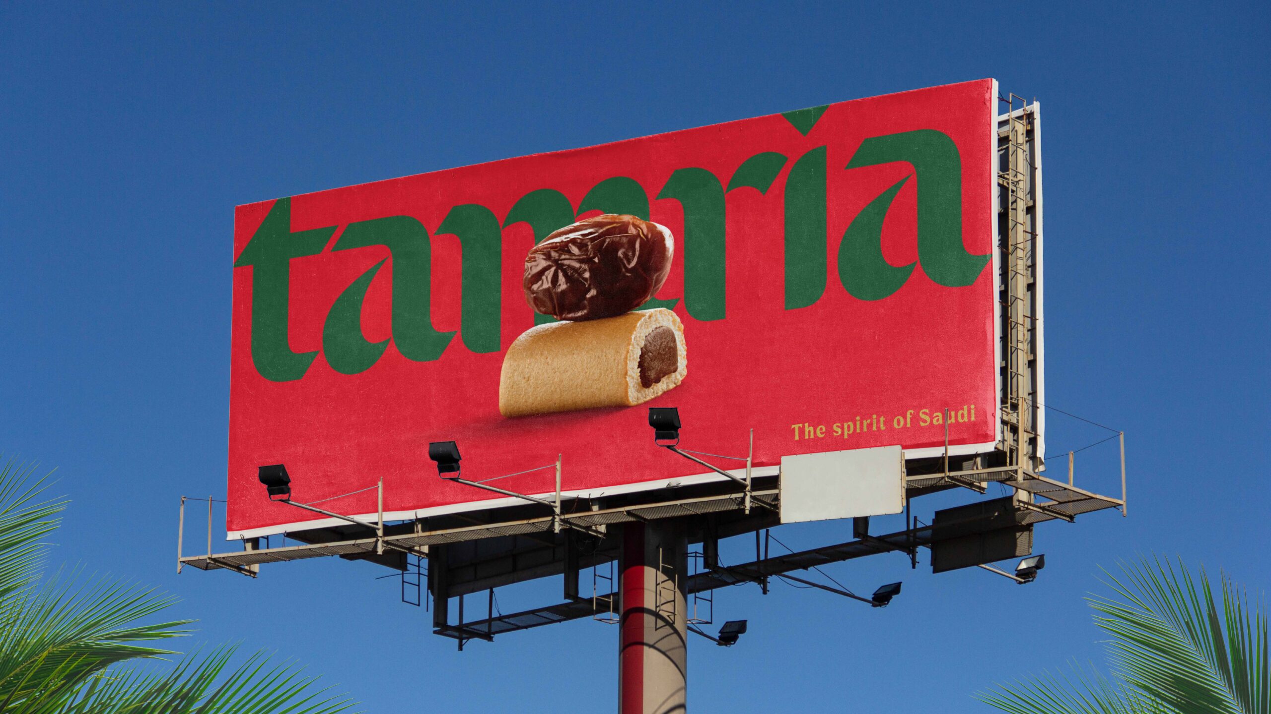
These assets combine into contemporary compositions, bold, layered and undeniably proud.
Definitive, distinctive, delicious.
4. Strategic Insight
The date is more than an ingredient. It is a cultural symbol, a daily gesture of welcome, and a thread connecting modern Saudi life with centuries of tradition. To create a brand that could travel globally while remaining deeply authentic, the identity needed to express this duality: the timeless craft of the orchard and the forward momentum of a nation in transformation.
The strategic idea therefore centred around cultural truth meeting contemporary ambition. Tamria would become a definitive expression of Saudi identity through the lens of its most emblematic fruit.
5. Design Execution
To honour tradition while elevating the brand to global standards, Derek&Eric created a visual system built on fine craft, cultural fluency and confident modernity.
Key components include
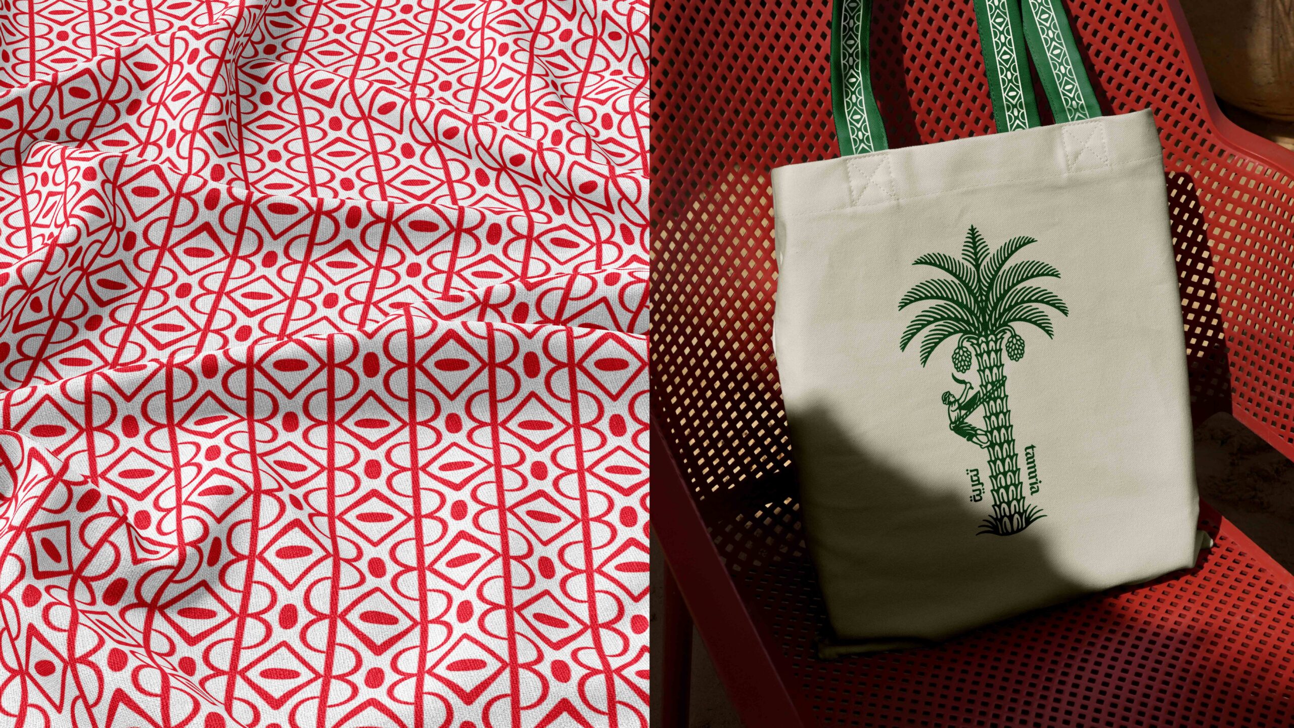
• A hand illustrated date palm, rendered with the detail and reverence of classical botanical art
• A bespoke logotype inspired by Arabic calligraphy, evoking flow, generosity and heritage
• A layered composition system balancing depth, boldness and proud cultural presence
• A warm, refined palette echoing the landscapes, textures and richness of Saudi provenance
• A typographic pairing that bridges analogue craft with contemporary clarity
The result is a brand world that feels premium yet grounded, modern yet unmistakably rooted in heritage.
6. Outcome and Impact
The redesigned identity positions Tamria as the global ambassador for Saudi dates. The new brand world is rich in cultural meaning, flexible across product formats and expressive enough to support years of innovation.
Key impacts include
• A distinctive, ownable identity capable of elevating an entire category
• A visual system that balances heritage with modernity, resonating locally and internationally
• A premium presence suited for both gifting and everyday enjoyment
• A brand narrative that authentically represents Saudi culture at a global level
With this redesign, Tamria steps into its role as a definitive symbol of Saudi hospitality and craftsmanship, ready to share a deeply rooted cultural tradition with the world.
CREDIT
- Agency/Creative: Derek&Eric
- Article Title: Derek&Eric Redesign Tamria as a Premium Global Brand Rooted in Saudi Date Heritage
- Organisation/Entity: Agency
- Project Status: Published
- Agency/Creative Country: United Kingdom
- Agency/Creative City: London
- Market Region: Middle East
- Project Deliverables: Brand Design, Logo Design, Packaging Design
- Industry: Food/Beverage
- Keywords: WBDS Agency Design Awards 2025/26 , Brand Identity Refresh


