Manomasa – Livin’ la vida LatAm
Summary
Manomasa’s redesign reconnects the brand with its Latin American roots, bringing flavour, colour and rhythm to the forefront. A vibrant palette, dynamic dancers and expressive ingredient storytelling help the brand break free from its niche and step into the mainstream with confidence.
Background
Manomasa has long stood out for its bold flavours and layered textures, earning a small but passionate following. However, its rustic, wholesome aesthetic placed it among many premium farm shop style snacks, limiting its ability to grow and innovate.
As the brand looked to move into the mainstream, it needed an identity that matched the energy and confidence of its flavour experience while reconnecting with the Latin American roots embedded in its name.
Business Challenge
The Manomasa name was created from a Latin American route: ‘Mano’ is Spanish for hand and ‘Masa’ is the maize dough that’s used to make traditional tortilla chips.
Since its launch, the brand has built up a small but dedicated following, who delight in the delicious flavours and exciting textures found across the range.
But despite this fanbase, the brand was struggling to make headway beyond its position as one of many wholesome ’farm shop-esque’ snack brands found in premium retailers.
How can design be used to break a brand out of a niche and into the mainstream?
Creative Solution
Our strategy was to go back to first principles, embracing the original inspiration for the product’s creation by bringing the visual experience of the brand in line with it’s flavour.
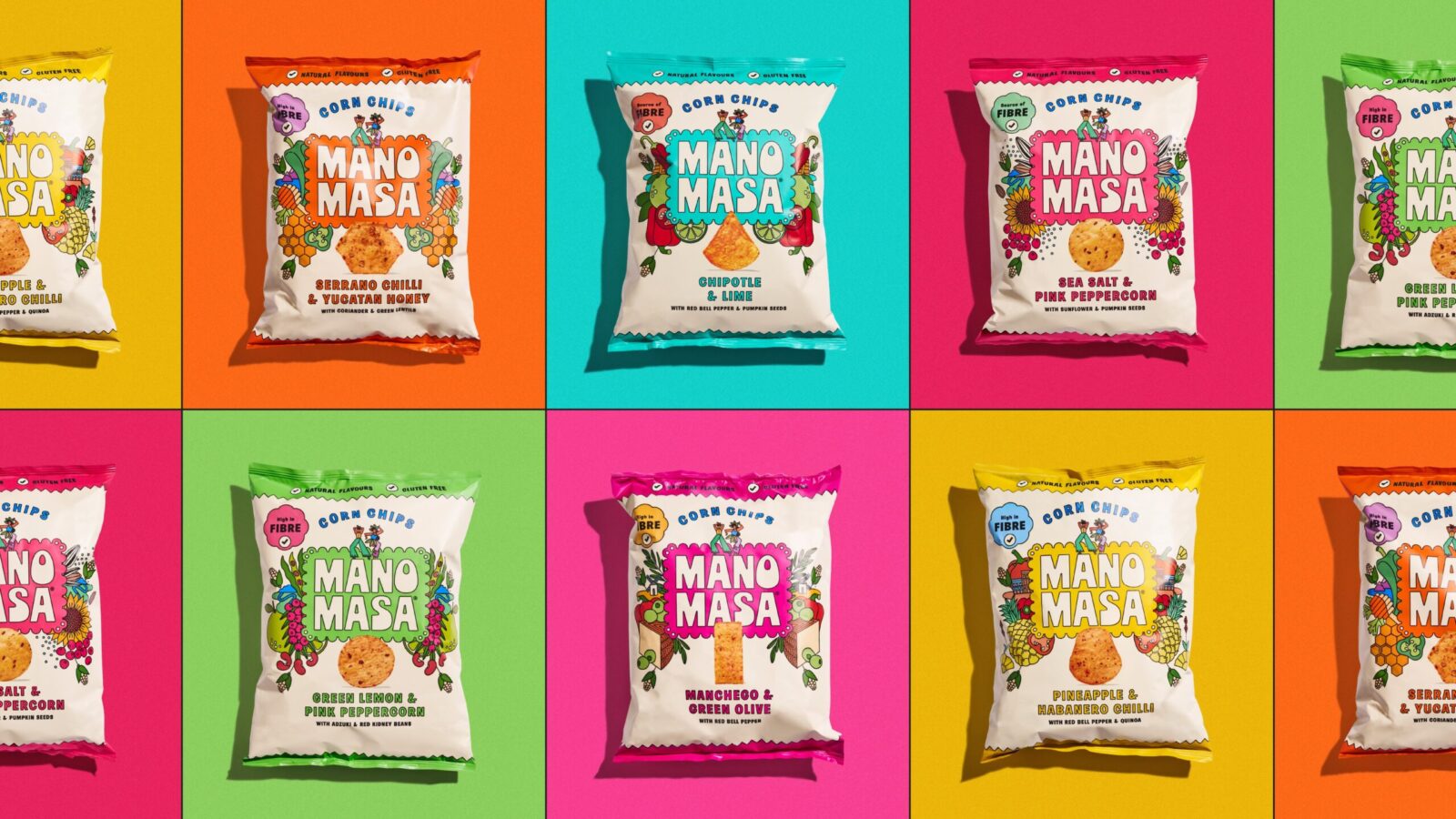
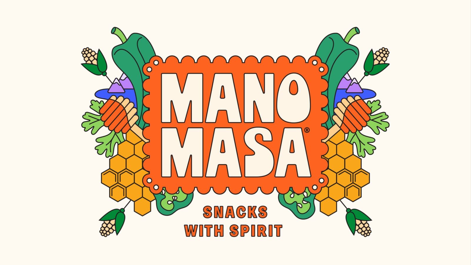
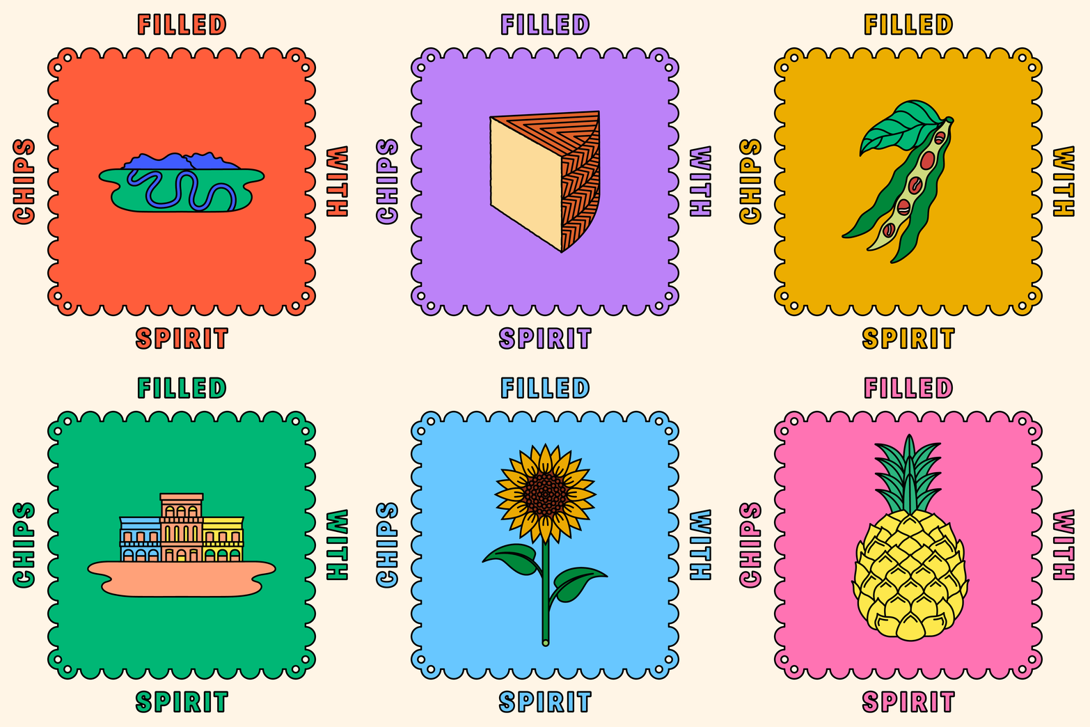
Latin America is an area of the world synonymous with energy, passion, colour and warmth. We took the existing visual structure of the packaging – central logotype, kaleidoscopic ingredient story and cream background – and spiced them all up with this distinctively idiosyncratic LatAm spirit.
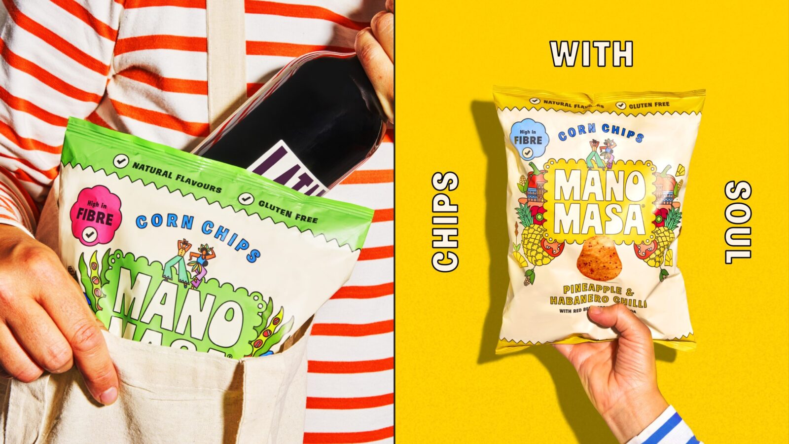
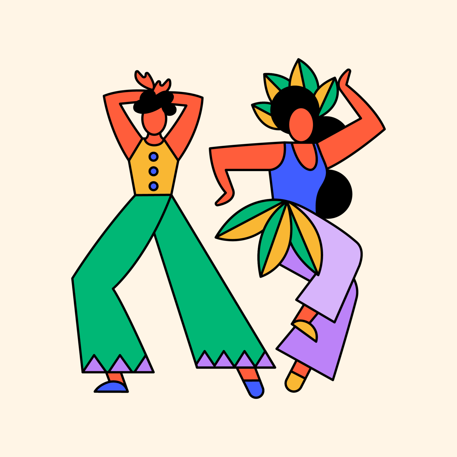
We also took the opportunity to pepper a new icon of a pair of dancers into the mix. In the midst of their joyful routine, they capture a sense of rhythm that opens up a world of potential in bringing the brand to life across platforms in vibrant motion.
Strategic Insight
Manomasa’s strength has always lived in its flavour. Yet the brand world did not reflect the energy, rhythm or warmth you experience when eating the product. By realigning the visual language with the vibrancy of its Latin American roots, the brand could unlock both mainstream appeal and a more culturally grounded personality.
The key insight was simple. If the flavour lives loud, the identity should too.
Design Execution
To deliver this Latin American spirit, Derek&Eric revitalised the existing Manomasa structure with expressive visual cues.
Key components include
A lively new dancing duo icon capturing rhythm, movement and cultural warmth
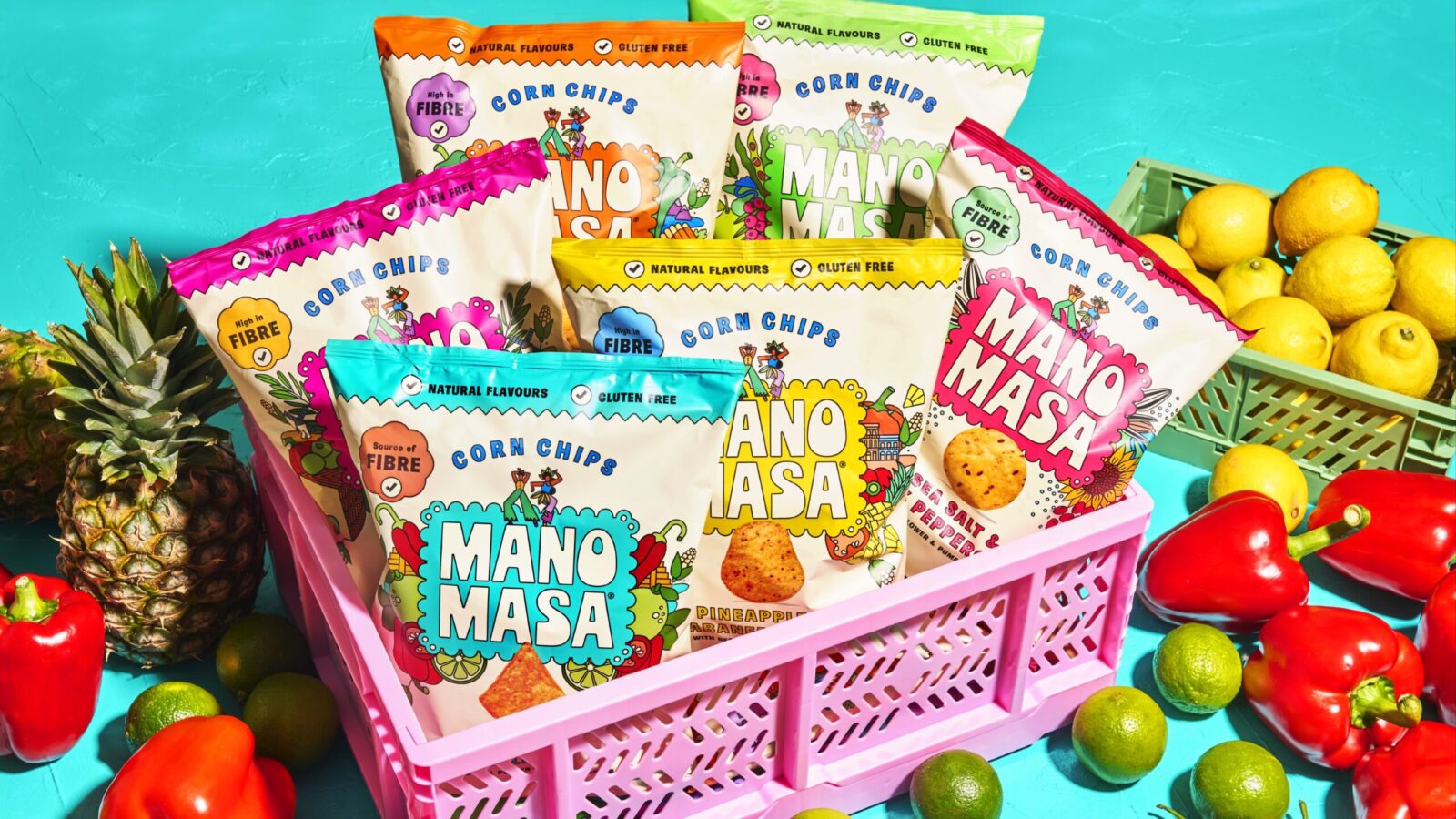
Spiced-up ingredient storytelling with richer colour and dynamic layouts
A strengthened palette inspired by Latin American contrast and vibrancy
A refreshed cream backdrop that anchors the chaos while keeping clarity
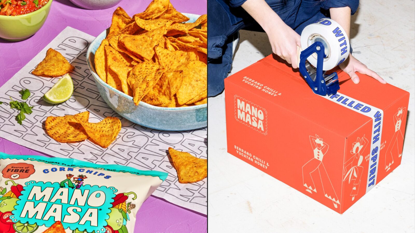
A flexible system built for future innovation across formats and categories
The result is an identity full of character, warmth and appetite appeal.
6. Outcome and Impact
The redesign breaks Manomasa out of its narrow niche and positions it as a confident player in the mainstream snack market.
Key impacts include
A bold, recognisable visual identity ready for mass audiences
A stronger connection to the brand’s cultural roots
A storytelling device that opens opportunities across motion, campaigns and digital
A flexible system that supports future product innovation
With “Livin’ la vida LatAm” as its new creative spirit, Manomasa now has the personality and clarity to match its flavour.

CREDIT
- Agency/Creative: Derek&Eric
- Article Title: Derek&Eric Reconnects Manomasa to Its Latin American Roots with Expressive Packaging Design
- Organisation/Entity: Agency
- Project Status: Published
- Agency/Creative Country: United Kingdom
- Agency/Creative City: London
- Market Region: London
- Project Deliverables: Brand Design, Brand Identity, Brand Mark, Brand Redesign, Brand Rejuvenation, Brand Strategy, Brand Tone of Voice, Brand World, Branding
- Industry: Food/Beverage
- Keywords: WBDS Agency Design Awards 2025/26 , Brand Identity Refresh
-
Credits:
Managing Director: Jon Gibbs


