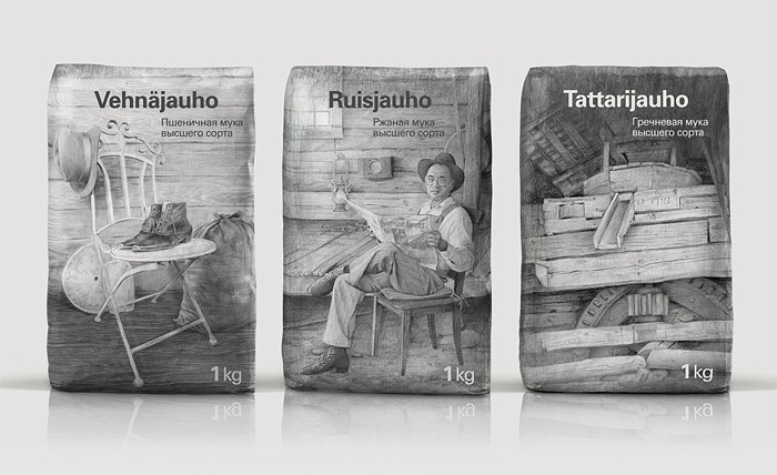
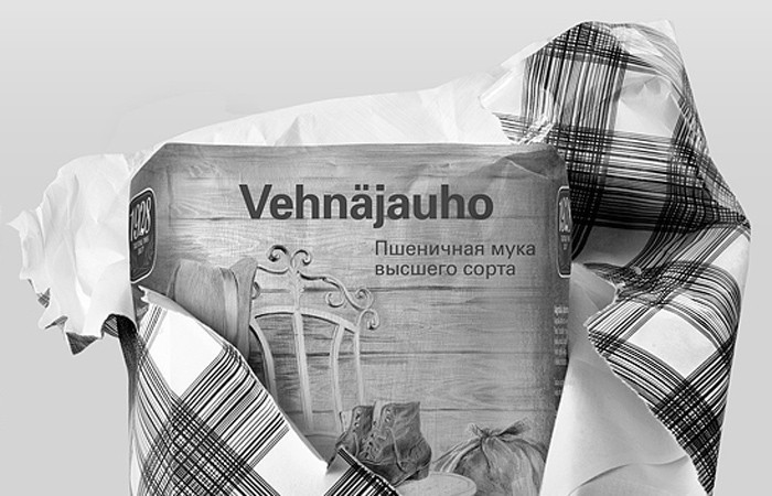
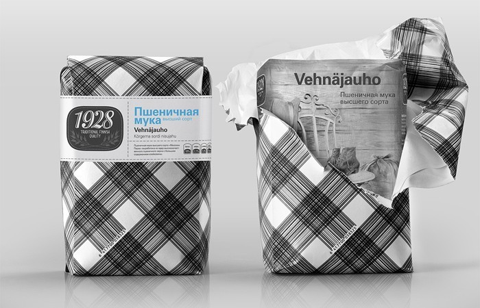
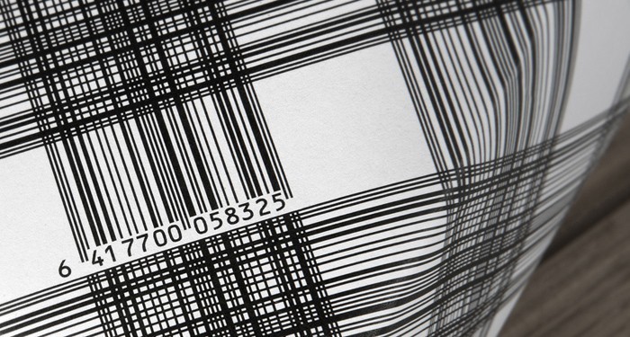
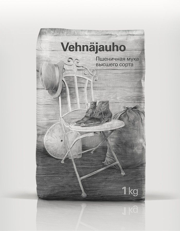
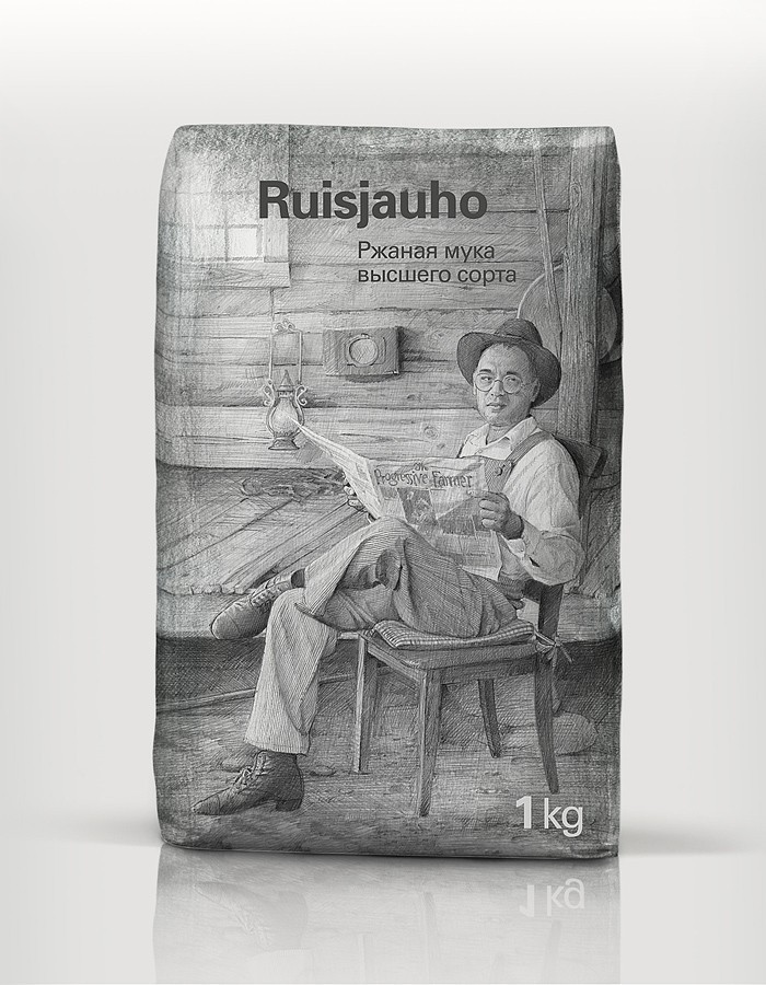
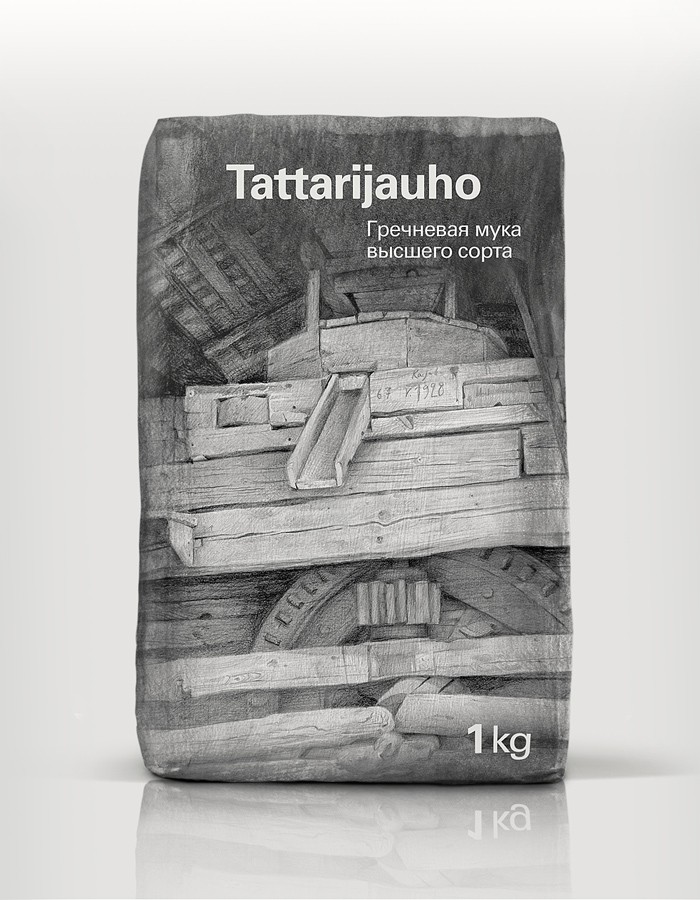
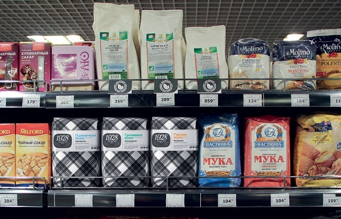
This has to be one of the best examples of packaging design from 2013. Absolutely beautiful – rarely do you see packaging look better on the inside than the outside. What a lovely experience it must be to open such a pack. Well done Depot WPF in Moscow.
Depot WPF uses hand drawn illustrations to emphasize tradition and history when designing the packaging for Finnish flour brand Myllyn Paras. Founded in 1928, Myllyn Paras has become one of the leading Finnish manufacturers of flour, flakes, grits, pastas, frozen doughs and frozen baked goods. It’s name is the synonym of quality and tradition.
”Globalization and high technologies have played a dirty trick with traditions, and it’s particularly obvious as far as agriculture and farming are concerned.” — says Alexey Fadeev, creative director of Depot WPF. — ”Products lose their authenticity, attention to detail and personal touch. We face impersonality and “grey mass”. Myllyn Paras is a global company, but we believe that modernization can play on the side of tradition, not destroying, but keeping it. Our packaging design is to illustrate this safekeeping — both literally and metaphorically”
CREDIT
- Agency/Creative: Depot WPF, Moscow
- Article Title: Depot WPF – Myllyn Paras Flour
- Project Type: Packaging


