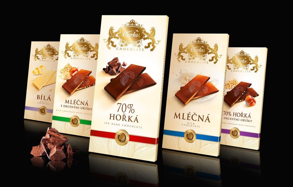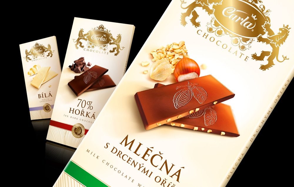
“Premium chocolate line.The main tasks we set for this product are the communication of delicacy, thinness of the chocolate and differentiation from the competition. The design is based on the dominant Carla CHOCOLATE logo and the minimalist premium food shot of the chocolate and its ingredients. A light color-coding appears in a strip at the bottom of the design, where there is also a seal of quality and organic decor based on cocoa beans. An essential part of this premium design is also a first-class printing process. Blind blocking, gold embossing, partial varnish are all used here to underline the impression of luxury.”


CREDIT
- Agency/Creative: DePOT Design
- Article Title: DePOT Design – Carla chocolate
- Project Type: Packaging
- Substrate: Pulp Paper
FEEDBACK
Relevance: Solution/idea in relation to brand, product or service
Implementation: Attention, detailing and finishing of final solution
Presentation: Text, visualisation and quality of the presentation


