


Hard lemonade’s OG reclaims its edge.
In 1999, Mike’s Hard Lemonade redefined the drinks landscape by launching a radically refreshing alternative to standard beer – and in the process, catapulted the FMB category. Now, as the hard lemonade shelf grows increasingly crowded, Mike’s is reasserting its status with a bold, rejuvenated brand identity.
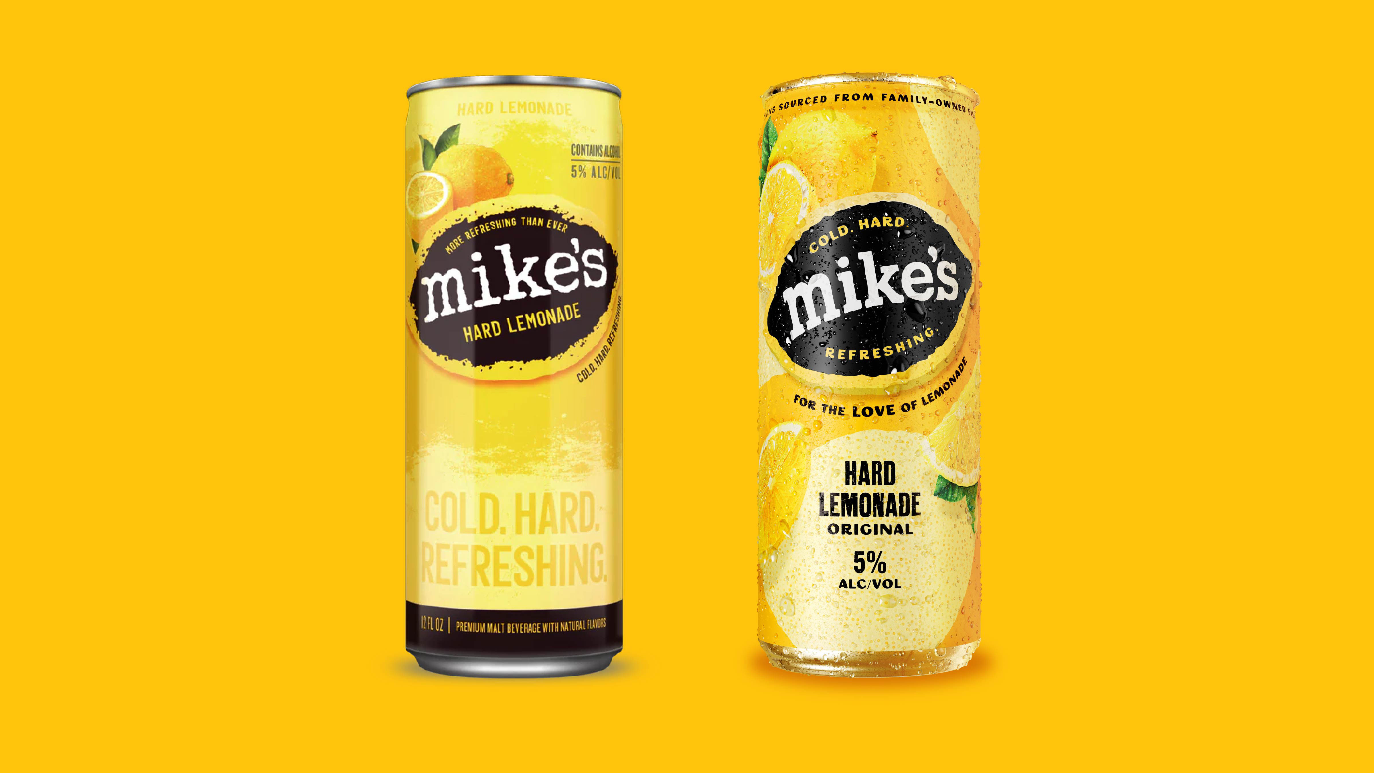
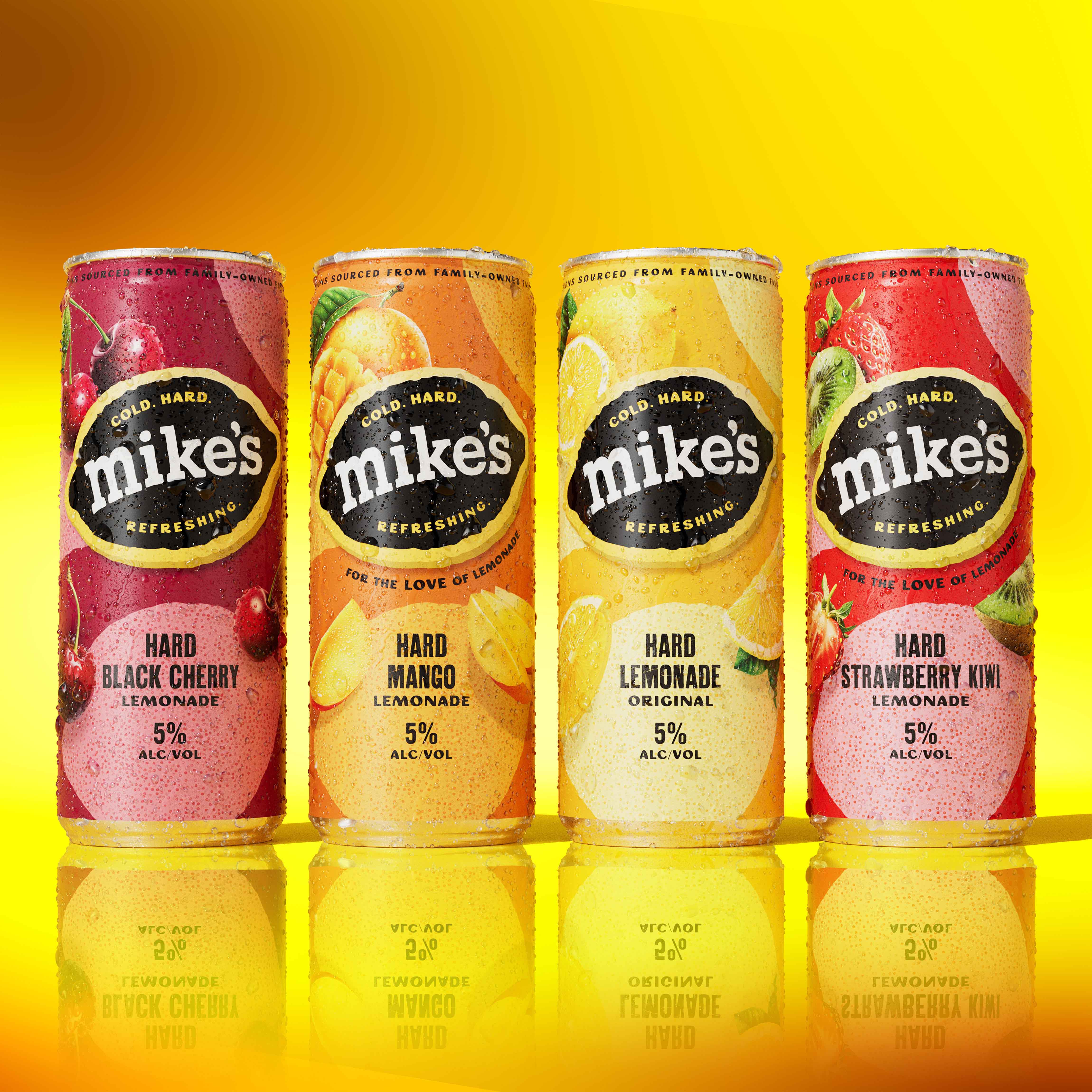
Led by global drinks branding specialists Denomination, the refresh reinvigorates Mike’s playful, punchy personality while modernising its shelf presence for today’s consumer. The creative challenge? Shift the brand from a nostalgic “guilty pleasure” to a proud, contemporary classic – without losing the essence that made it iconic.
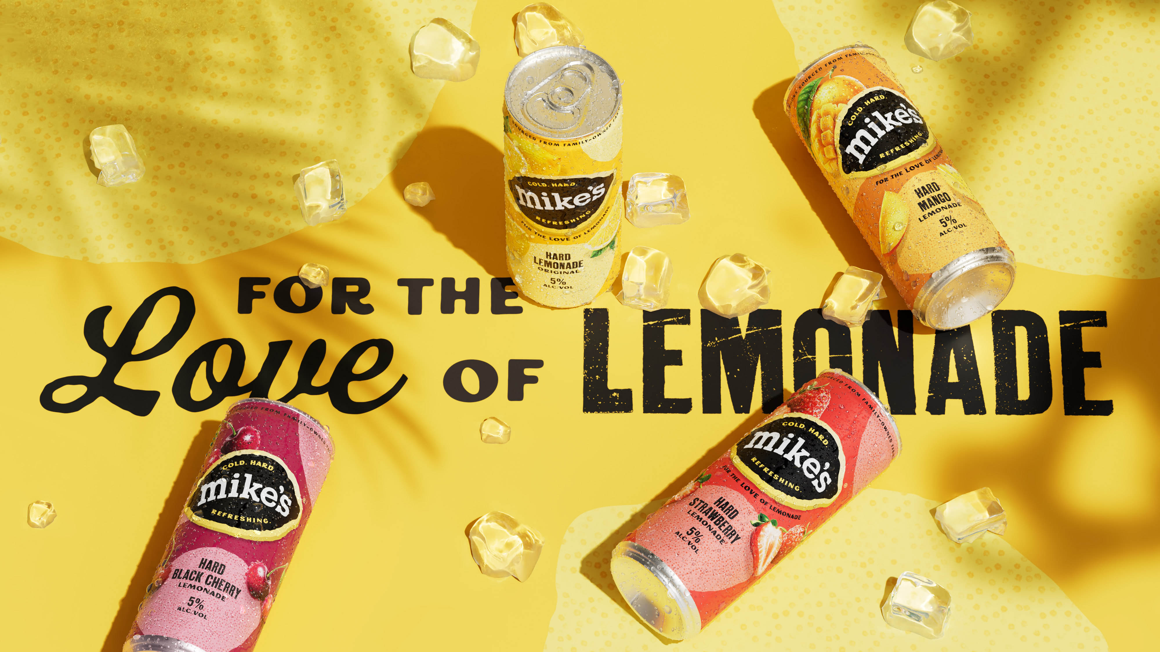
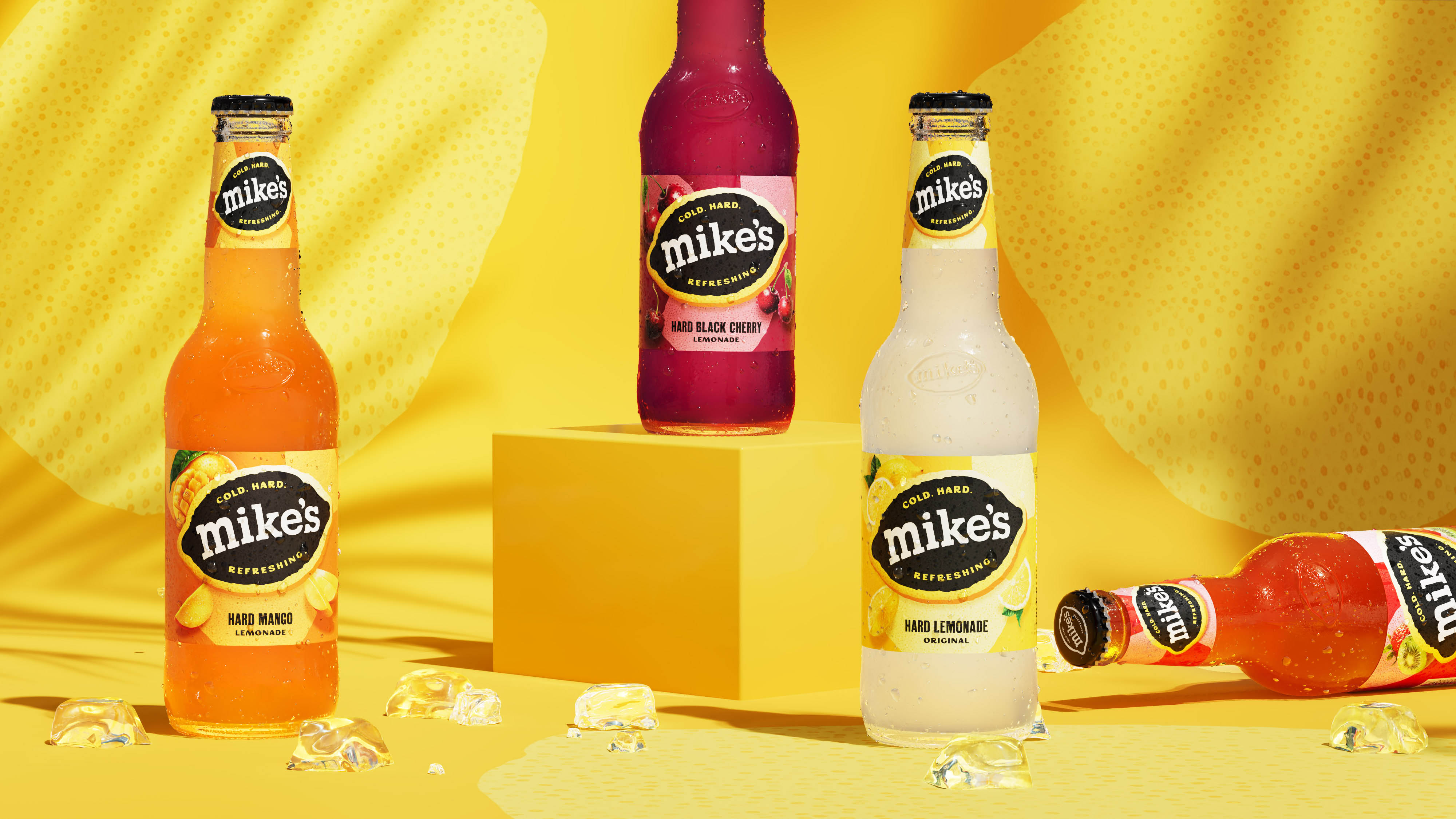
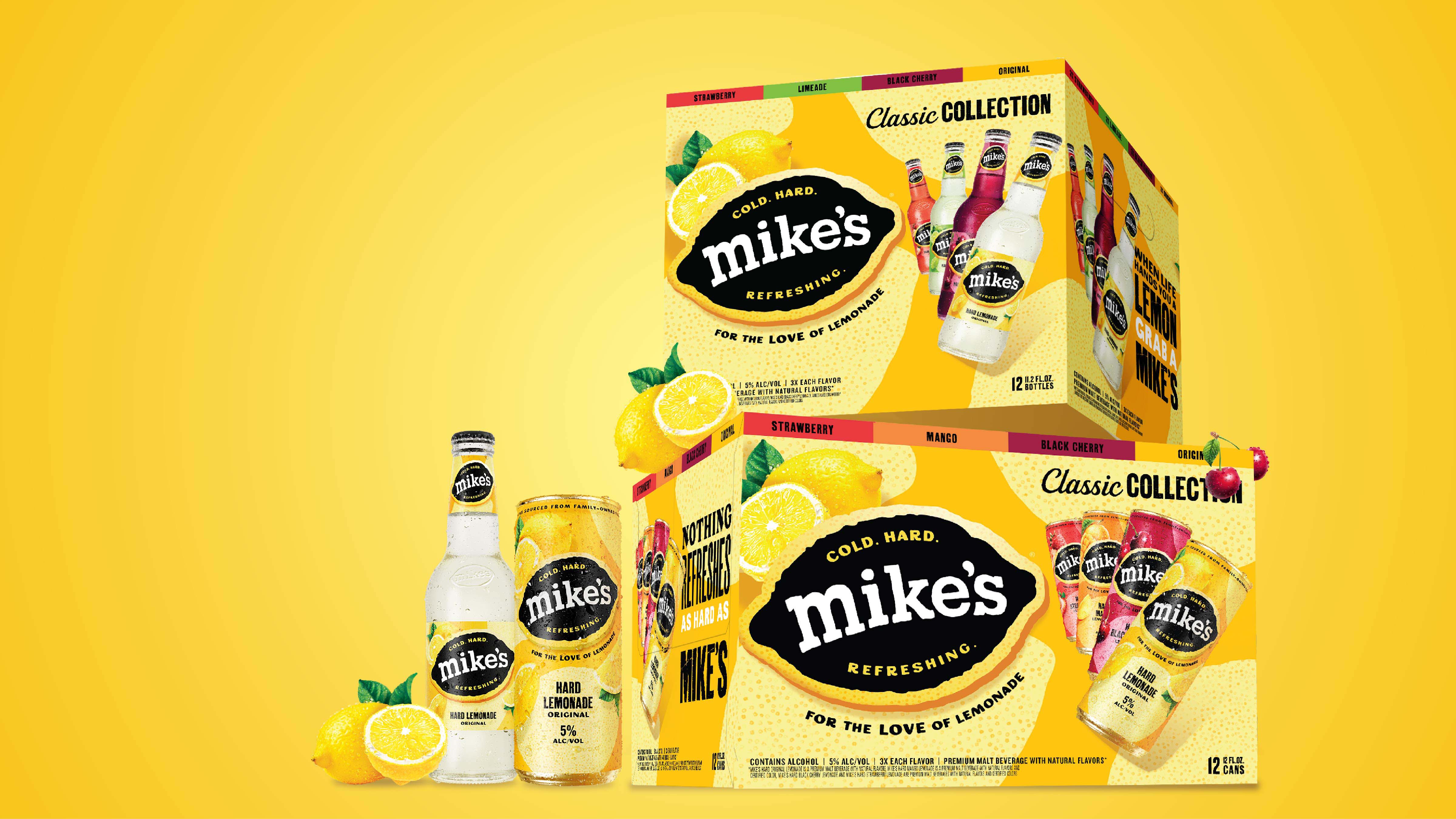
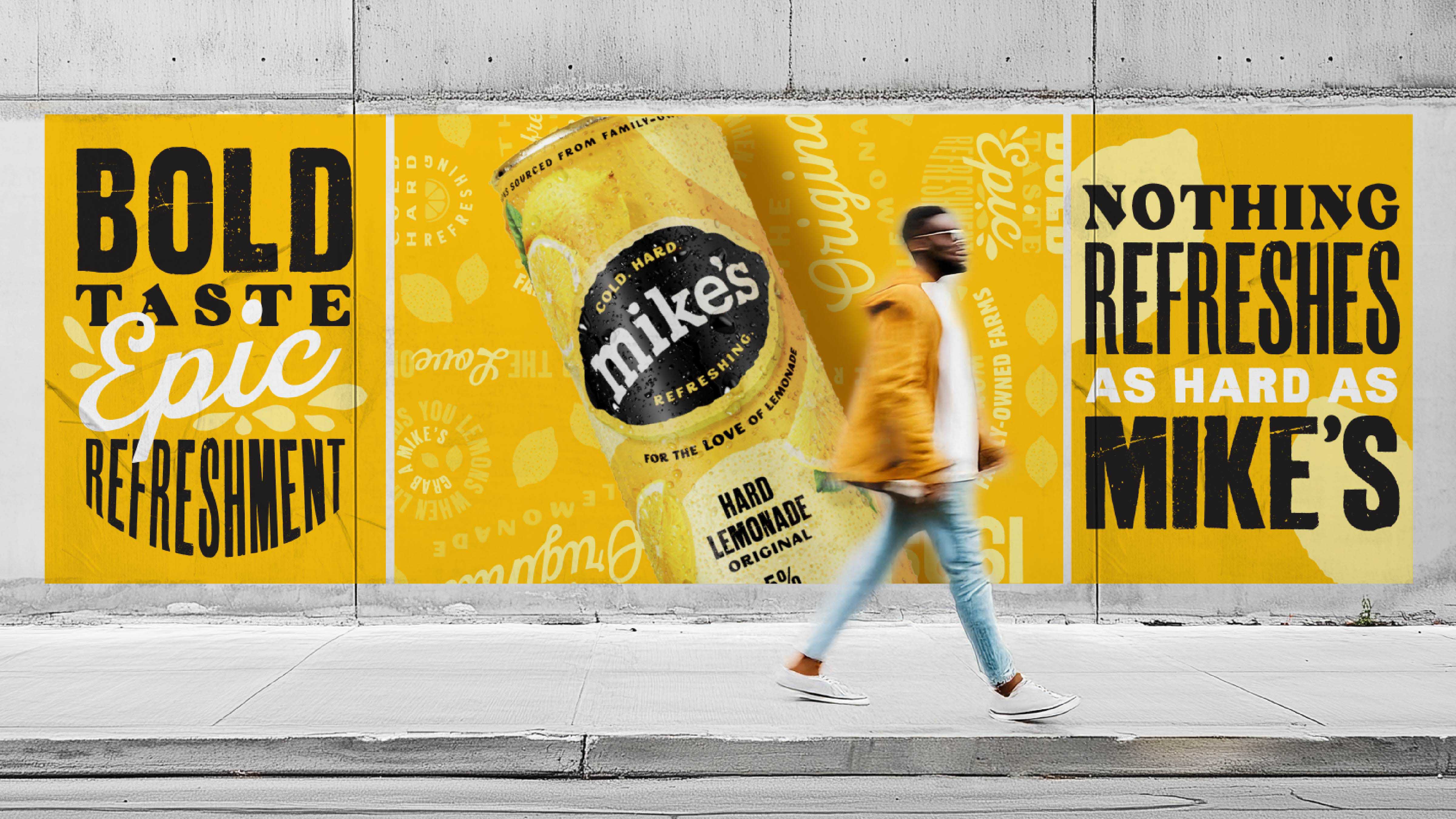
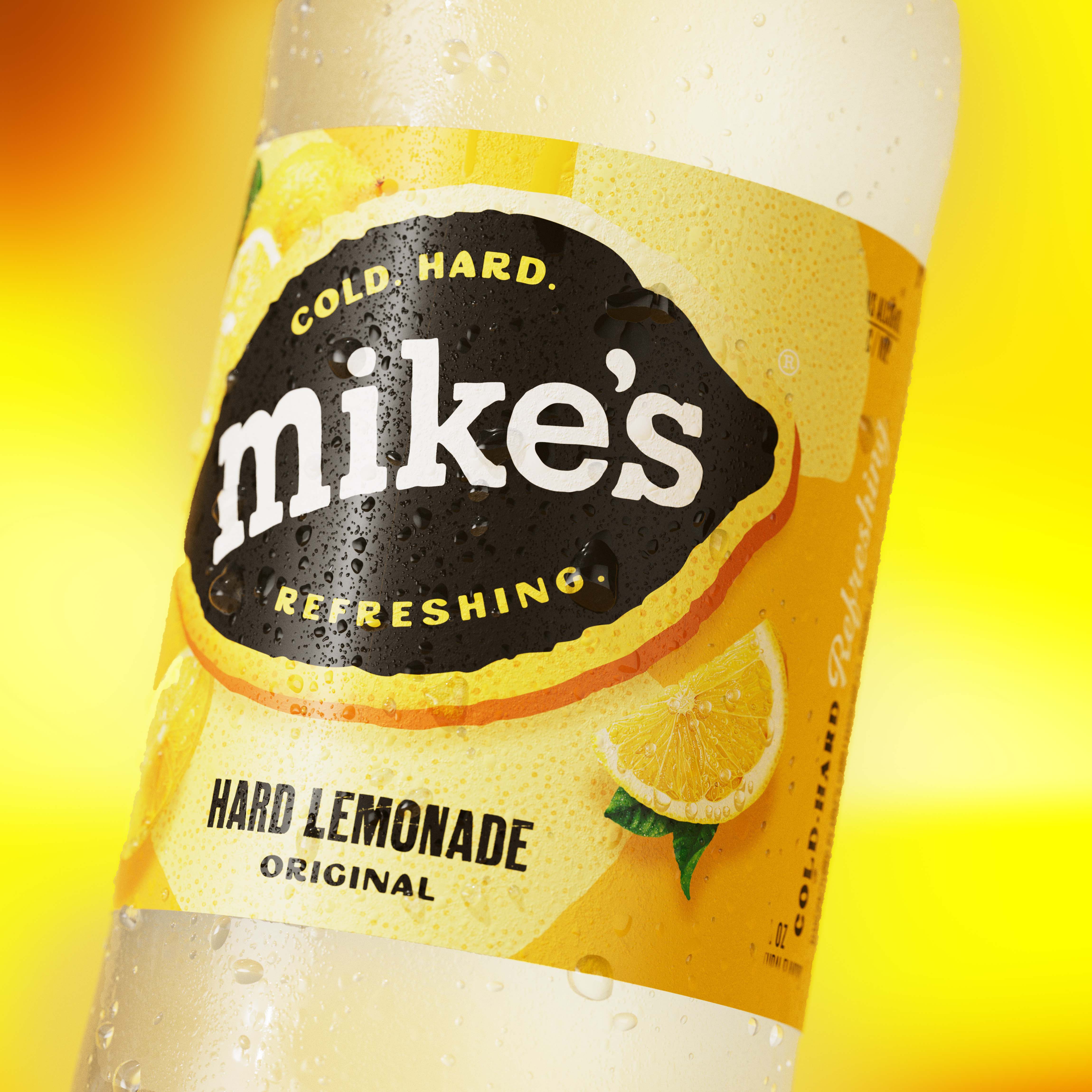
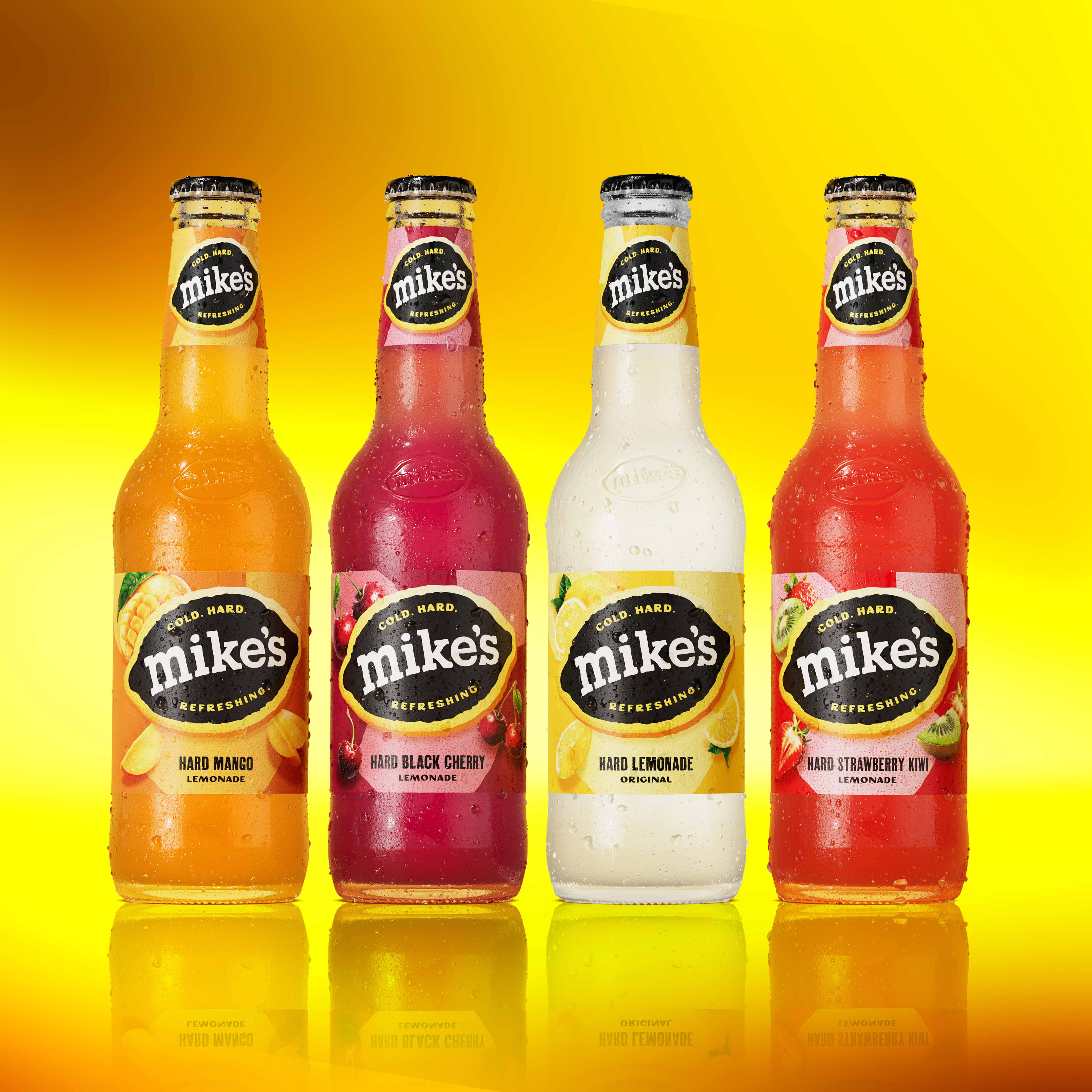
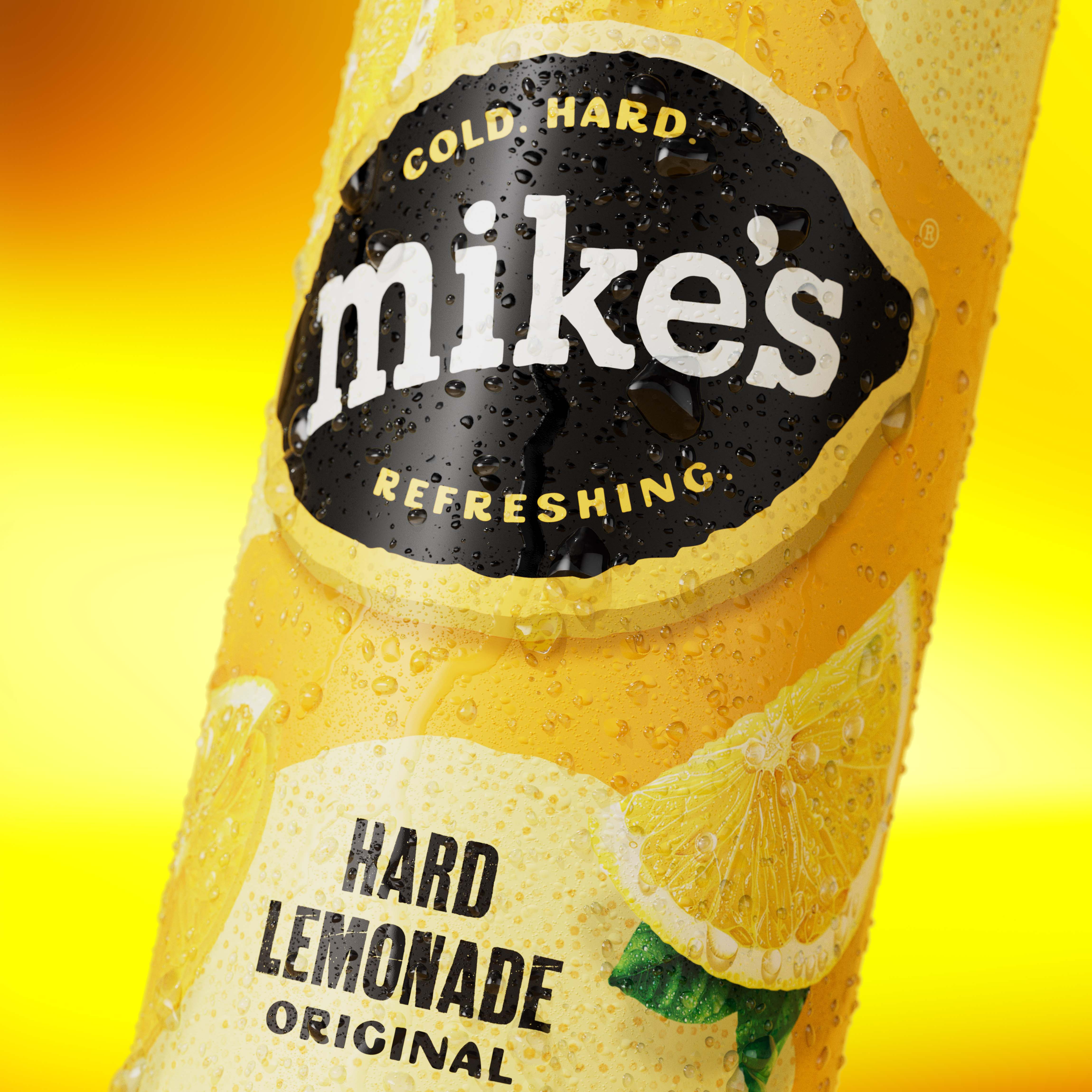
Working in close partnership with the Mark Anthony Brand, Denomination unearthed and evolved Mike’s most powerful brand assets: its zesty lemon equity, unapologetic use of yellow, and irreverent tone of voice. The result is a revitalised identity that leans into joy and refreshment – anchored by a strengthened logotype, a sharper, more confident lemon motif, and a louder call to “For the love of lemonade.”
“This evolved system brings cohesion across the Mike’s portfolio, while unlocking new opportunities for storytelling and culture-led expression,” said Hamish Campbell, VP Executive Creative Director at Denomination. “It’s always a joy to infuse fresh zest into an iconic brand. By modernising the brand’s strong equities and crafting a vibrant, flavorful design system, we’ve reinvigorated the full portfolio and brought back the beloved Mike’s attitude.”
Taglines like “Nothing refreshes as hard as Mike’s” and “When life gives you lemons, grab a Mike’s” double down on the brand’s role as both an icon and an instigator of fun. David Parsons, Creative Director at Mark Anthony, added: “It was a great pleasure working with the team at Denomination to refresh the Mike’s Hard Lemonade brand. Thank you for your partnership in recrafting this iconic brand.”
Mike’s isn’t just back – it never left. It just got sharper, fresher, louder, and a whole lot harder to ignore.

CREDIT
- Agency/Creative: Denomination
- Article Title: Denomination Helps Mike’s Hard Lemonade Reassert Its Iconic Edge
- Organisation/Entity: Agency
- Project Type: Packaging
- Project Status: Published
- Agency/Creative Country: United States
- Agency/Creative City: New York
- Market Region: North America
- Project Deliverables: Advertising, Brand Redesign, Packaging Design
- Format: Bottle, Can
- Industry: Food/Beverage
- Keywords: redesign, packaging, identity
-
Credits:
Design Agency: Denomination


