


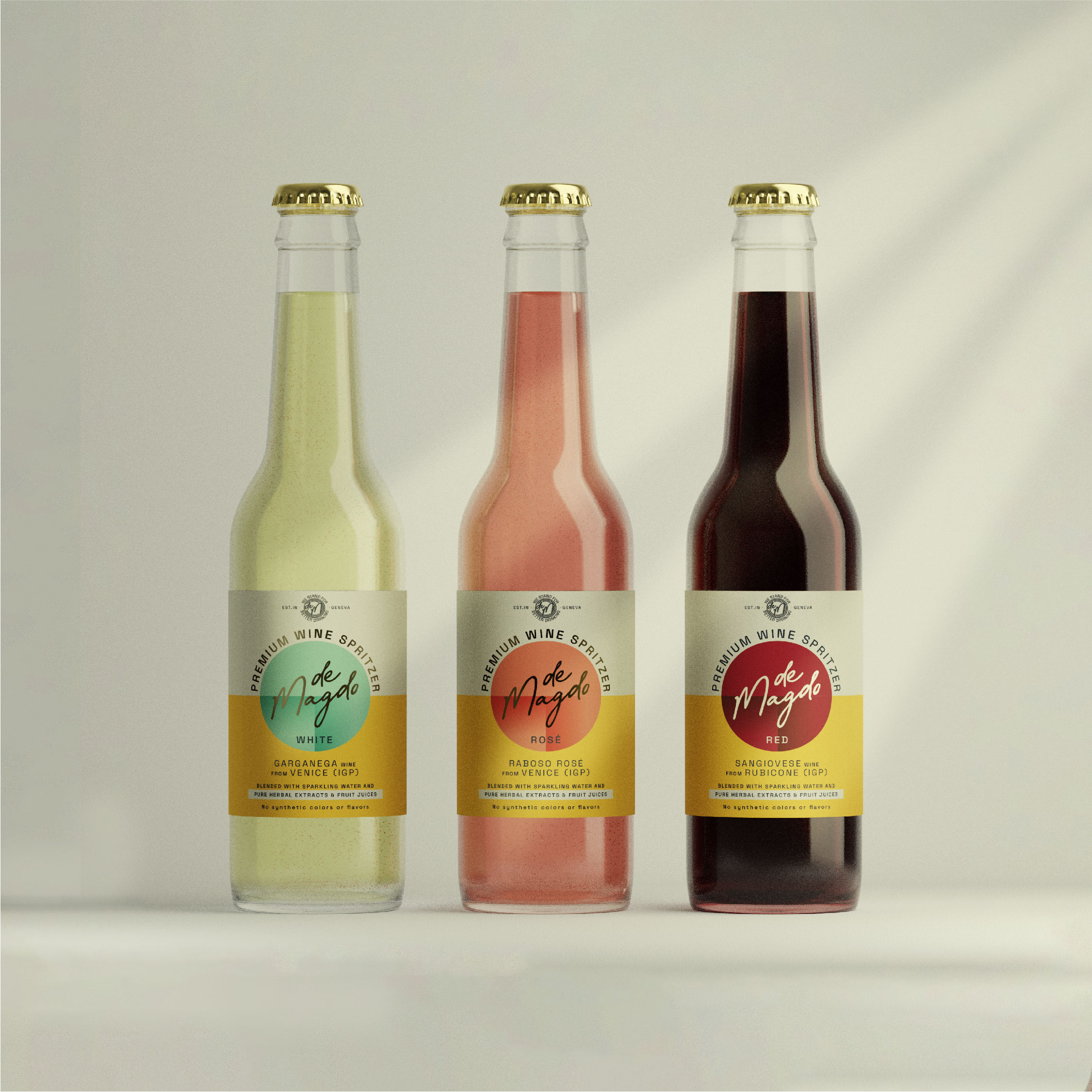
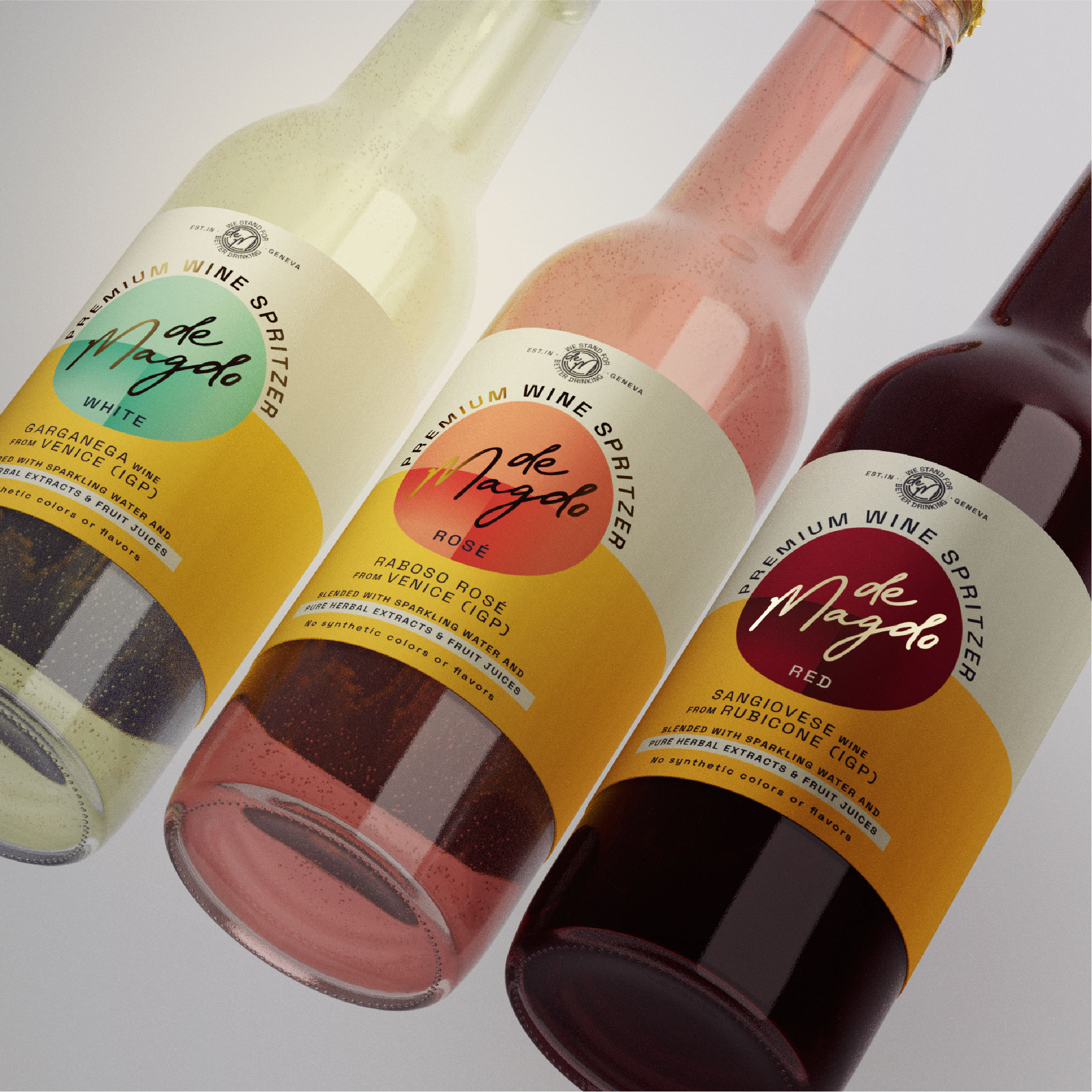
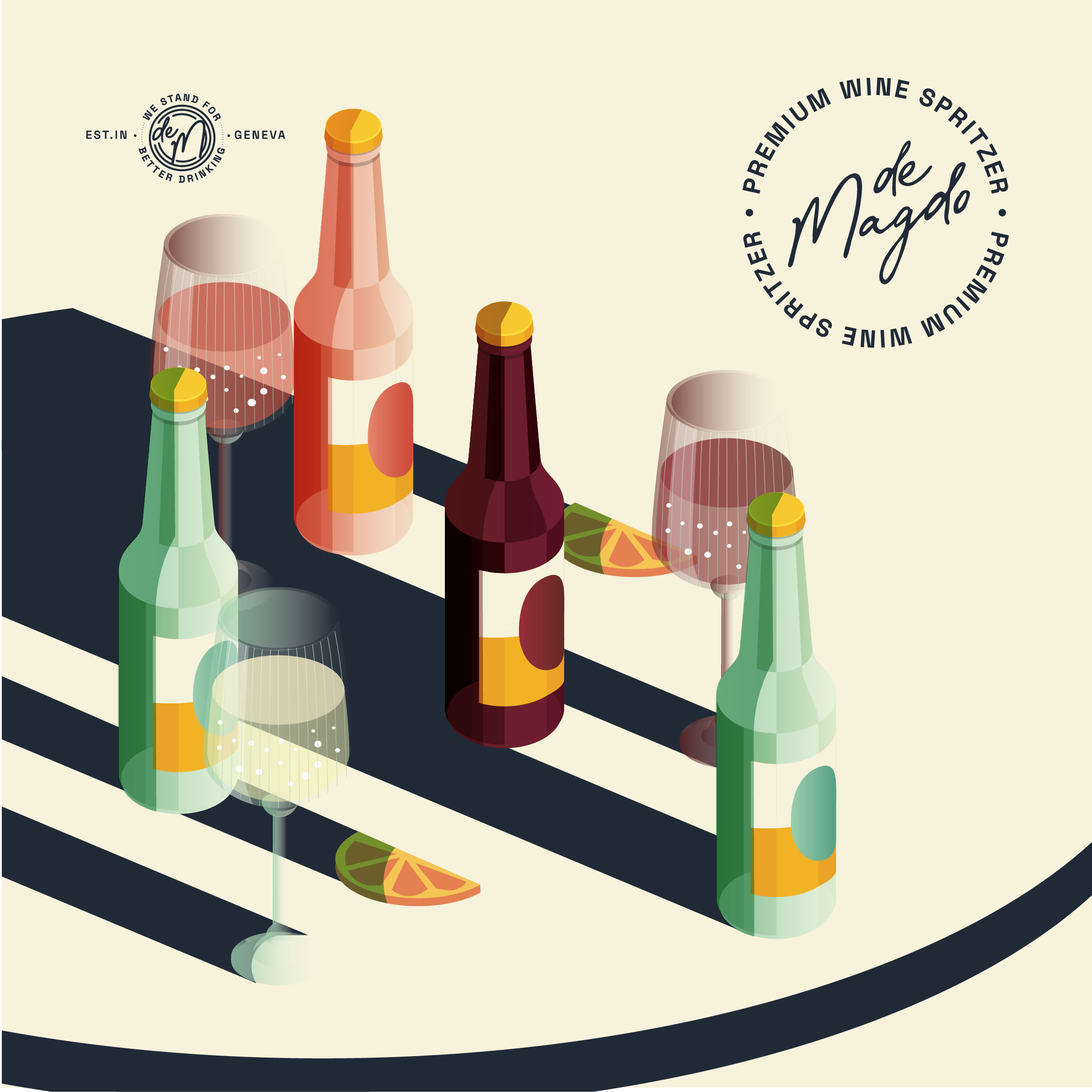
Showcasing the collaboration with the Geneva-based Swiss brand, deMagdo, on the design of their new label for an exciting product line set to hit the market soon. This venture encompasses three exquisite spritzers offerings: white wine, red wine, and rosé. Our design approach focuses on clean typography and a harmonious blend of colors, ensuring a visually compelling and cohesive brand presentation. The addition of deMagdo’s original yellow shades from their previous brand identity provides a subtle but recognizable link to the established brand, instilling a sense of familiarity.
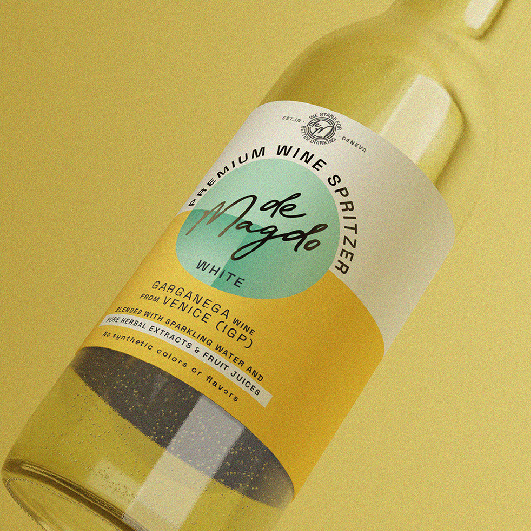
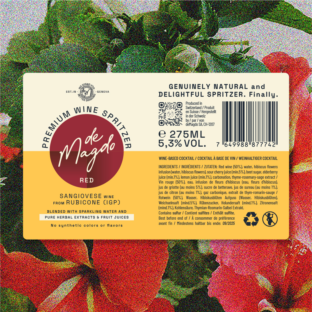
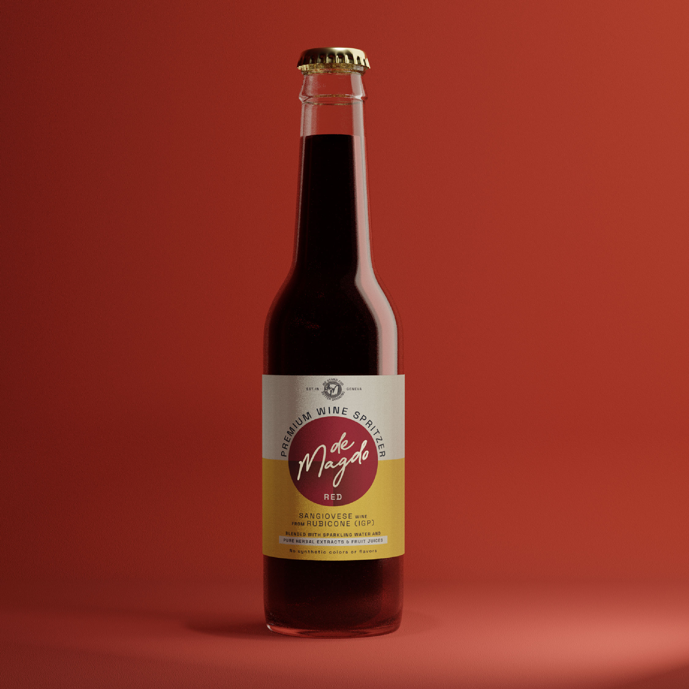
The label for the white wine boasts a refreshing aesthetic with a light teal color as its focal point. The clean typography enhances legibility, creating an elegant and modern appearance. The rosé label exudes a delicate warmth with a light warm rose color. The clean typography maintains a sense of simplicity, allowing the soft color palette to shine. For the red wine label, a rich and sophisticated dark ruby color takes center stage. The clean typography is carefully chosen to convey a timeless and premium feel. This label captures the essence of the red wine within a design that is both contemporary and rooted in the established brand’s visual language.
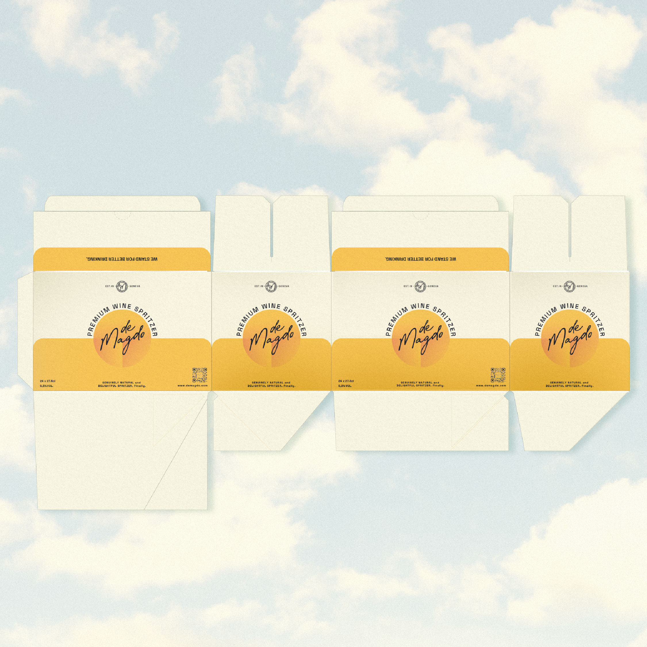
To accommodate various preferences and occasions, the label design seamlessly translates across both bottle and can versions (Coming later this year). Whether it’s the sleek and modern can or the classic and timeless bottle, the design remains consistent, ensuring brand coherence across different packaging formats.
This label design for deMagdo’s new products represents a fusion of modernity and brand heritage. It’s a testament to our commitment to creating visually striking, cohesive, and versatile designs that resonate with consumers.

CREDIT
- Agency/Creative: Barney Studio
- Article Title: deMagdo Spritzers Re-Packaging Design by Barney Studio
- Organisation/Entity: Agency
- Project Type: Packaging
- Project Status: Published
- Agency/Creative Country: Slovakia
- Agency/Creative City: Bratislava
- Market Region: Europe
- Project Deliverables: 3D Modelling, Food Photography, Illustration, Label Design, Packaging Design, Packaging Guidelines
- Format: Bottle, Can
- Industry: Food/Beverage
- Keywords: packaging design, spritzers, natural, label design, bottle design, can design, illustration, food&beverage
-
Credits:
Art Director & Brand Designer: Keisi Katiaj
3D Artist & Graphic Designer: Michal Cerno


